

Steve Jobs was one person who took these little details very seriously. After dropping out of college, he sat in on a calligraphy class and learned about serif and sans serif typefaces, along with how to vary the spacing between letter combinations.
He shared the story during his famous 2005 Stanford commencement speech, saying it all came back to him a decade later while designing the first Macintosh. “It was the first computer with beautiful typography,” Jobs said. He even credited that single class for the Mac having multiple typefaces and proportionally spaced fonts.

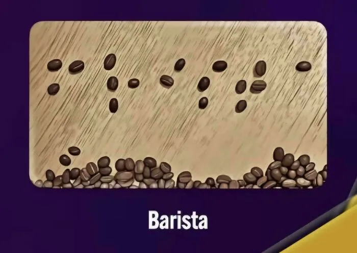
#23 Because The B And A At The Start Of "Barista" Are Too Close, This Actually Says "Frista" In Braille

So the next time you walk past a shop sign or scroll through your phone, take a second to notice the letters. A lot of thought usually goes into how they’re shaped and spaced.
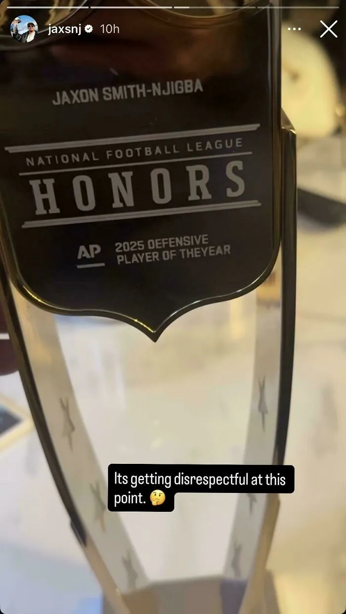
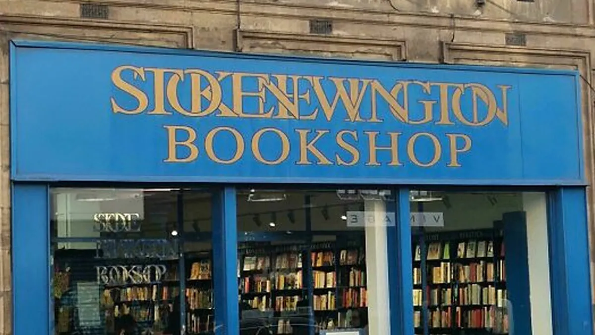
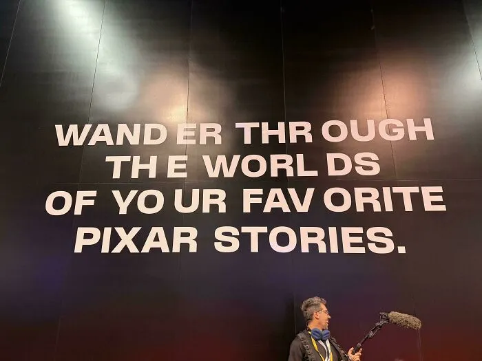
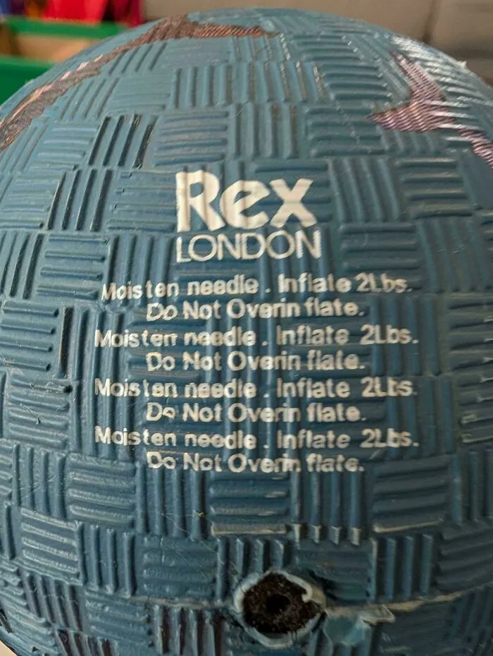
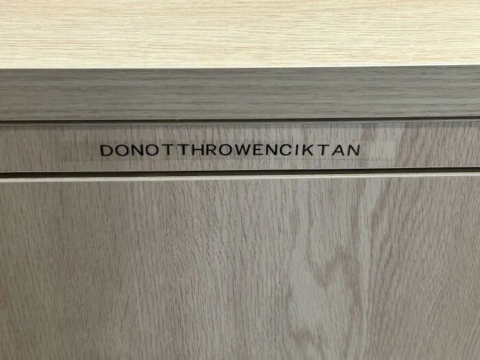
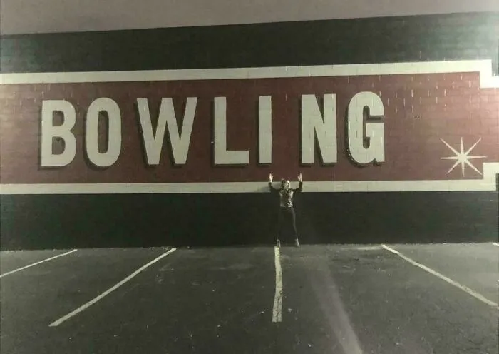
And when nobody pays enough attention, well, that’s how we end up with the hilarious fails on this list.



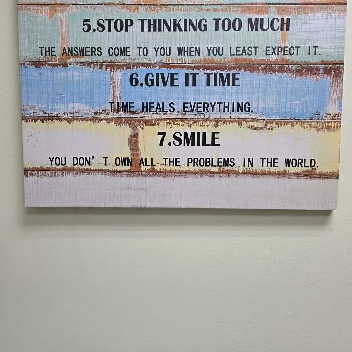
#31 This Inspirational Sign In My Doctor's Office Drives Me Crazy Every Time I Get To Number 7