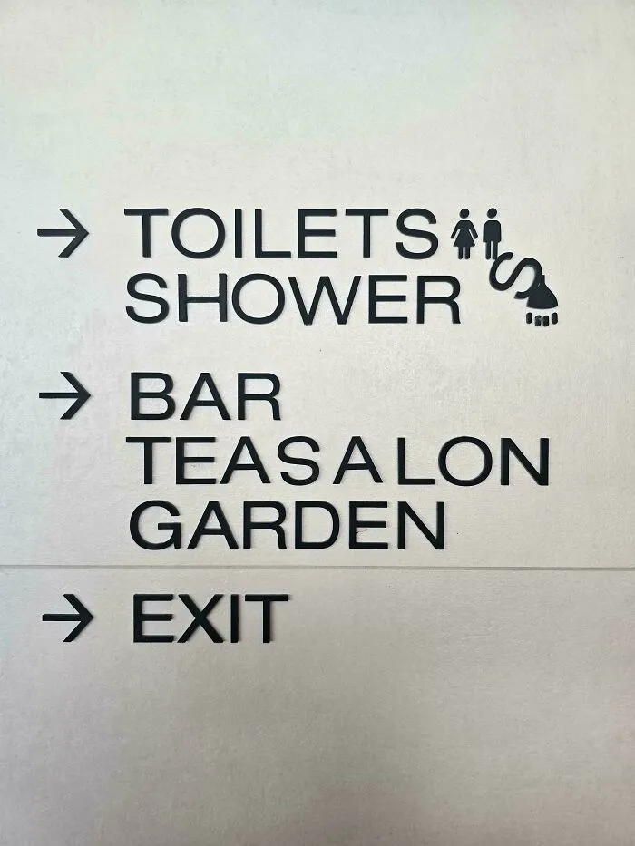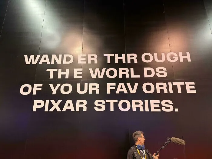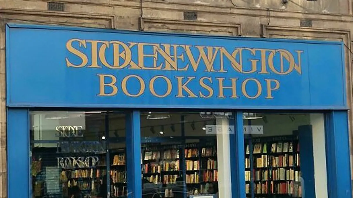


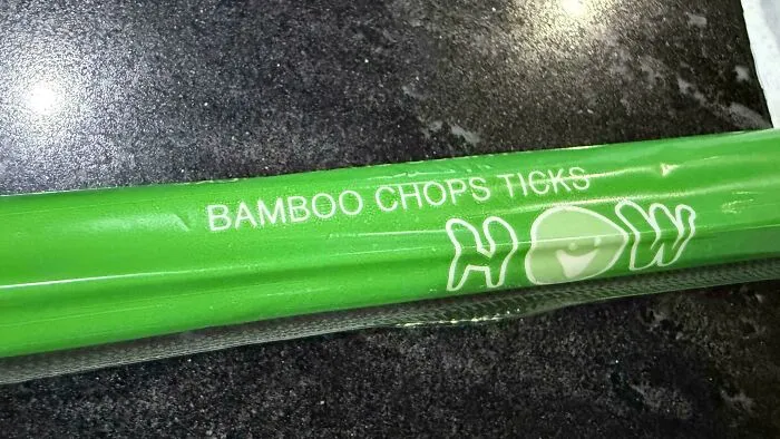
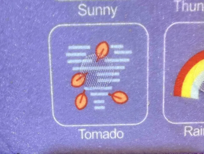
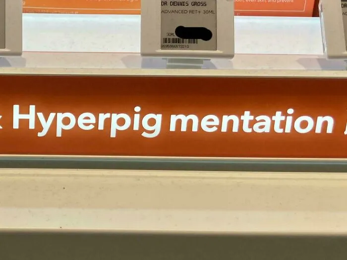
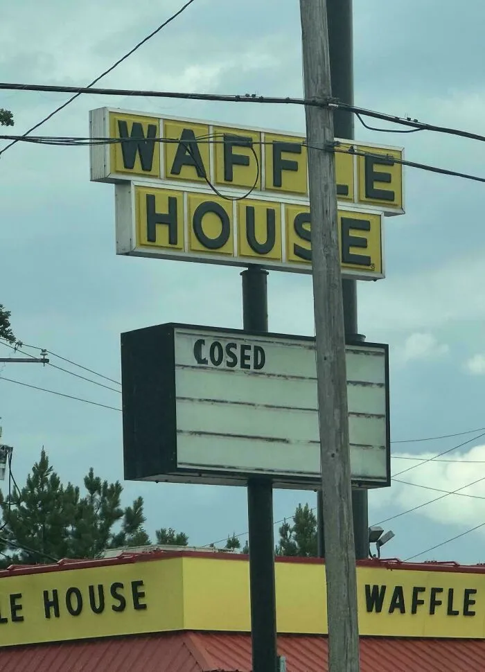
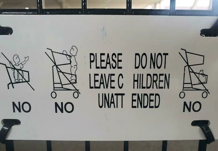
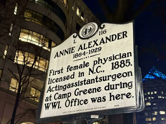
At first glance, r/keming might look like someone misspelled the subreddit’s name. In reality, it’s a clever nod to the very problem the community is all about.
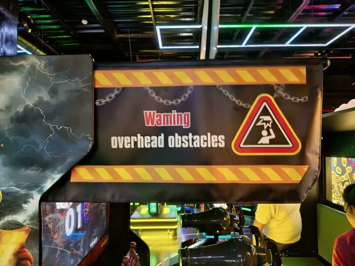
When the letters “r” and “n” are placed too close together, they can easily pass for an “m.” Squish them in “kerning,” and you get “keming.”
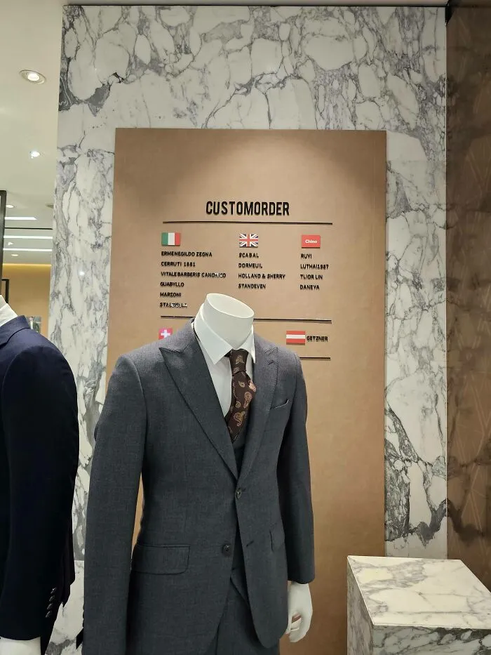
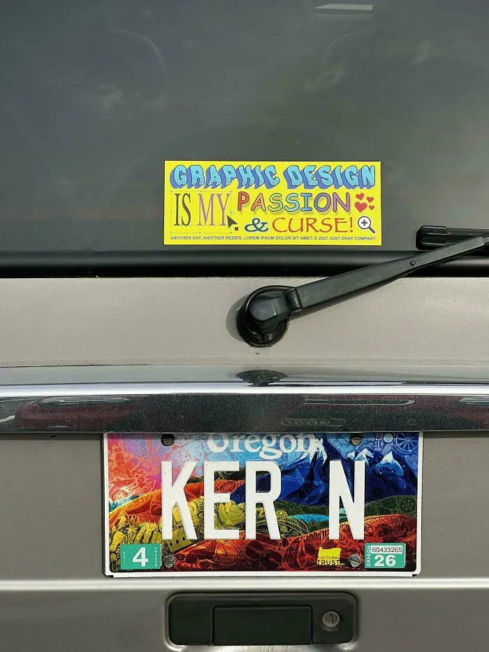
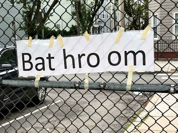
As we mentioned, kerning is all about the space between letters, and the word itself has a pretty interesting backstory.
According to Vocabulary.com, it comes from the French “carne,” meaning “projecting angle,” which goes back to the Latin word for “hinge.” Its typography meaning was born in old-school print shops.
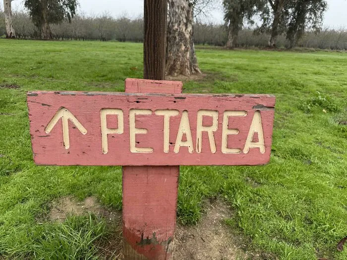
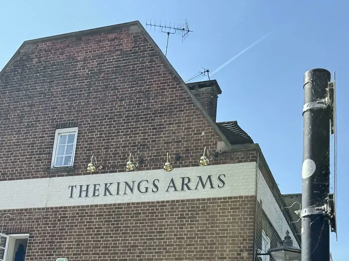
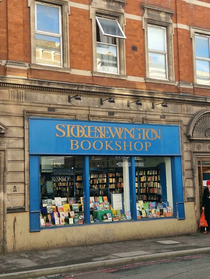
Back when printing relied on metal type, every character was cast on its own little block. Some letters, like the tail of a “j” or the top of an “f,” stuck out past the edge of that block.
These overhanging bits were called kerns, and they let neighboring characters sit closer together for a neater fit, as CreativePro explains. Sometimes printers even had to cut away part of the metal itself, so the whole process was slow and expensive.
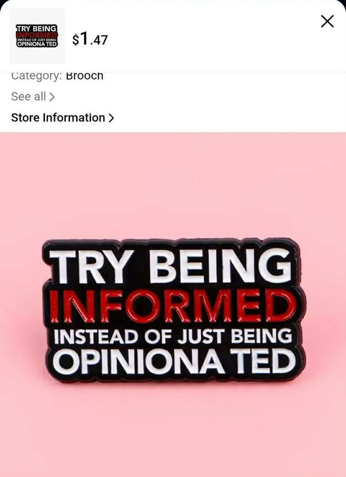
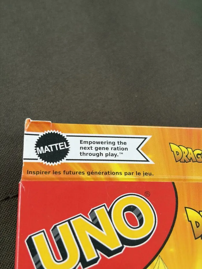
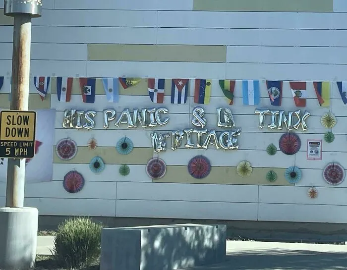
Thankfully, digital fonts made kerning way easier. Most fonts today come with built-in spacing adjustments for tricky pairs, and design software can add or remove space with just a few clicks.
Letter spacing, however, is just one small part of typography. The way text is designed in general plays a huge role in how we take in information. We might not stop to think about it, but it affects us every time we read something.


In 2012, filmmaker Errol Morris decided to test this with an interesting experiment on The New York Times website.
He posted a quiz titled “Are You an Optimist or a Pessimist?” that asked readers to go through a short passage and decide whether they believed its claim was true. What the 45,000 people who took part didn’t know was that the quiz was really about something else.
Morris wanted to see how people responded to the same passage when it was displayed in different typefaces. Each reader randomly got one of six fonts: Baskerville, Georgia, Computer Modern, Helvetica, Comic Sans or Trebuchet.
As it turns out, people were more likely to believe the passage when it appeared in Baskerville.
Typefaces generally fall into two big families. Serif styles, like Times New Roman, have tiny decorative strokes at the ends of each letter. Sans serif options, like Arial, skip them for a cleaner look.
For years, the common wisdom said serifs belong in print while their sleeker cousins work better on screens. However, after reviewing over a century of research, psychologist John T. E. Richardson found that adult readers generally show no clear preference for either one.