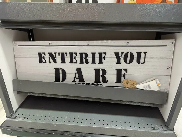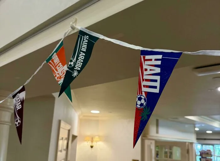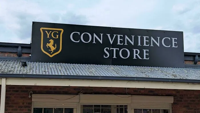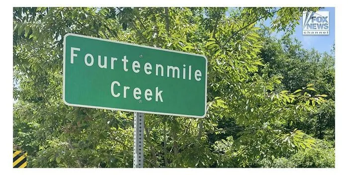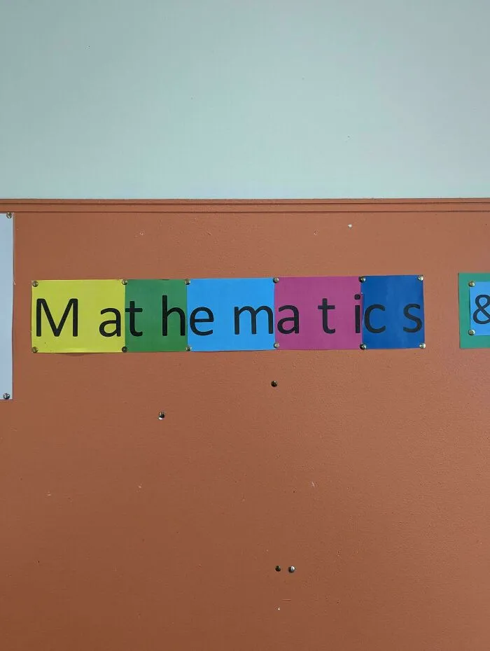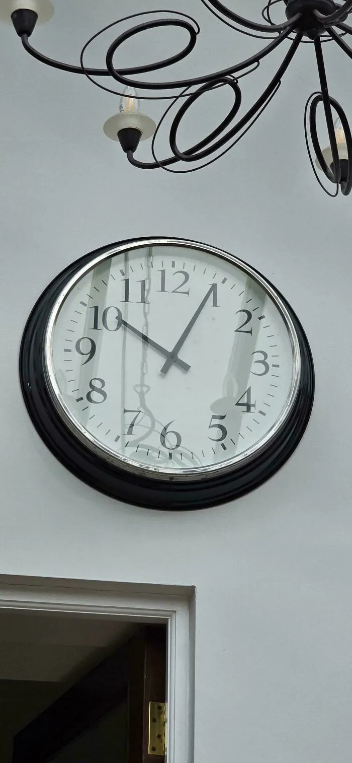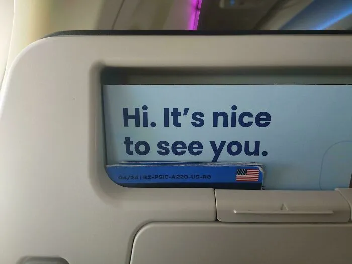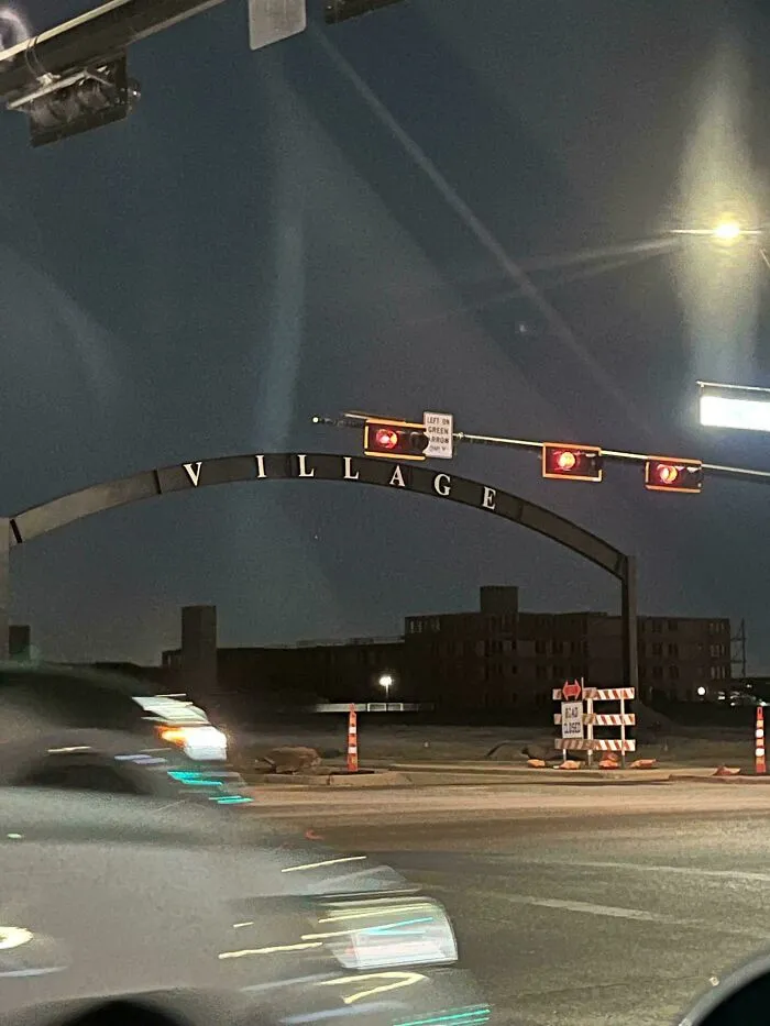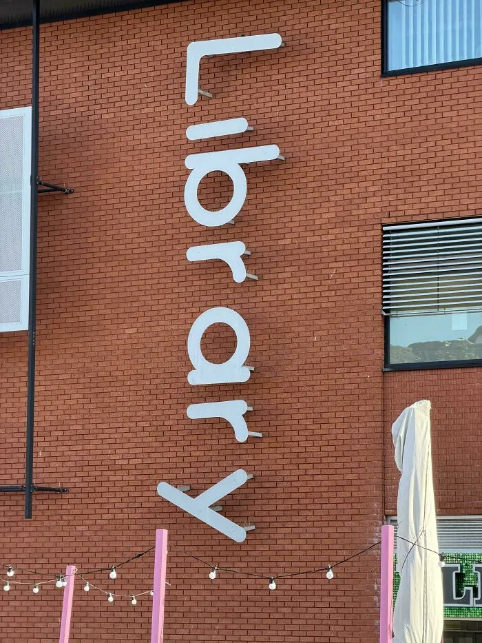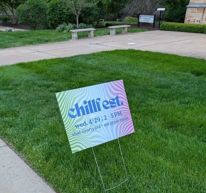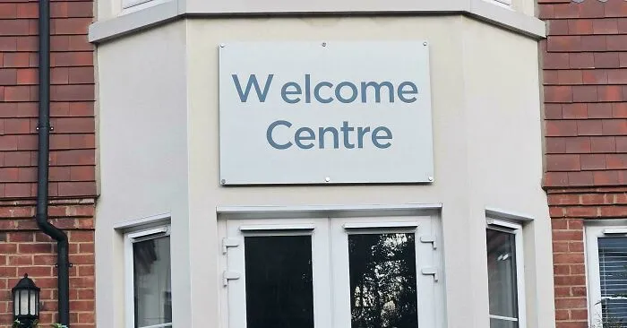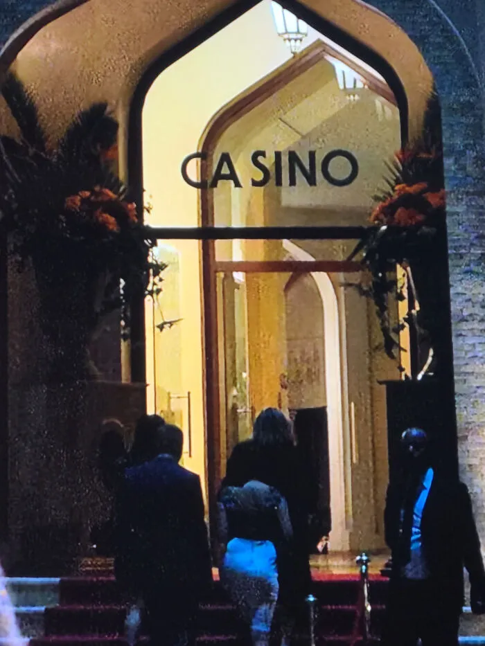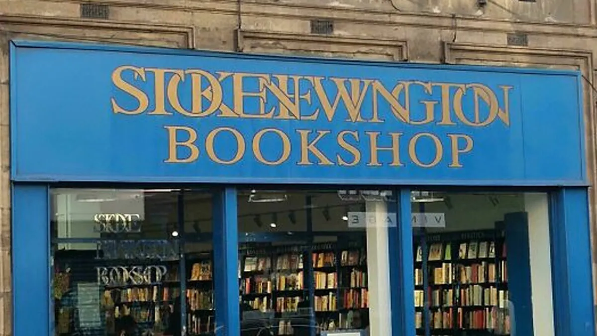


In typography, kerning is the process of adjusting the space between two specific characters. Most of us never give it a second thought, but it’s wild how much that tiny detail can matter.
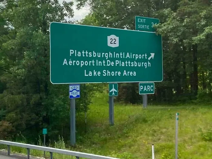
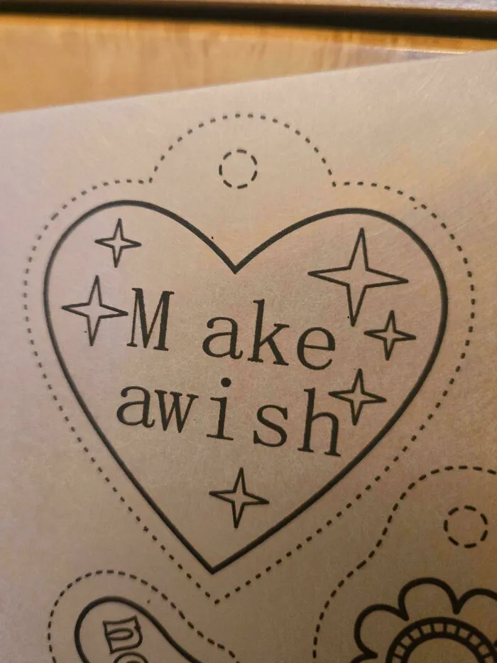
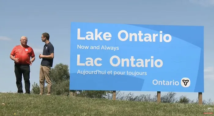
Put two letters a little too close together, or leave too much room between them, and suddenly a perfectly normal phrase can take on a completely different meaning. Sometimes, the result is hilariously unfortunate.

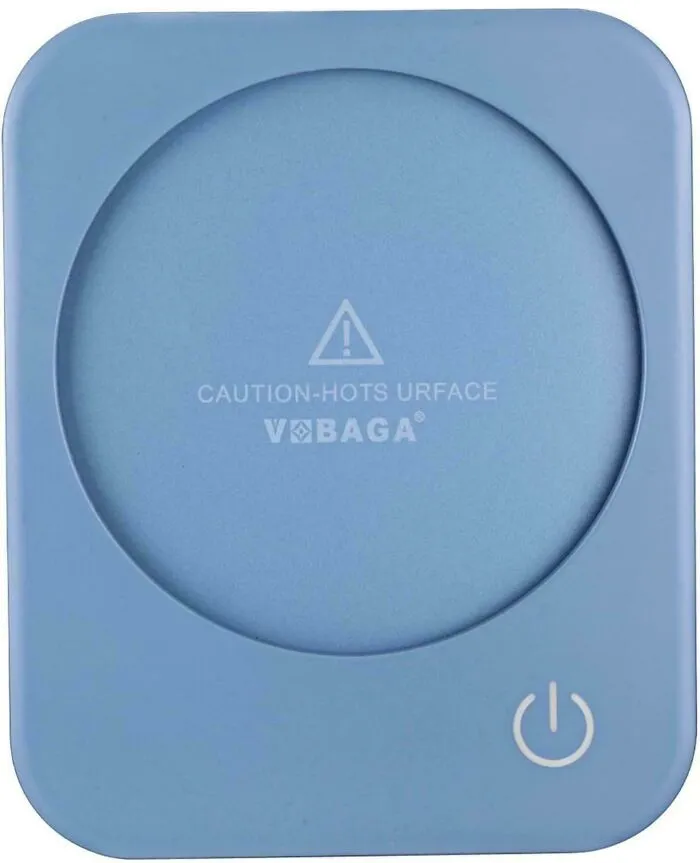

#47 Egregious… But Inevitable Considering LEGO Strict Sticker Placement Rules, I Suppose
Report
5points