



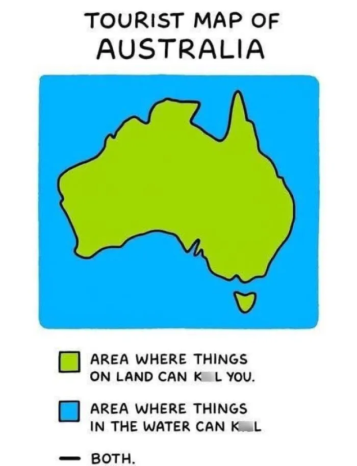
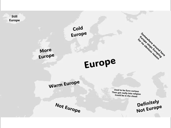
A map is really just an answer to a question, and the question is usually some version of how to get from here to there without losing your sanity. The best maps know exactly which question they are answering and politely ignore everything else. The worst ones try to answer every question at once, or better yet, a question nobody asked. That one idea separates a map you can use from a map you can only hang in the hallway as a conversation piece.
The London Underground map is a masterclass in knowing what to leave out. Before the 1930s the network was drawn over real London geography, which meant tangled curves and cramped central stations.
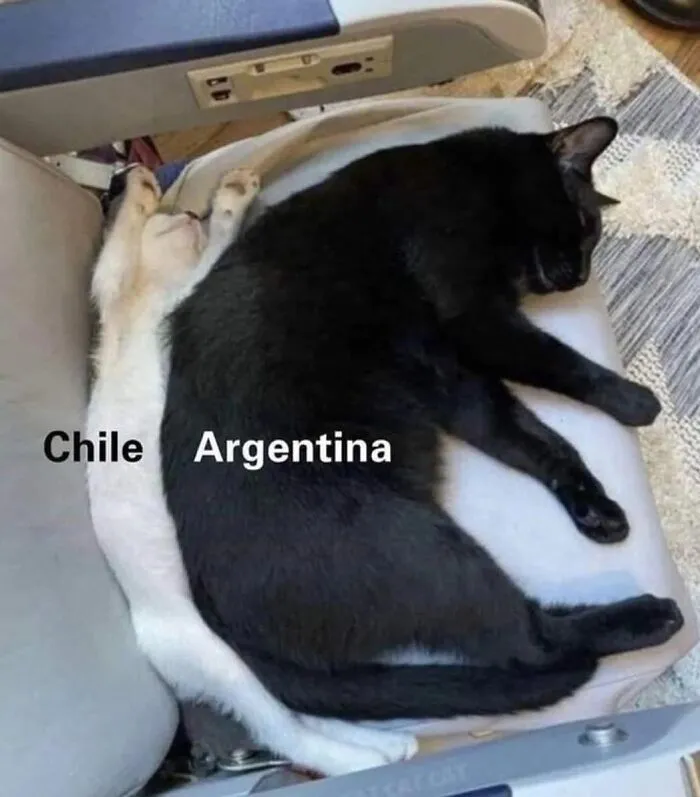
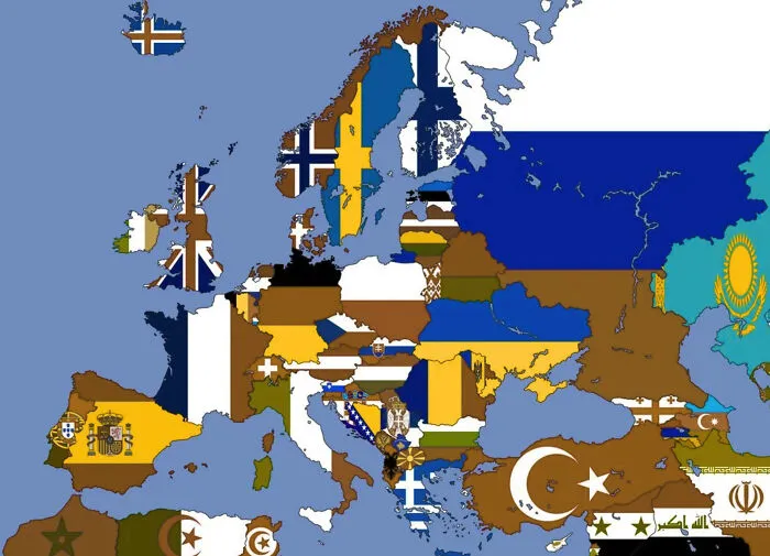
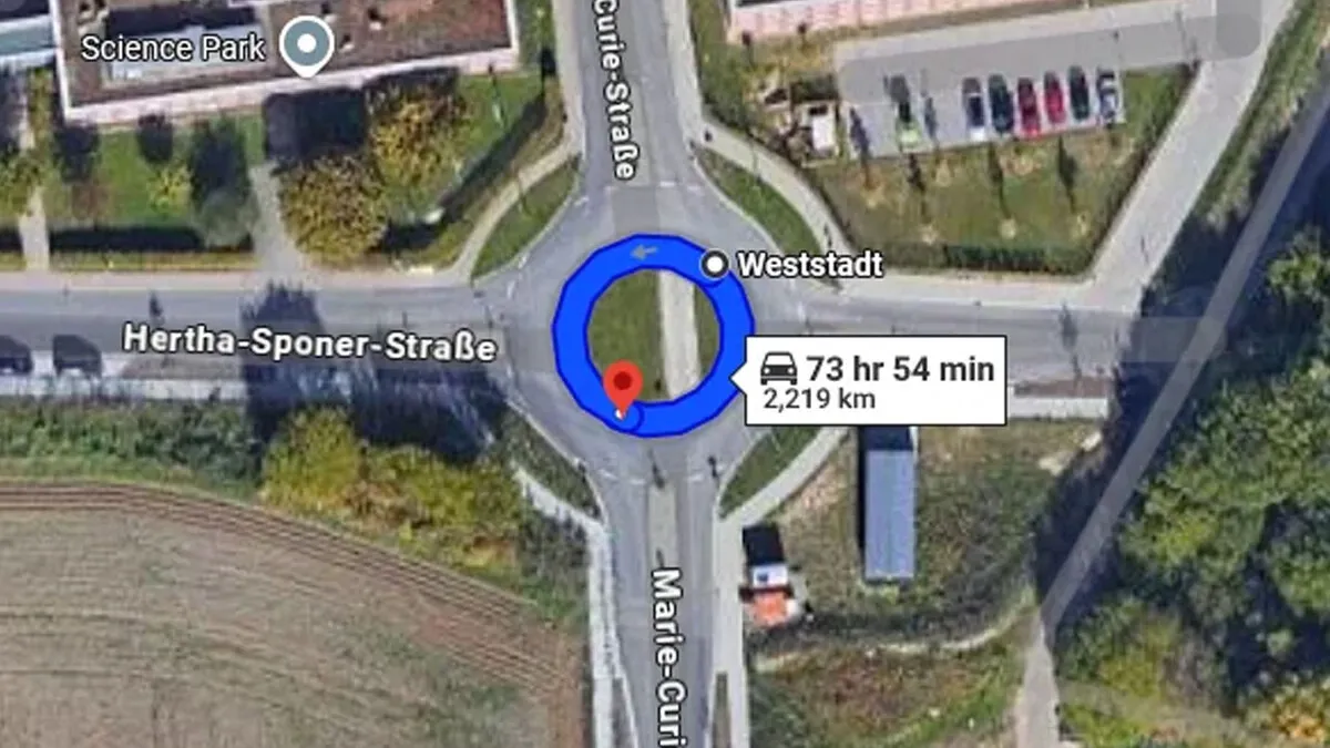
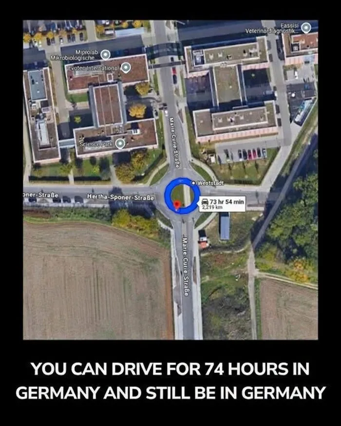
#6 Did You Know, You Can Drive For 74 Hours In Germany And Still Be In Germany?
Then a draftsman named Harry Beck, who spent his days sketching electrical circuit diagrams, decided to treat the whole system like a circuit board. His version showed how stations connect rather than how far apart they really are, and the London Transport Museum notes that a 2006 national contest ranked it the second favorite British design of the twentieth century. It is not flawless, since plenty of people have hopped on a train between two stations that are a short stroll apart because the map made the gap look huge. Still, for deciding which line to take and where to change, it is very hard to beat.
Then come the humble extras that separate a real map from a doodle. A legend explains the symbols, because a tiny blue triangle could be a campsite, a lighthouse, or a sandwich shop. A scale tells you whether that squiggle is a ten minute stroll or a three day expedition. A north arrow stops you from marching confidently the wrong way. A date matters too, since a map showing a bridge that vanished decades ago is less a guide and more a ghost story. And a title helps, because a map that never says what it shows is just expensive wallpaper.
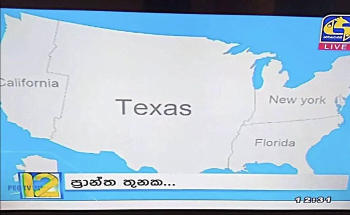
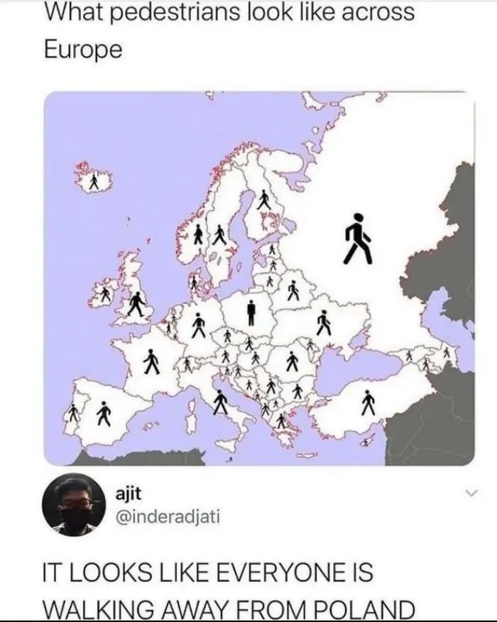
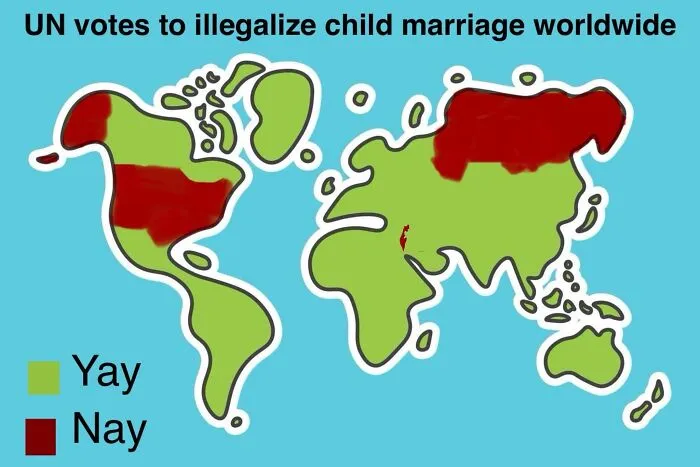
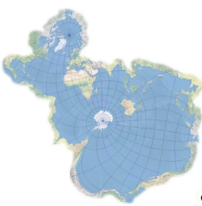
Every flat map of a round planet has to bend the truth somewhere. The famous Mercator projection is a gift to sailors because a straight line on it matches a steady compass heading. The price is that it stretches places near the poles and shrinks places near the equator, so Greenland looks almost as big as Africa, even though Africa is roughly fourteen times larger.
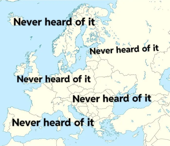
#13 If You Put The Us & Canada Over Europe, A Lot Of People Would Lose Their Lives
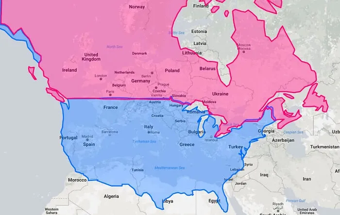
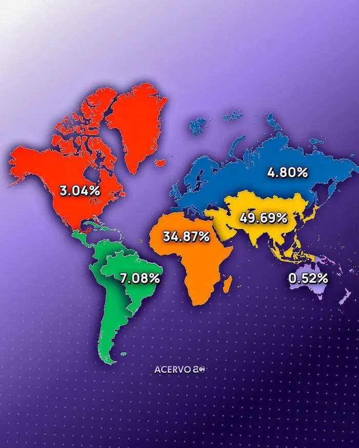
You can drag countries around and watch them change size on The True Size Of, which is a lovely way to lose an afternoon. A projection is not good or bad by itself. It is only good or bad for a job, and a map built for ships is the wrong tool for settling arguments about which country is biggest.
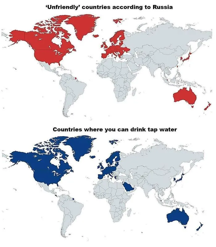
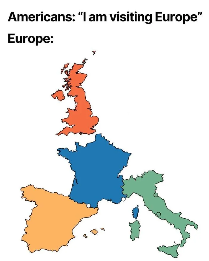
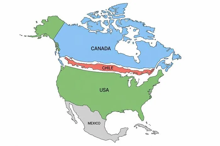
A map with the right information can still flop if nobody can read it. Colors that are too similar, labels piled up like passengers on a rush hour train, and text so tiny it needs a magnifying glass all make a map miserable. So does using red and green as the only difference between two things, which leaves some readers guessing. Good design is mostly contrast and breathing room, so the eye knows where to land first.