



Sometimes a map is not for finding your way at all but for finding an answer. During a cholera outbreak in Soho in 1854, physician John Snow marked the cases on a street map, and the lethal cases clustered around one water pump on Broad Street. The London Museum explains how Snow used it to persuade local authorities to remove the pump handle. The map worked because it showed two things clearly, the lethal cases and the pumps, and let everything else sit quietly in the background.
Then there is the opposite approach, which is packing in a huge amount and somehow pulling it off. In 1869 the French engineer Charles Minard drew Napoleon's disastrous march into Russia as a single image, with a band that thins as soldiers are lost and a temperature line for the freezing retreat. Big Think's Strange Maps column points out that it unites six different sets of data, and it still reads easily because every piece serves one story. Crowding is fine as long as the crowd has a job.

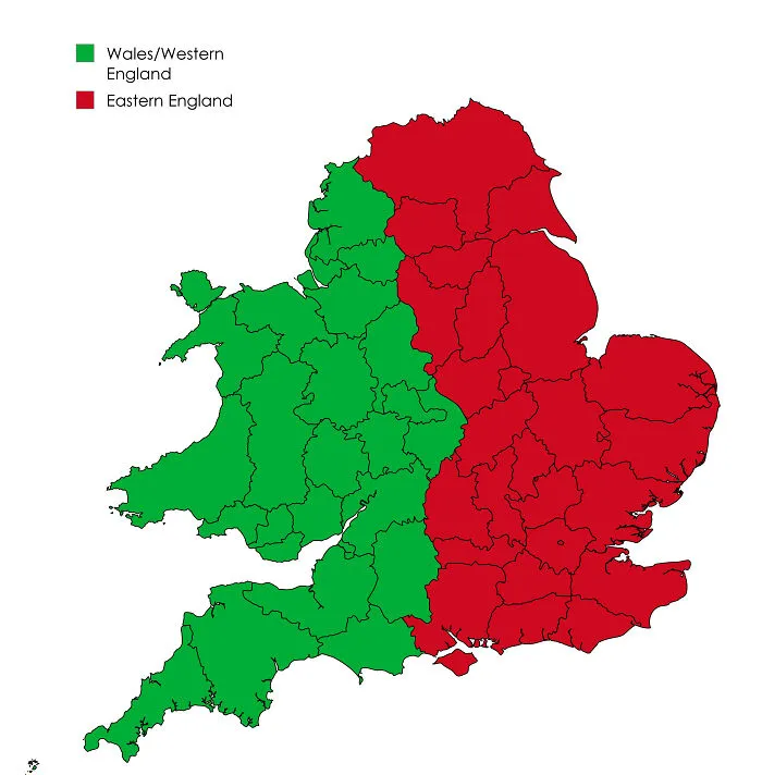
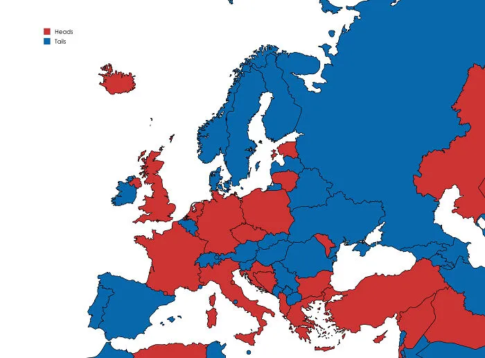
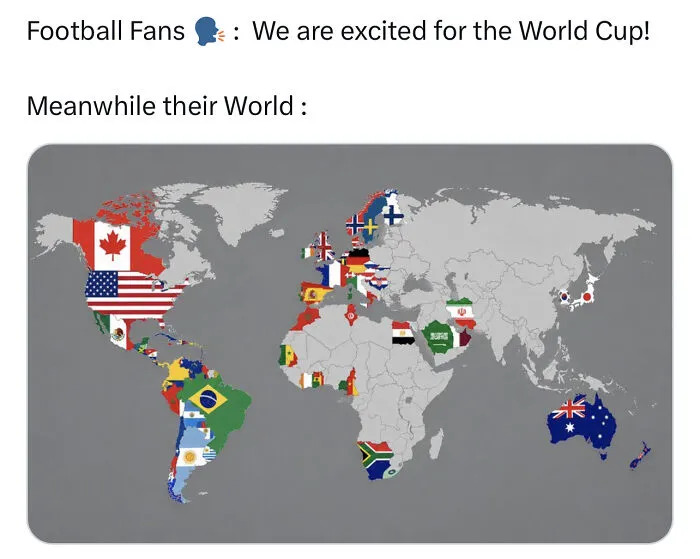
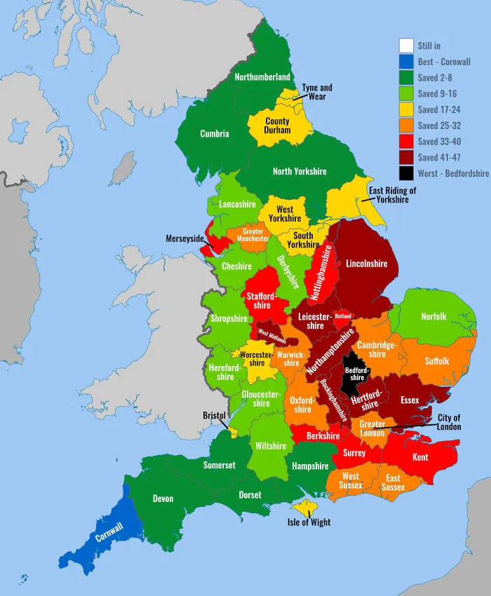
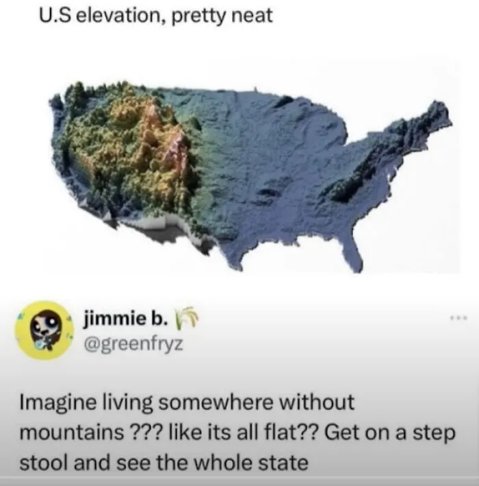
So a useful map answers a clear question, leaves out what does not matter, labels what remains, admits its limits, and never makes the reader squint. Keep that in mind as you scroll, because the maps ahead miss nearly all of it, and a few of them seem to be doing it on purpose.