




The oldest maps out there are roughly 4000 years old, depicting a section of the river Odet valley in modern Finistère, Brittany. It was found in a tomb, possibly to communicate to people what its inhabitant “controlled.” The fact is that all through history, humans have been trying to make records of the world around them in interesting ways.
The “Simon shows you maps” Facebook page, run by the titular Simon, is dedicated to sharing cool and interesting maps. So get comfortable as you scroll through, upvote the best ones and be sure to share your thoughts and ideas in the comments section down below.
More info: Facebook
#21 Just A Quick Reminder. A Little Public Service Announcement To Please My Dutch Friends

Report
22points
Above all, maps mirror the world and our choices back at us. They remind us why some places thrive and others struggle, how our actions remake the planet, and where injustices cluster. By mapping everything from literacy to air quality, we are faced with the issues that confront us, and can more readily imagine solutions.
#22

The classification of Germany in this map classifying the nature of most commonly used profanities across Europe is certainly correct. I would argue a whole category is missing here: family related profanities. Sure, they are often mixed with sexual insults but I thing they deserve their own category!
Report
22points


In short, mapping data turns the maze of numbers into a comprehensible cosmos. It is a synthesis of insight, storytelling, art, and strategy, no wonder we come back to maps time and again when we want to make sense of our complex, interrelated world.
#25 Germans And Scandinavias Holidaying In Spain Lose Their Mind Over The Late Dinners

Report
21points
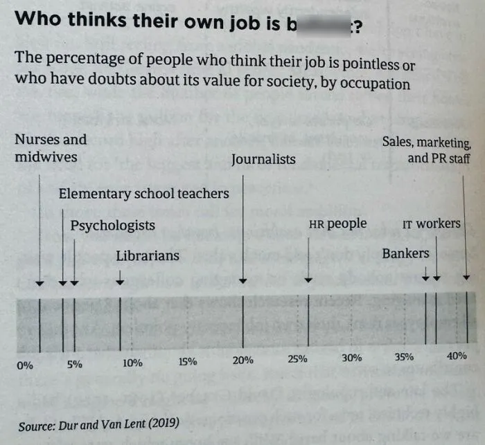
#26 In A World Where More People Obsess About Their Work Being Inherently Meaningful, I Hope That You See Your Job Relatively Close To The Left Side Of The Chart
Report
21points
#27

In places like Germany, the full retirement of the huge Baby Boomer cohort will drive pension payments up significantly. The relatively small workforce will pay for that. Young workers will increasingly dislike that. Voting behaviour might shift further away from established parties as a result.
Report
20points
#28 This Map Shows The Number Of Dentists Per 10,000 Residents Across Europe

Report
20points
#29 Look Who Just Made It Into The Top 20 Of The World’s Largest Economies. Welcome To The Top, Poland

Report
20points
#30

I had never seen the US Baby Boom been visualized in this way. Rather cool visuals. The chart assumes Baby Boomers to be born between 1946 and 1964
Report
20points
#31 This Map Shows Europe In A Silly Scenario Where Sea Levels Decrease By 1000 Meters

Report
19points
#32 Want To Swear But Kids Are Around? Use These Kid-Friendly Swear Words!

Report
19points

#34 This Map Shows The Number Of Ant Species In The 50 Most "Antsy" Countries

Report
18points
#35 Time Traveling Back To 600 Ad Europe, Would You Be Able To Communicate With Anyone?

Report
18points
#36

This map shows the status of coal power in Europe as of 2024. Coal is being phased out. Now it’s time to drive down energy costs. Crucial considering the continent wants to be competitive in high end manufacturing, needs big data centers, and wants at least a bit of supply chain sovereignty.
Report
18points

#38 Yet Another Map That Supports My Suspicion That Poland Is Europe’s Hottest Place To Be At The Moment. Cheaper Than Germany, On The Up Economically

Report
15points

#40

We are being shown how people in Slovakia reference other European nations in their idioms. Germans also use the stingy Scotsman stereotype
Report
15points