



Bored Panda
99 Fascinating Maps That Explain The World Better Than Any Spreadsheet (New Pics)

99 Fascinating Maps That Explain The World Better Than Any Spreadsheet (New Pics)

40
2
Numbers and geography. Neither, as my family never tires of pointing out, is exactly my strong suit. A spreadsheet? My eyes glaze over instantly. Need directions? You’re better off staying home than listening to me. Maps, however, are a bit of a different story. Maybe it’s because a good map does the hard work for you. Take a pile of data that would normally send me running, add a few colors, and suddenly order is restored to the world (or at least the part of it on the map). And it’s not all navigation, either.
Turns out some maps even reveal all sorts of curiosities you never knew you wanted to know about, like which European countries use a comma instead of a decimal point, where it’s illegal to boil a lobster alive, or how many hours you’d have to work to buy GTA VI, depending on where you live. So whether you’re a geography buff or someone who, like me, still gets lost on the way to the shops, here are some of the most fascinating maps out there, plus some expert insight from Philippa Irvine, a geography lecturer at Rhodes University in South Africa.

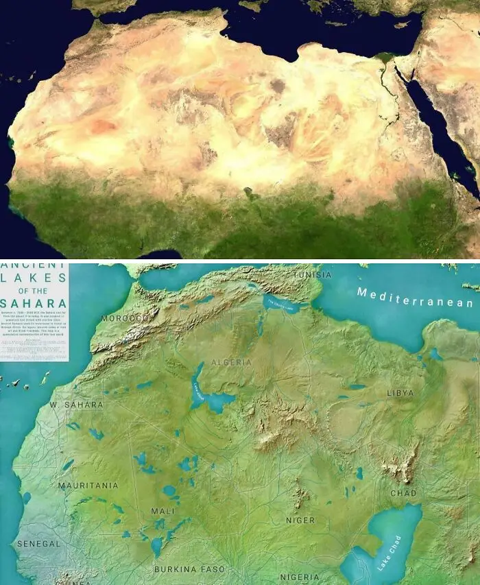
#1 The Sahara Today vs. 8 Thousand Years Ago

Side by side satellite maps comparing current desert Sahara to ancient green lakes region.
14points

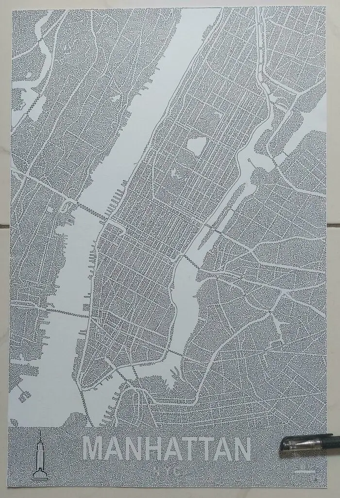
#2 I've Drawn Manhattan With One Line That Never Intersects [oc]

Intricate single-line drawing of a Manhattan map, showcasing artistic fascinating maps that explain cities.
14points

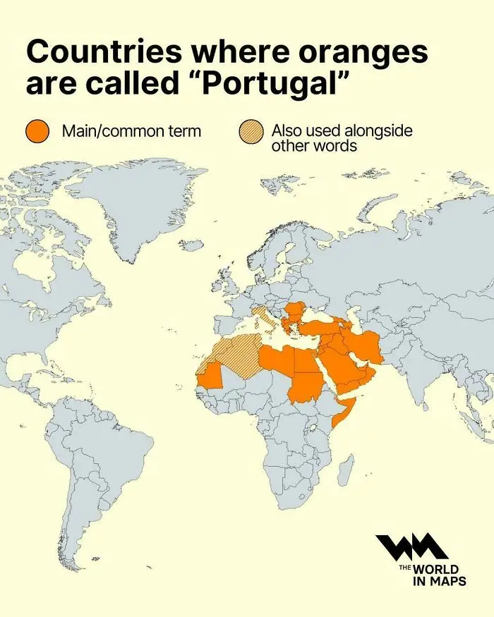
#3 Countries Where Oranges Are Called ''portugal''

A global map illustrating countries where oranges are called Portugal.
13points

Not too long ago, a friend of mine shared a photo on Facebook of a stack of old maps she’d been gifted. Her caption? “Someone just spoke my love language.” If you’re reading this post, you can probably relate. But even if you aren’t a certifiable cartophile, you have to admit that there’s something pretty delightful about maps, whether they’re the old-school paper kind or their modern digital (even interactive!) counterparts.

Sure, they’re a useful tool for getting around, especially if you’re geographically challenged, like me. But as Esri, the company behind the ArcGIS mapping software, puts it, “Maps are more than diagrams that help you navigate from point A to point B.” They can help us visualize data, spot trends, and, perhaps most importantly, spark curiosity.
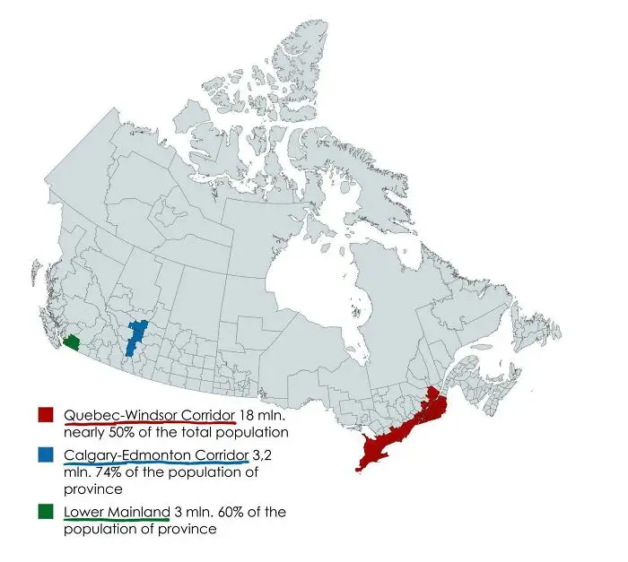
#4 70% Of Canada's Population Lives In These Three Regions

Fascinating maps highlighting population densities and major corridors in Canada.
11points

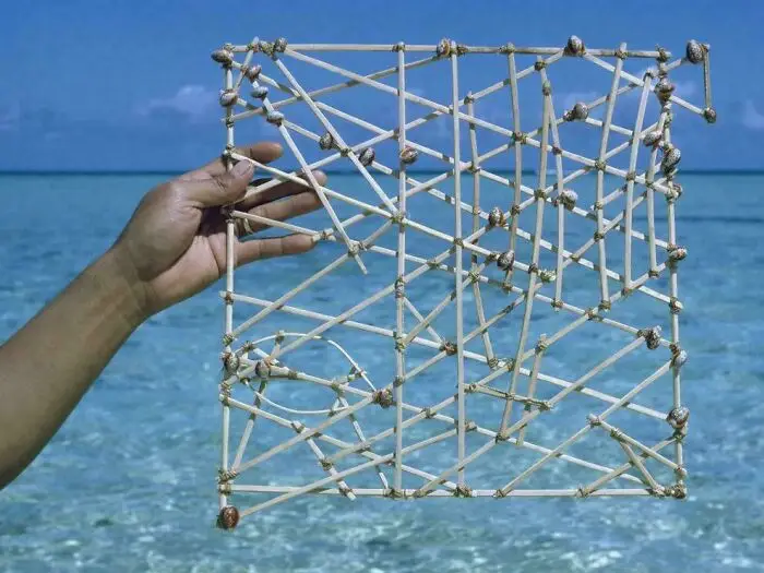
#5 Polynesian Shell Map

A hand holding a traditional wooden Marshallese stick chart used for ocean navigation against the sea.
11points

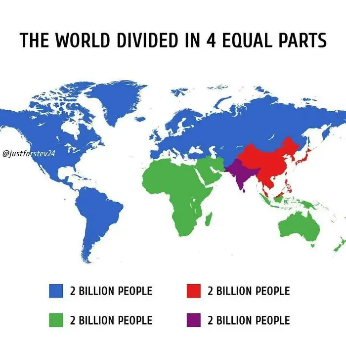
#6 World Blocks By Population (2b Each)

A map dividing world population into four equal regions of two billion people each.
11points

And they’ve been helping us do this for a very long time. According to National Geographic, some of the oldest known maps are clay tablets from ancient Babylon. Maps have come a long way since then. These days, making a pretty sophisticated-looking one takes little more than some data and free software, no clay or map-making experience needed.
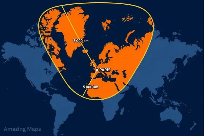
#7 What A 5,000 Km Radius Around Paris Looks Like On A Mercator Map

A world map featuring a highlighted five-thousand-kilometer radius centered on Paris.
10points

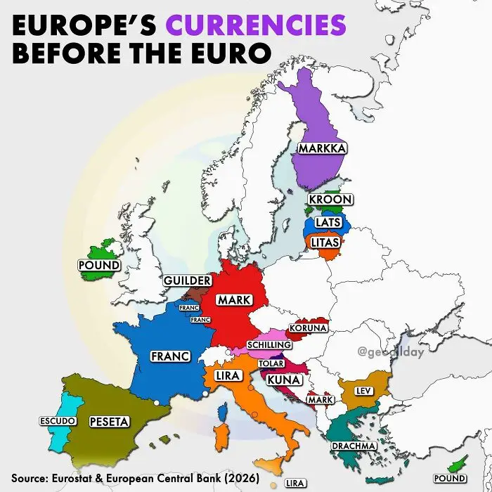
#8 Europe's Currencies Before The Euro

Color-coded map showing former national currencies across Europe before the adoption of the euro.
10points

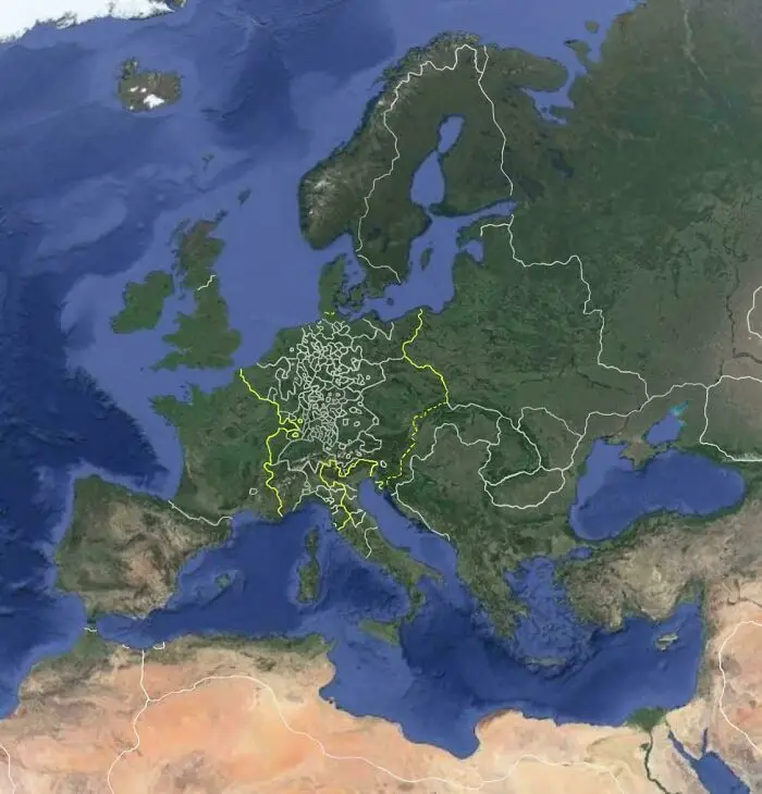
#9 Europe On Google Earth, But It's The 17th Century

A satellite map of Europe showcasing the Holy Roman Empire outline, one of many fascinating maps.
Report
9points

And if you’ve ever thought every map worth making has already been made, think again. As Esri points out, “What about a map of the earthquake that happened earlier this morning? Our world is constantly changing, and we will never run out of things to map.” That’s good news for professional cartographers (making maps is, after all, kind of their whole job). But it’s also good news for the countless people who make maps simply because they love it.
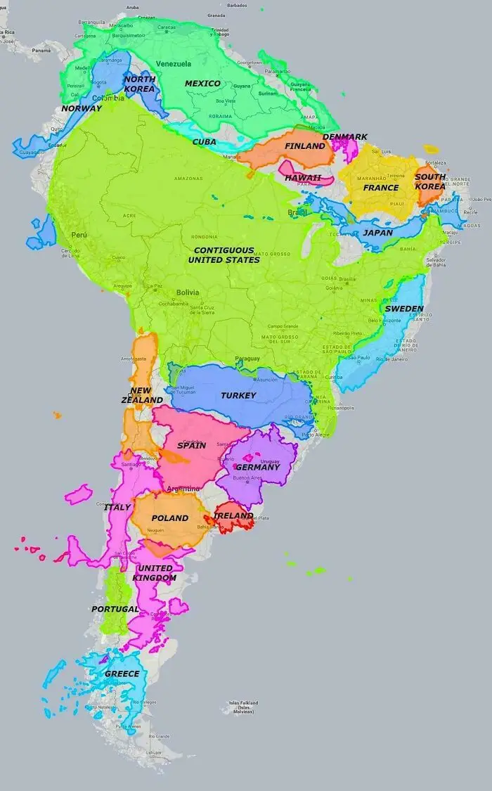
#10 South America Is Much Bigger Than Most People Realize

Fascinating maps comparing the size of South American countries to other nations.
9points

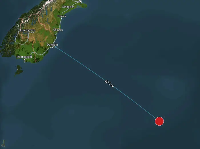
#11 The Most Isolated Building On Earth

A map depicting a distance of 457.9 miles in the ocean off the coast of Dunedin, New Zealand.
Report
9points

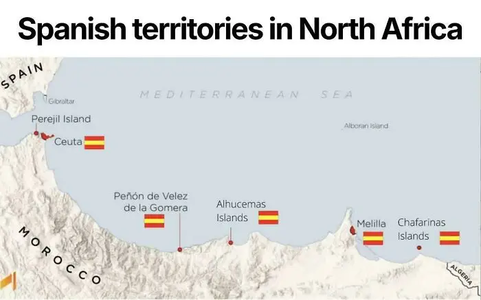
#12 Spanish Territories In North Africa

A map illustrating Spanish territories along the coastline of North Africa, featuring flags next to key locations.
9points

Science journalist and geologist Betsy Mason is one of them. In a piece for Wired, she recalls looking for any excuse to make a map as a kid. Alongside maps of her real home, school, and neighborhood, she drew the ones she wished she had, complete with stables full of horses, fields of frogs and praying mantises, and entire rooms for storing stuffed animals. She even counts the maps she got to make in Geology 101 among the reasons she became a geologist.
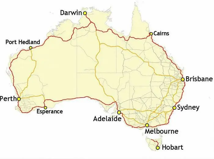
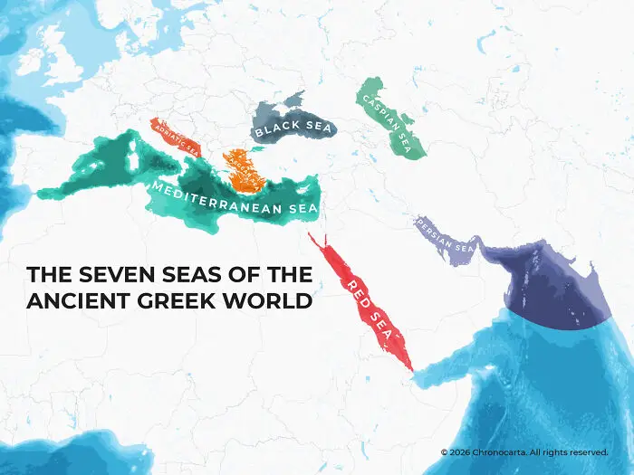
#13 Australia's Highway 1 Is The World's Longest National Highway

A map of Australia highlighting major coastal highway routes connecting cities as part of fascinating maps that explain.
9points

#14 Map Of The Seven Seas In Greek Sources

Historical map illustrating the seven seas of the ancient Greek world to explain the world better.
8points

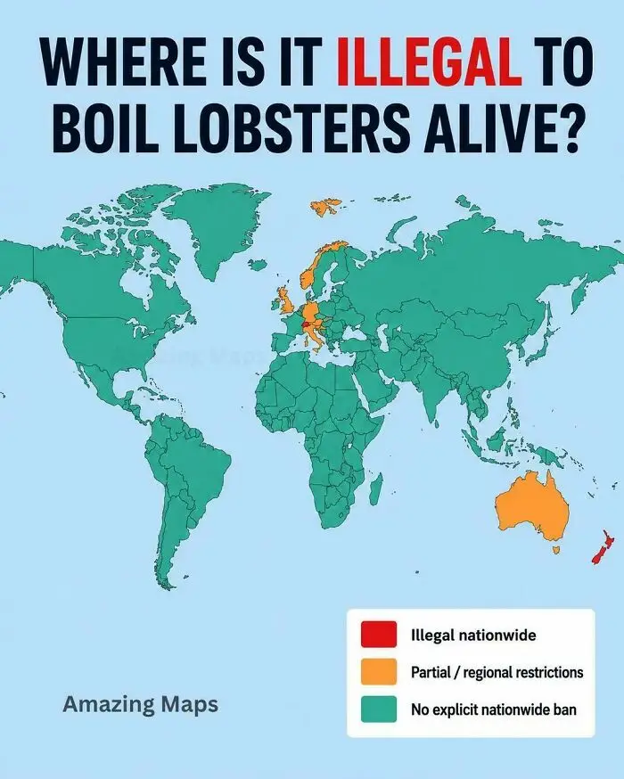
#15 The Countries That Have Banned Boiling Lobsters Alive

World map illustrating laws on boiling lobsters alive by country.
8points

So what is it about making maps that she loves so much? Mason admits she’s not entirely sure. Sometimes, she says, it’s the order of it all, “putting everything precisely where it is supposed to be,” or the satisfaction of methodically turning a bunch of data into “something tangible, maybe even useful.” Other times, it’s the way maps help her think about things in relation to each other “in a way my brain isn’t always good at doing on its own.” And then there are the possibilities. Just as maps help her make sense of things that exist, “they can help me imagine things that don’t.”
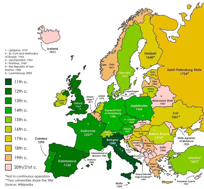
#16 The Oldest Continuously Operating Universities In Each European Country

A fascinating map of Europe color-coded by the century in which each country established its oldest university.
Report
8points

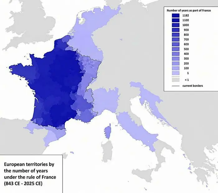
#17 How Long Different Parts Of Europe Were Ruled By France

Historical map showing European territories under French rule over centuries to explain the world.
8points

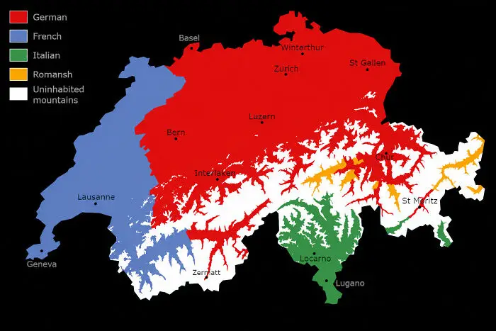
#18 Language Map Of Switzerland, Excluding Uninhabited Mountains

Linguistic map of Switzerland displaying language regions, one of many fascinating maps.
8points

Mason is far from alone. Geography lecturer Philippa Irvine (who also happens to be my friend with the stack of old maps) knows the feeling well. “I enjoy the logic of it but also the creativity,” she told Bored Panda. “The need to marry information with composition and legibility makes it somewhere between science and art.”

#19 Lithuania At It's Historical Peak (15th Century) Also Known As Grand Duchy Of Lithuania, It Expanded Up To 900,000-100,000 Sq Km
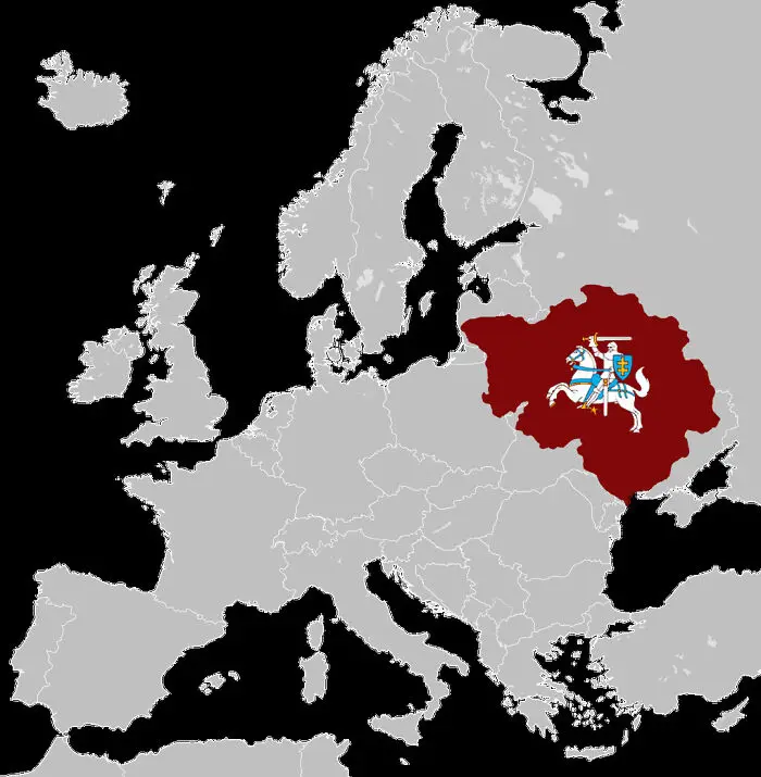
Fascinating maps that explain the world showing historical map highlighting Grand Duchy of Lithuania in Europe.
Report
8points

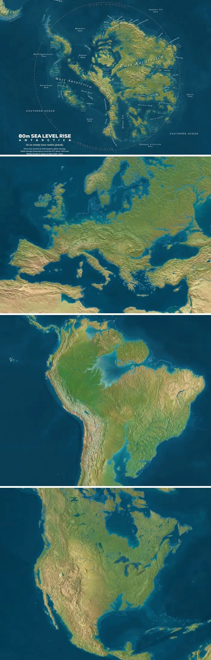
#20 Sea Level If All Ice Would Melt

Fascinating maps that explain the world showing global coastlines with an 80m sea level rise scenario.
8points
40
2