
Bored Panda
42 Designs That Are So Terrible, They Should Have Gotten Someone Fired

42 Designs That Are So Terrible, They Should Have Gotten Someone Fired

0
0
“It's through mistakes that you actually can grow. You have to get bad in order to get good."
Paula Scher, one of the most influential graphic designers of our time, once uttered those words in reference to design. And while I’m sure she was being honest, I think some designers really took those words to heart and somewhere along the way abandoned the “getting good” part of their plans.
Below, we’ve gathered some of the most atrocious examples of design that have been shared on this subreddit that’s dedicated to roasting terrible design. From signs that induce headaches just from trying to read them to ovens that melt their own knobs, apparently, there are plenty of bad designers out there who need to grow a bit (or a lot) before they start producing excellent work. 
Be sure to upvote all of the photos that make you want to fire a designer somewhere out there, and let us know in the comments what the worst examples of design you’ve ever seen were. Keep reading to also find an interview we were lucky enough to receive from graphic designer, writer and the man behind Identity Designed, David Airey. Then if you’re interested in checking out even more examples of horrific design, you can find some of our previous articles on the same topic here, here and here.

#21 Investing Ad Shows A Picture Of A Negative Return Rate

Poorly designed investment graphic showing a confusing negative 5.35% return with unclear data presentation.
Report
0points

#22 This Awful Photoshop For A Slide I Saw An Ad For. Why Are They Wearing Normal Clothes In The Water? What The Heck Is Going On In The Background? So Many Questions!
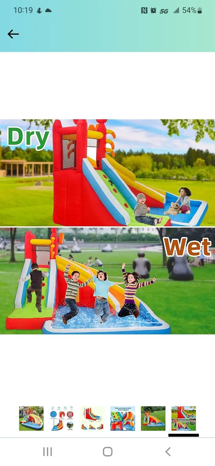
Inflatable children's slide with dry and wet play options in a colorful outdoor design likely to be a terrible design.
Report
0points

#23 Feel Like This Airline Overestimates The Danger Of Rogue Origami Birds
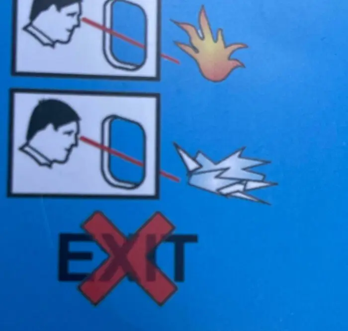
Illustration showing incorrect and correct airplane window usage with a confusing design and a crossed-out exit sign.
0points

#24 Who Wants A Nice Cold Formaldehyde Beverage? Someone Didn’t Think That Chemical Formula Through…
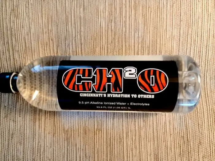
Bottle of water labeled CH2O with a confusing logo design, illustrating terrible design examples that should have gotten someone fired.
0points

#25 Slip And You’ll Break Your Neck Going To The Basement To Do Laundry At My Apartment Building
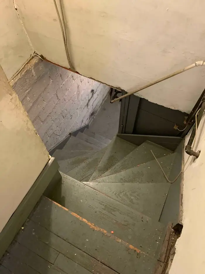
Worn and poorly designed stairway with uneven steps and exposed pipes, illustrating terrible design mistakes.
Report
0points

#26 Missed Opportunity For Using The Jesus Statue As "T" Rather Than "I", Which Would Be More Readable And Intuitive
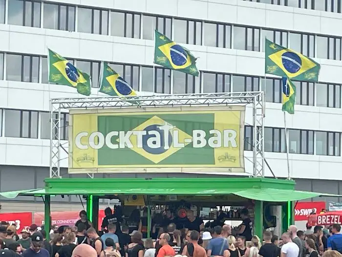
Cocktail bar sign with misplaced letters creating a confusing design mistake at a busy outdoor event with Brazilian flags.
Report
0points

#27 From A Baseball Stadium That Took 1.2 Billion Nt Dollars To Build, This Sure Exceeds The Expectations
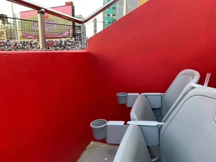
Terrible design of stadium seats with obstructed view behind a bright red wall, showcasing poor seating arrangement.
Report
0points

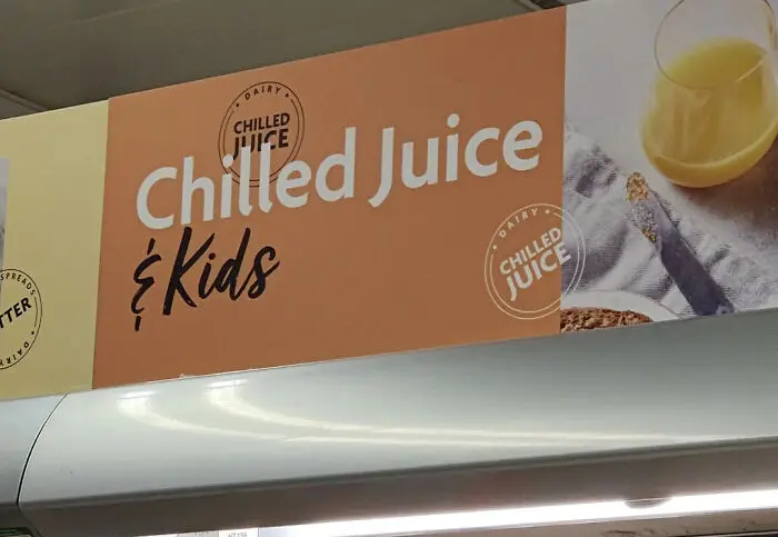
#28 Chilled Juice & Kids

Signage displaying the phrase chilled juice and kids, an example of terrible design likely to get someone fired.
0points

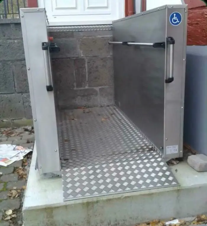
#29 Parcours For Wheelchairs…

Poorly designed wheelchair lift with no access due to a wall blocking the entry, showcasing terrible design failures.
0points

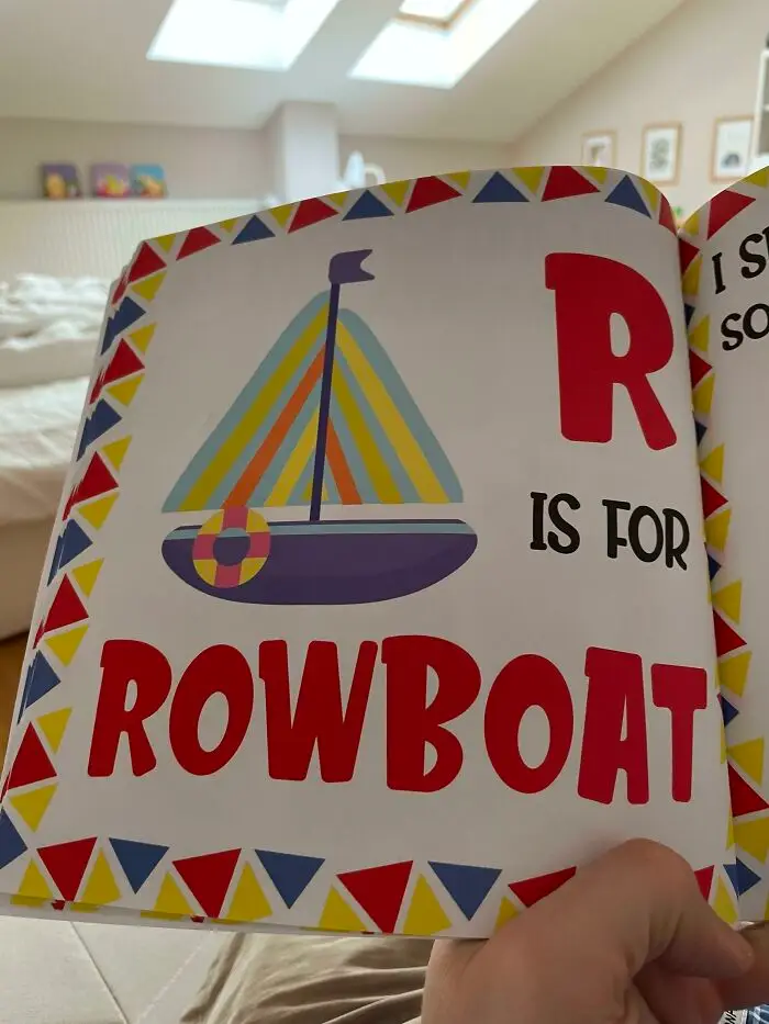
#30 R Is For ?

Child's book page with a sailboat illustration labeled incorrectly as a rowboat, showcasing a terrible design mistake.
Report
0points

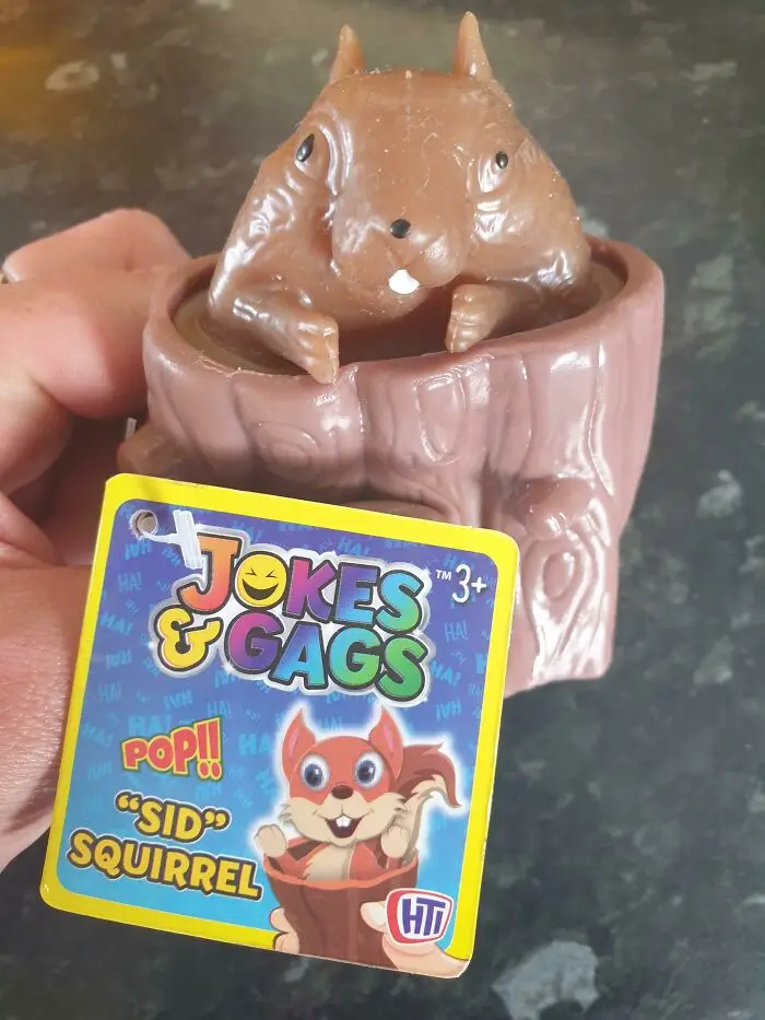
#31 Photoshop vs. Reality?

Brown squirrel toy design with uneven eyes and distorted face, an example of terrible design that should have gotten someone fired.
0points

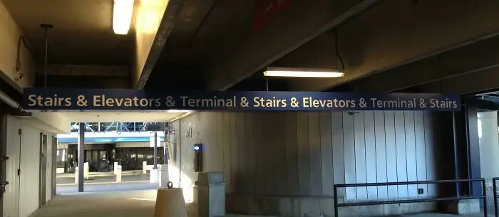
#32 The Almost Never Ending Airport Directional Sign.

Confusing sign design at a terminal repeating stairs and elevators multiple times, illustrating terrible design choices.
0points

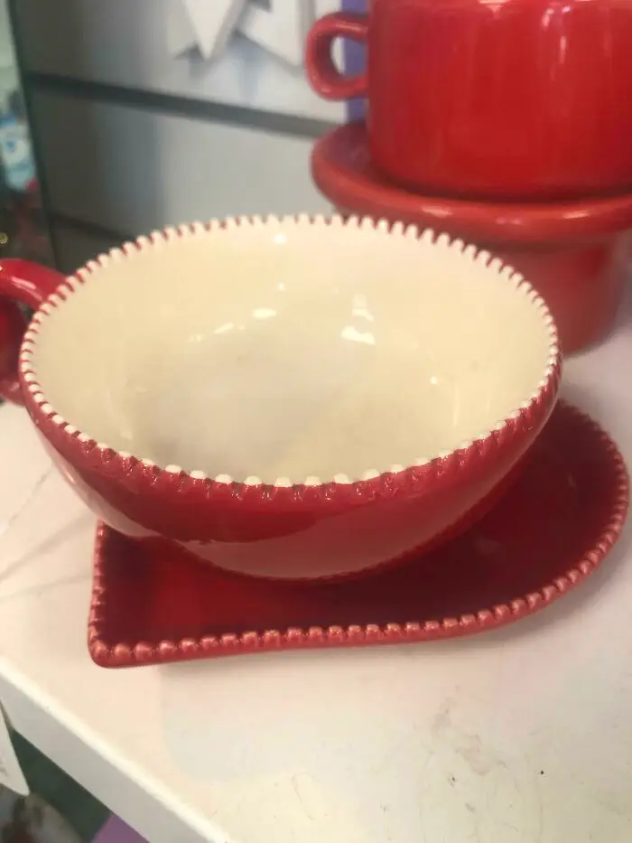
#33 The Cup That Nibbles Your Lip With Its Little Teethies

Red and white cup with mismatched heart-shaped saucer showcasing one of the terrible designs that should have gotten someone fired.
0points

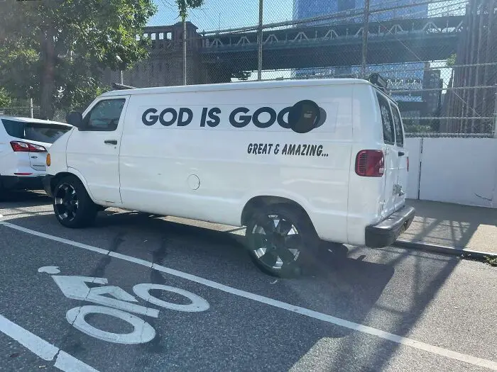
#34 God Is Goo.

White van with poorly designed text saying God is God great & amazing, parked partially in a bike lane showing terrible design mistakes.
Report
0points

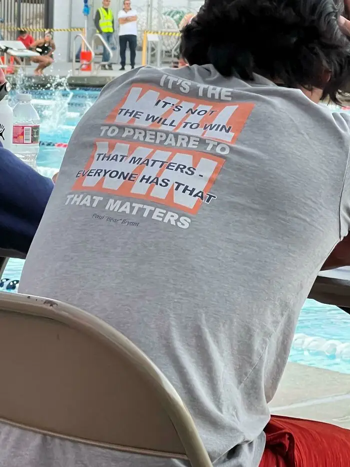
#35 We Have To Decode What The Shirt Says

Person wearing a shirt with a confusing quote design sitting by a swimming pool, showcasing a terrible design example.
0points

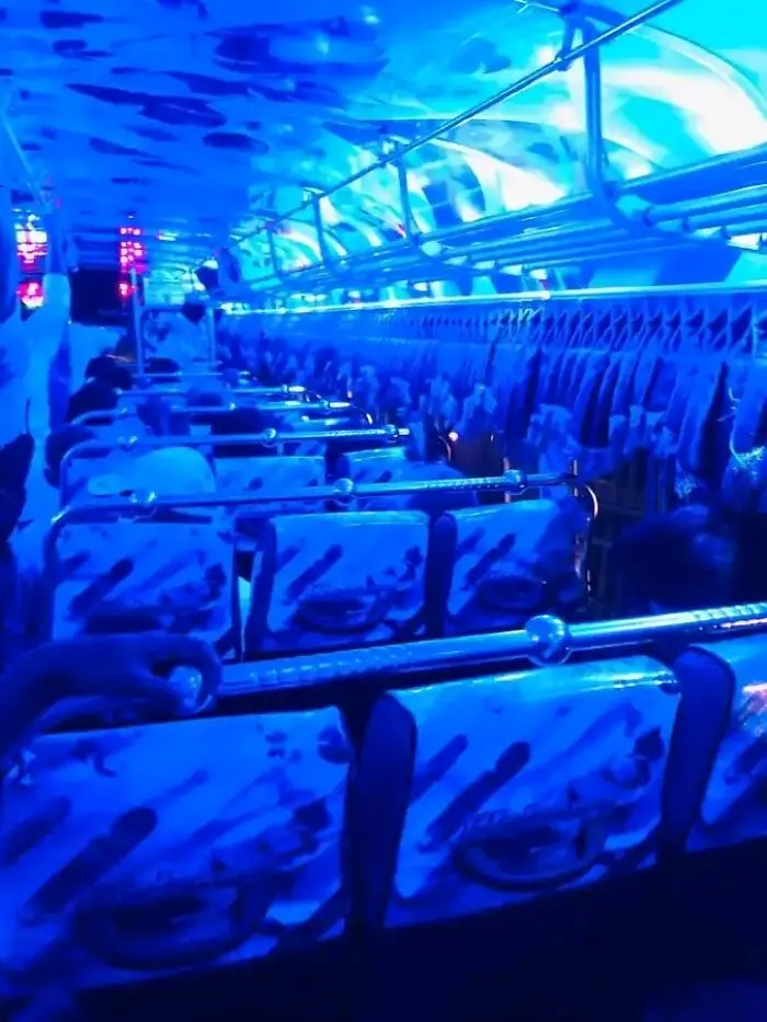
#36 Interior Design Of This Bus

Interior of a bus with poorly designed seats and lighting, showcasing one of the terrible designs that should have gotten someone fired.
Report
0points

#37 It Just Looks Depressed

Large spider sculpture with awkward design on a grassy hill under cloudy sky, showcasing terrible design flaws.
0points

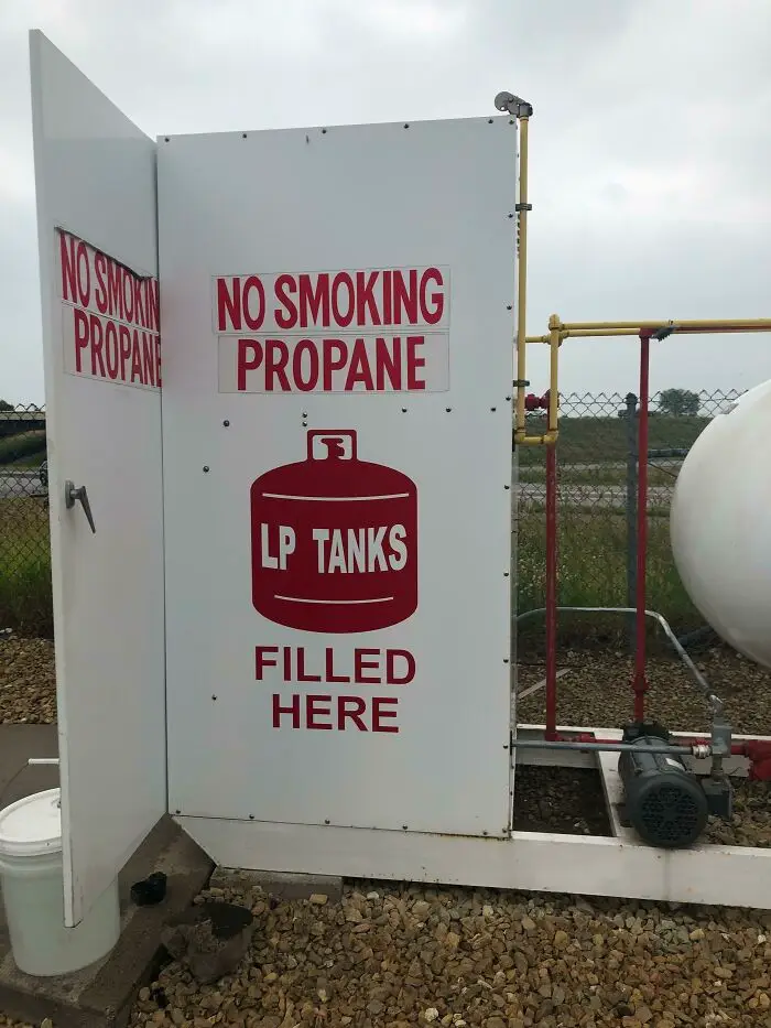
#38 Don’t Smoke The Propane!

Sign on propane tank station with confusing and poorly designed layout showing no smoking warning and filling instructions.
0points

#39 Happy Birthday Ha
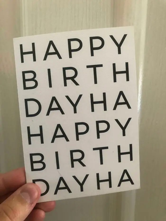
Hand holding a poorly designed card with "happy birthday" text repeated and awkwardly broken, showcasing terrible design.
Report
0points

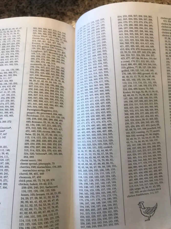
#40 This Chicken Cookbook Has An Index Entry For Chicken

Open book pages filled with dense, small text and numbers illustrating a confusing and poorly designed layout.
-1point

Add New Image

Not your original work?

0
0