
Bored Panda
42 Designs That Are So Terrible, They Should Have Gotten Someone Fired

42 Designs That Are So Terrible, They Should Have Gotten Someone Fired

0
0
“It's through mistakes that you actually can grow. You have to get bad in order to get good."
Paula Scher, one of the most influential graphic designers of our time, once uttered those words in reference to design. And while I’m sure she was being honest, I think some designers really took those words to heart and somewhere along the way abandoned the “getting good” part of their plans.
Below, we’ve gathered some of the most atrocious examples of design that have been shared on this subreddit that’s dedicated to roasting terrible design. From signs that induce headaches just from trying to read them to ovens that melt their own knobs, apparently, there are plenty of bad designers out there who need to grow a bit (or a lot) before they start producing excellent work. 
Be sure to upvote all of the photos that make you want to fire a designer somewhere out there, and let us know in the comments what the worst examples of design you’ve ever seen were. Keep reading to also find an interview we were lucky enough to receive from graphic designer, writer and the man behind Identity Designed, David Airey. Then if you’re interested in checking out even more examples of horrific design, you can find some of our previous articles on the same topic here, here and here.
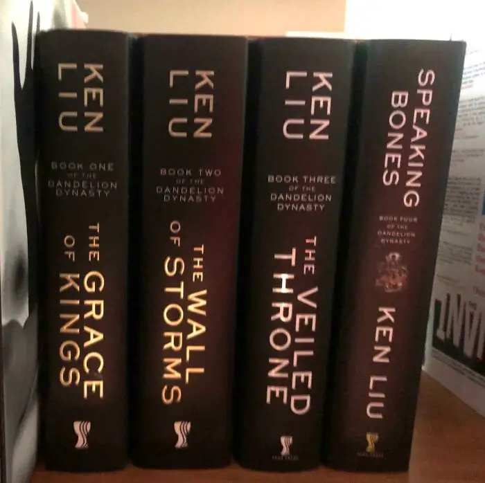

#1 Why Would You Do This?

Books with vertical and horizontal text orientation that display terrible design choices in typography and layout.
0points

#2 This Playground Is Built In A Hole And Fills With Water When It Rains

Playground flooded with water around swings, illustrating one of the terrible designs that should have gotten someone fired.
Report
0points

#3 You've Seen Crappy Elevator Button Designs Before. Get Ready For The Crappiest Elevator Button Design You've Ever Seen
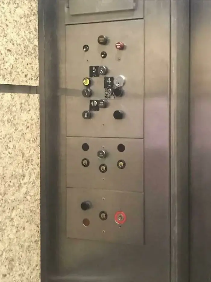
Confusing elevator panel with numerous misaligned buttons and unclear floor indicators as a terrible design example.
0points

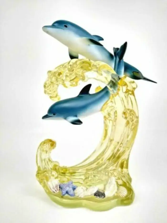
#4 What Was Wrong With Blue Water?

Two dolphin figurines jumping over a yellow wave with seashells, an example of terrible design mistakes.
Report
0points

#5 Not Sure The Cover Artist Read The Book?

Poster design featuring a cowboy on horseback at sunset with cactus plants, showcasing terrible design elements.
Report
0points

#6 The Shadows Of The Numbers Are In A Different Font Than The Numbers Themselves
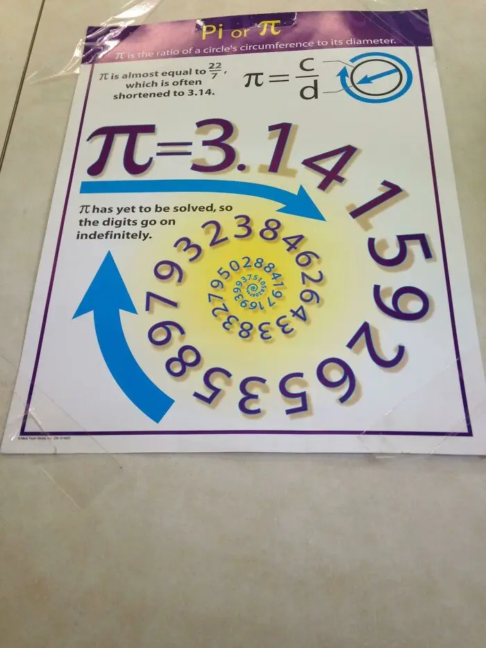
Poster with a confusing pi design featuring a spiral of digits and overlapping text, illustrating terrible design mistakes.
0points

#7 Couldn’t Figure Out Why I Kept Grabbing The Wrong Size Out Of The Multipack Box… Then Realized All 3 Sizes Come In All 3 Colors!
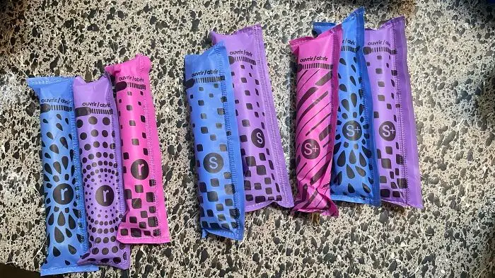
Colorful packages with confusing symbols and patterns showing poor design choices that highlight terrible designs.
0points

#8 Are You 25 Feet Tall, Own A Multimillion Dollar Yacht And Want To Hand Wash Your Yacht Fully Clothed While Out To Sea? We Have An Inflatable Dock For You!
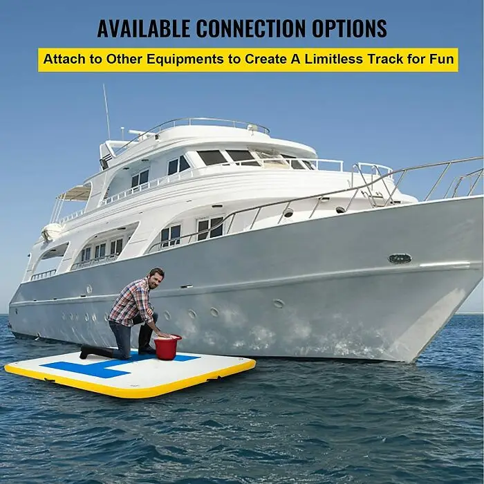
Man kneeling on a floating platform next to a yacht, illustrating one of the terrible design fails in connection options.
0points

#9 Oven Vents Directly Onto The Knobs, Making Them Discolored And Burning Hot To The Touch.
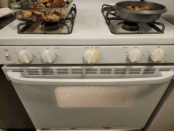
Oven and stove with unclear knob labels, illustrating one of the terrible design choices that should have gotten someone fired.
0points

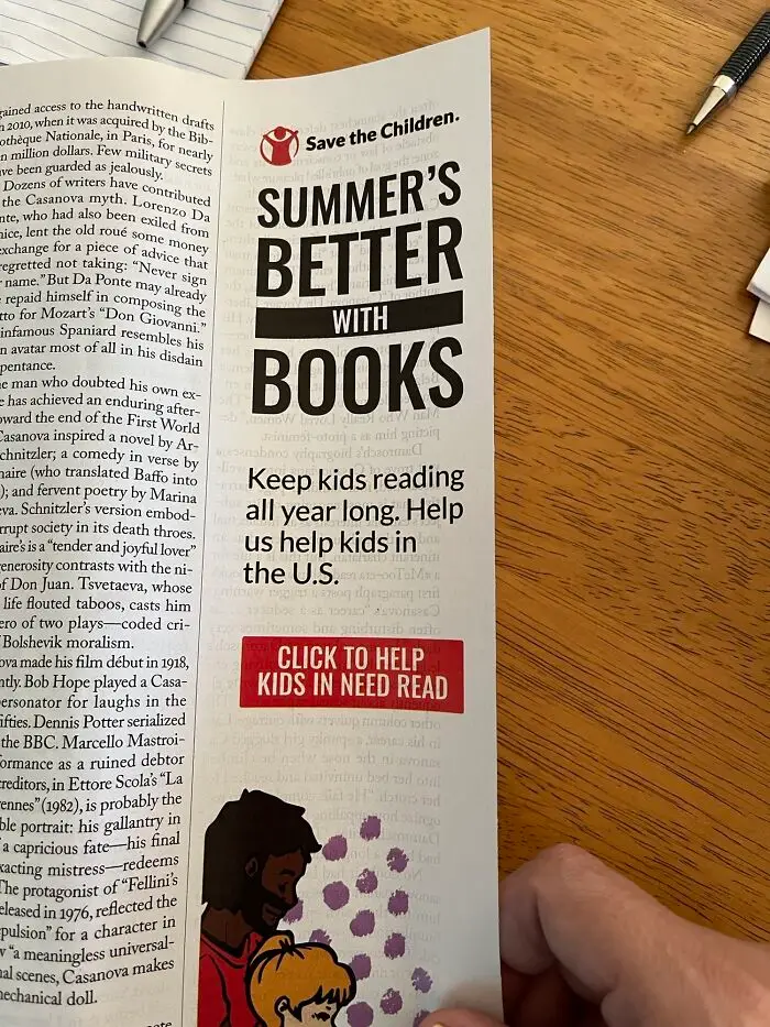
#10 This Ad In My Print Copy Of The New Yorker

Save the Children brochure promoting reading with a design viewed as one of the terrible designs that should have gotten someone fired.
0points

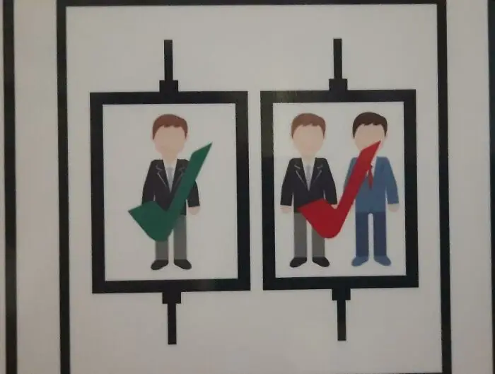
#11 1 Person Is Ok, 2 People Is Ok But In Red

Graphic design showing two framed illustrations, one with a green checkmark on a single person, another with a red checkmark on two people.
Report
0points

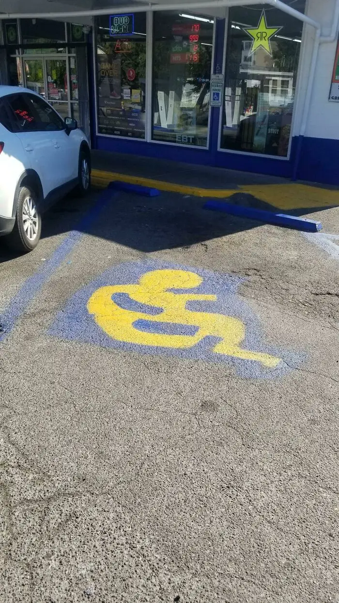
#12 Not Sure Who's Allowed To Park Here

Handicap parking space with a poorly designed, confusing accessibility symbol in a parking lot outside a store.
Report
0points

#13 The Ad Literally Says, "Modern Kitchen, Great Layout, Bright And Spacious!"
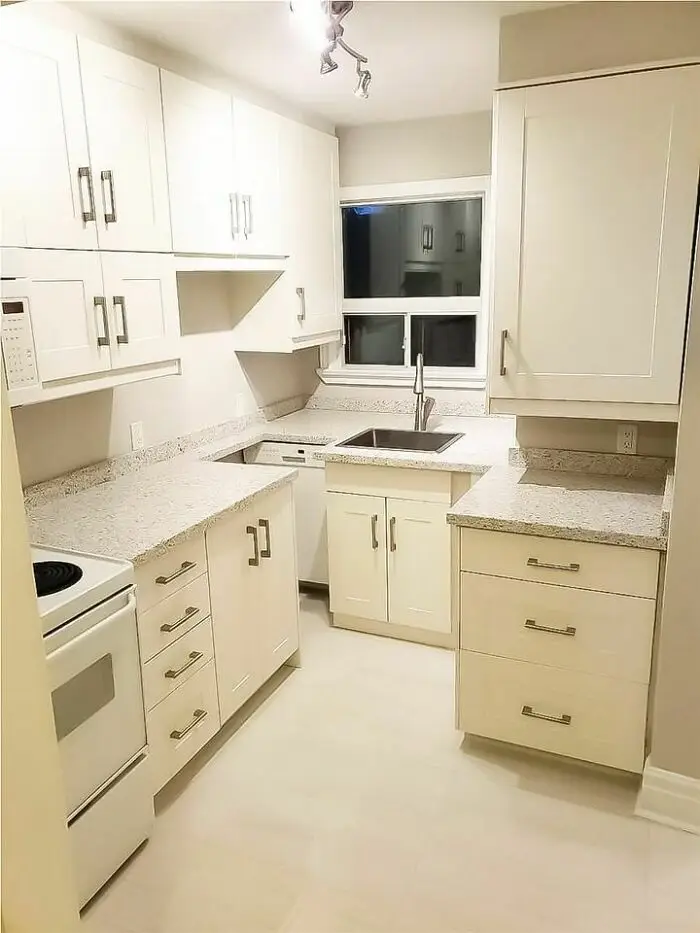
Small kitchen with terrible design showing awkwardly placed cabinets and sink disrupting counter space and workflow.
0points

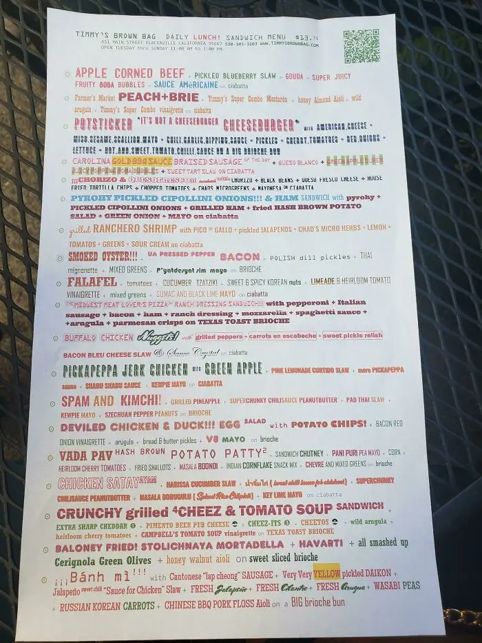
#14 Insane Menu At An Insane Sandwich Shop

Menu with confusing and cluttered text design, illustrating terrible design choices that could have gotten someone fired.
0points

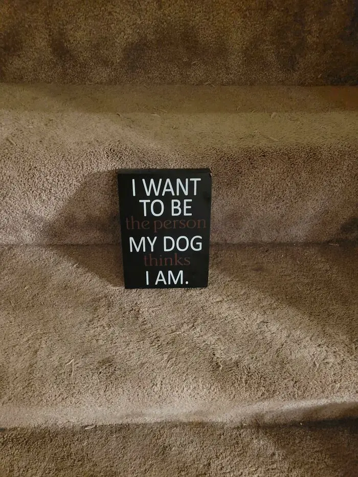
#15 Terrible Sign Color Choices

Sign with confusing text placement on carpeted stair, an example of terrible design that should have gotten someone fired.
0points

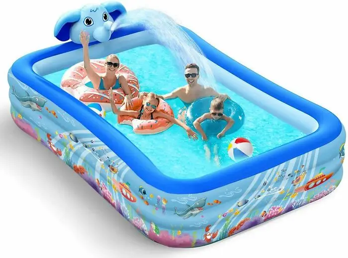
#16 7ft Pool Holds An Entire Family. (Legs Not Included)

Inflatable pool with an awkward elephant water spout and smiling people inside showcasing terrible design.
0points

#17 If Only There Was A Letter In Flame That Could Resemble A Flame

Sign for Asian Flame Indian Kitchen and Bar with a flame icon replacing the letter O, an example of terrible design.
Report
0points

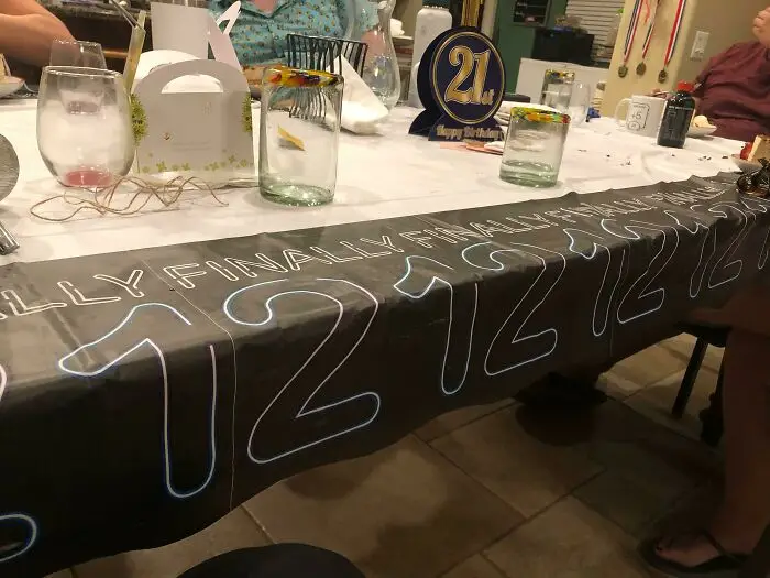
#18 Supposed To Be Finally 21 But Spacing Makes It Looks Like A 12

Birthday party tablecloth with repeated large numbers and text showing terrible design and visual confusion.
0points

#19 A Catalog For A Clothing Company I Once Worked At. How Was This Cover Ever Approved?

Close-up of a magazine cover with a design flaw where faces overlap awkwardly, showing a terrible design mistake.
0points

#20 A Beautiful Hardwood Bridge We Built At Work. Wheelchair Accessible. Comes With A Nice Steel Pole Almost Smack Bang In The Middle. This Is What Happens When Architects Refuse To Change Their Plan Even When Common Sense Says Let’s Move The Bridge

Wooden bridge design with obstructive support posts blocking the walkway, showcasing one of the worst design fails.
0points

Add New Image

Not your original work?

0
0