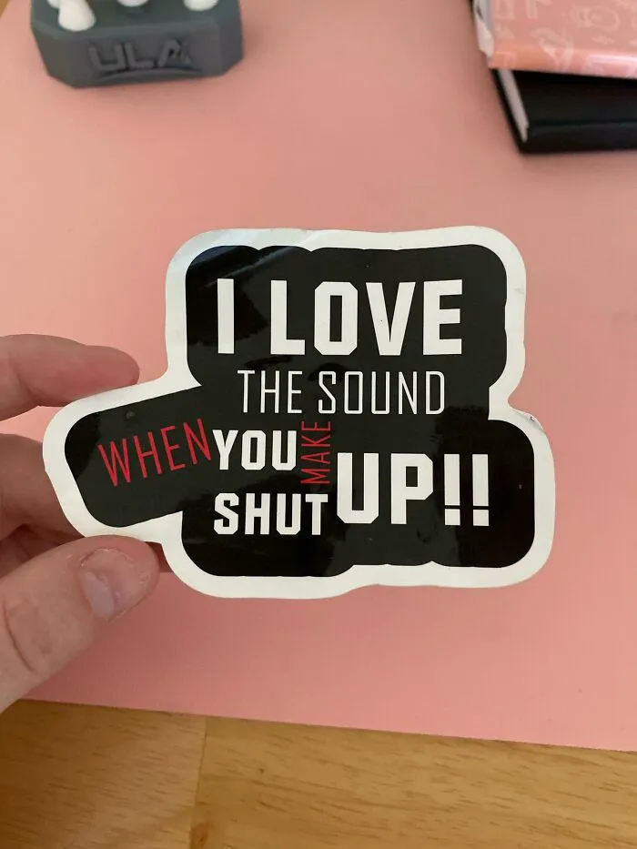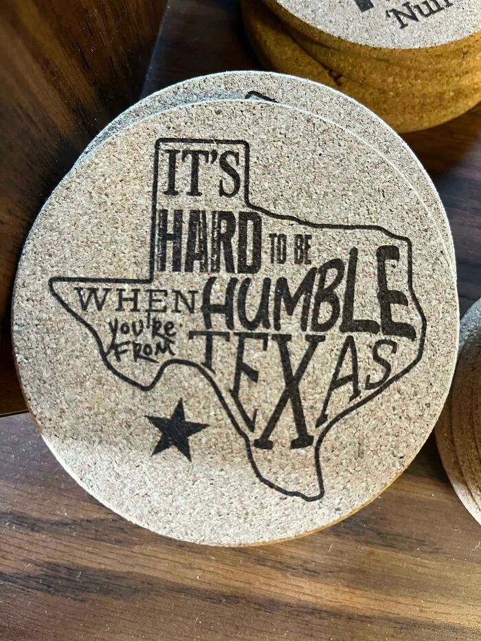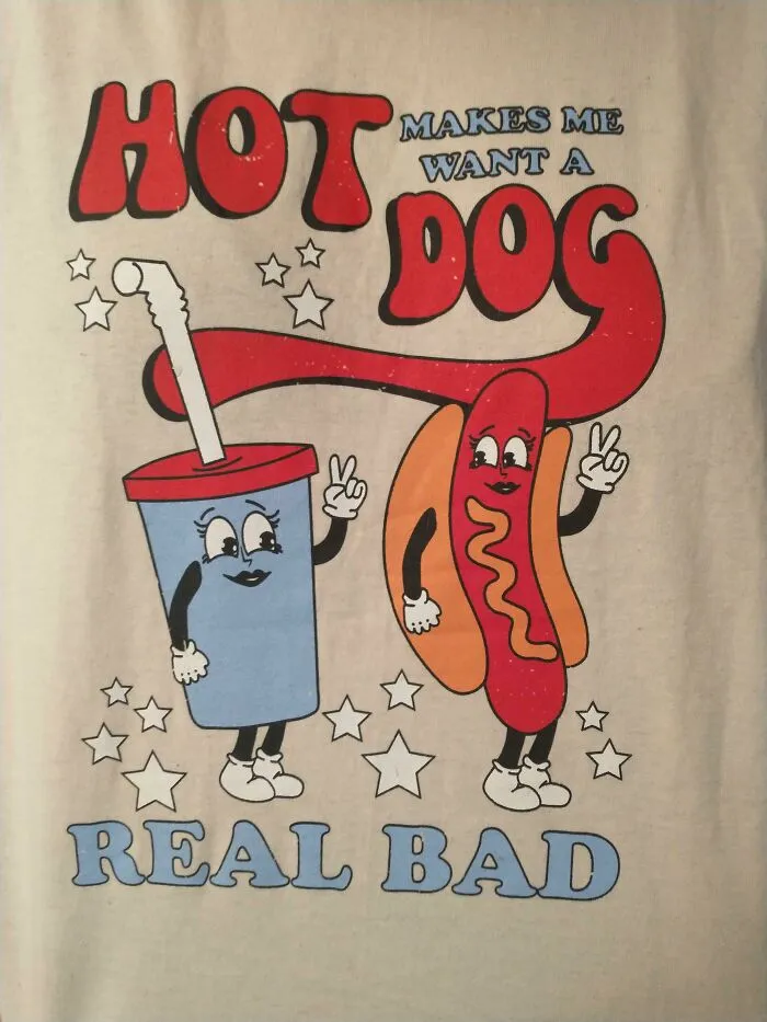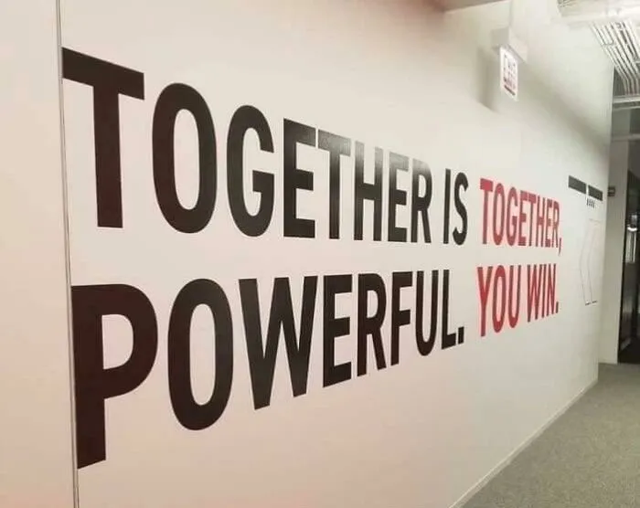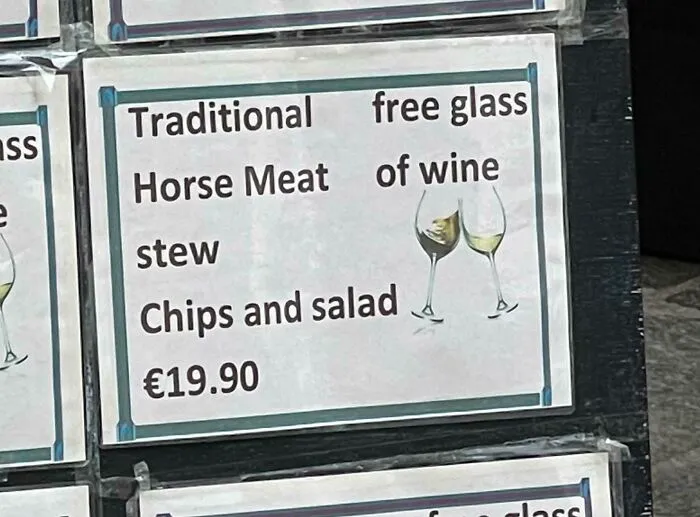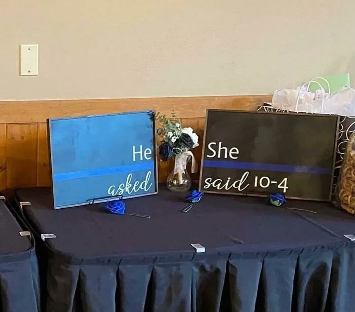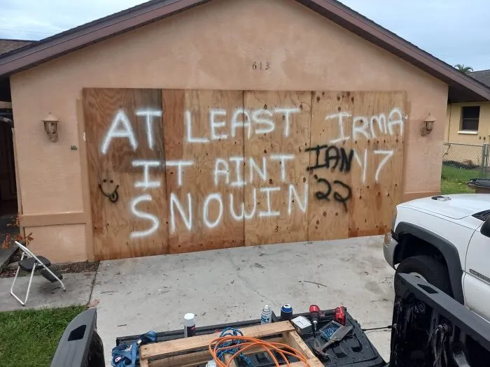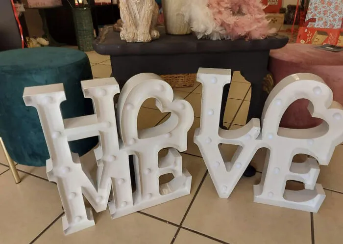


Brevity! Clarity! Proper kerning (that’s the spacing between letters)! And no silly business with the fonts! At their core, signs are supposed to impart the biggest amount of information in the least amount of time. That sounds simple enough on paper (pun intended), but not everyone manages to rise to the challenge.
They follow through with their [cough] artistic vision [cough] and the result is a hot mess of utterly illegible chaos. The worst of the bunch end up being featured on the r/dontdeadopeninside subreddit, an online community that is dedicated to nonsense signs if read normally. We’ve collected some of their best posts to share with you. Scroll down, but be careful—if you’re a fan of order, you might end up facepalming way too much.