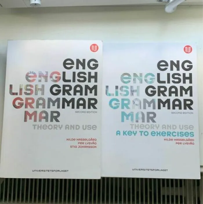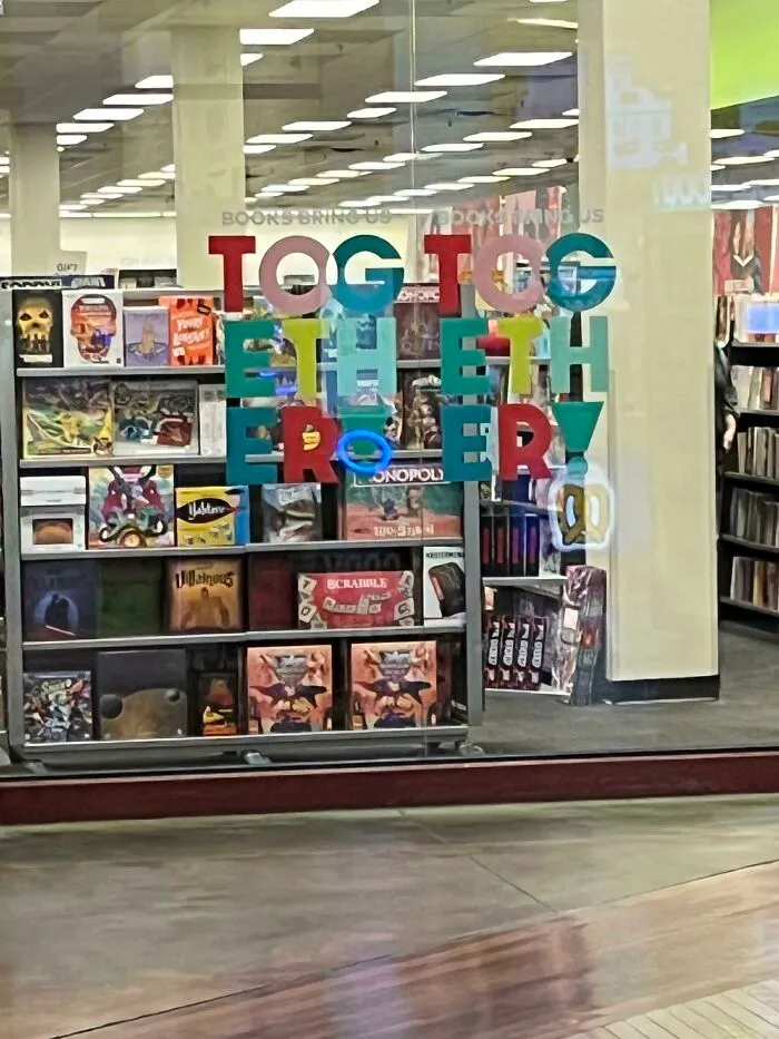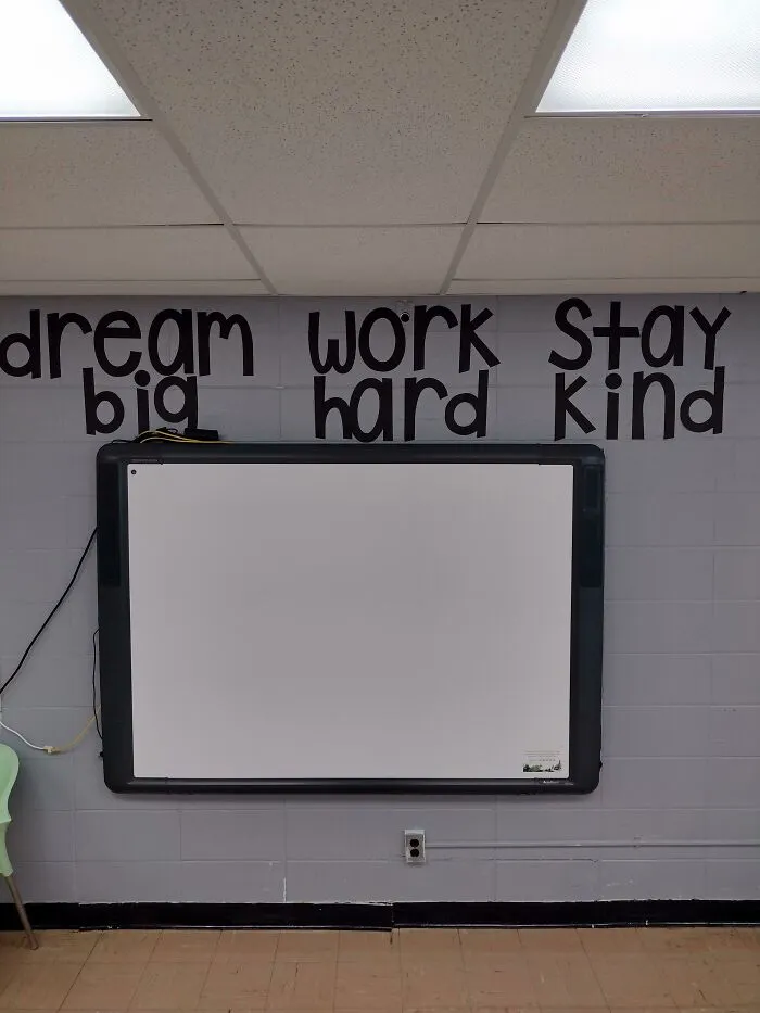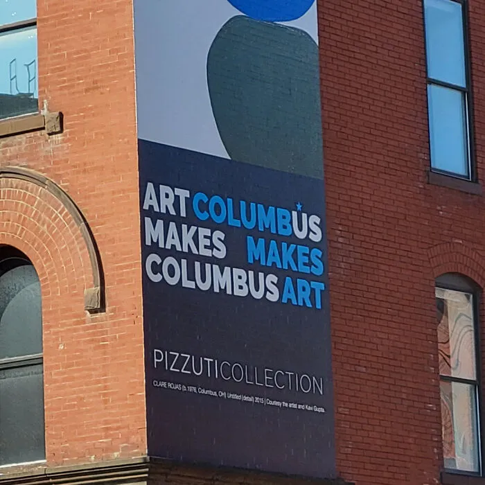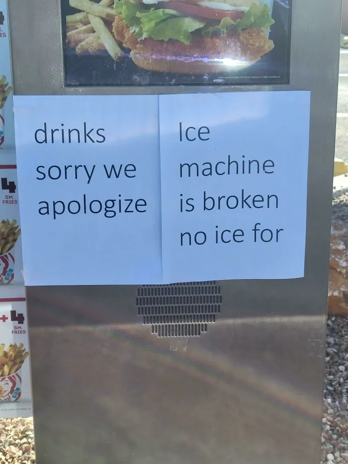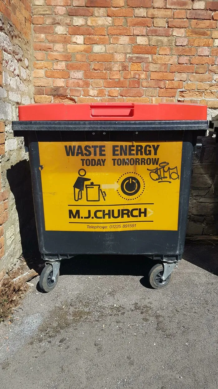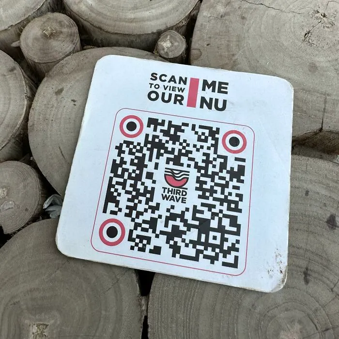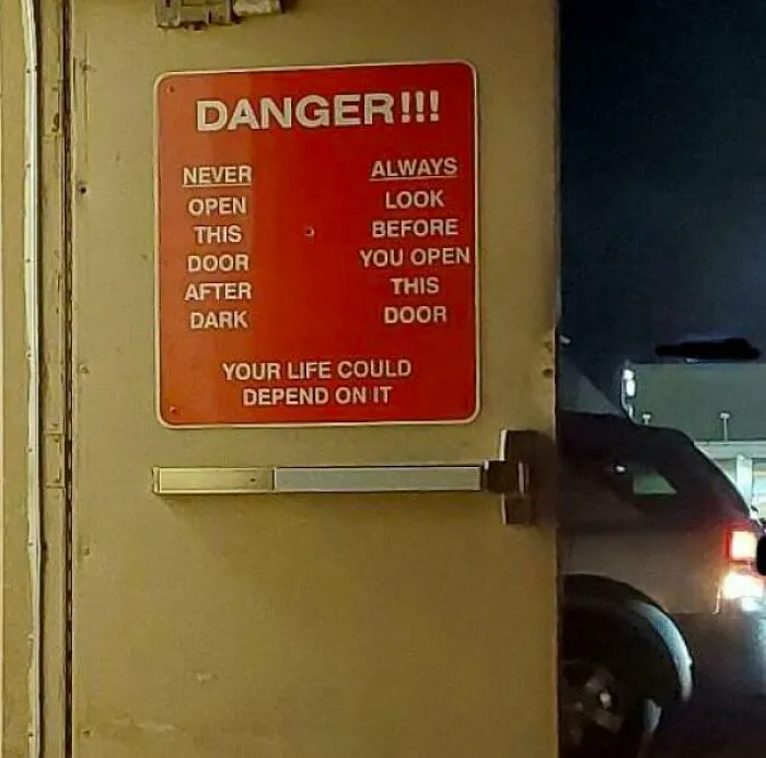


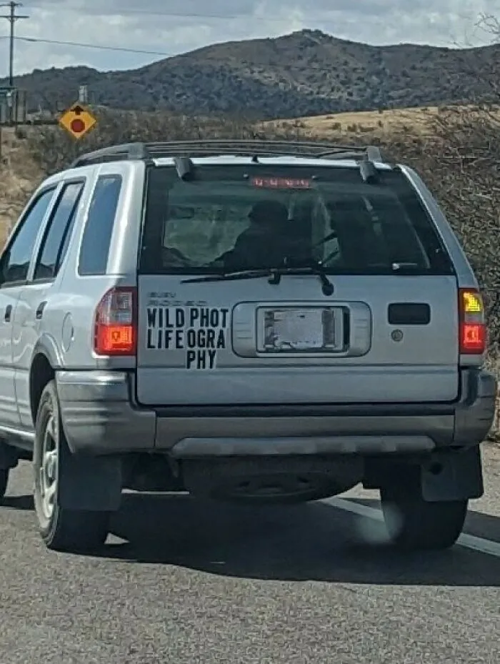
Secondly, you should definitely take the time to show your design to a few different people, whether they’re your relatives, close friends, coworkers, or—heck—even some passersby on the street. You’re essentially conducting a bit of research with tiny focus groups. They might catch a silly mistake you left in or might end up interpreting the entire sign very differently than you intended. It’s better to deal with a dash of embarrassment now than tons of it later.
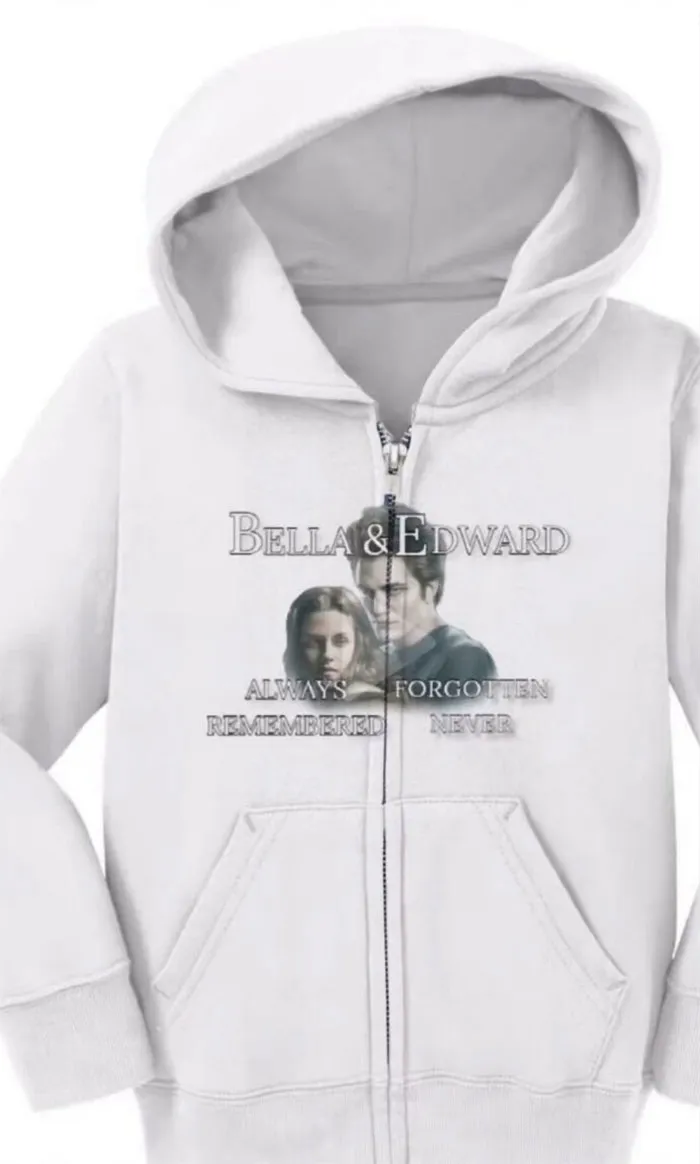
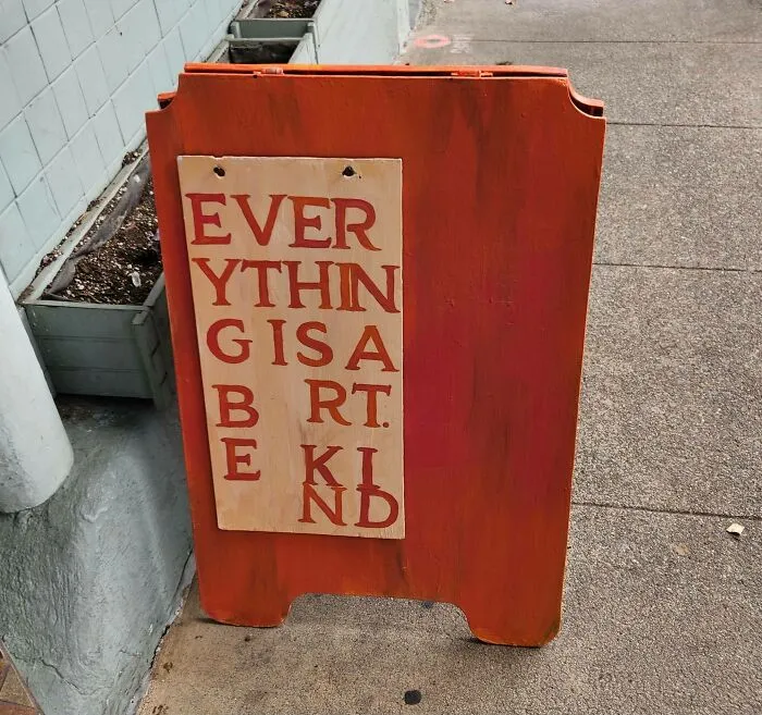

If you’re working on a very important project, you might want to consider hiring some professionals to help you, instead of doing everything yourself. Find a designer with a decent reputation to flesh out some of your ideas. Meanwhile, consider getting in touch with a proofreader or editor as well. We all make silly mistakes from time to time, and it helps to have a real pro in your corner.
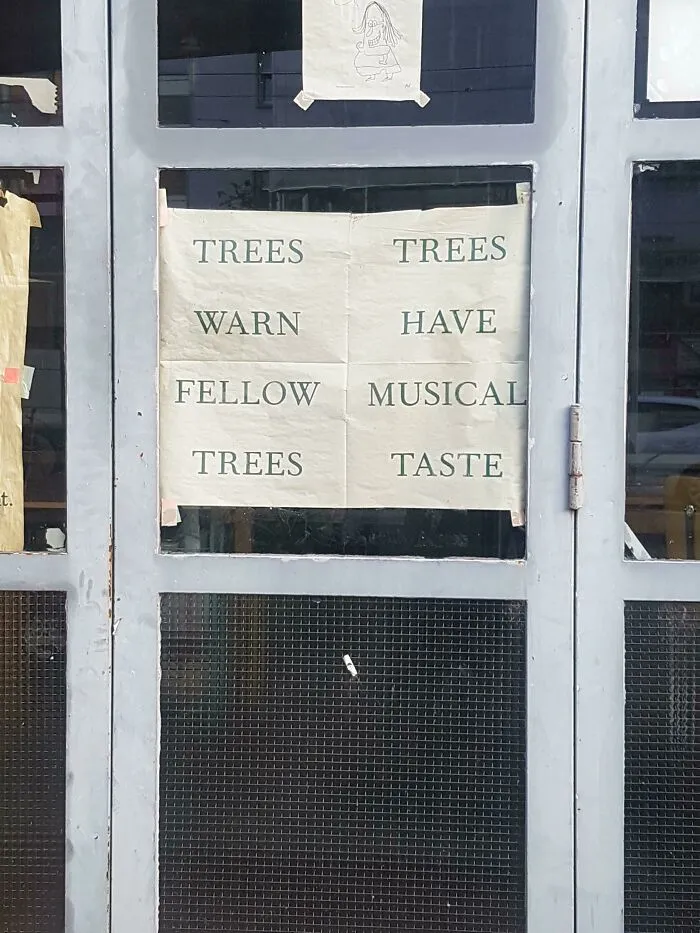
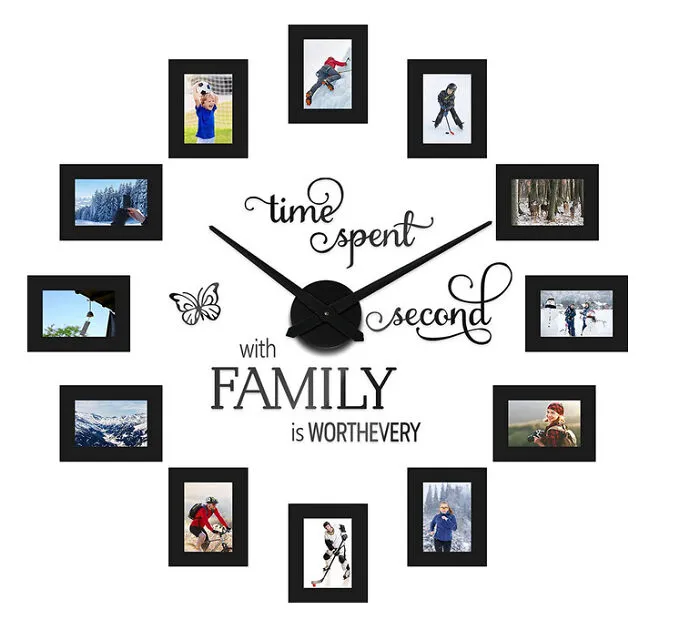
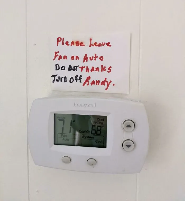
The fact is that if you just wing it, you might end up losing your audience or potential customers. The more fluent your font is, the clearer your message. And vice versa! How trustworthy and likable you and your business are depends a lot on how you brand everything. Ideally, everything should be as legible as possible. With a focus on readable fonts, good kerning, and an overall design that focuses people’s attention where you want it to.
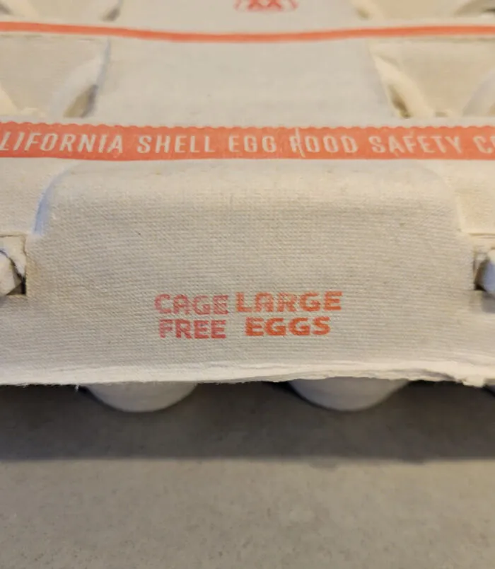
#28 I Don't Know Why Everyone Has Been Complaining. My Cage Large Eggs Have Been Very Affordable
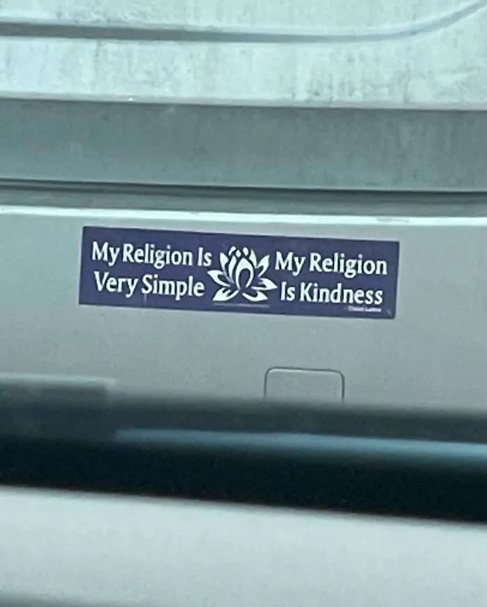
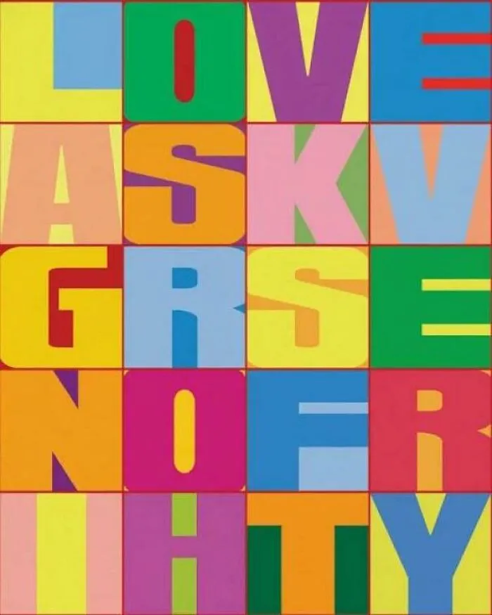
Here at Bored Panda, we’re very big fans of poorly designed signs—we can’t get enough of these trainwrecks! As such, we’ve featured the genius of r/dontdeadopeninside time and again. If you’d like to see some more chaotic signs that are definitely going to be misinterpreted, check out our earlier lists here and here, as well as here and here.