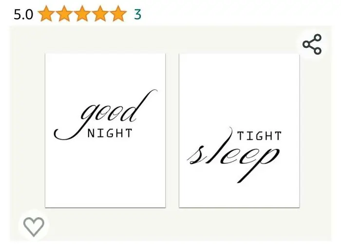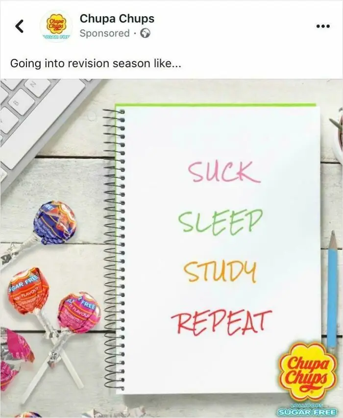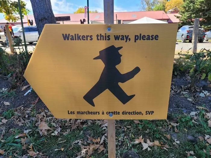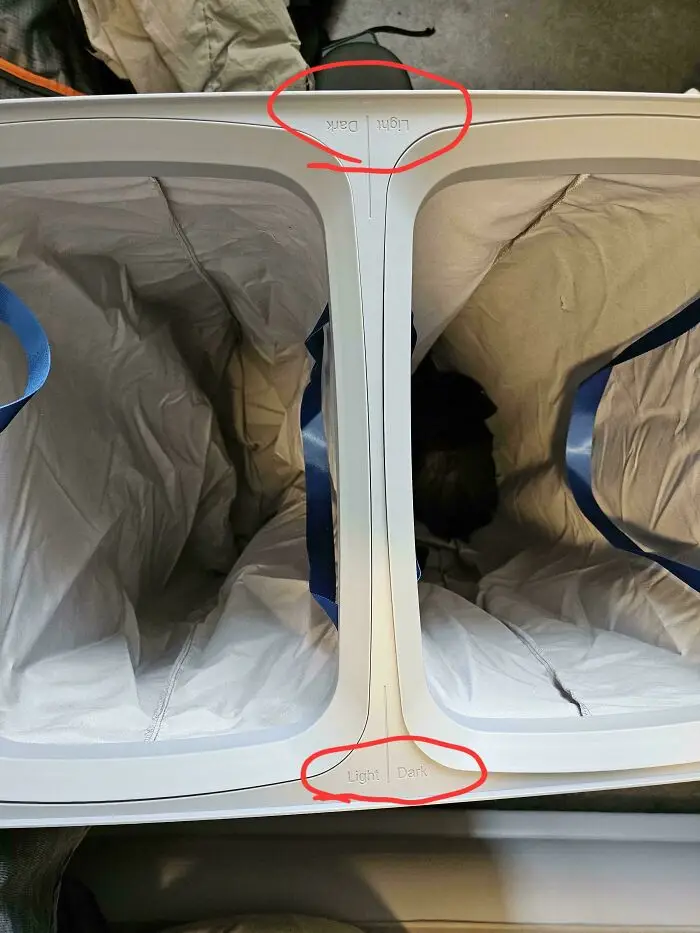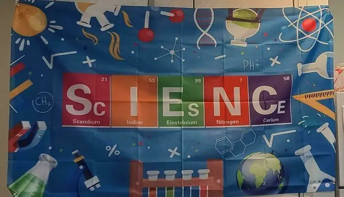


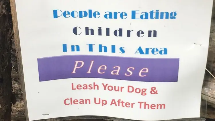


Good design has a few simple rules: simplicity, clarity, and visual appeal. Some designs, however, fail to execute all of these criteria. Bad design can be disappointing; it can be dull and uninspiring, but when it starts to veer into the realm of the offensive, that’s when you know you have a problem.
Bored Panda has made you a compilation of signs, labels, and other awfully designed objects that might make you say: “Who approved this?” There’s no way such inappropriate designs could’ve made it through a professional’s eyes, yet they did, it seems. Check these out if you’re looking for a few moments to laugh, cringe, and shake your head in ridiculous disbelief.
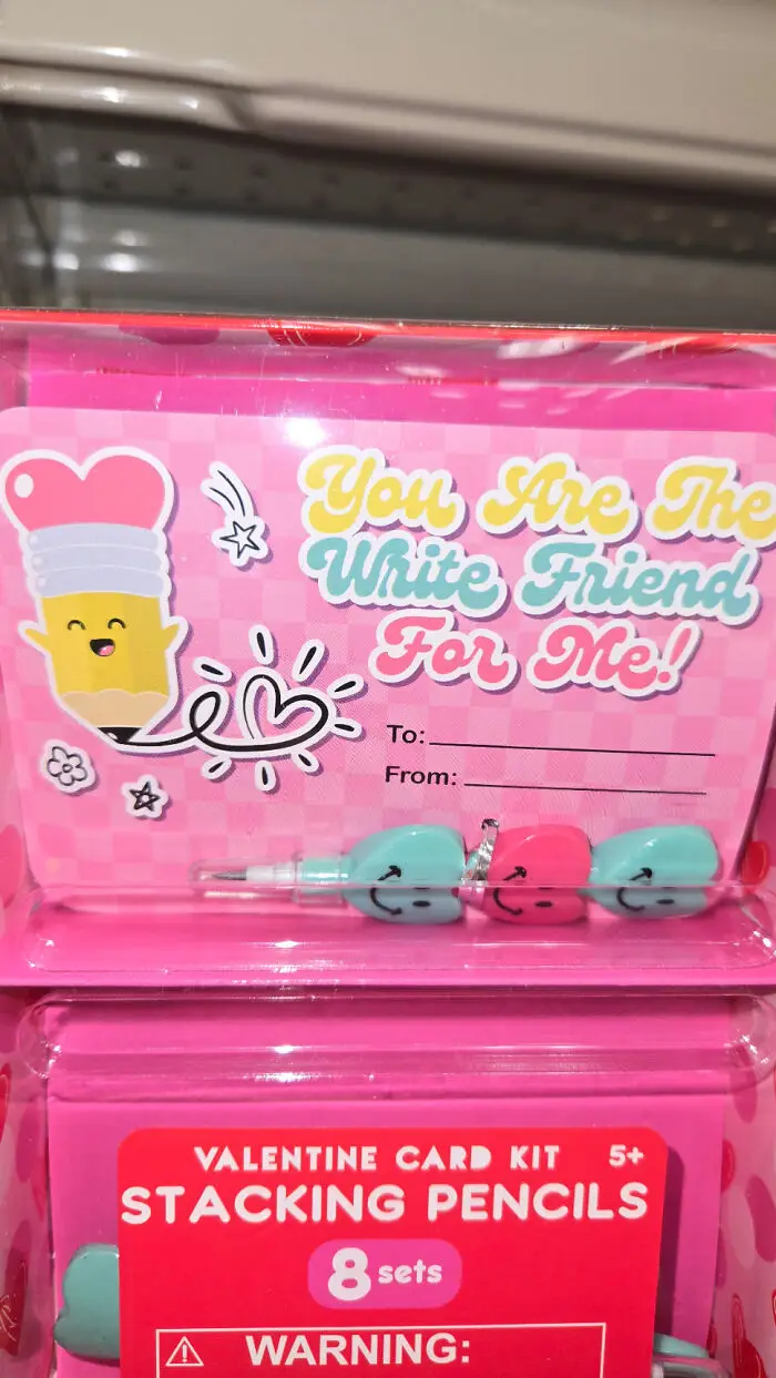
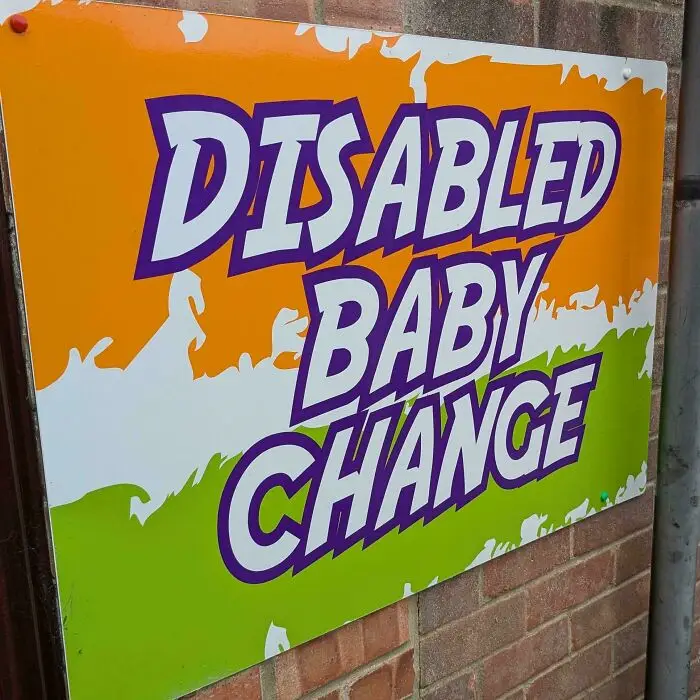
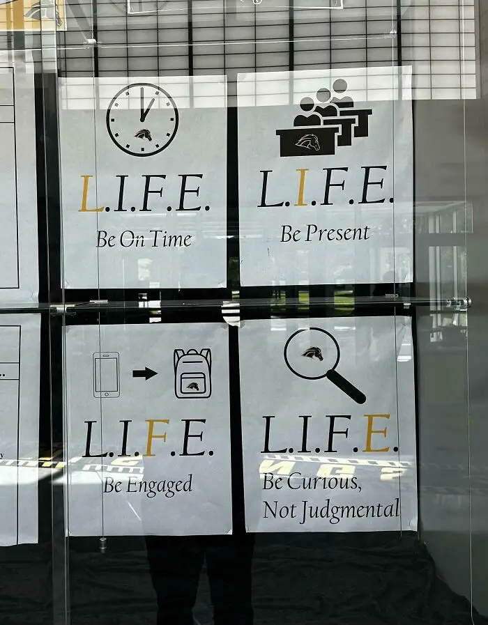
#67 For The Life Of Me, I Have No Idea How The Pictures And Captions Correspond To The Acronym
Report
15points
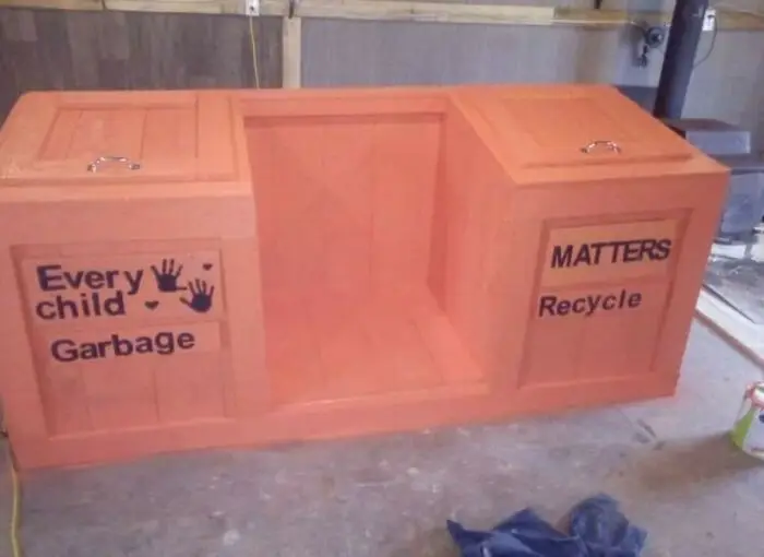
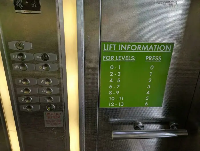
#69 I Was Wondering Why I Kept Ending Up On The 4th Floor After Pressing 2
Report
15points
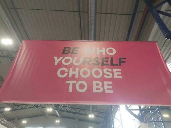
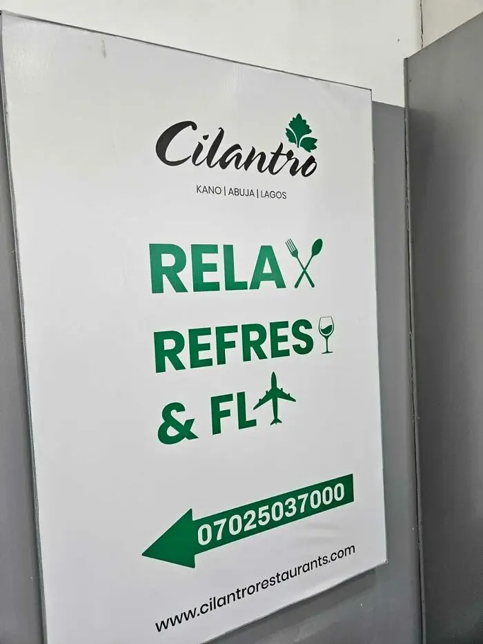
#74 Since A Wine Glass Naturally Looks Like The Letter 'H' And An Aircraft Like A 'Y'
Report
13points
#75 “If Only There Was An Object That Looked Like An ‘O’” Is Only The Start Of This One
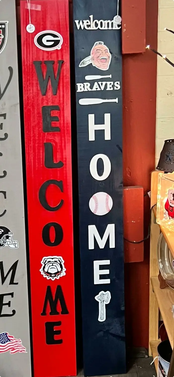
Report
13points