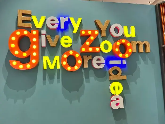


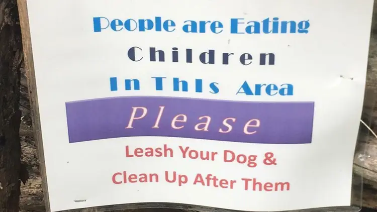


Good design has a few simple rules: simplicity, clarity, and visual appeal. Some designs, however, fail to execute all of these criteria. Bad design can be disappointing; it can be dull and uninspiring, but when it starts to veer into the realm of the offensive, that’s when you know you have a problem.
Bored Panda has made you a compilation of signs, labels, and other awfully designed objects that might make you say: “Who approved this?” There’s no way such inappropriate designs could’ve made it through a professional’s eyes, yet they did, it seems. Check these out if you’re looking for a few moments to laugh, cringe, and shake your head in ridiculous disbelief.
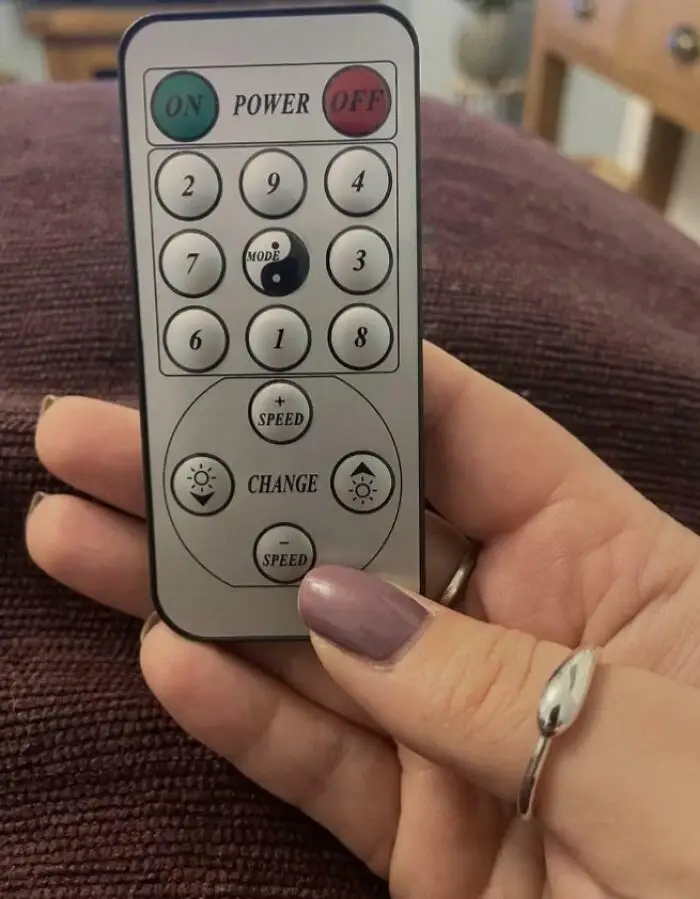
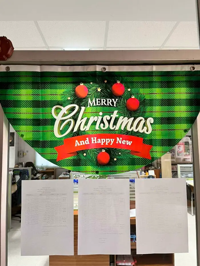
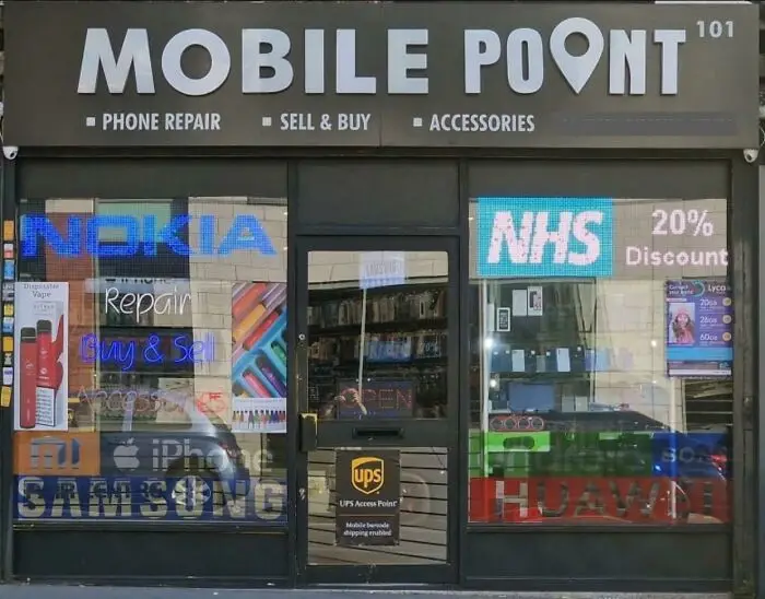
#43 Mobile Poont? Surely The O Would Have Served Better As The Point Icon!
Report
21points
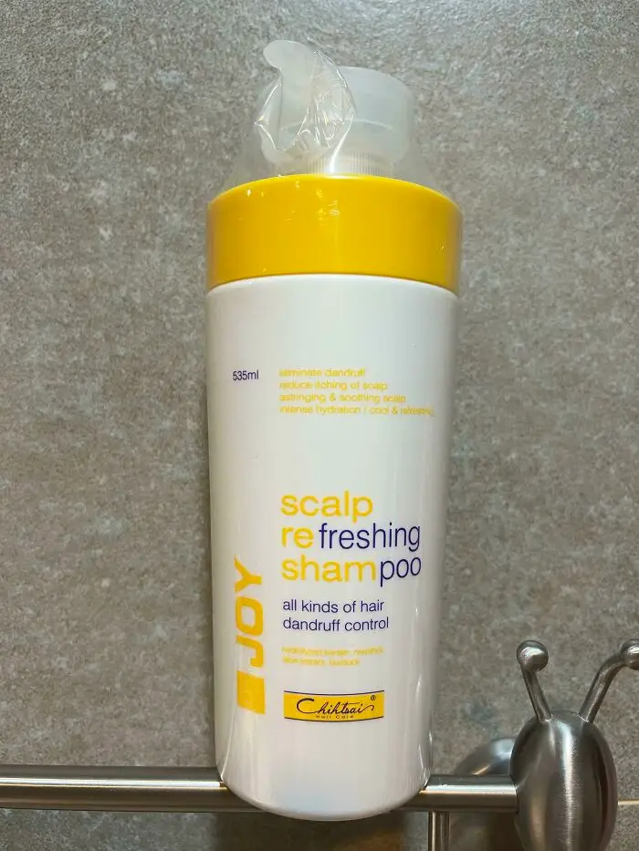
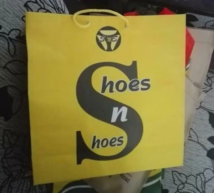
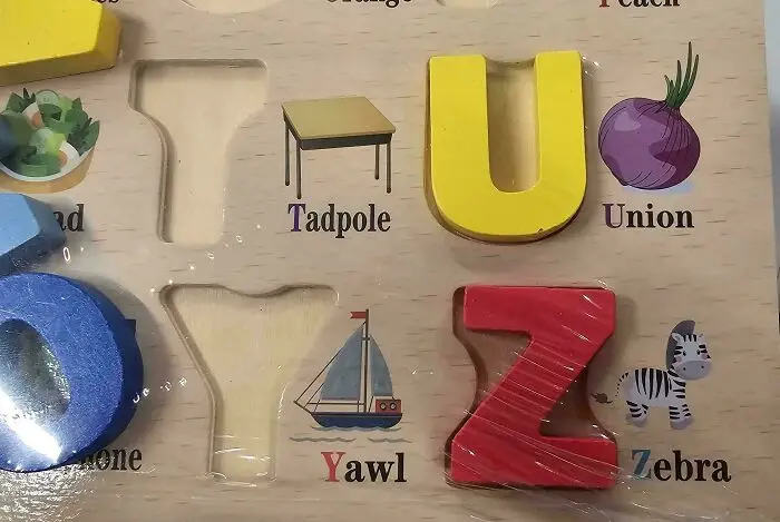
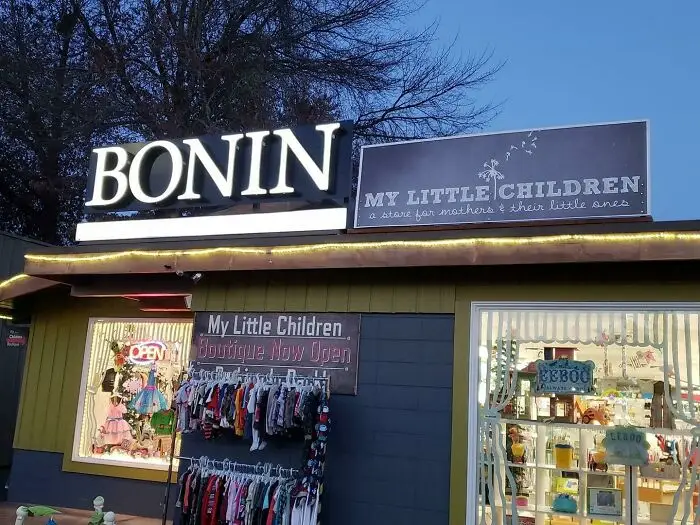
#49 Two Shops Next To Each Other. They Might Want To Think About Moving One Of The Signs Somewhere Else
Report
20points
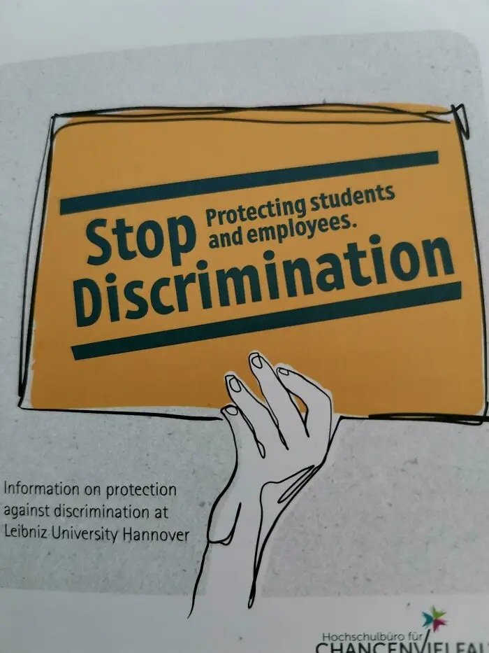
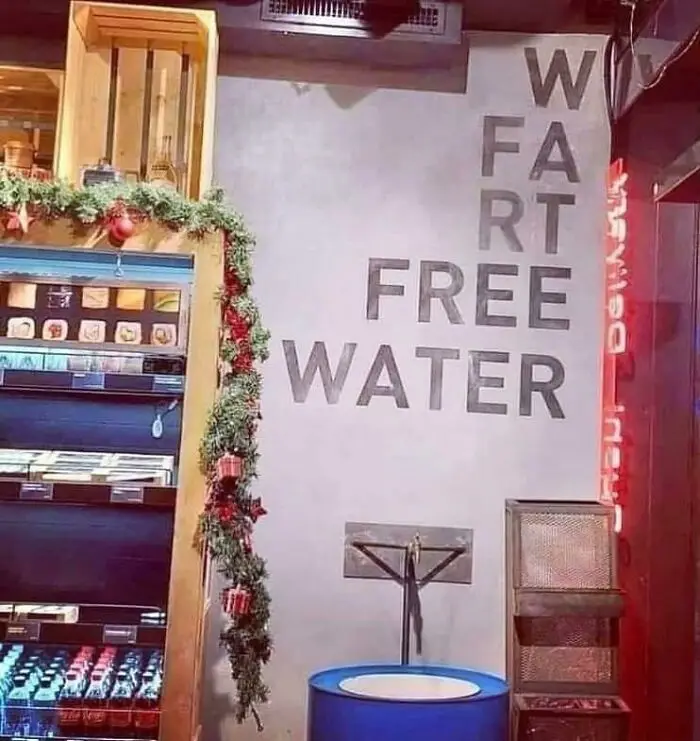
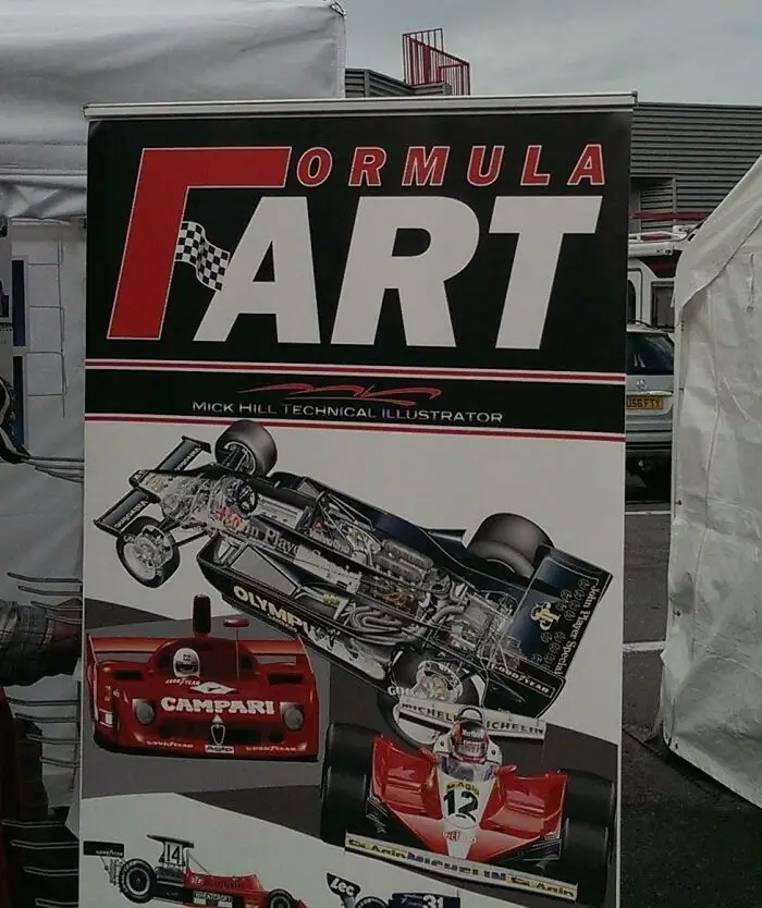
#56 Promotional Poster For 'Formula Art' Accidentally Suggests A Much Gassier Business
Report
19points
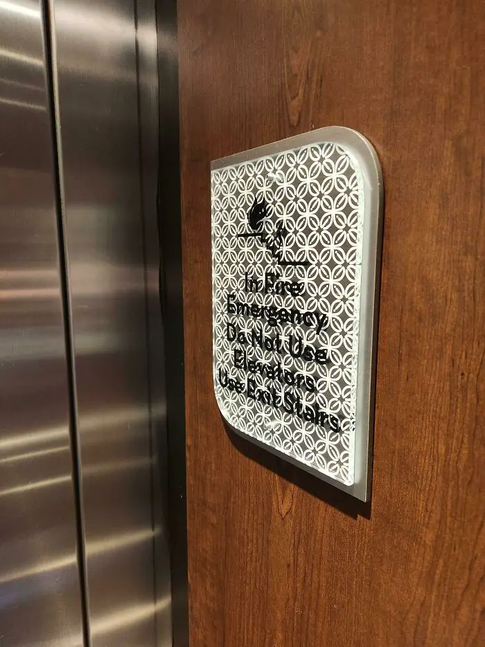
#57 Yep, I'll Definitely Know What To Do "In Fire Emergency", Hilton Garden Inn Cherry Creek (Denver)
Report
19points
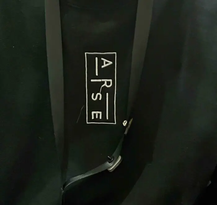
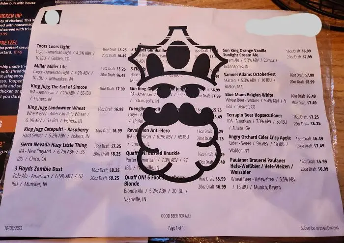
#59 The Restaurant Logo On This Menu Blocks The Words And Makes It Impossible To Read
Report
19points