



Let's be honest... Not everyone gets excited at the idea of reading pages of convoluted data or spreadsheets containing thousands of numbers. They can be complicated, time-consuming, and quite frankly, boring. Cool and fascinating charts - now that's a different story. They're like the drive-throughs of information. No need to dress up and sit through long courses, just grab your takeaway and go.
Well-designed charts have the ability to turn mountains of research into easily consumable, and sometimes entertaining, information. They explain in seconds what could take dozens of pages to describe. And nowadays, they cover everything under the sun. Some reveal intriguing trends we didn't realize were happening, others answer questions we didn't know we had.
Every now and again, Bored Panda puts together a compilation of the most interesting charts out there. And today we're doing just that... From the world's happiest cities, to how many hours of work are needed in different countries to escape poverty, keep scrolling if you want understand the bigger picture at a glance.


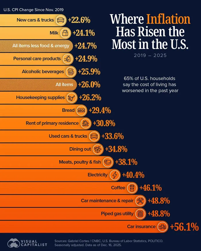
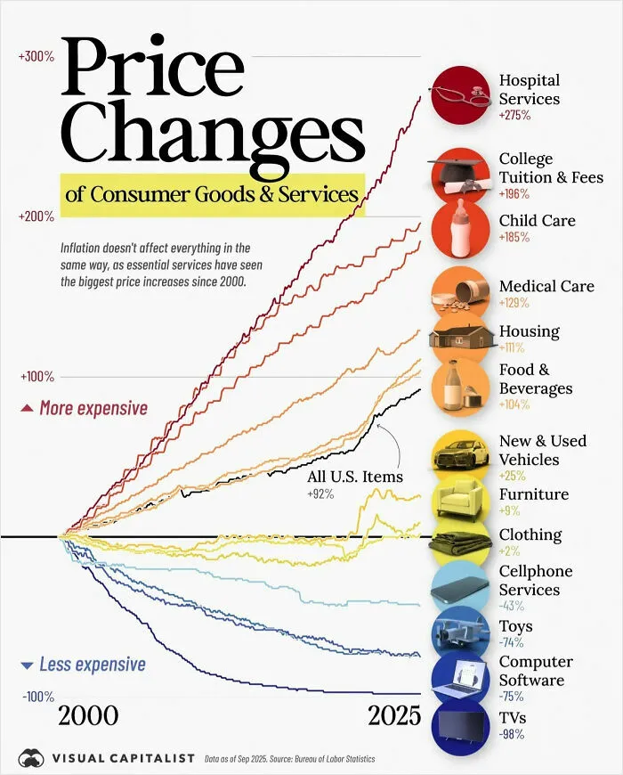
#50 A Cool Guide To Know Where Inflation Has Risen The Most In The US (2019-2025)
Report
18points



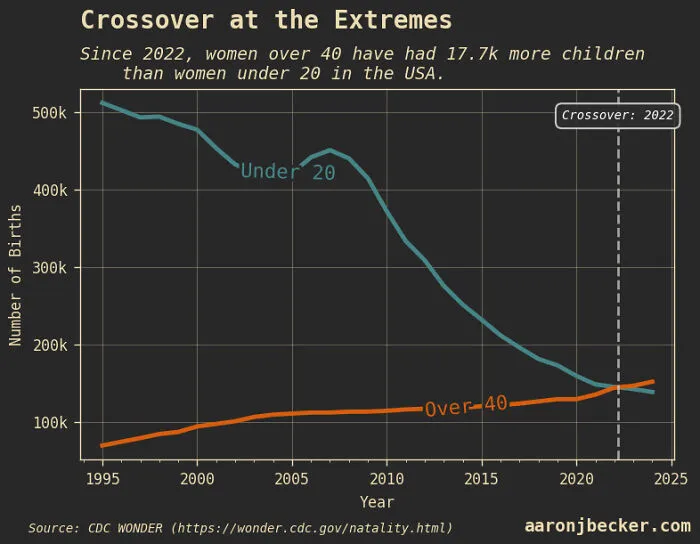
#58 Since 2022, Women Over 40 Have Had More Babies Than Women Under 20 In The USA
Report
15points