



Another thing that can leave people scratching their head is the thoughtless use of color. If random colors are assigned as representations on a chart or graph, it can lead to chaos, clutter, confusion and a rainbow of nothingness. The colors themselves need to tell a good story. And sometimes, it's okay to use just one color instead of a whole bunch.
"While the colors may create an aesthetically pleasing chart, they contribute nothing to our understanding of the data," notes the GoodData.AI site. "In fact, instead of adding clarity, the colors create visual noise that detracts from the data's message."
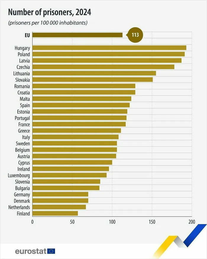
#23 In 2024, There Were 508 746 Prisoners In The EU, Indicating A 2.0% Increase Compared With 2023
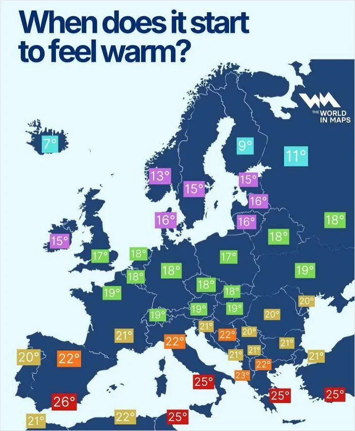
#24 In The EU In 2024, 51% Of The Population Lived In A House, While 48% Lived In A Flat (And 1% Lived In Other Accommodation, Such As Houseboats And Vans)

To create an effective chart, experts advise that you begin by identifying the story you want to tell (comparison, trend, distribution, or composition). "Then select a chart that naturally fits that purpose, like a line chart for trends over time or a bar chart for comparing categories," adds the GoodData.AI team.
SEO copywriter, editor, and content strategist Rachel Nicholson, agrees. The expert reveals that before creating any data-based graphics, she ask herself: "Do I want to convince or clarify a point? Am I trying to visualize data that helped me solve a problem? Or am I trying to communicate a change that’s happening?"
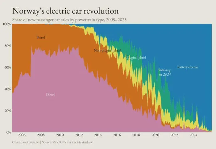
#26 Norway Has Gone From Near-Zero Sales Of Non‑emitting Battery Electric Vehicles To Now Close To 100% Of All New Passenger Car Sales
Nicholson says that if she's trying to convince, she'll probably opt for a pie or donut chart. But if she's trying to communicate a change that’s happening, then it largely depends on the specific change.
"For tasks such as communicating a weekly schedule change or reallocating work between team members, I’ll use the Gantt chart," Nicholson explains. "If I’m trying to show an internal change in marketing or sales trends over time, well, it’d likely be time to break out the bar graph."
Either way, a chart or graph can help you get your point across a whole lot easier than a long email or massive spreadsheet containing an overwhelming amount of information.

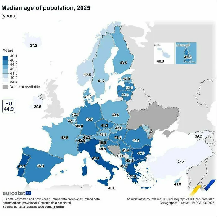
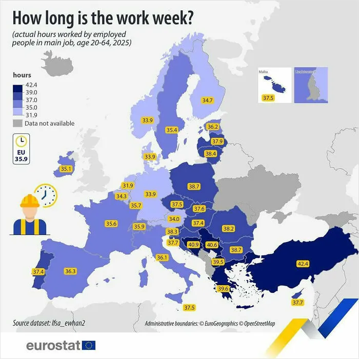
#34 In 2025, People In The EU Aged 20-64 Worked (Both Full And Part Time) An Average Of 35.9 Hours Per Week In Their Main Job
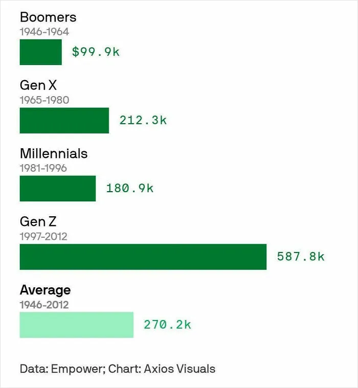
#36 Boomers Say It Takes $100k A Year To Be Financially Successful, Gen Z Says It Takes $600k