




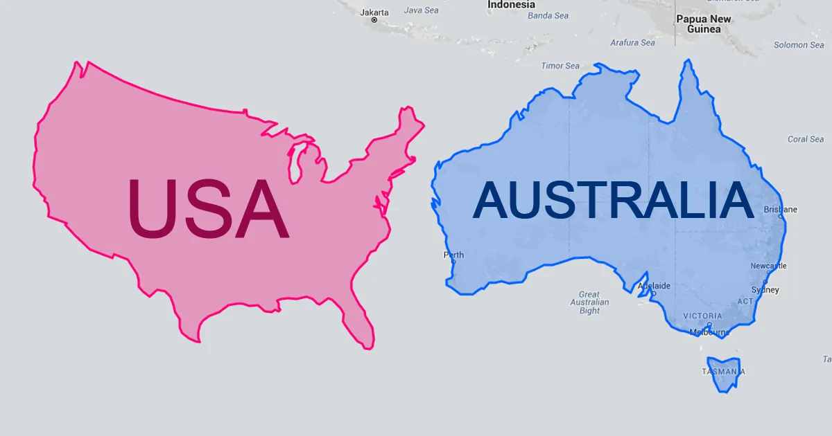



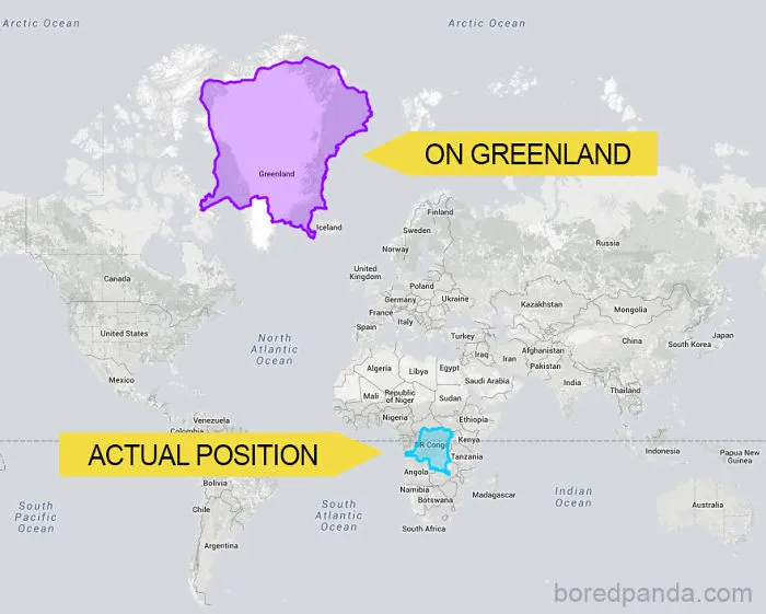
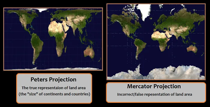
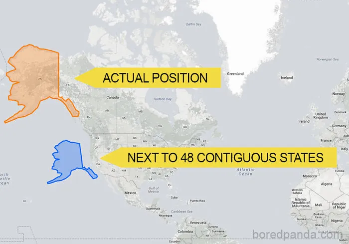
Ever wondered why Greenland looks as big as Africa on the map? It’s because of something called the Mercator projection. Putting a 3-D planet on a two-dimensional world map was challenging for early cartographers. So, a Flemish geographer and cartographer named Gerardus Mercator came up with a solution for the most accurate world map.
In 1569, he designed an atlas that could be accurately used for navigation. Still, the downside was that his system distorted the size of objects depending on their position relative to the equator.
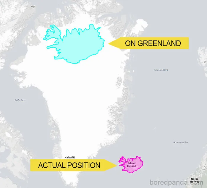
Because of this, landmasses like Antarctica and Greenland appear much bigger than they are. Though there are around 40 types of map projections, from conical to polyhedral and retroazimuthal, depicting the actual size of the world, this one is still used the most because of its convenience and simplicity, even by Google Maps. None of these projections can be titled the real world map because they all depict the same Earth through a different lens.
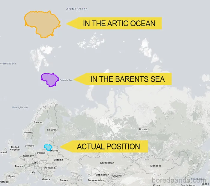
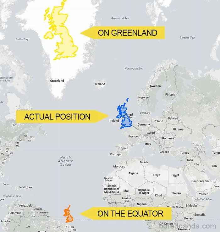
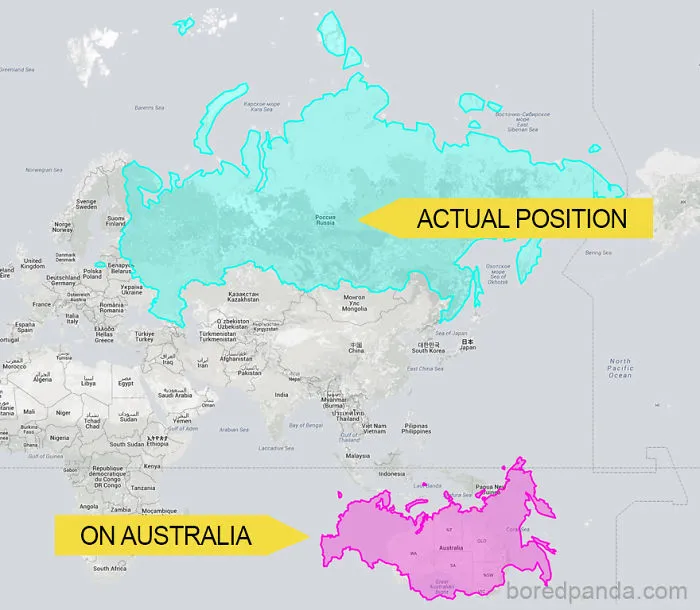
So, what does the real-world map look like? To show how incorrect our understanding of countries by size is, a website called thetruesize.com lets you move land masses into different locations. This helps you understand the actual size of countries.
We at Bored Panda played a bit with this tool, and what we found will change your perspective on our planet’s geography. The website lets you juxtapose two countries to compare their relative size, and if you’re wondering which countries are the best to live in, we explored that too.
Here’s what the real size of countries looks like.
#22 Moving UK North And South Reveals How It Actually Compares To Other Countries
The True Size
Report16points
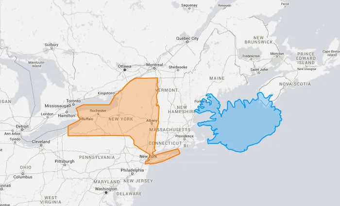
#25 #27 Tiny Iceland Compared To New York
16points
#27 Let Me Just Make This Easy; The Issue Is Peters (accurate) Vs Mercator (inaccurate).
13points
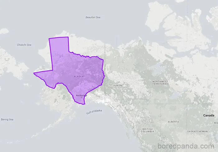
#29 Texas Moved On Top Of Alaska Shows That They're Almost The Same Size
Report
10points
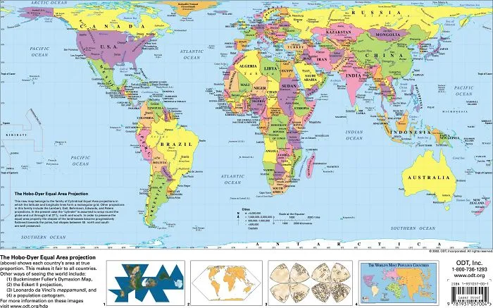
#30 You Cannot Make Legitimate Size Comparison Unless You Are Doing So On An Equal Area Map
10points
The second article discusses the inaccuracies of the Mercator projection, similar to the detailed exploration in the first article.
For a deeper look into how maps can distort perceptions of country sizes, you might explore the interesting ways countries are depicted in size.