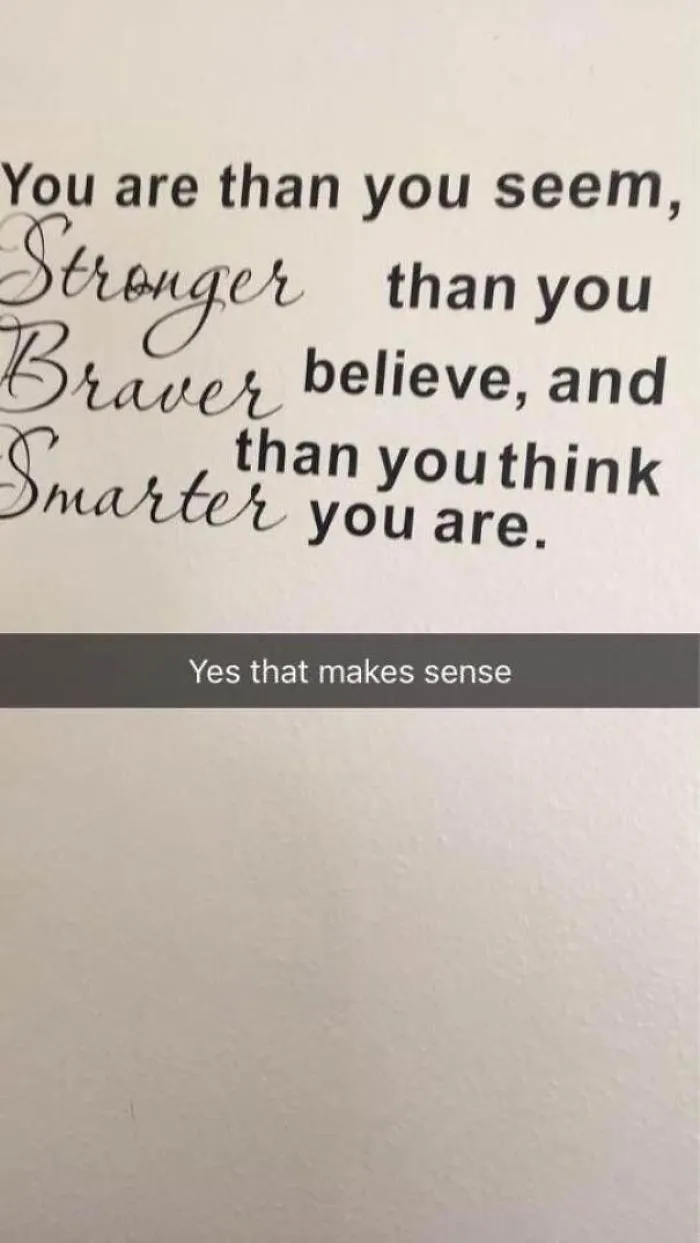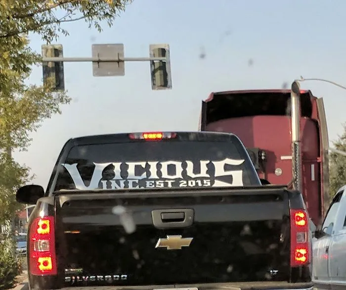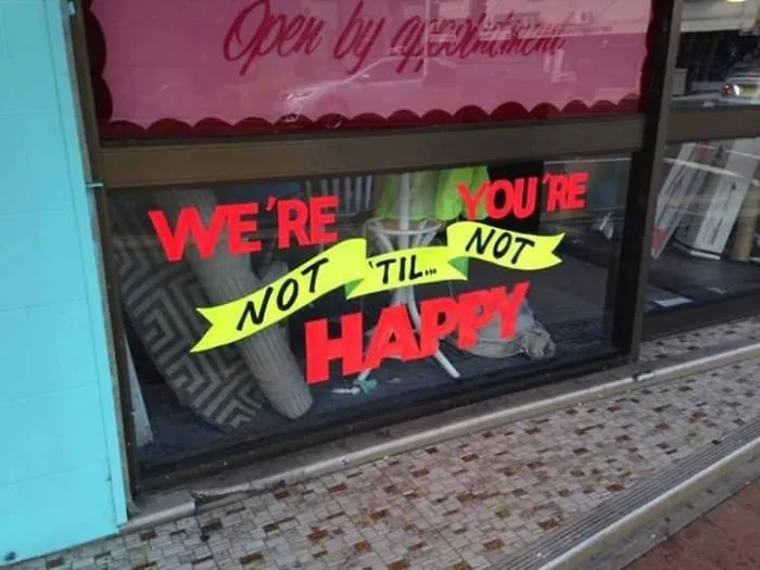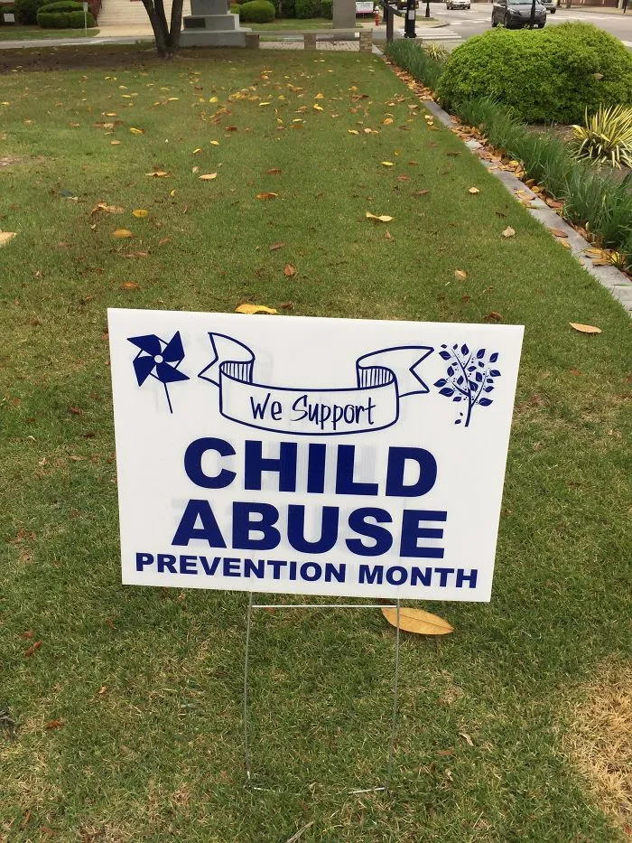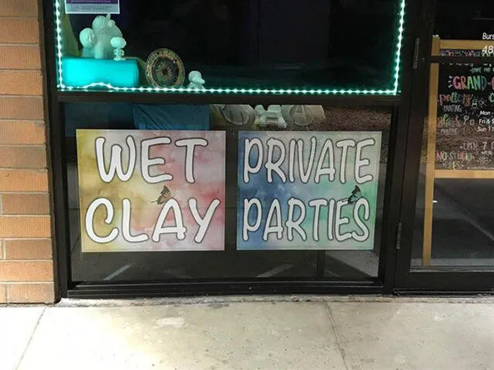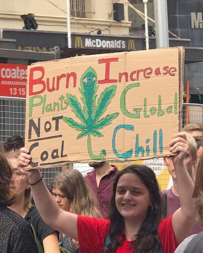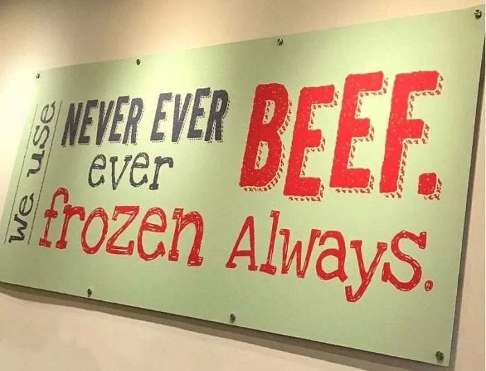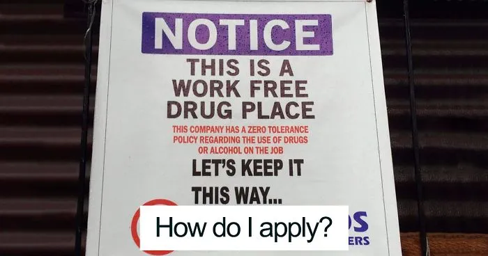


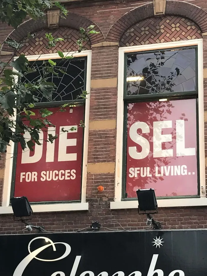
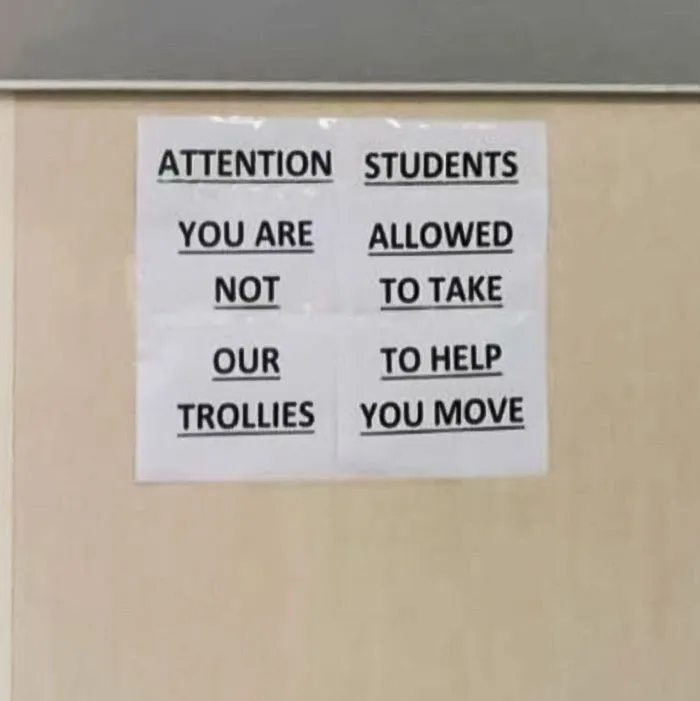
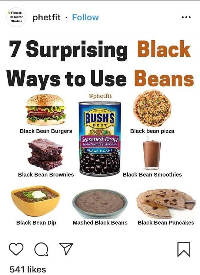
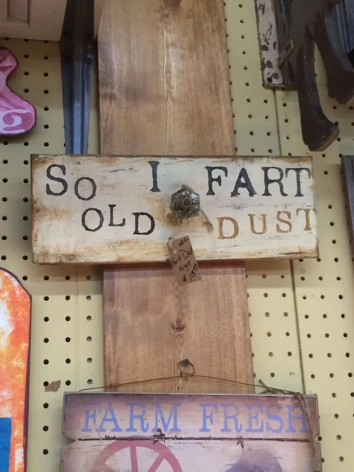
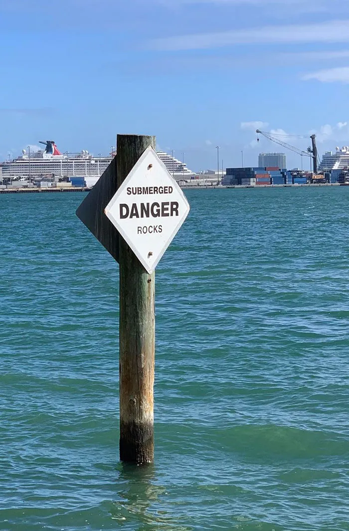
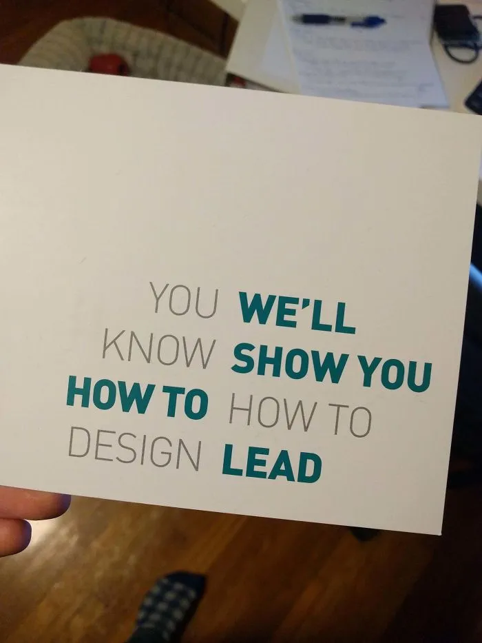
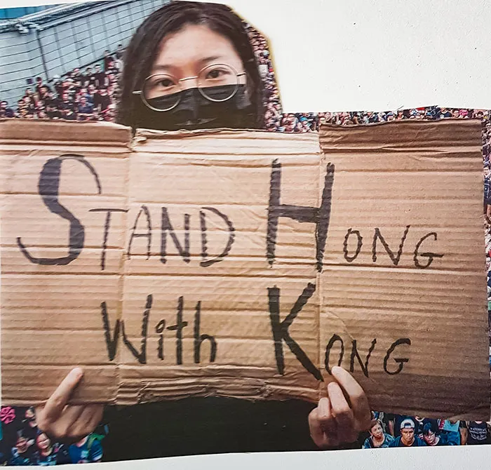
Design seems like such a simple, elementary thing when you think about it, but hordes of people keep getting the basics wrong, often with hilarious and side-splitting results. Buildings are hard to design, as are other objects, but we usually take the lettering and layout of sentences and phrases for granted, as though everyone will be able to understand us no matter how.we.words.our.place.
Well, the truth is, designing text so it’s readable isn’t as easy as you’d expect. There’s a system to it. There are processes that must be followed. Typography rules that ought never be broken. Except that those rules are broken all the time by some oblivious people. Bored Panda collected some of the best examples of incredibly bad text design that is wonderfully enjoyable to make fun of. From lame ads to funny posters, nodofy is safe from bad design. So upvote the best/worst fails, see if your friends can figure out what’s actually written, and let us know in the comments if you've seen design fails that compare to these ones.
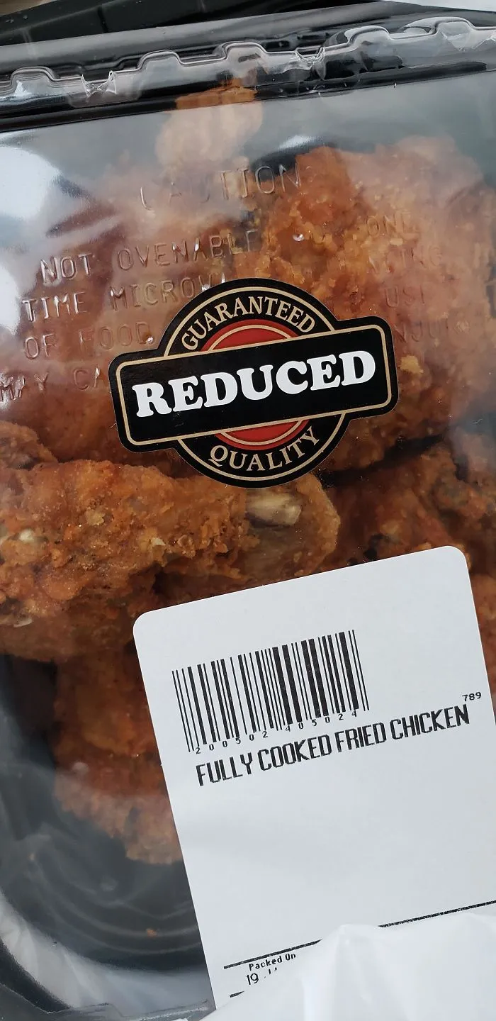
#21 Just Purchased This Low Quality Fried Chicken At The Grocery Store
Report
240points
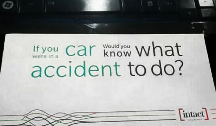
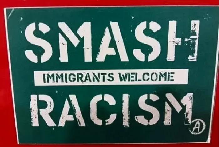
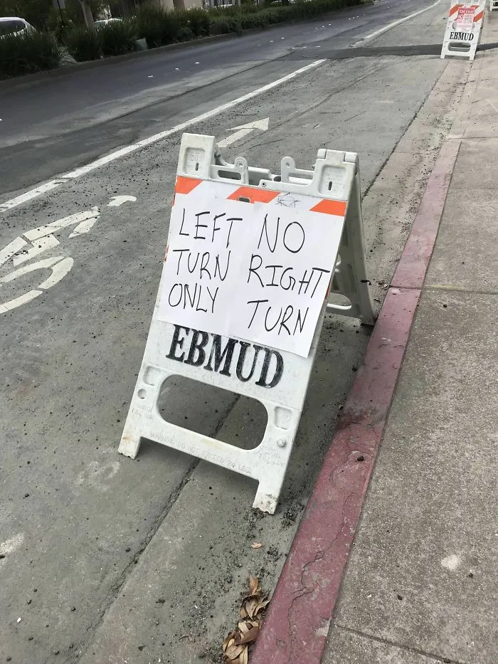
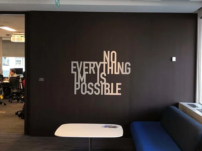
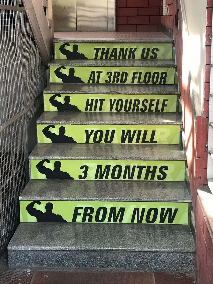
#33 When Your Gym Tryies Hard To Motivate You But Fails To Make Any Sense
Report
170points