



This post may include affiliate links.
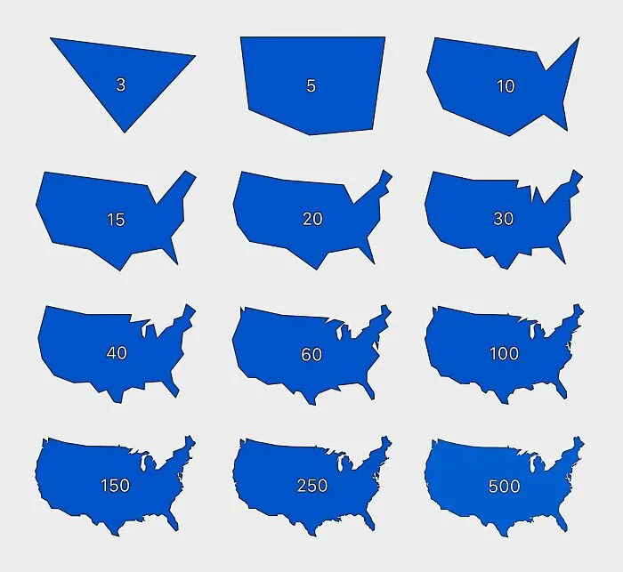
Meanwhile, you should put a lot of care into the symbology of your map. Some of the most important things that affect the readability and message of your map are:
- The color choices you make
- The widths of your lines
- The icons you use
- The labeling
Of course, no proper map is complete without a legend. It allows your audience to decipher the symbology of the map. In a nutshell, the legend has to be legible and easy to understand.
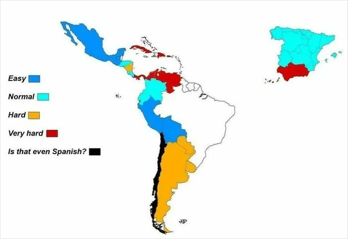
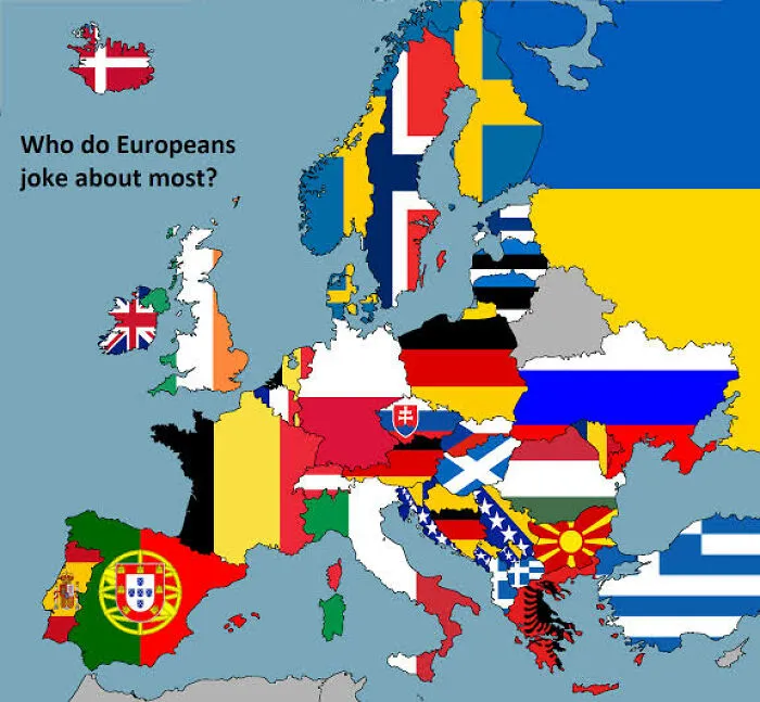
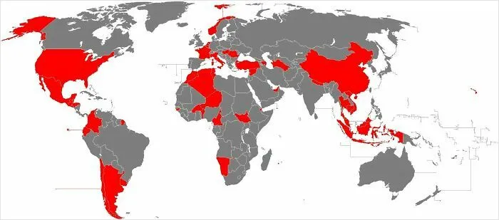
‘Terrible Maps’ has become so popular that Howe even ended up publishing a book—‘Terrible Maps: The stupidly funny illustrated gift book perfect for geography lovers’—full of the most hilarious ones he’s crafted. According to the author, the book is a celebration of “pointless cartography in all its glory.”
Bored Panda has reached out to Howe via email to learn more about the entire project, and we’ll update the article as soon as we hear back from him.
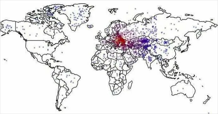
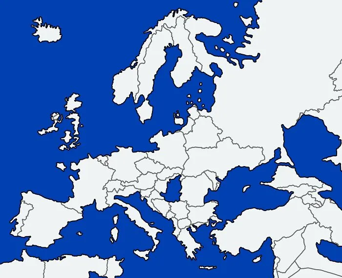
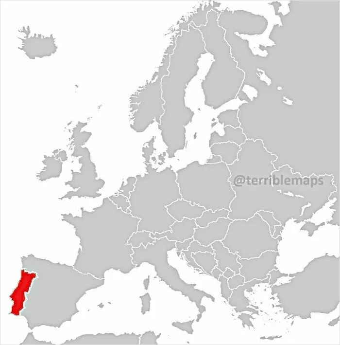
The ‘Terrible Maps’ project has seen incredible success over the years. For example, on Facebook alone, the project’s account has garnered 1.2 million followers and 882k likes.
Meanwhile, even more people follow its account on X (formerly Twitter): 1.7 million people from around the globe are fans of the page there. And on Instagram, a further 382k people follow ‘Terrible Maps.’
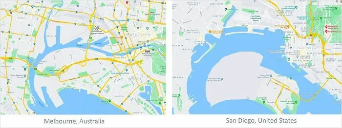
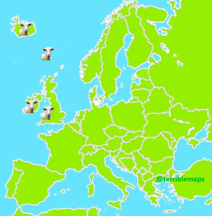
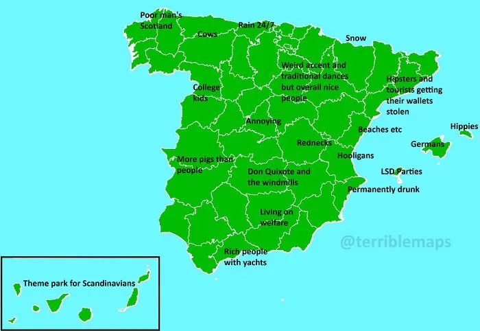
What are your thoughts about ‘Terrible Maps,’ dear Pandas? Which of the maps that we’ve showcased here today amused you the most? Which ones did you find surprisingly informative, despite the witty ideas behind them?
On a scale of 1 to 10, how big of a cartography and geography fan would you say you are? We’d like to hear from you. Share your thoughts below!
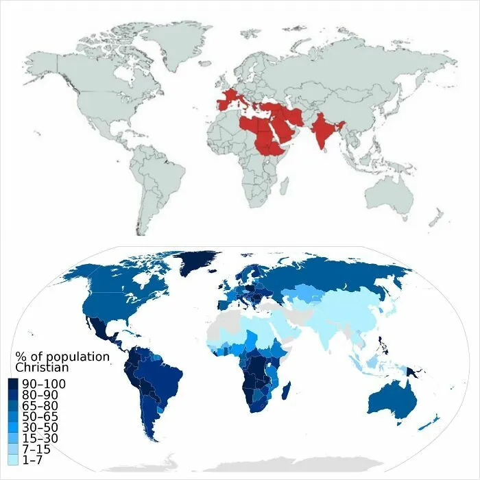
#32 Countries Mentioned In The Bible vs. % Of Population Practising Christianity
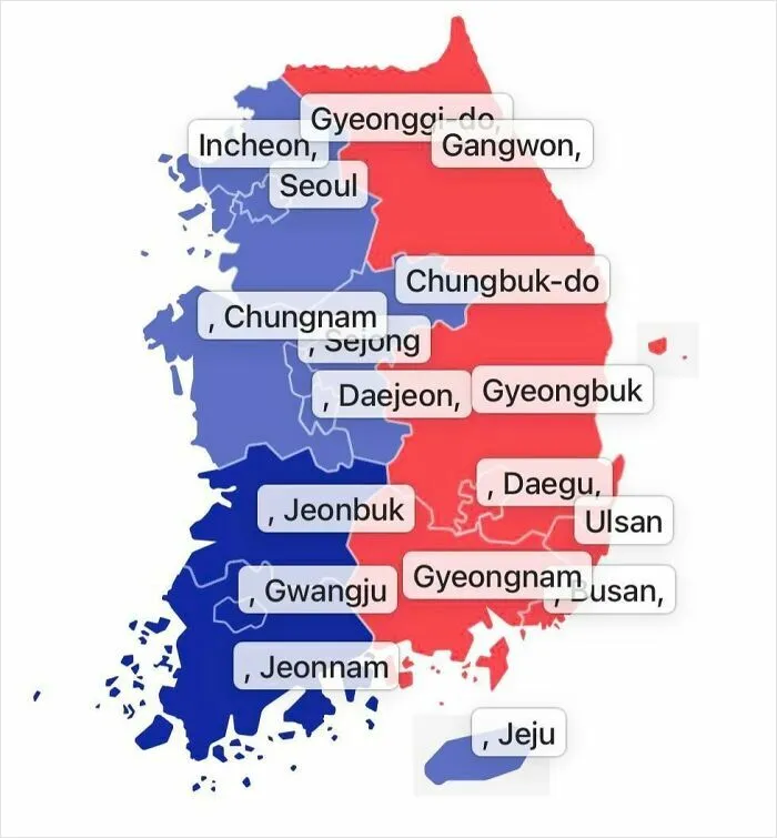
#39 South Korea Takes The Idea Of Political Left vs. Right Very Seriously (2025 South Korean Presidential Election Results)