

Bored Panda
86 Times People Had Their Own Idea On How To Design A Sign, And That Idea Was Just 100% Senseless
Funny,FailsNOV 7, 2026

86 Times People Had Their Own Idea On How To Design A Sign, And That Idea Was Just 100% Senseless

32
0
Whether you’re stuck in bumper-to-bumper traffic or taking a quick stroll through the neighborhood, street signs, billboards, and posters usually fade into the background. Every once in a while, though, a sign demands your full attention — usually for all the wrong reasons.
Sometimes it’s genius, intentional comedy — like a missing poster featuring a Golden Retriever proudly holding a stolen garden gnome in its mouth. Other times, it’s a complete design disaster — with spelling or grammar mistakes, or chaotic word placements.
If your day could use a pick-me-up, we’ve rounded up some of the most ridiculous, silly, and hilarious signs spotted in the wild and shared by the eagle-eyed members of a popular Facebook group. Dive in, and don’t forget to see the signs on your next walk.
#61

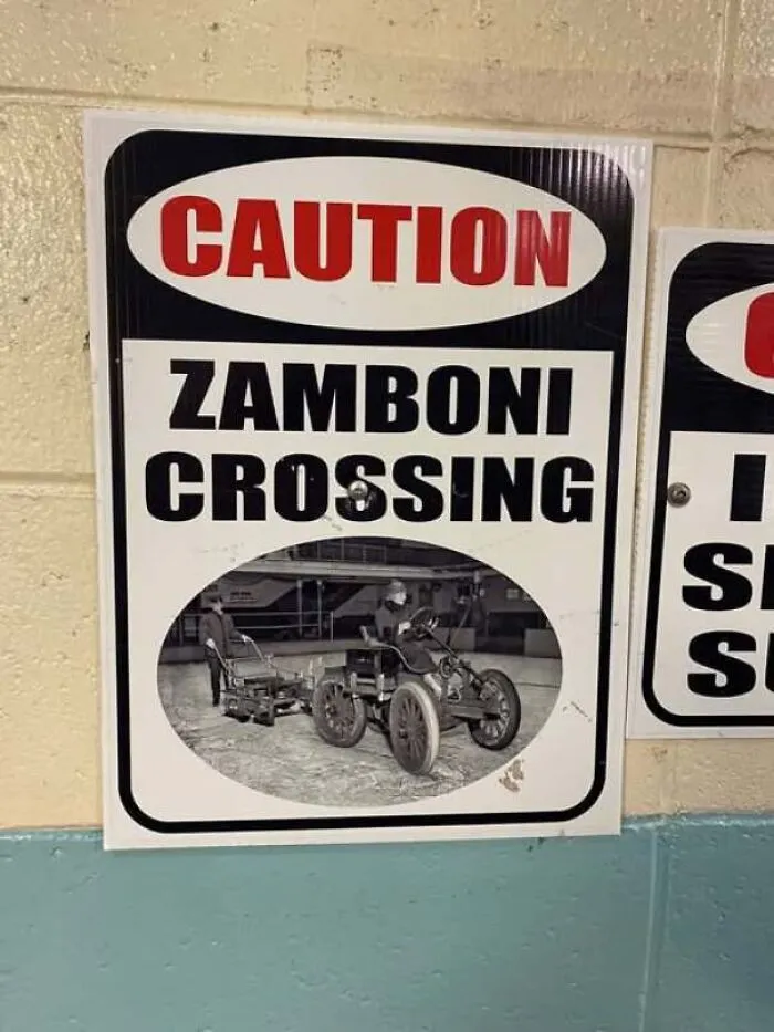
Caution sign warning of a Zamboni crossing with a vintage image illustration.
3points

#62

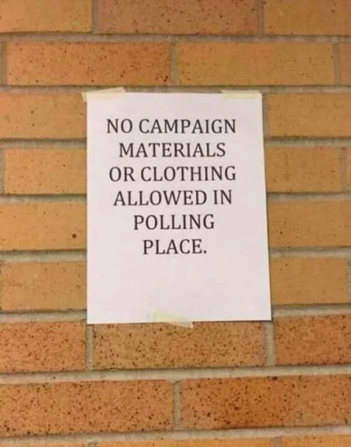
A poorly worded notice on a brick wall illustrating how not to design a sign.
3points

#63

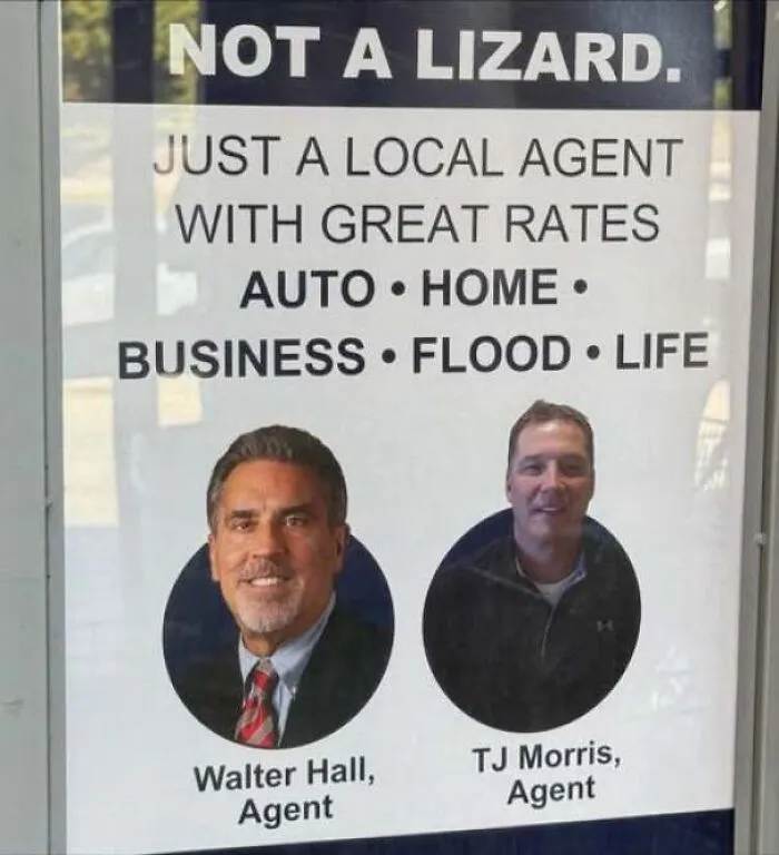
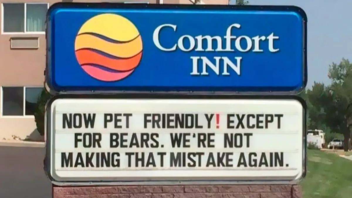
An advertisement poster featuring an awkward tagline that fails to design a sign effectively.
3points

#64

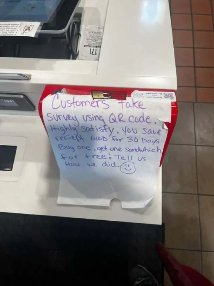
Handwritten paper instruction note attached to a register showing a senseless sign design.
2points

#65

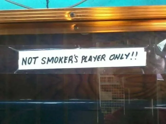
A handwritten notice taped to glass demonstrating confusing grammar when people design a sign
Report
2points

#66

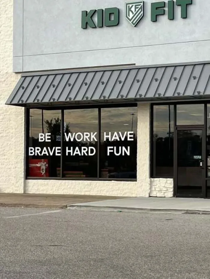
Confusing window sign text at Kid Fit displaying words that read awkwardly across panes
2points

#67

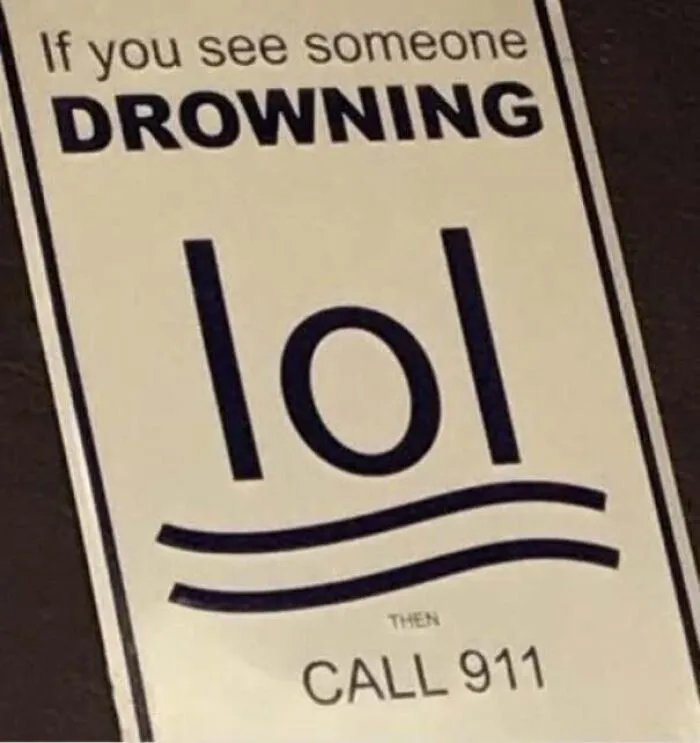
A poorly designed sign using the word lol to depict a drowning person above waves
2points

#68

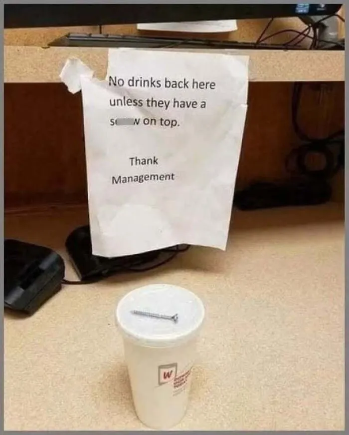
A coffee cup with a literal metal screw on top following a misspelled management sign.
2points

#69

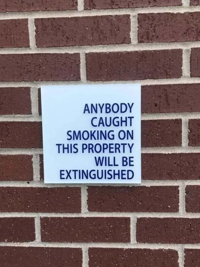
Funny sign design mounted on a brick wall reading, ANYBODY CAUGHT SMOKING ON THIS PROPERTY WILL BE EXTINGUISHED.
2points

#70

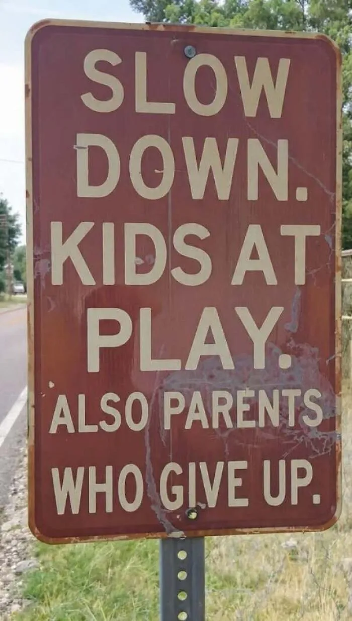
A brown road sign reading slow down kids at play also parents who give up, showing how to design a sign terribly.
2points

#71

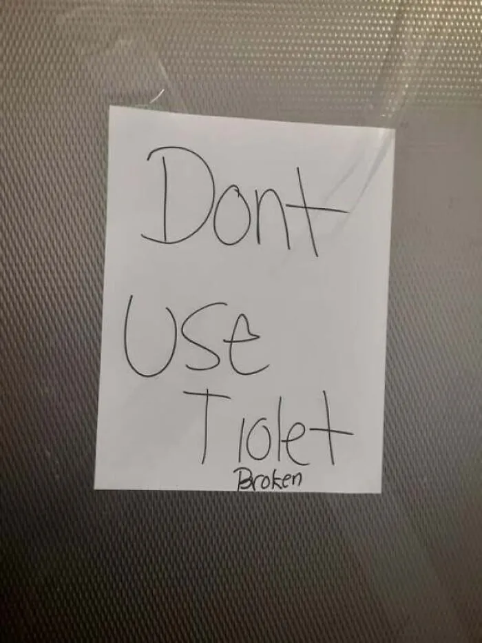
A handwritten paper sign stating dont use tiolet broken, an example of a bad design a sign attempt.
Report
2points

#72

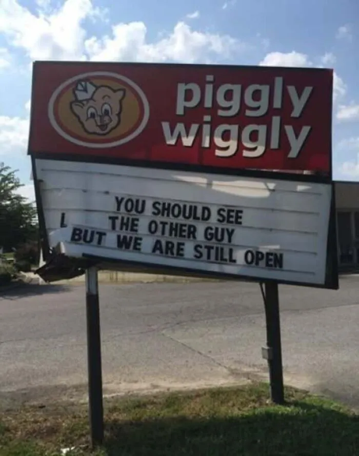
A damaged Piggly Wiggly store sign with funny text, showcasing a poor way to design a sign.
2points

#73

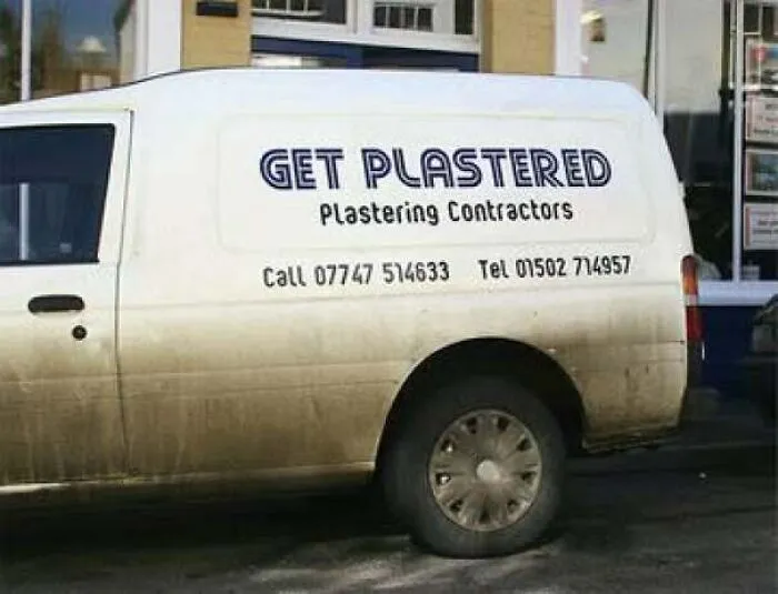
Side of a contractor van featuring a funny pun sign reading, GET PLASTERED Plastering Contractors.
2points

#74

Back tattoo reading Proud Parrot flanked by English flags displaying a funny design idea
2points

#75

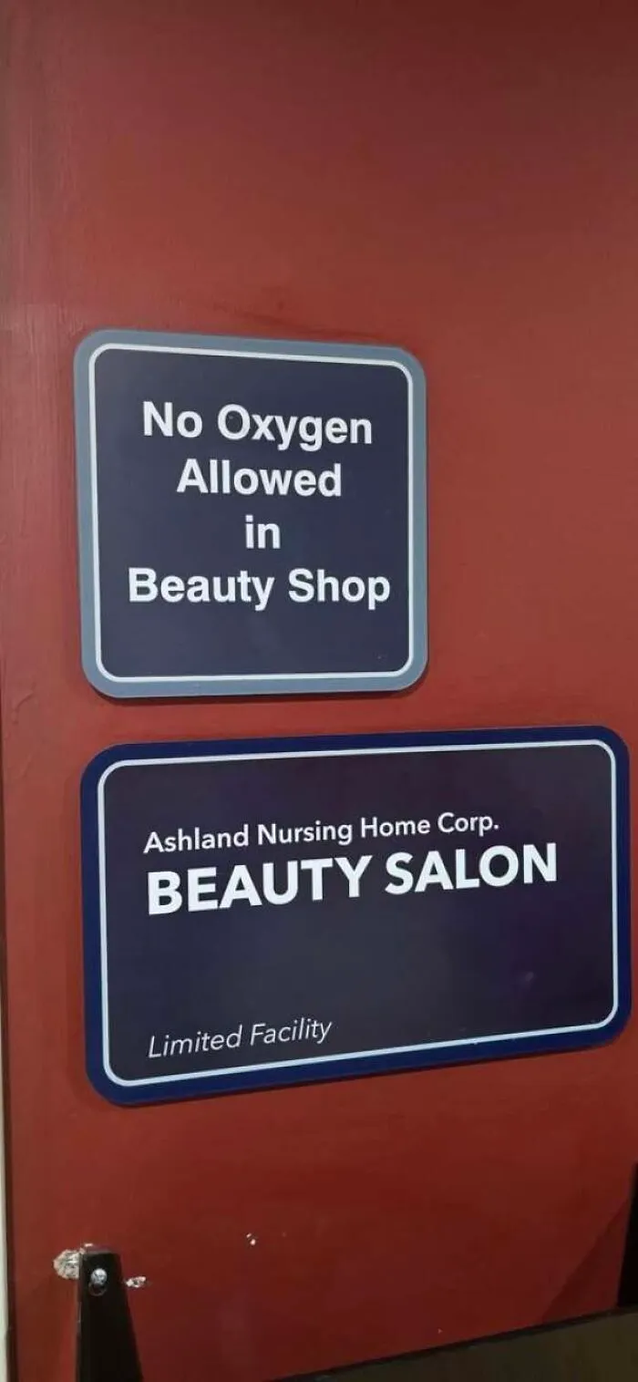
Senseless door signs showing an odd choice on how to design a sign banning oxygen in a beauty shop.
2points

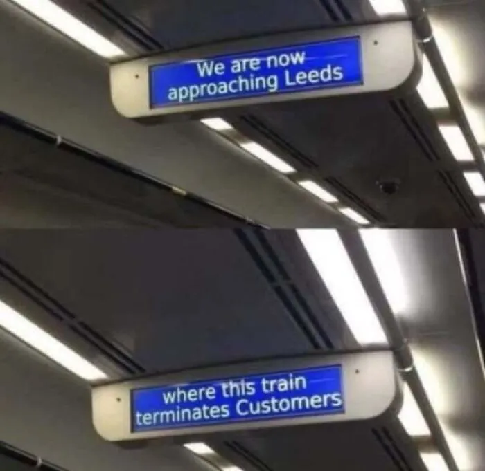
#76

Train screen displays an ominous message about terminating customers showcasing a poorly designed sign
2points

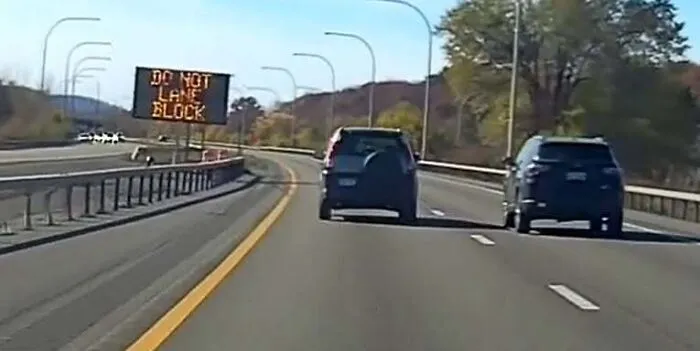
#77

Highway electronic traffic sign displaying confusing text as an example of how to design a sign poorly
2points

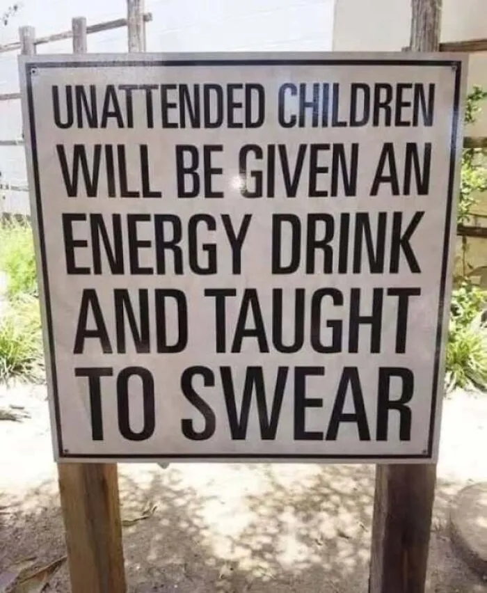
#78

Warning notice with bold text stating consequences for unattended kids to design a sign with humor.
Report
2points

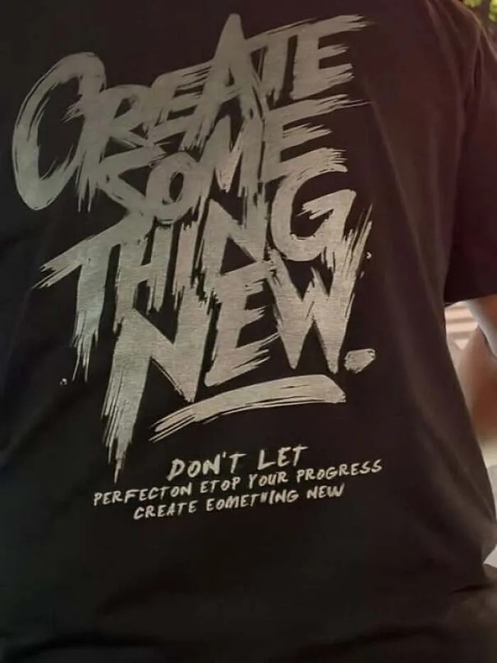
#79

Black t-shirt with paint-stroke typography showing how to design a sign with typo-filled text.
2points

#80

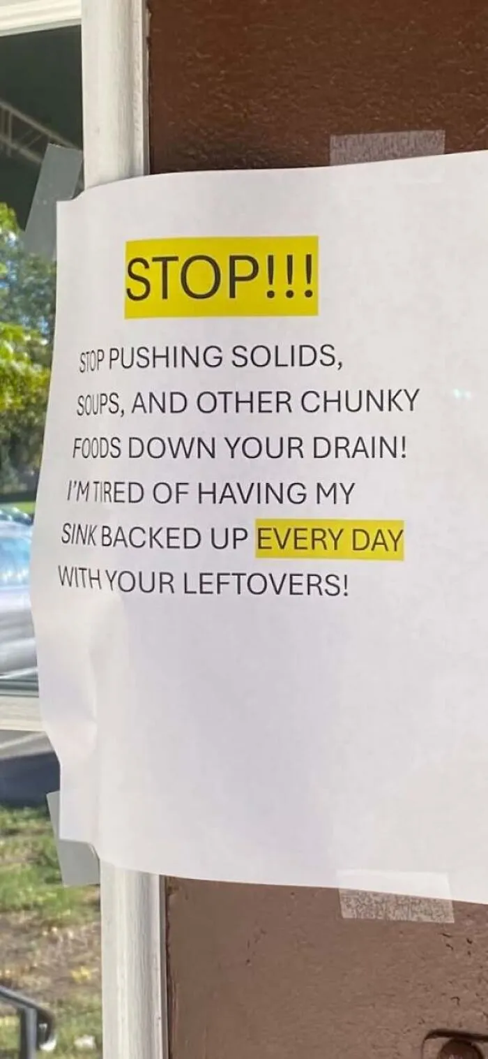
Warning note about clogged drains highlighting a frustrating attempt to design a sign.
2points
32
0