






We take the same streets to work, sit at the same red lights, and walk past the same storefronts without much thought. Our eyes brush over hundreds of signs along the way — bus stop posters, big highway billboards, tiny sidewalk chalkboards, and shop window stickers.
Most of it just blurs together into background noise. But every now and then, something sticks.
You probably can’t list every advertisement you saw this morning, but if a logo pops up on your daily walk week after week, it starts to feel familiar. And that's exactly how signage works. You don’t even realize it’s happening, but your brain is taking notes. That simple, quiet repetition is really the secret sauce behind physical signs.
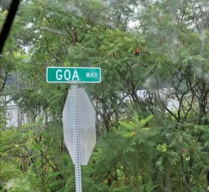
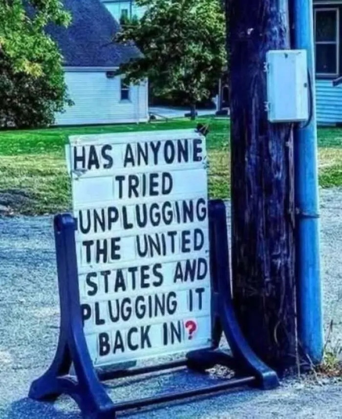

Location plays a massive role here, too. Unlike a phone ad that disappears the second you swipe, a real-world sign stays put. Put a poster right outside a shopping mall, and you’re talking to people who are already out looking to buy something. Put a sign for a bakery right outside a subway exit, and you catch people the second their stomachs start rumbling on their morning walk.
It isn’t just about getting a sign in front of as many eyes as possible. It’s about putting the right idea in front of someone at the exact moment they might actually care.
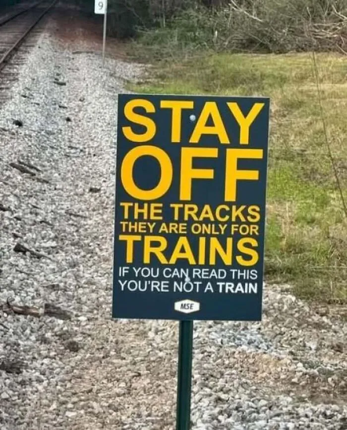
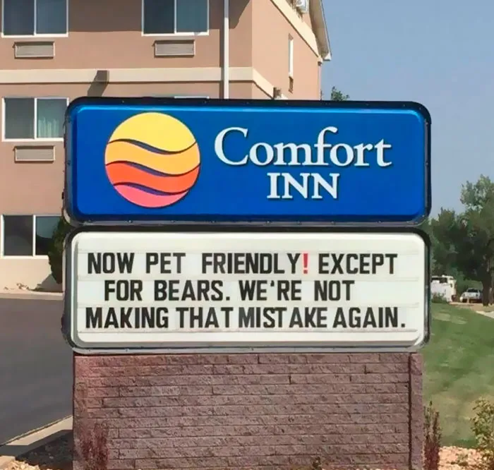
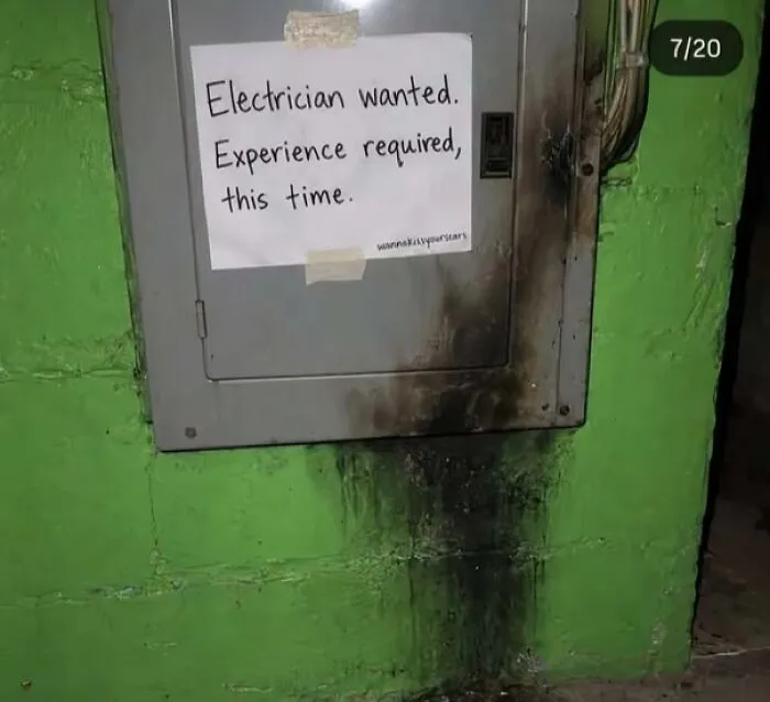
Catching people while they’re on the move is tricky. Whether someone is zooming past at 50 miles an hour or sprinting to catch a bus, you only get a fraction of a second to make your point.
That’s why the best signs keep things simple. If you try to say too much, people end up reading nothing. A great sign focuses on just one clear idea, uses short words, and makes the message instantly easy to spot. In real life, clarity always beats trying to be overly informative.
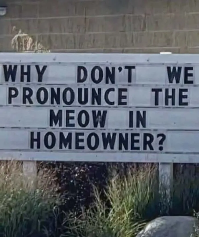


A study in the Journal of Pragmatics analyzed over 700 public signs to see how public spaces talk to us. The conclusion was that signs don’t just state rules — they try to negotiate with our subconscious. Experts call this managing “reactance” — the natural human urge to do the exact opposite of what you are told.
When a sign has a harsh command like “Keep off the grass” or “Do not block driveway,” our brains can register an attack on our personal freedom. That friction can trigger defensive defiance, making people far more likely to ignore the sign entirely.
To bypass this natural resistance, sign makers must use subtle persuasive tactics. The study found that effective signs rely heavily on positive politeness and strategic indirectness. Rather than barking orders, these signs treat the viewer as a cooperative partner.
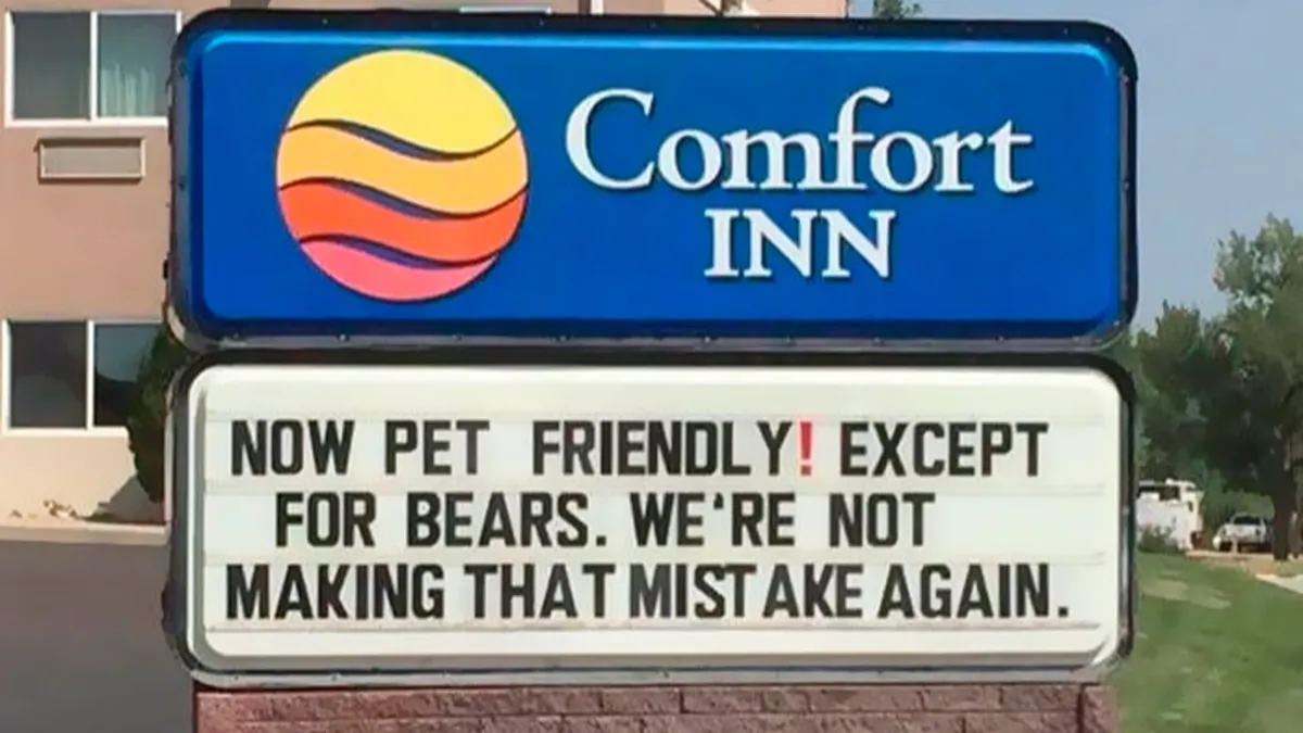
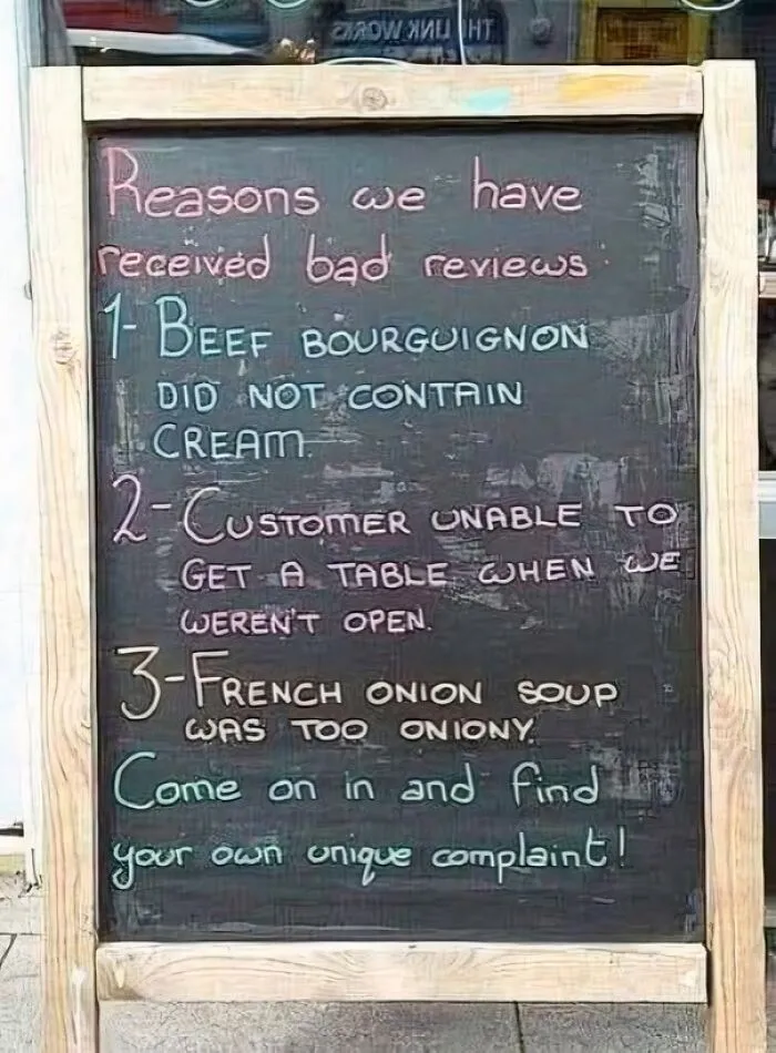
Humor is another powerful tool for disarming our defensive instincts. By replacing a cold threat with self-deprecating wit or a lighthearted joke, a sign can lower our guard. Ultimately, public signs work best when they stop demanding compliance and use clever tactics instead.
#13
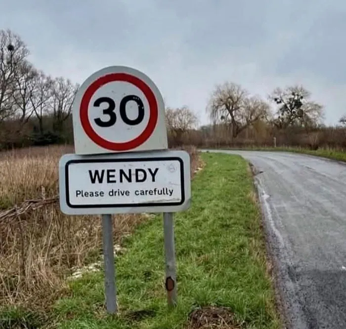
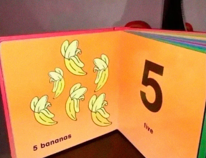
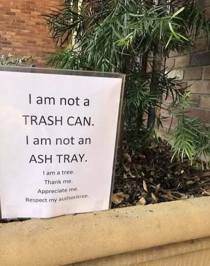
Beyond corporate branding and city rules lies a third type of street sign: the intentional spoof.
Recently, “A Sign of Humor” — an anonymous guerrilla artist — started using his creativity on Glasgow’s streets. By pasting clever parody signs near iconic landmarks like the Finnieston Crane and the Barrowland Ballroom, this mystery creator wants to pull people away from their phone screens and back into the real world.
The mission is to spark joy and fight back against urban burnout.
“We’re just bombarded with bad news constantly, so having something that's different makes people realize that the world around them isn't all bad; it can be quite funny and amusing as well,” the artist explains. “I think it just contributes to the wellbeing of society.”
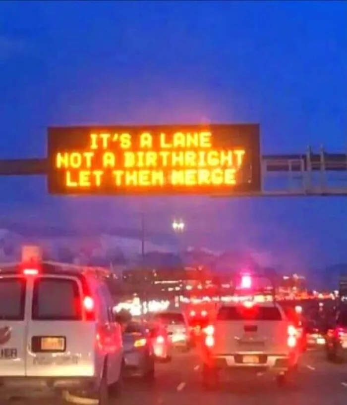
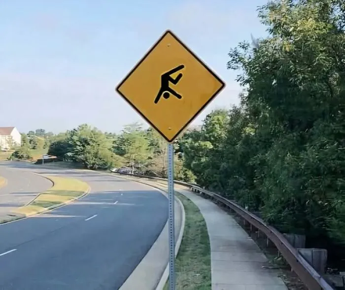
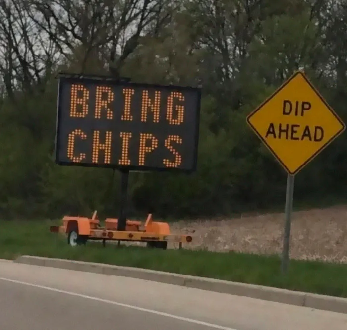
Visual humor in public spaces comes in many flavors, and smart sign designers know exactly how to use each one to grab our attention.
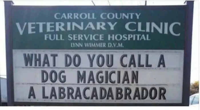
For instance, pun-based signs are a classic, lighthearted way to make a lasting impression. By playing with words, these signs create a fun, welcoming vibe that instantly lowers a customer’s guard. Because a good pun is easy to get and easy to share, it often ends up on social media, giving the business free exposure.
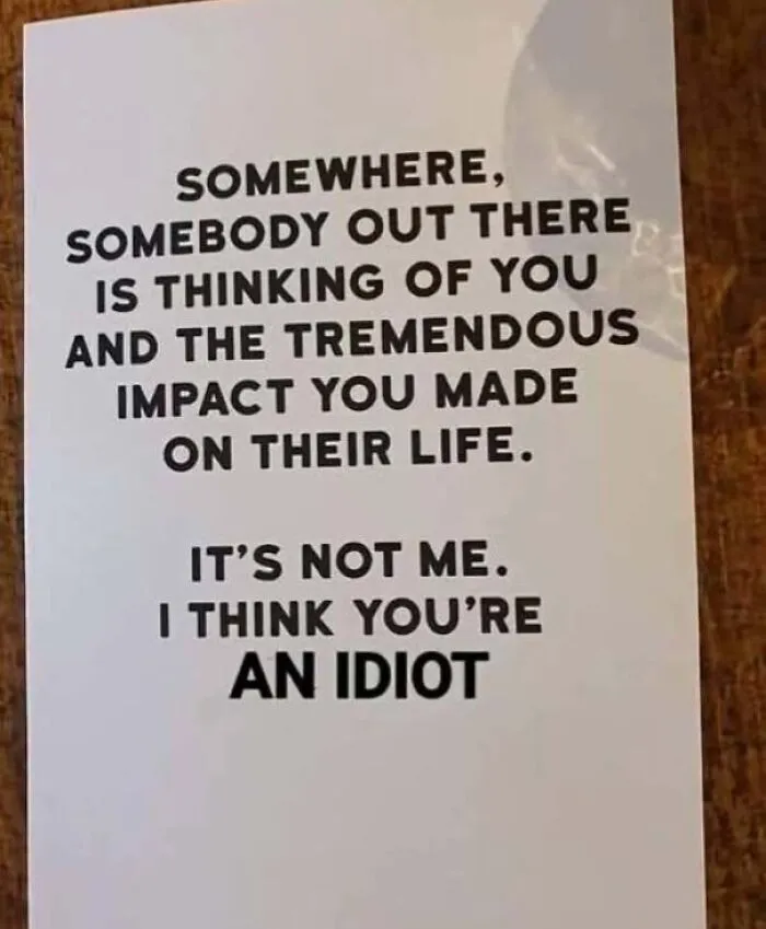
For brands with a bolder personality, sarcastic or sassy signs offer a different edge. A touch of it lets a business show off its cheeky side. On the other hand, tapping into pop culture takes that connection even further. A recognizable quote, TV reference, or movie joke on a storefront marker can make a business feel current and relatable.