



Tim also explained the method that his team uses to ensure that they design signs that won't end up on a list like this. “Most graphic designers start with the size of the sign - then the lettering & graphics are added. Think backwards," he explained. "A more strategic approach can be taken by having the design reverse engineered for maximum impact. This design strategy starts with the viewing distance. How far away does your target audience need to be able to read the sign?”
“Once the distance is measured, a Letter Sizing Calculator can be used to scientifically determine the very best letter sizes,” Tim continued. “As an example, what is the best letter size if the viewing distance is 110 feet? When you type 110 feet into the calculator, you’ll instantly see 22 inches is recommended for maximum impact - easy.”
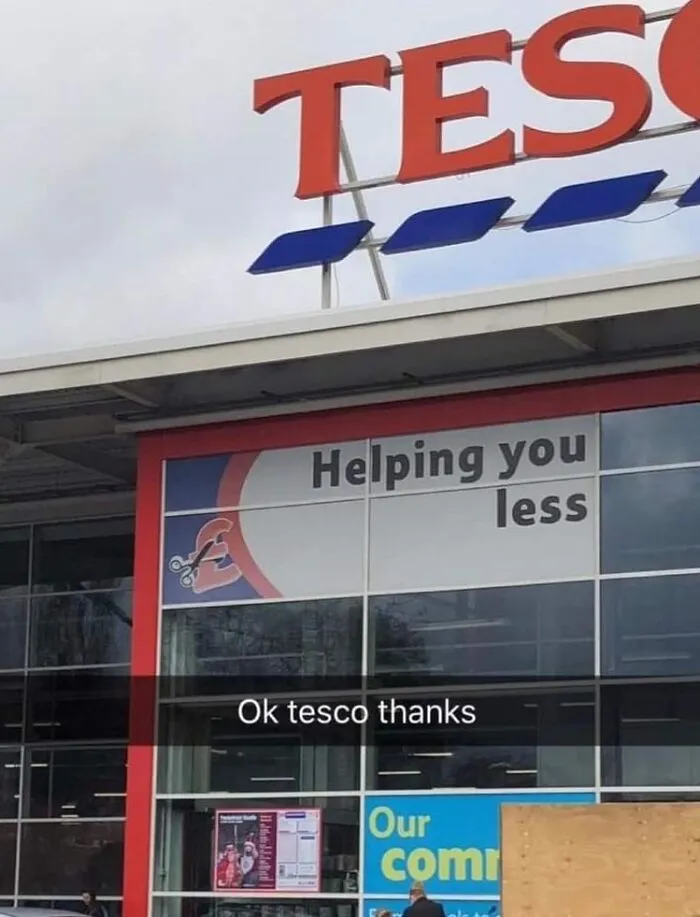
And if you’re curious what the Sign Chef himself considers to be the most important factor when designing a sign, Tim told Bored Panda, “The legibility of the message is the single most important factor. Of equal importance is the message itself. What is the core message people need to grasp in an instant?” It seems like the people who designed signs that are featured on this list could learn a thing or two from Tim and his team!
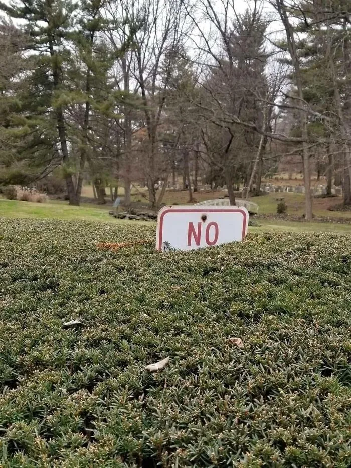
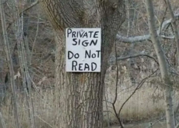
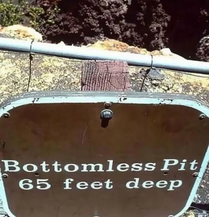
We hope this list is turning you into a connoisseur of signs, pandas. If you’re ever planning on creating signage in the future, now you know what not to do. Or perhaps, what you should do, depending on your goal! Keep upvoting the pics that you find particularly amusing, and let us know in the comments what the most brilliant signs you’ve ever seen were. Then, if you’re interested in checking out another Bored Panda article featuring useless, unsuccessful and/or unpopular signs, you can find that piece right here!