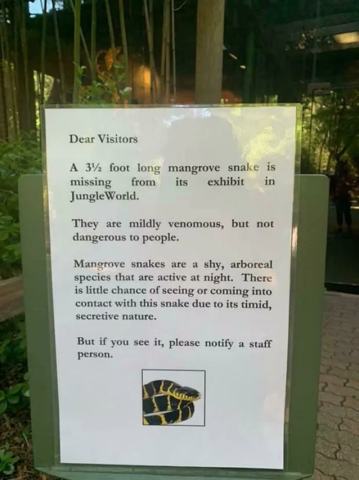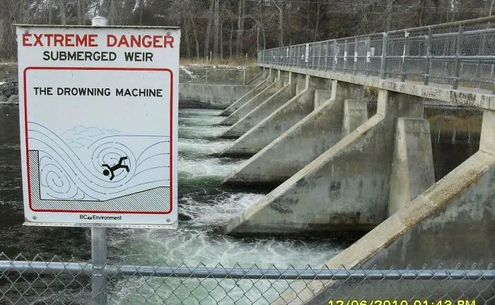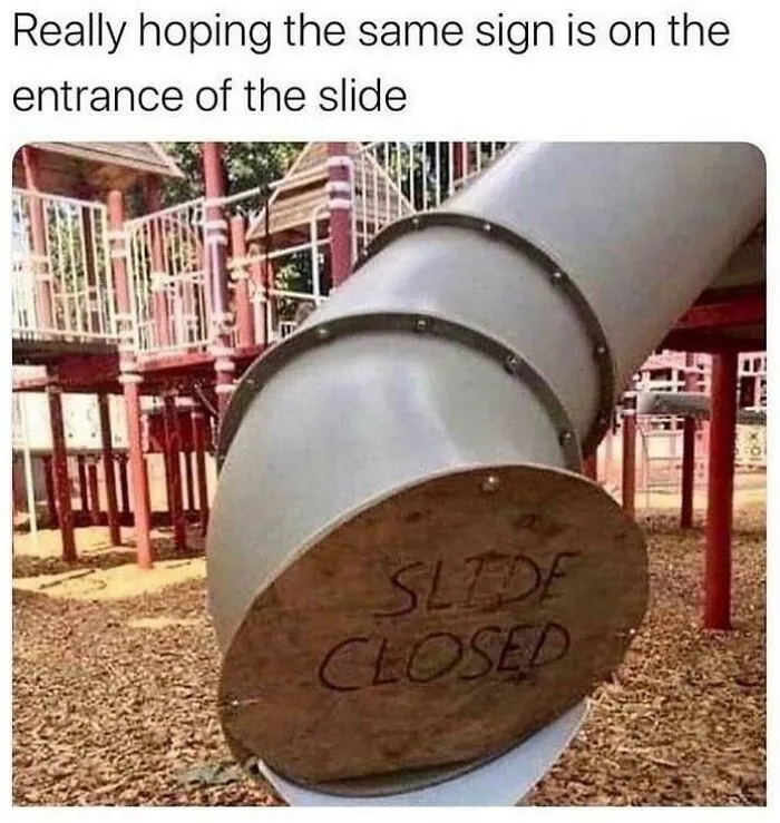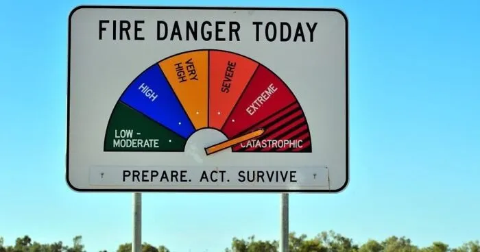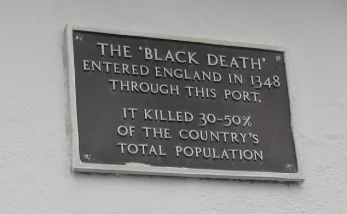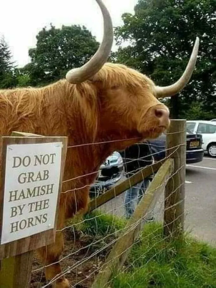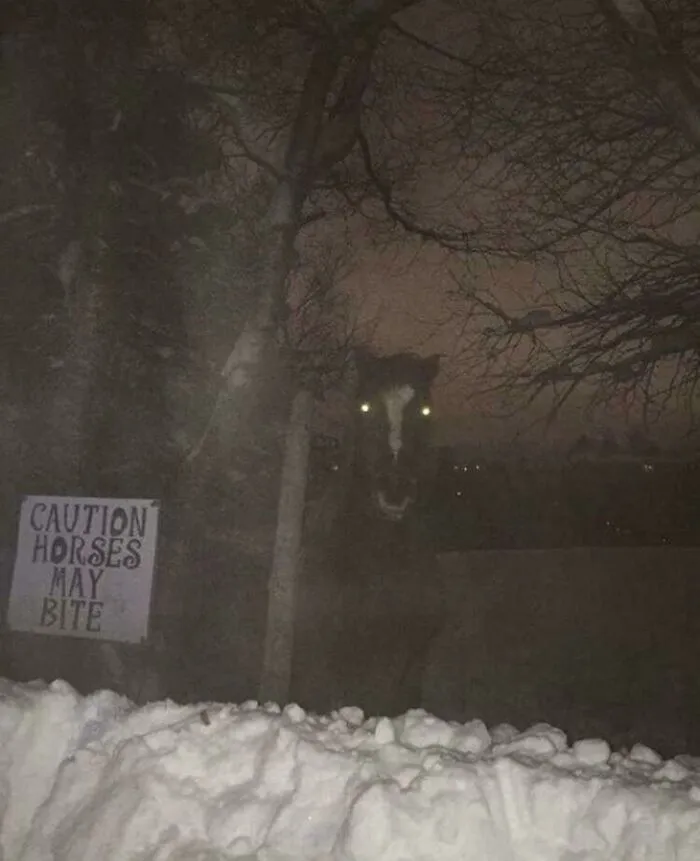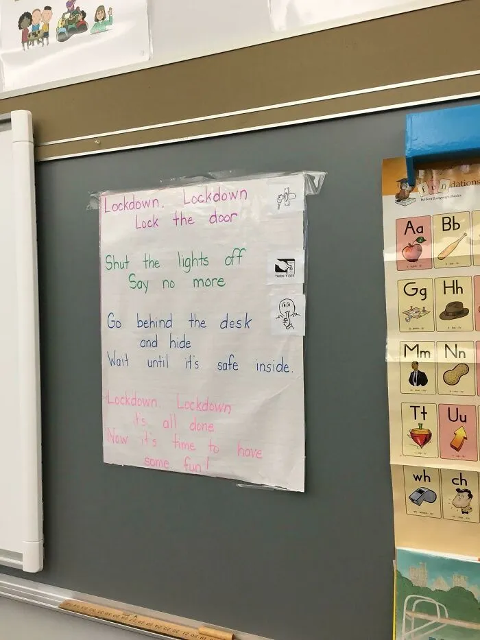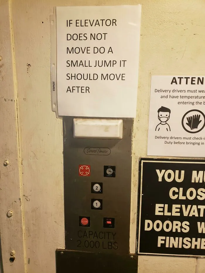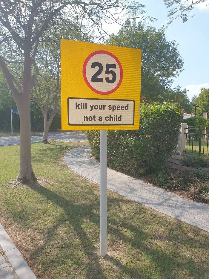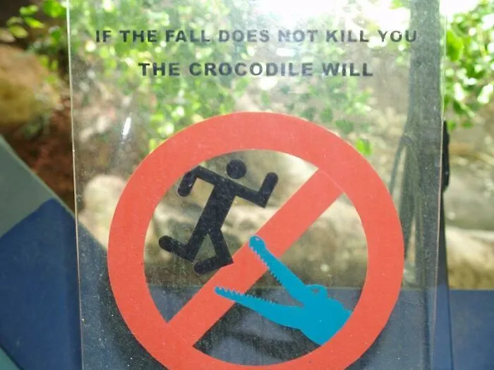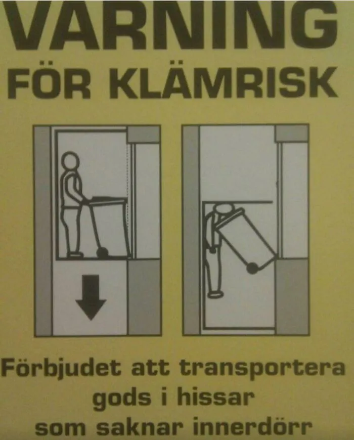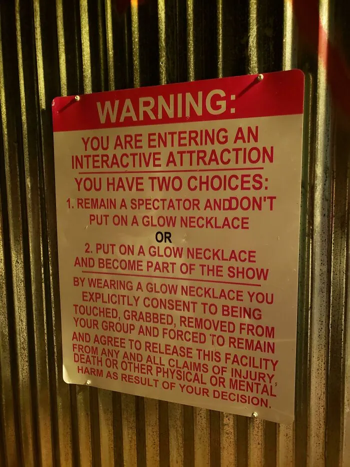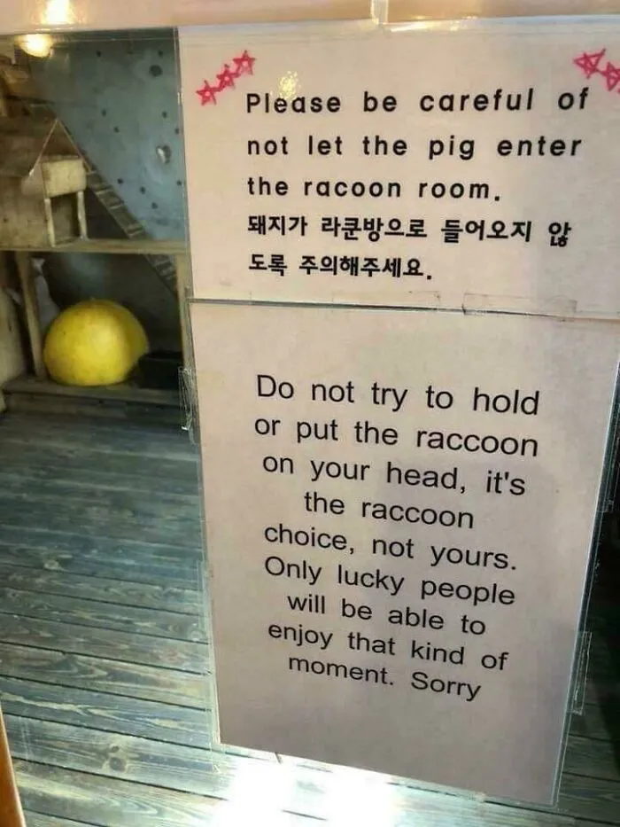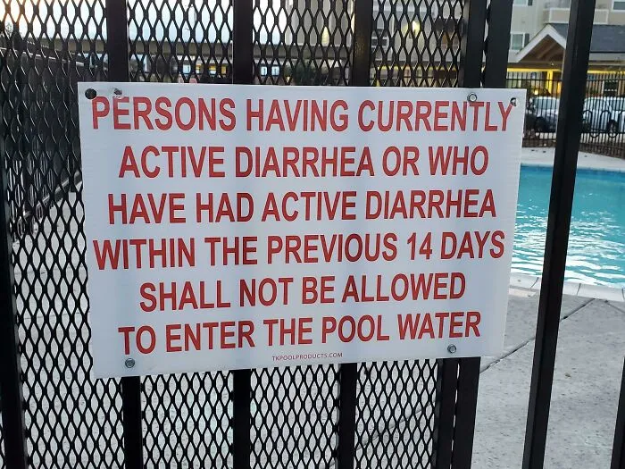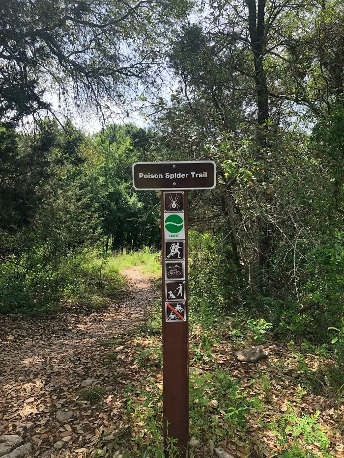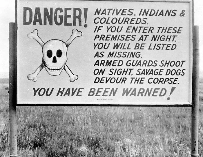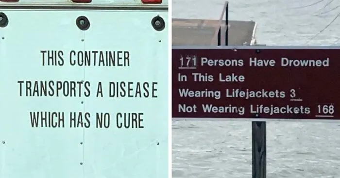


When you think about it, the goal of a sign is pretty basic, isn’t it? We put them up to give us directions, send messages, and warn us about dangers lurking around the corner. But while sometimes they hilariously fail to fulfill their purpose by looking like the most random and absurd announcements ever created, others seem to carry a somewhat threatening aura.
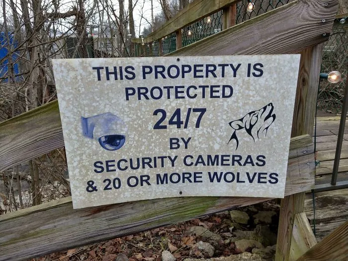
We’re talking about signs that remind us the world is filled with unforeseen hazards that make us want to stop and quickly run the other way. So let us introduce you to the 'Scary Signs' subreddit. This online community with over 379K members has set out on a mission to share pictures of terrifying messages from all over the world "that you don't want to be near".
Some of them are scarier than the danger itself, others are so creepy we can’t help but wonder why they got put up there in the first place. Whatever the case may be, these warnings definitely catch one's attention. Bored Panda has collected some of the most frightening posts from the group, so continue scrolling to check them out for yourself, and let us know what you think about them in the comments!
Lastly, our personal, social, and cultural backgrounds also affect our decision-making. Green explained that even when two people make the same cost-benefit analysis, they could go two different ways — one might ignore the sign while the other doesn't. "People accept different danger levels, have different attitudes about their ability to control danger and are differentially affected by social and cultural norms," the expert added.
So for warning signs to be persuasive, designers should focus more on the psychological factor. Sure, the bright glaring colors and terrifying symbols catch our attention and might stop us from falling into dangerous threats, but harmony between human behavior and design would reduce accidents even further.