


Bored Panda
80 Times Common Sense Took A Day Off During The Design Phase
Funny,FailsNOV 8, 2026

80 Times Common Sense Took A Day Off During The Design Phase

44
5
We interact with design every day without even thinking about it. Whether it’s the piece of furniture you bought from IKEA or the public bench overlooking the city from below, these supposedly well-designed pieces make our lives more convenient. 
But there’s a special kind of frustration that comes with encountering something that is so poorly thought out. Even if you don’t think you have keen attention to detail, these laughable flaws will stand out like a flamingo in a flock of pigeons. 
Here are some examples, courtesy of this subreddit, which can make you wonder whether the person who gave the green light used even a little common sense.

#1 My Mom Bought A Strawberry Scented Minion Shampoo For My Little Brother
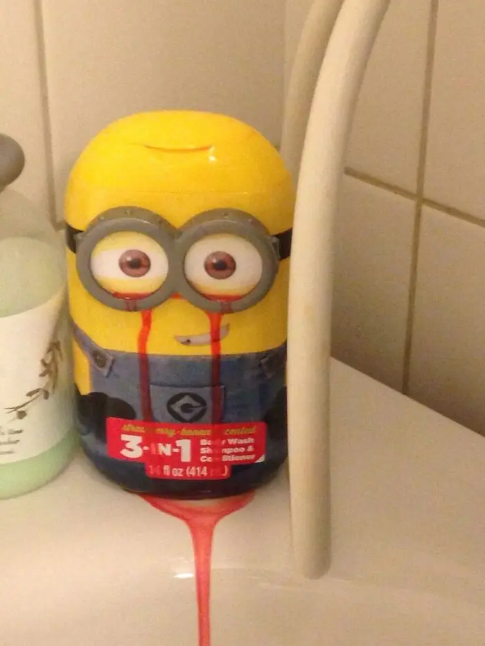
Yellow Minion body wash dispenser leaking red soap from the bottom as an example of terrible designs.
26points

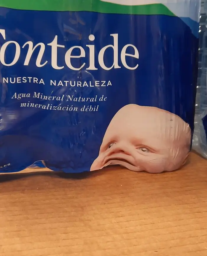
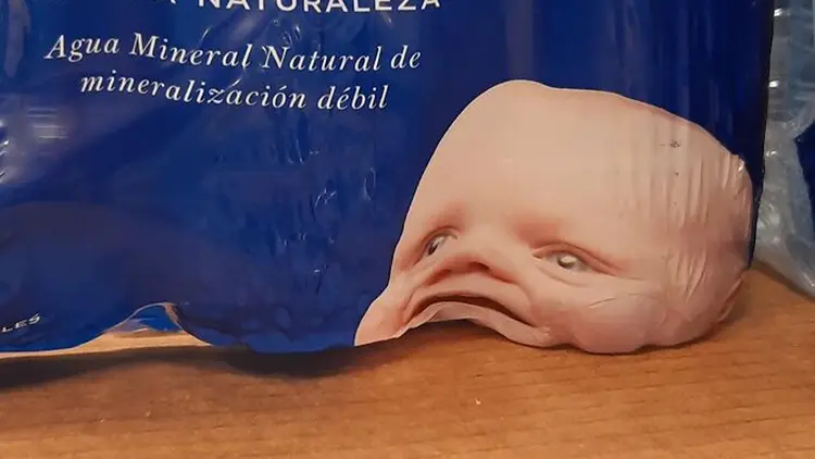
#2 The Placement Of This Baby's Head Wasn't Quite Thought Through

Distorted face artwork on a plastic water bottle wrapper showing terrible designs.
24points

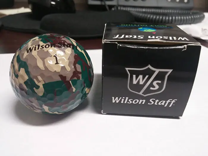
#3 I Received The Most Useless Item Ever At A Golf Tournament

A camouflage golf ball, an example of terrible designs due to how easy it would be to lose
Report
23points

Some may argue that a few design “fails” featured on this list aren’t all bad. After all, imperfect work can have its own appeal. So what makes a design bad? Is it all aesthetics? 

Researcher and Nielsen Norman Group co-founder Jakob Nielsen says it all boils down to one key factor: usability. He explains that it “makes designs easy, efficient, and satisfying to use.”
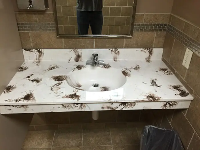

#4 Not Exactly The Color Pattern You Like To See In A Bathroom

A bathroom sink with a mottled brown pattern that looks like dirt, showing a terrible design choice.
22points

#5 Why You Don’t Put Christmas Lights On Palm Trees

Palm trees wrapped in holiday lights creating a terrible design with questionable shapes.
Report
22points

#6 I Almost Gagged When I Opened The Cabinet In My Bnb. Turns Out It Was Just The Design
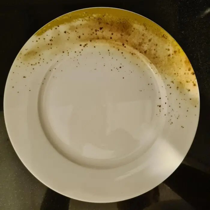
A white ceramic plate with a brown speckled border resembling dirt, showcasing terrible designs.
Report
20points

But what exactly is usability? Nielsen defines it as a quality attribute defined by five quality components: learnability (how easy it is for users to accomplish basic tasks the first time), efficiency (how quickly users can perform tasks), memorability (how easy it is for a user to establish proficiency after a period of not using it), errors (the number of mistakes users make and how severe they are), and satisfaction (this is self-explanatory). 

Nielsen also pointed out another key factor alongside usability: utility. And it should answer one important question: “Does it do what users need?”
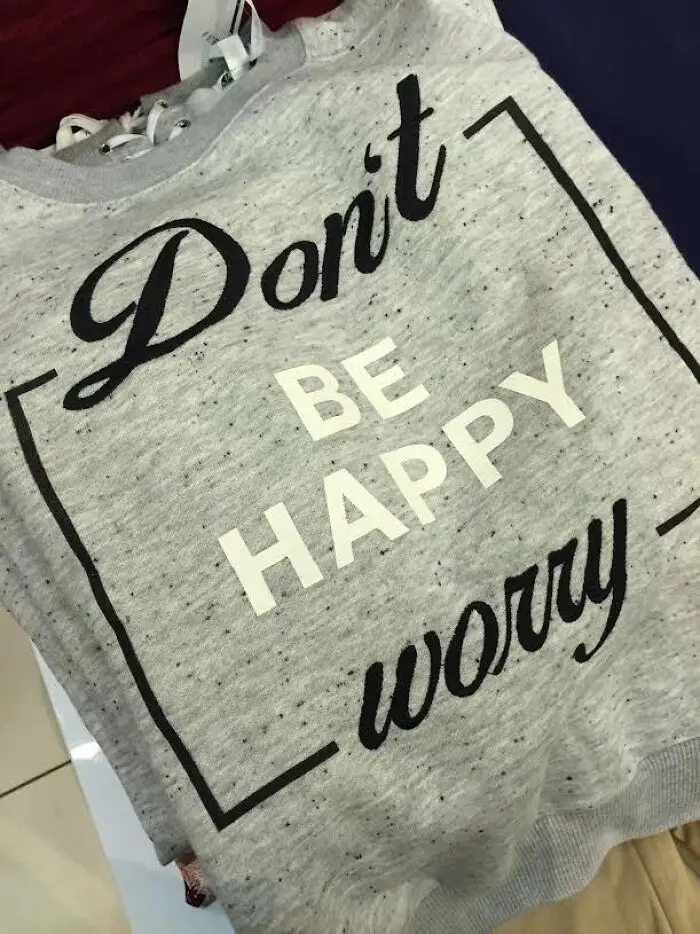
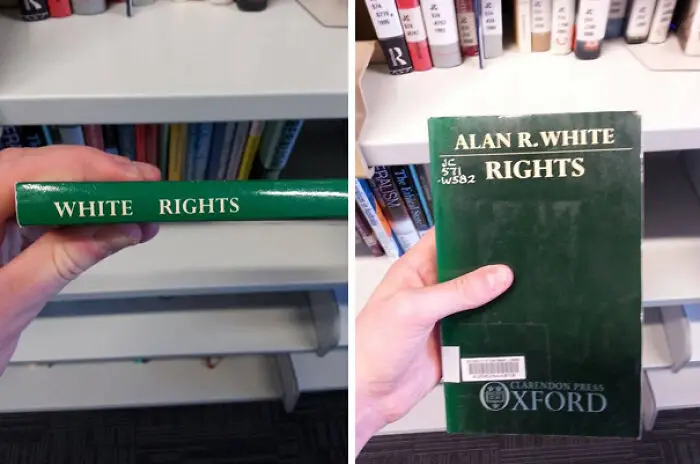
#7 Thanks For The Advice

A shirt featuring confusing text layout that reads Don't Be Happy Worry, illustrating a terrible design fail.
Report
20points

#8 White Rights

A book spine aligning author name to read White Rights showing a terrible design
Report
19points

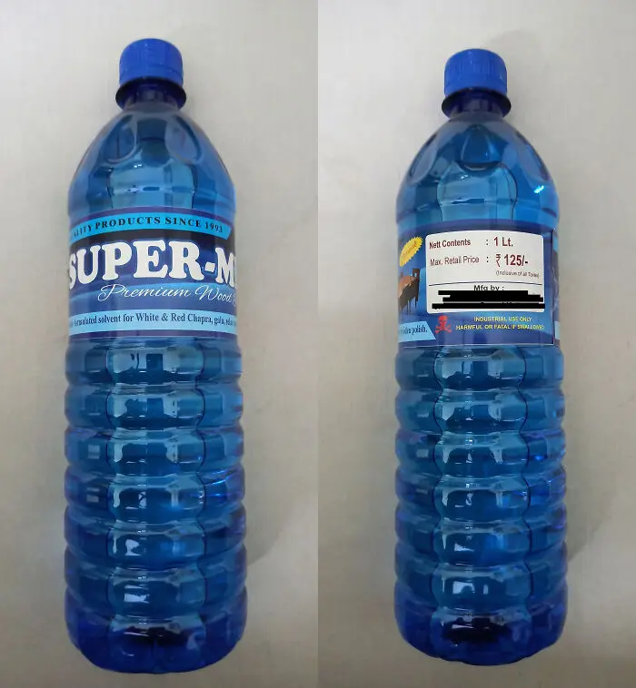
#9 Almost Drank From This Bottle Of Wood Polish Disguised As A Water Bottle

A blue bottle of chemical solvent designed to look like a water bottle, an example of terrible designs.
18points

But the bigger question is: why are companies producing badly designed products in the first place? According to an article by author and speaker Scott Berkun, one possible reason is that universities treat technology and design as separate subjects. 

“Absent from required classes, then or today, are the interdisciplinary insights that are essential to designing good things for people. Instead, students are taught to build things that function technically but not humanely,” wrote Berkun, who studied computer science at Carnegie Mellon University.

#10 This Sidewalk Looks Blurry. Makes Me A Little Dizzy. I Keep Blinking, Trying To Clear My Eyes Looking At This
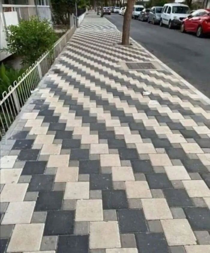
A disorienting zigzag paved sidewalk, showcasing a terrible design that creates a trippy visual optical illusion.
18points

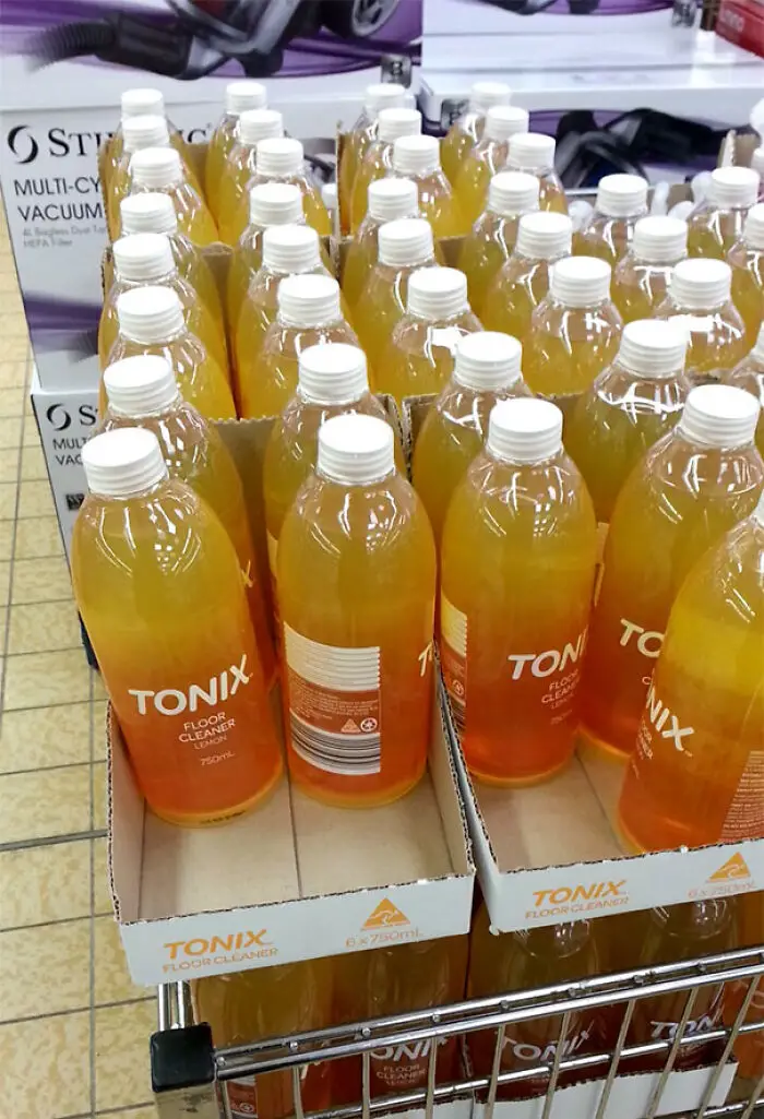
#11 Tonix Sounds Like A Soft Drink Though

Clear bottles filled with orange floor cleaner packaged like juice, illustrating terrible designs for household products.
Report
18points

#12 Opening The Box With The Pull Tab Destroys Both Heating Instructions And Customer Service Contact Number
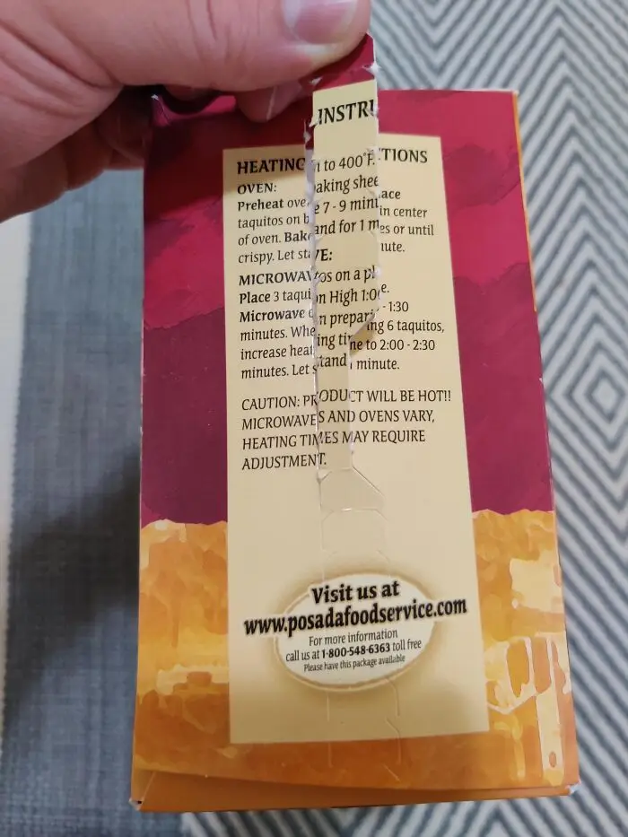
Food packaging tear strip placed directly over the cooking instructions, demonstrating terrible designs.
17points

Berkun also pointed out that engineers and designers tend to assume that what works for them will also work for everyone else. He says the damaging effect of thinking “what’s good for me is good for all” runs deep in society. 

“Without expert help, we are all prone to forgetting that a design that’s intuitive to us can simultaneously be confusing to others,” Berkun explained.
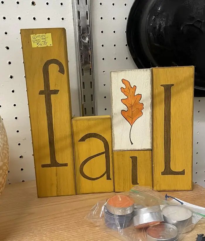
#13 These Blocks That Should Say “Fall” But Definitely Say “Fail”

Wooden decorative blocks meant to spell fall with a leaf for the letter L, accidentally reading fail due to terrible designs.
16points

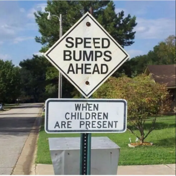
#14 Do The Children Lay On The Road?

A sign saying Speed Bumps Ahead mounted above another sign saying When Children Are Present, showing terrible designs.
Report
16points

#15 Got This As A Gift And Honestly I Don't Want To Throw It Away Just Because It's Terribly Funny
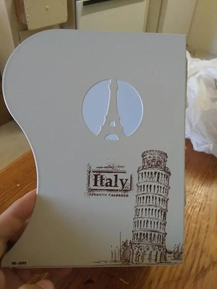
A souvenir book with terrible designs featuring the Eiffel Tower printed above the label Italy.
15points

According to Berkun, the onus of becoming more educated about good design shouldn’t fall solely on designers. He says this applies to everyone, from consumers to business leaders. 

“This is often as simple as valuing design experts enough to listen to them at the start of projects when the important decisions are made, rather than at the end when their advice will be far too late,” Berkun said.
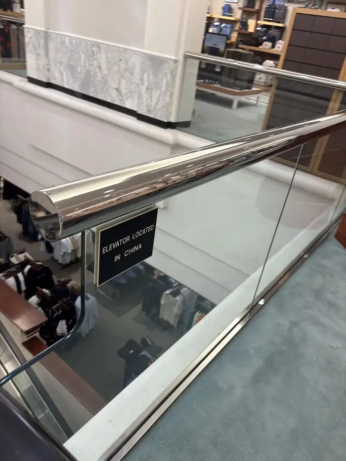
#16 As Opposed To The Sign Which Is Located In New Mexico

A small sign on a glass railing in a store reading elevator located in china, showcasing a terrible design in signage.
15points

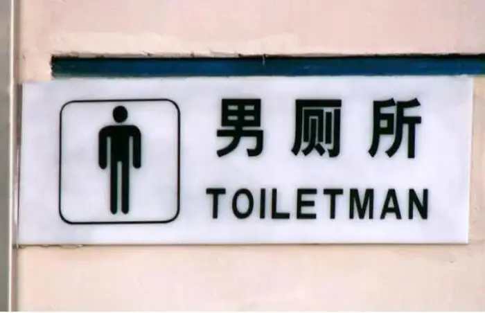
#17 Men's Restroom Sign Error

A bathroom sign translated as Toiletman alongside a male pictogram, demonstrating terrible designs.
15points

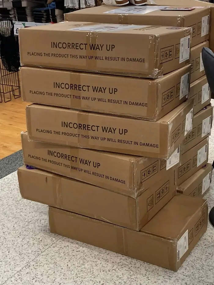
#18 Are These Boxes The Wrong Way Up?

Cardboard boxes showcasing terrible designs printed with Incorrect Way Up printed upside down
Report
14points

Not all of us are design experts, but we all know good design should make our lives easier. But as these examples show, not every designer seems to get that memo. Sometimes, there is nothing left to do but laugh it off and accept it as a fact of life. 

Which of these photos confused you the most? And have you ever encountered a design that made you wonder whether common sense was involved? Let us know in the comments!
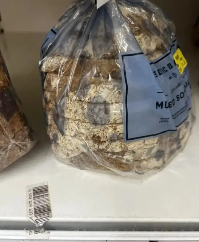
#19 This Awful Bread Packaging Design, Which Looks Exactly Like Mould

Bagged sliced bread with blue seeds resembling mold, illustrating a terrible design for bakery product packaging.
14points

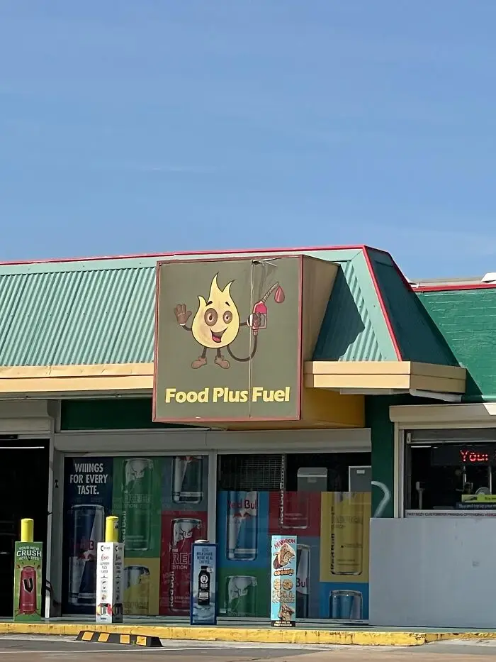
#20 Dunno About Having Fire As A Petrol/Gas Station Mascot…

A convenience store sign showing a flame character pumping gas into itself as an example of terrible designs.
14points
44
5