





Before social media platforms gave everyone a ready-made profile, people had to create their own little corners of the internet. GeoCities made that much easier by letting anyone with an email address build a personal webpage for free. Users could use simple templates and forms instead of learning complex tools like HTML or FTP.
This freedom led to all sorts of personal projects. People could make fan pages for their favorite bands, share hobbies, post photos, or write about daily life. The pages often looked a bit rough, but that was part of the charm. People finally had a place online to express themselves without following anyone else's design rules.
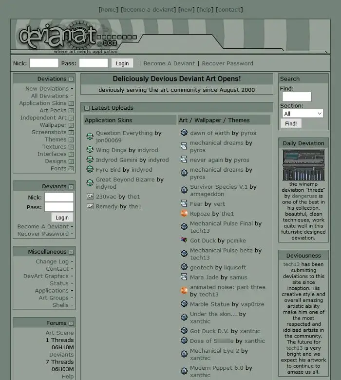
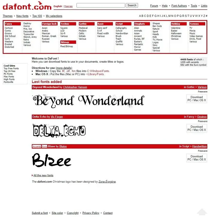
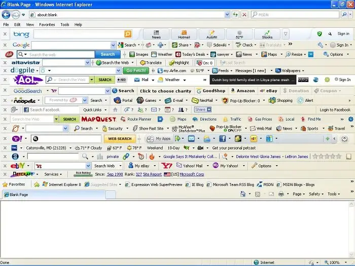
Once ordinary people started building their own websites, the internet developed a visual personality of its own. Designers experimented with tiled backgrounds, bright colors, animated GIFs, visitor counters, and blinking text. Guestbooks and "under construction" signs were common, too. Since there were no strict minimalist trends, many pages packed in as much personality as they could.
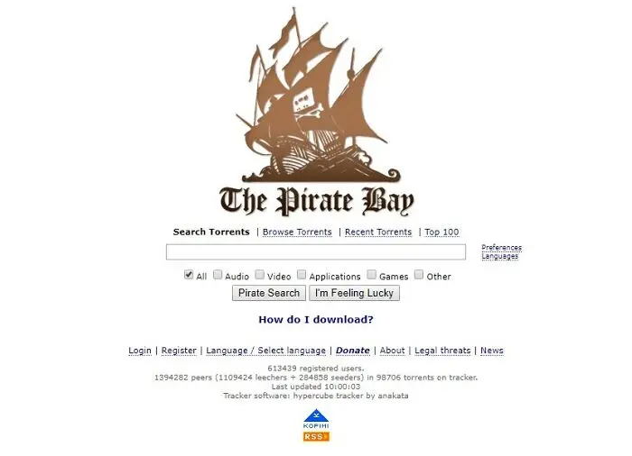
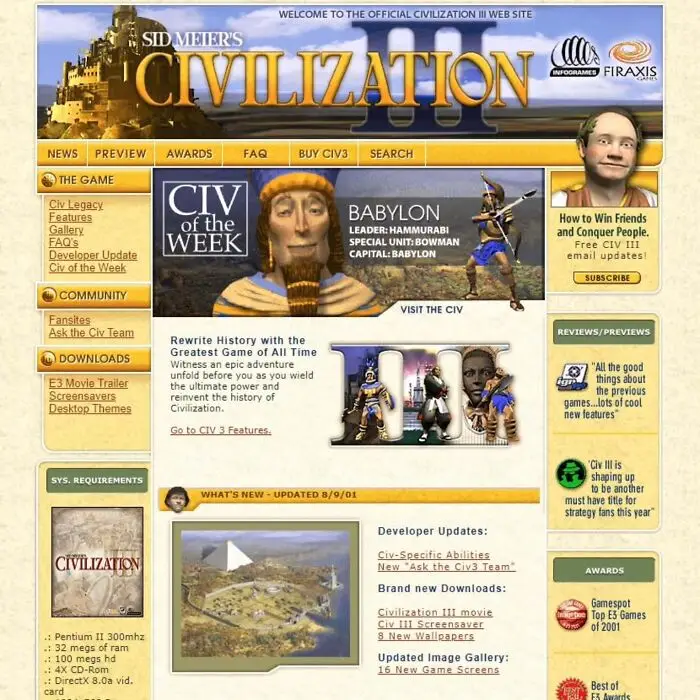
Technology influenced these unusual designs, too. Early browsers had few styling options, and CSS was just starting to become popular in the mid-1990s. Many people used HTML tables to organize text and images, which sometimes led to awkward layouts. The internet looked messy compared to today, but it gave people lots of freedom to experiment.
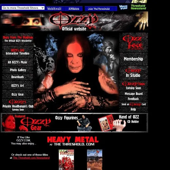
Personal websites soon became more than isolated pages. GeoCities organized them into themed neighborhoods, where people with similar interests could find one another. Users made pages about technology, music, hobbies, and entertainment. By 1999, there were 41 neighborhoods and tens of millions of personal pages.
These online neighborhoods made it easy for visitors to interact. People signed guestbooks, shared links through web rings, and left messages on each other's pages. Some volunteers welcomed newcomers and gave out awards for websites. It felt more like visiting someone's home in a quirky digital town than scrolling through an endless feed.
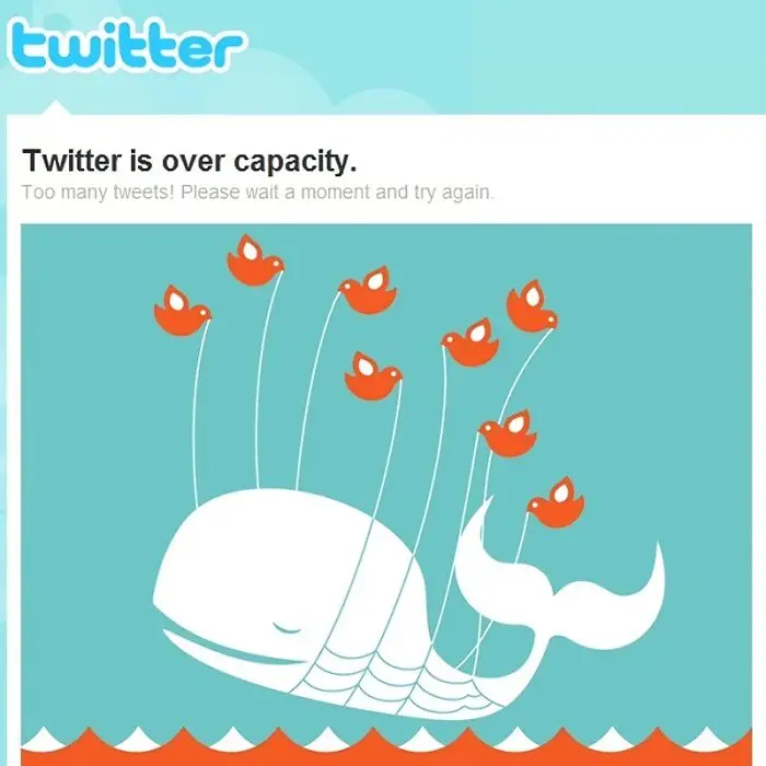
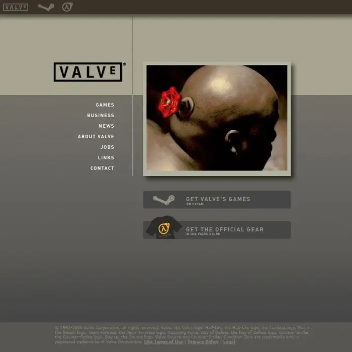
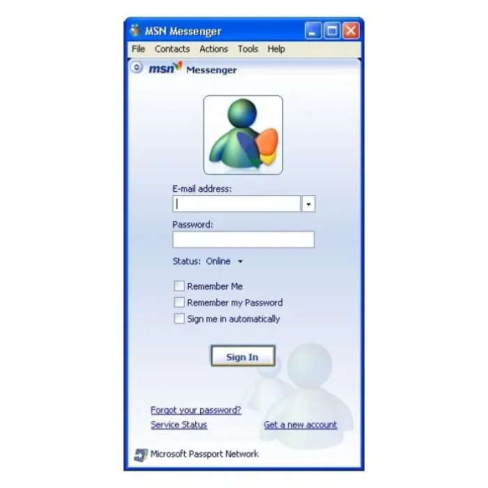
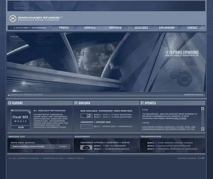
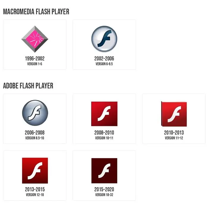
As personal websites became more creative, developers wanted to give visitors something beyond text and static pictures. Adobe Flash helped make that possible by adding animations, interactive games, and multimedia experiences to web pages. With Flash, websites could have moving characters, animated menus, sound effects, and even games that people could play right in their browsers.
Over time, Flash lost its place as web technology advanced. HTML5, WebGL, and WebAssembly gave developers new ways to make interactive content without needing a separate Flash Player. Adobe stopped supporting Flash Player on December 31, 2020, and blocked Flash content in January 2021. This was the end of an era for many classic websites.
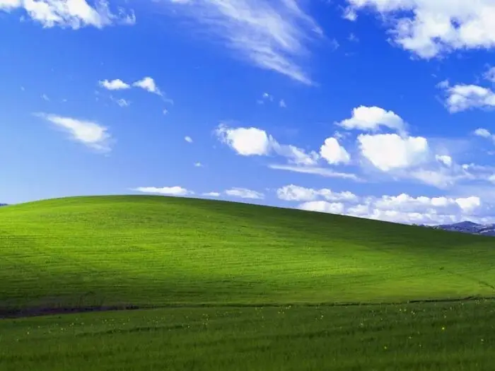
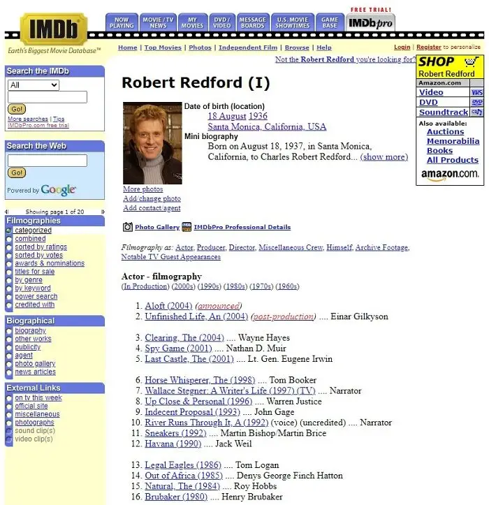
Those colorful websites also reflected the technology people had at the time. In the mid-1990s, many users connected through dial-up modems running at just 14.4 kbps. Since loading big images could take a minute, creators usually limited graphics and focused on simple text and navigation.
When modem speeds got faster and browsers added new features, designers could try more things. A 28.8 kbps modem gave many users twice the speed, and later 56K and broadband made it easier to load richer pages. Websites slowly moved past just text and links, allowing for more creative layouts, images, and multimedia.

We’re talking about a time before modern social media became a place to share everyday moments. Back then, people used sites like MySpace and Fotolog to show who they were. MySpace let you customize your profile, share music, and connect with friends. Fotolog was all about posting photos and leaving comments. Both sites helped people express themselves online.
I remember using MySpace and Fotolog myself, and part of the fun came from making those spaces feel personal. You could choose how your page looked, share the songs you loved, upload pictures, and leave comments for friends. Fotolog was an insane hit, even attracting 15 million subscribers by 2008, with users publishing around one million photos every day.
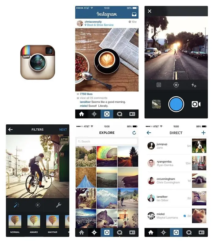
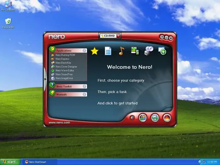
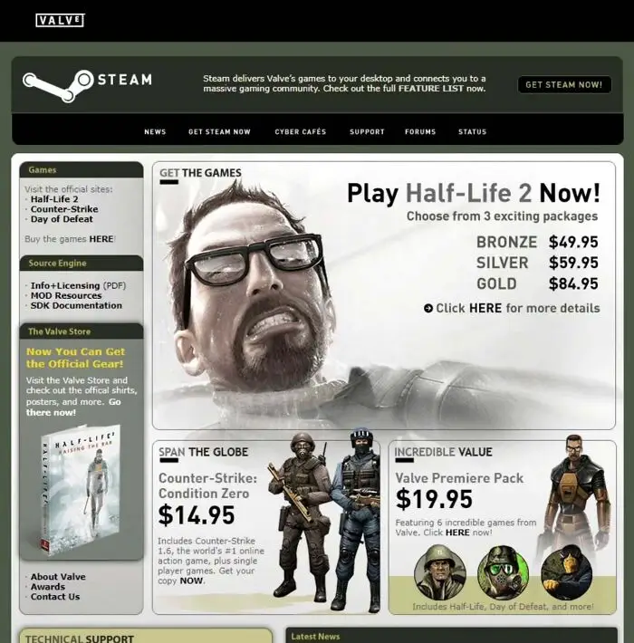
Looking back at old websites, I get more than just memories of outdated technology. Browsing through these photos reminds me of a certain time in my life. And it’s not just me. These memories often bring back good feelings and help us feel closer to the experiences and people from our past.
This emotional connection is part of why so many people are still fascinated by the early internet. Going back to old platforms, personal pages, and familiar designs can feel like opening a time capsule. If you spent time on GeoCities, MySpace, or Fotolog, these throwbacks let you reconnect with a version of the internet that felt truly personal.
The internet looks very different now, but those early websites still mean a lot to many people. Do you remember any of these old-school designs? Share your favorite internet memories in the comments!