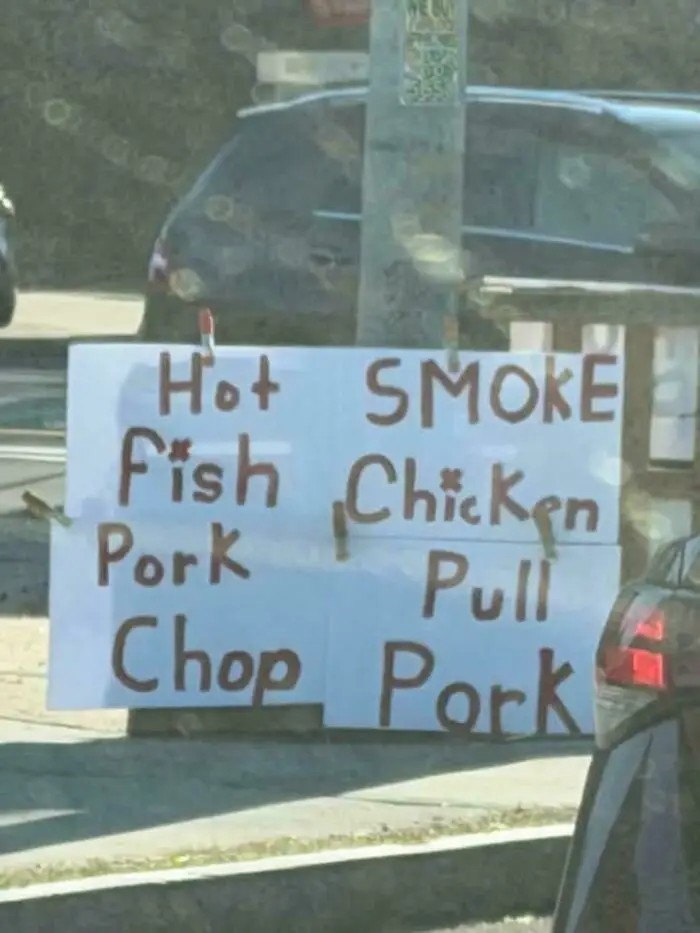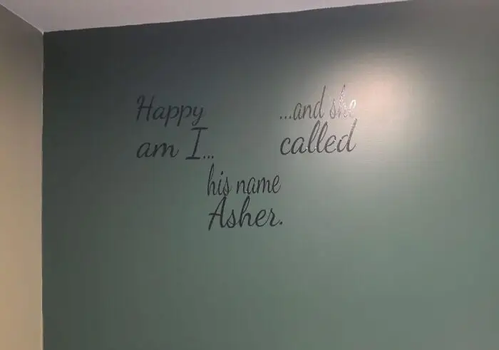


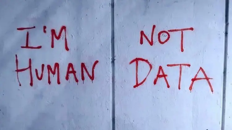


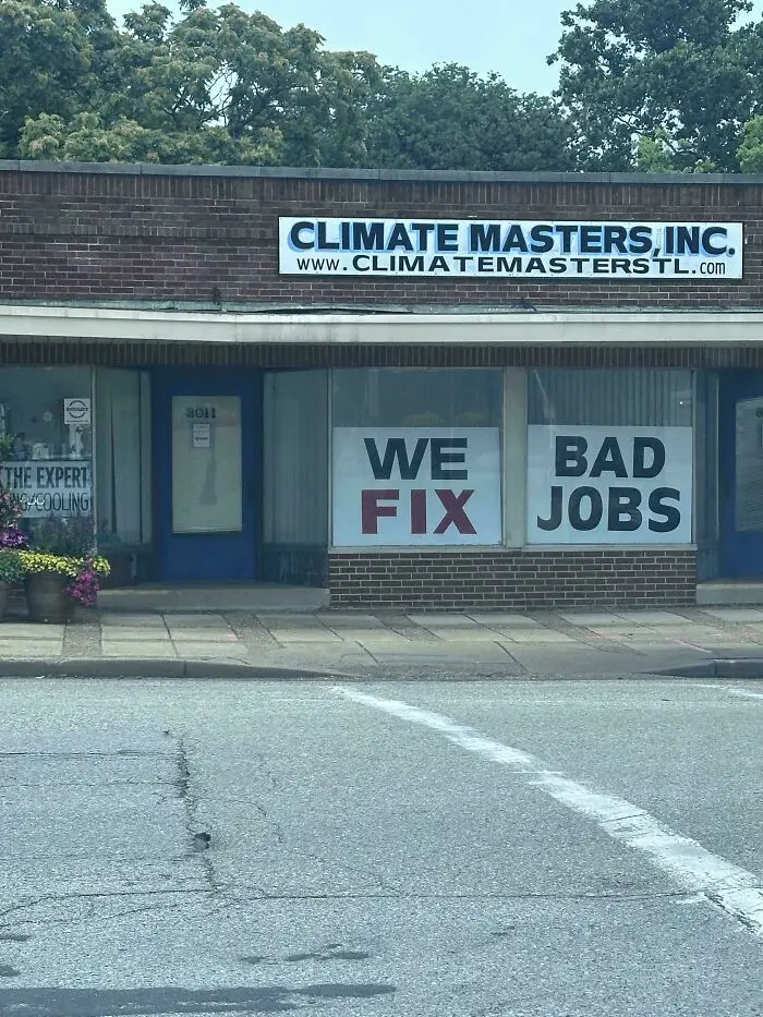
The inspiration for the DDOI online group comes from the massively popular TV series ‘The Walking Dead.’
The show had a promotional poster that, due to the bizarre spacing, warped the message written on a door. The signage here was so hilariously bad that it became a meme and spread online.
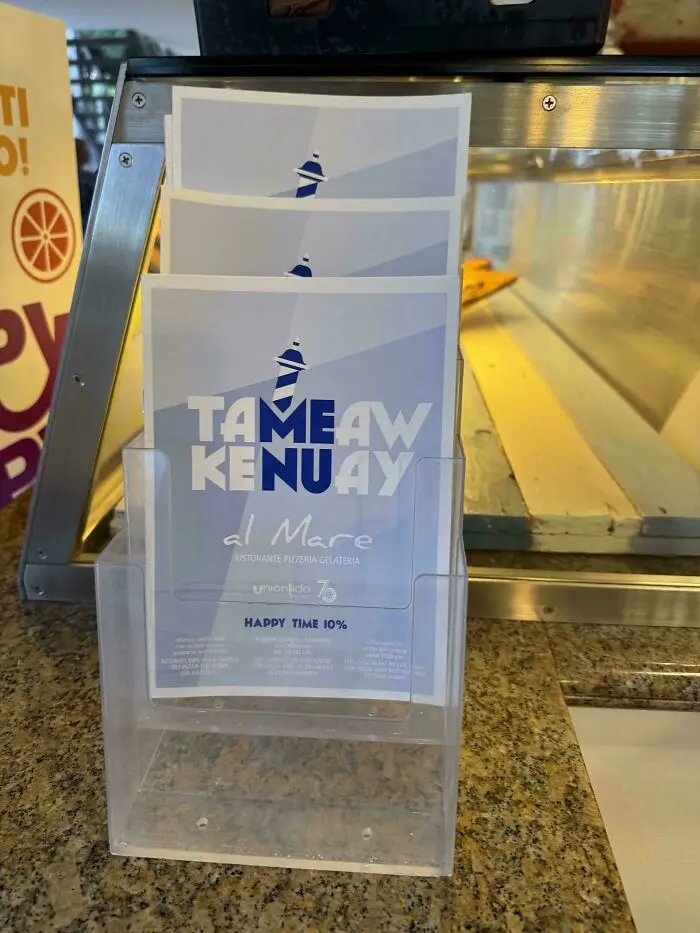
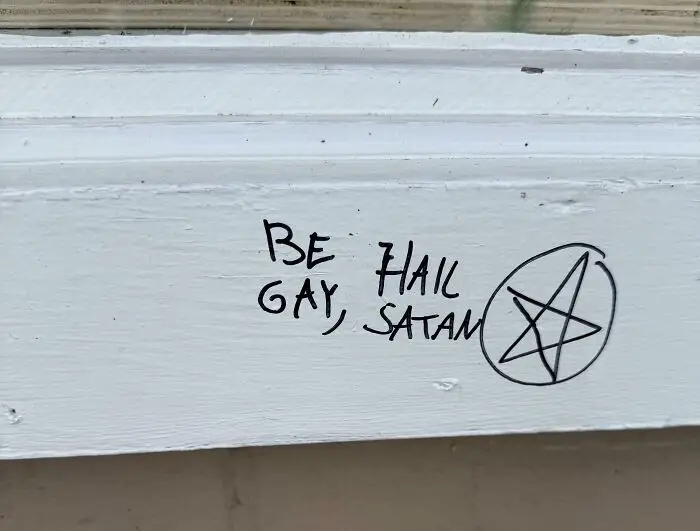
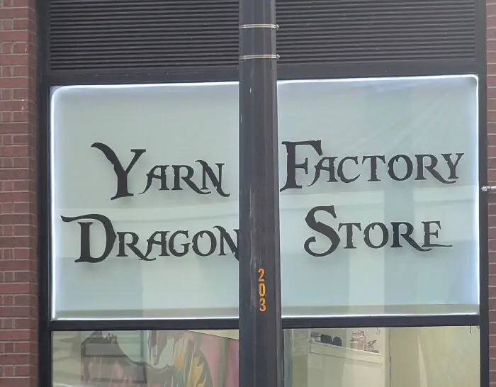
The DDOI online community is practically legendary by now. It has been calling out hilarious and nonsensical visual design fails since 2014.
Now, nearly 12 years after the group was started, it continues to draw in a massive crowd of gawking internet users and people eager to call out bad signs. At the time of writing, the subreddit gets 36k visitors per week.
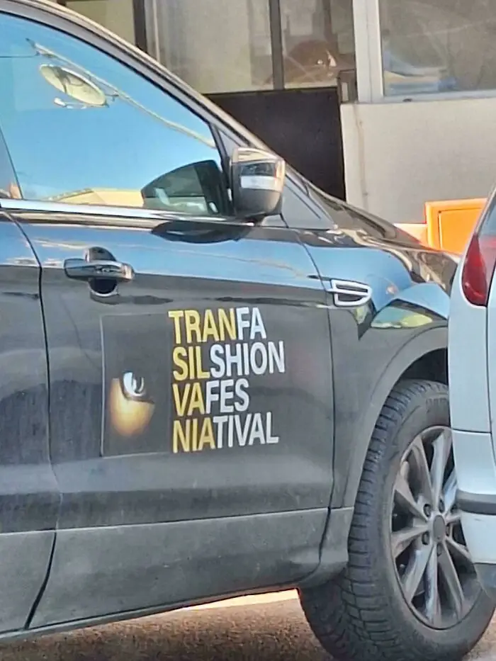
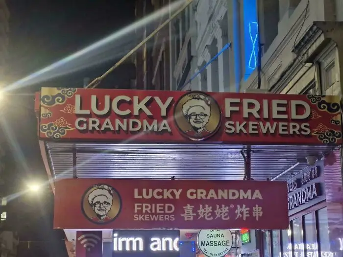
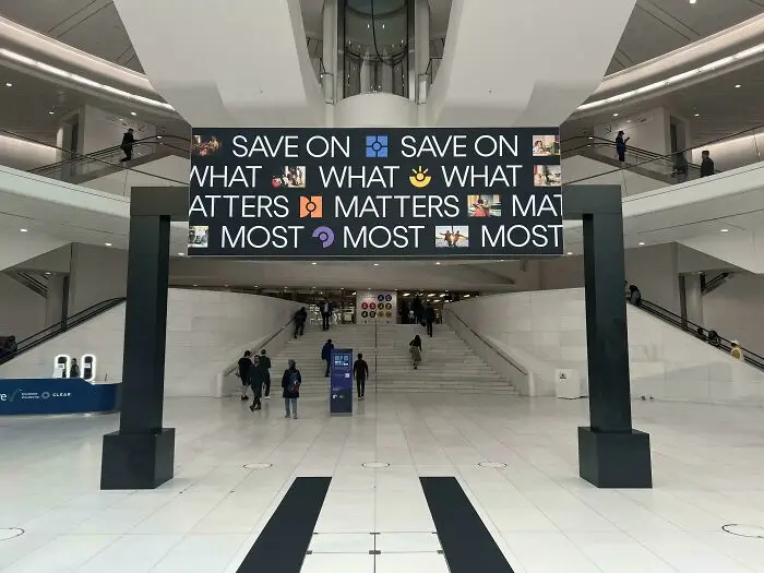
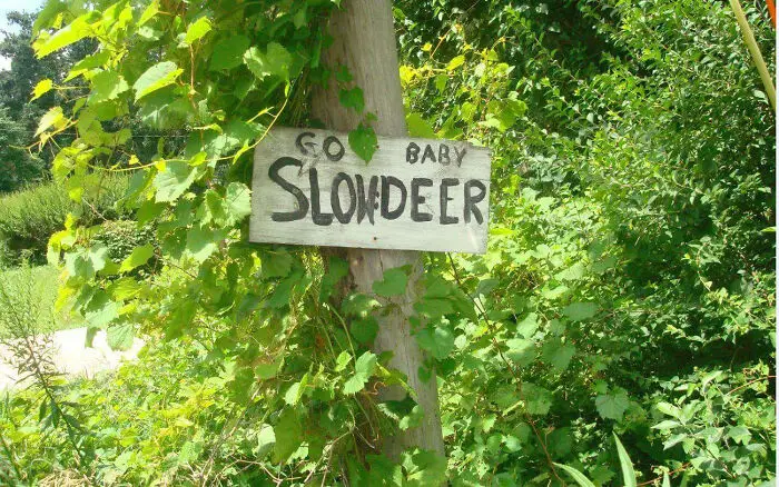
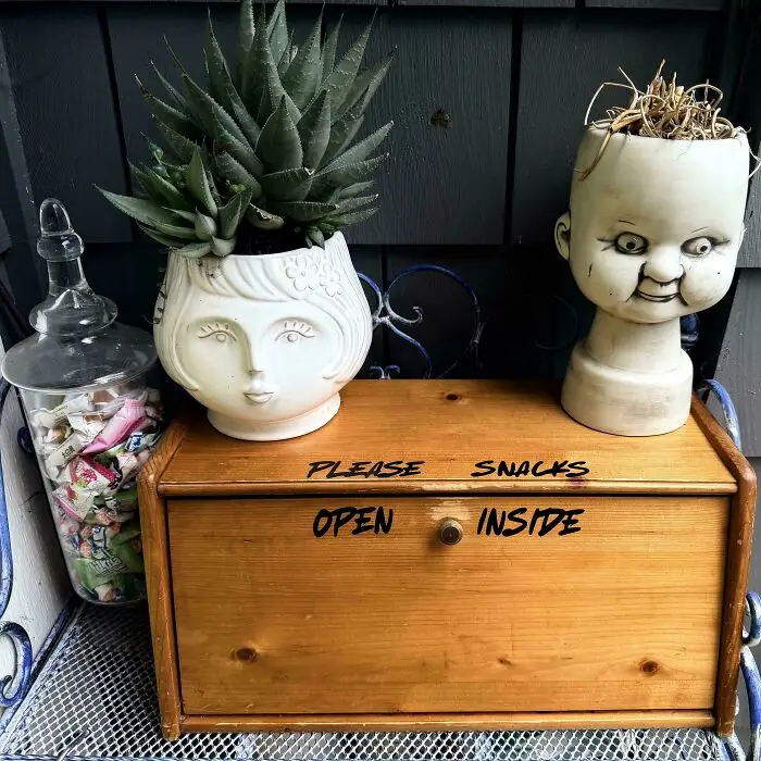
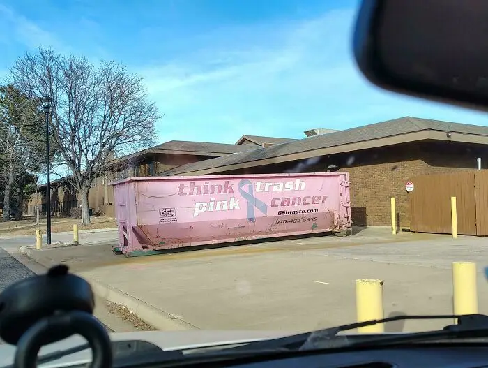
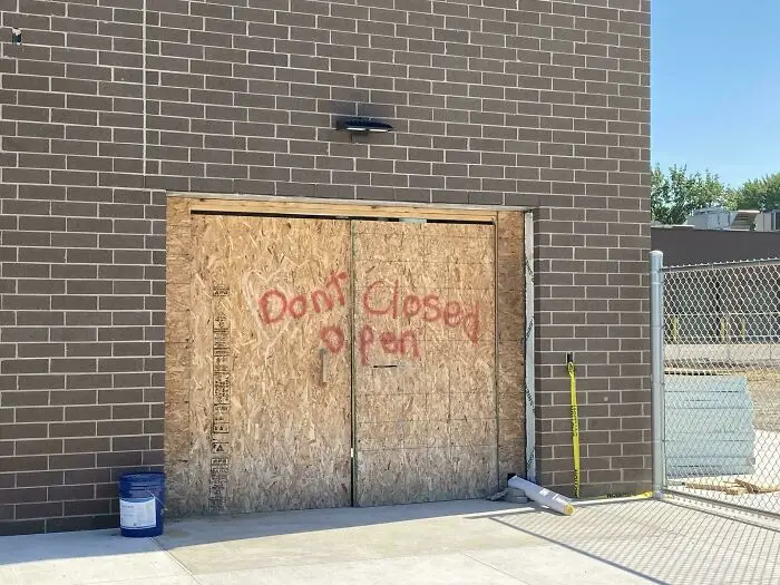
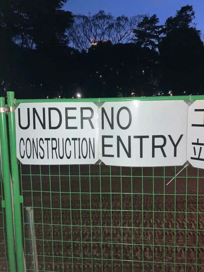
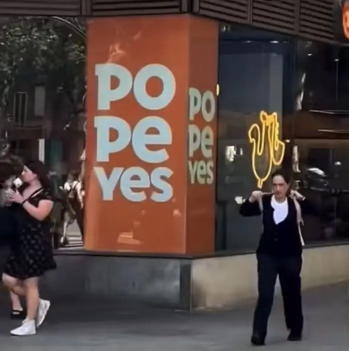
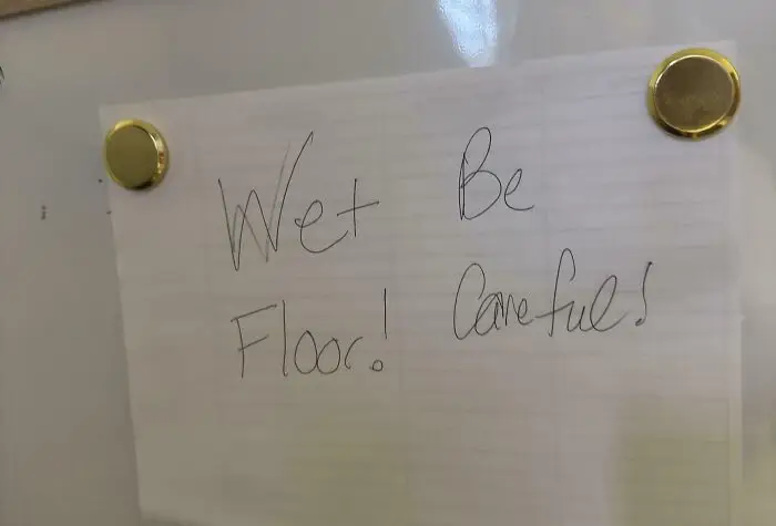
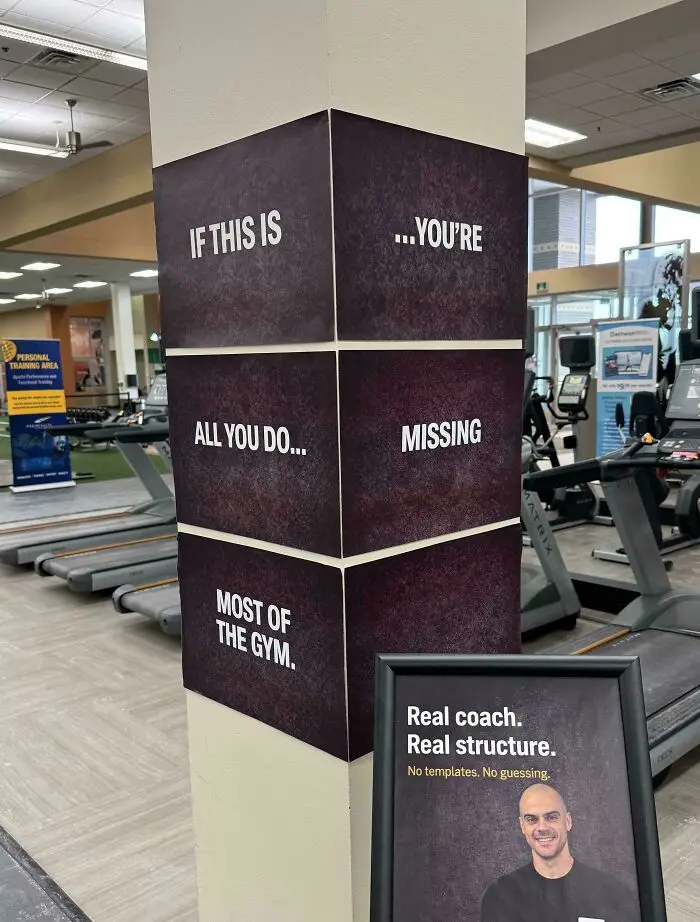
The essence of the DDOI online group is sharing visual designs, signs, posters, and other examples of text that, when read regularly from top to bottom and left to right, end up confusing, nonsensical, and funny.
The subreddit revolves around English posts, and the mistakes should be instantly obvious. The moderators who run the group that the community should avoid forcing anything or posting something that could be easily faked or staged.
Meanwhile, posters are encouraged to share the incorrect way of reading the text in the title of their post.
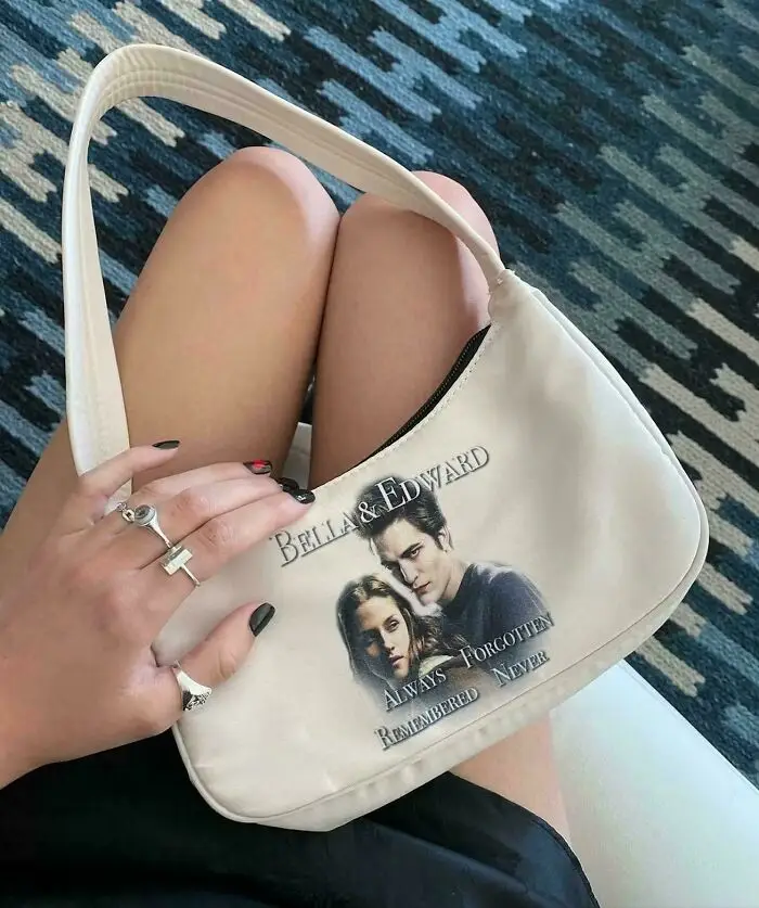
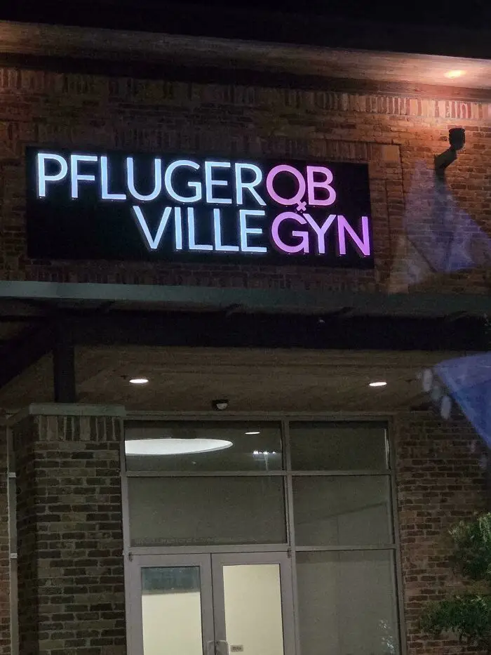
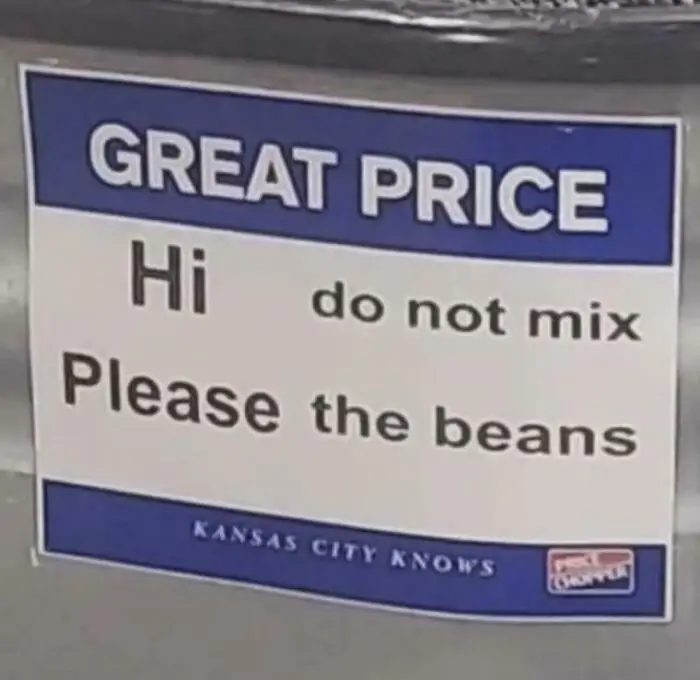
Which of these hilariously bad sign fails made you wince and cringe the hardest, and why?
What are the worst examples of visual media that you’ve personally seen in your local area? In your opinion, what can all creative professionals do to become more self-aware of the quality of their work?
Share your thoughts with all the other readers in the comments.