




Hey there, logo enthusiasts! We sincerely hope you've had your daily dose of coffee because we're about to take a wild ride through the weird and wacky world of logo design fails (I mean, who doesn’t like funny things?). So Pandas, strap in, because we're about to showcase some examples where designers took 'thinking outside the box' a little too literally.
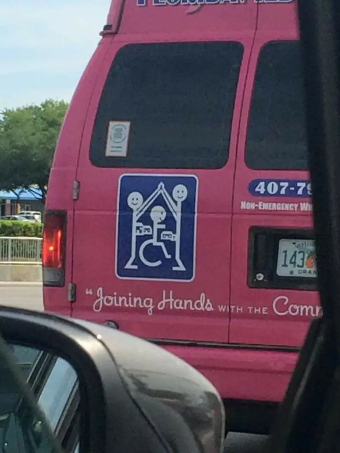
To kick off the post, we are starting off with a real gem. We all know our local pharmacies, right? The place where we get our essentials, life-saving medications, and more. Now imagine a pharmacy that, for some peculiar reason, thought, "Yes, a hanged family would make a great logo for our company". Man, you're probably thinking, "No way?! How did someone not see anything wrong with this before it went up?" Well, buckle up, because this is only the tip of the iceberg when it comes to the logo fails you are about to see as you scroll down below.
#21 The Unfortunate Logo Of A Florists Near Me. I've Been Calling It Std's For Years. It's Sid's

Report
127points

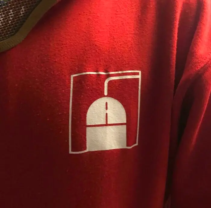


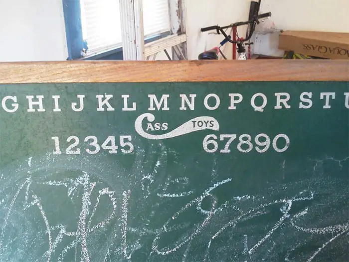

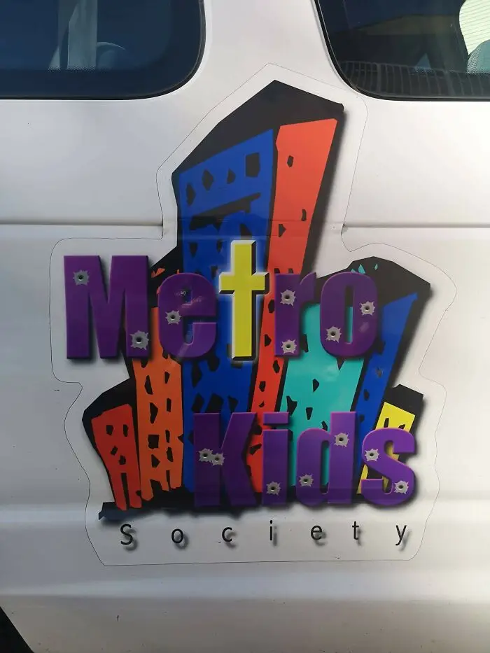
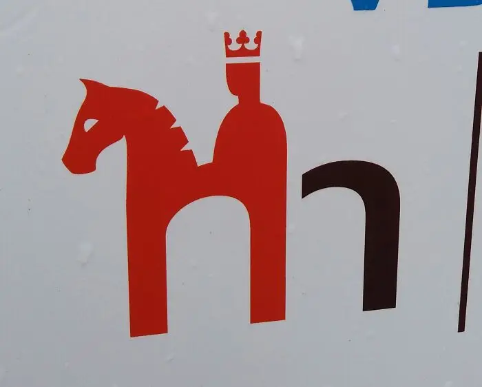
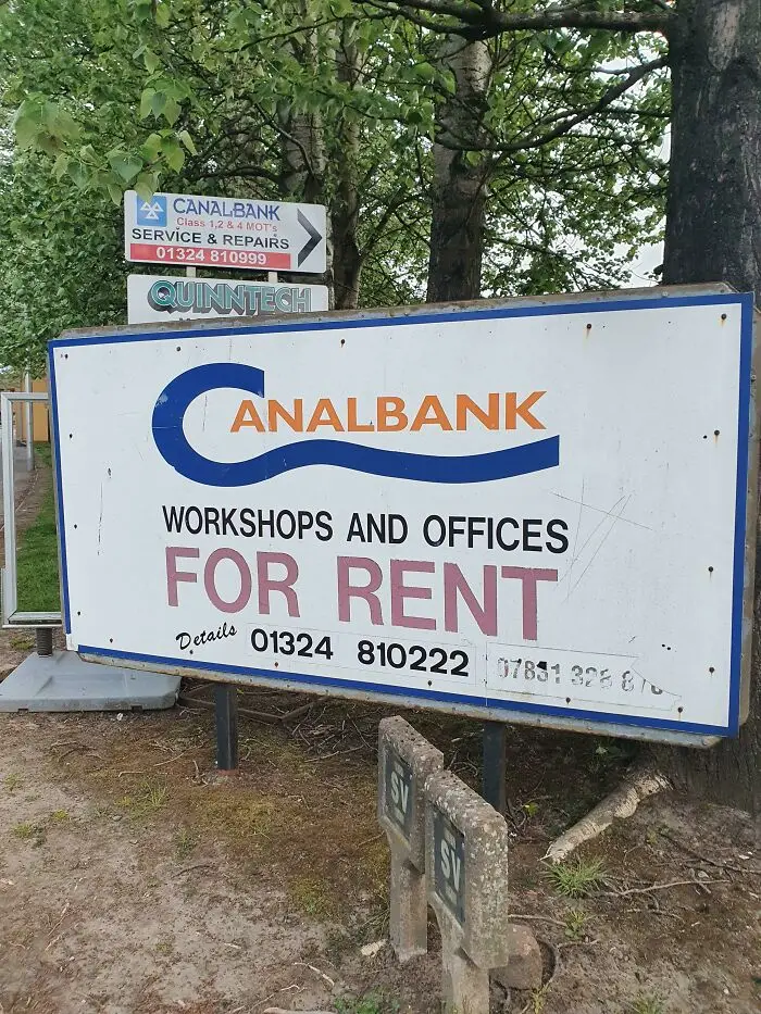

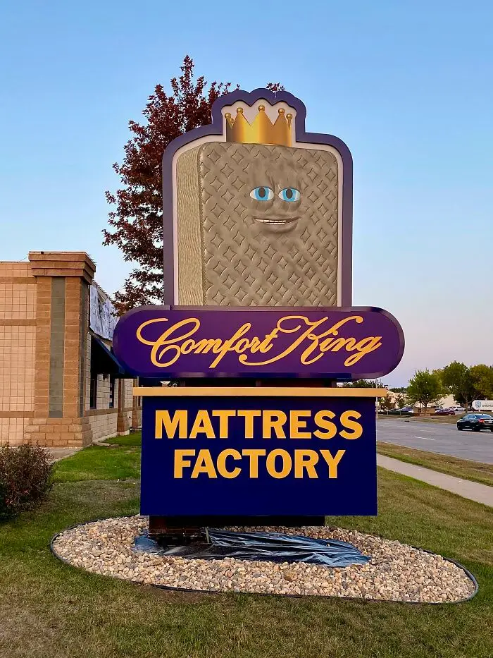
#32 Someone Paid Money For This To Be Their Sign And Logo/Mascot. I’m Convinced This Is Drug Lord’s Money Laundering Business
Report
91points

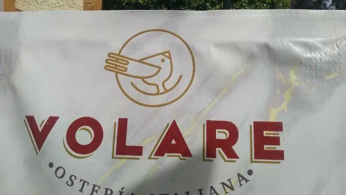
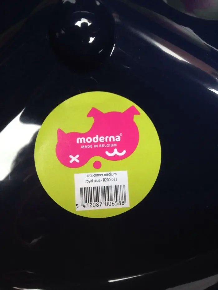
#34 This Pet Supplies Company's Logo Is Meant To Depict A Cat And A Dog, But What I See Is A Dead Bird
Report
90points