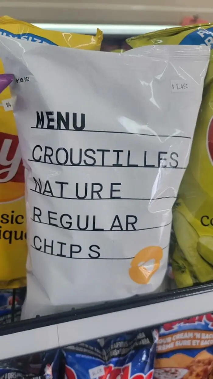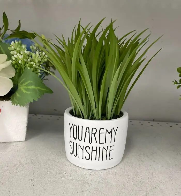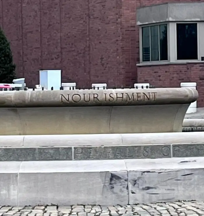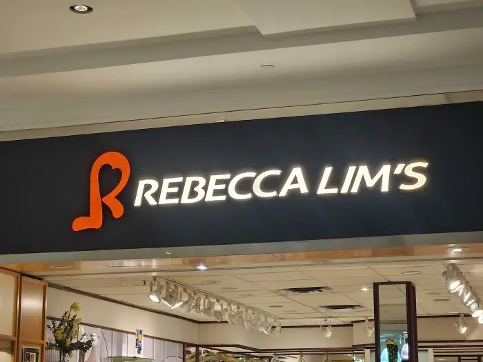


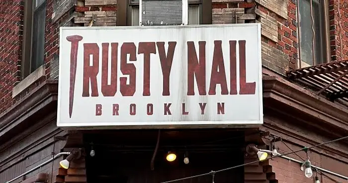


Kerning is the process of adjusting the spacing between individual characters in a font. This is done to achieve a visually pleasing and balanced appearance of the text. But as with most things, every now and then, things can go wrong.
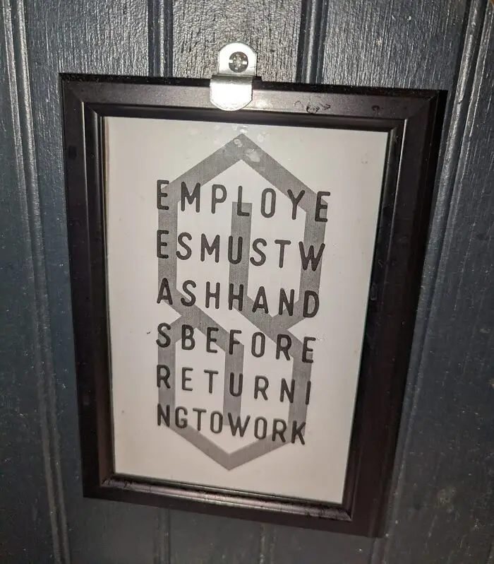
Put the symbols too close or too far from one another and you end up with awkward or humorous typography. For example, if a company wanted to make a poster advertising their "cleaning" services but made the spacing between the letters "c" and "l" too tight, it can create the word "dining" instead.
The funny part is that such mistakes are more common than we might think. And the Facebook group 'The Real Crime Is That Kerning' has all the proof. Here are some of their finds.
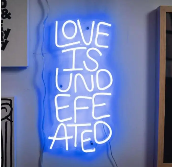
"If you’re not a designer, it’s not something you think about," DeCotes said. "People don’t realize anytime they see giant text, whether it’s on a poster, a billboard, or a website, headline fonts have probably been thoughtfully kerned.”
Assuming it's been executed well, of course!
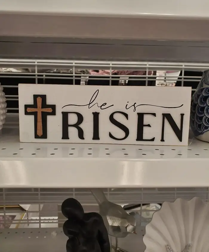
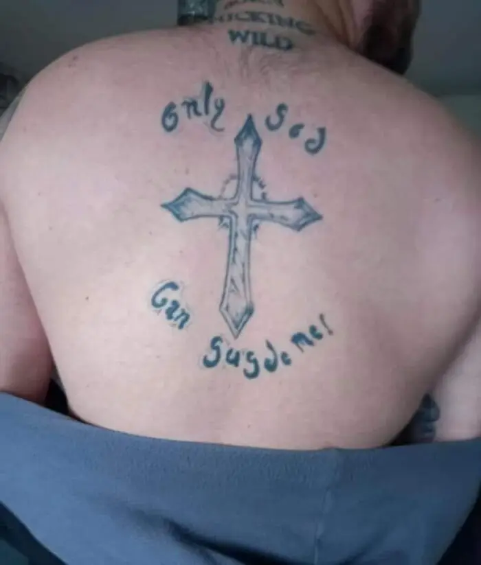
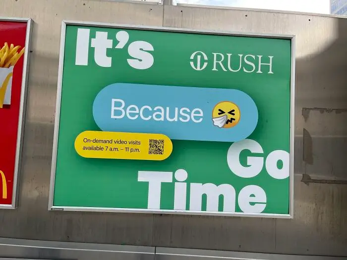
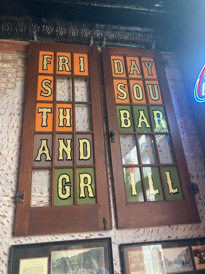
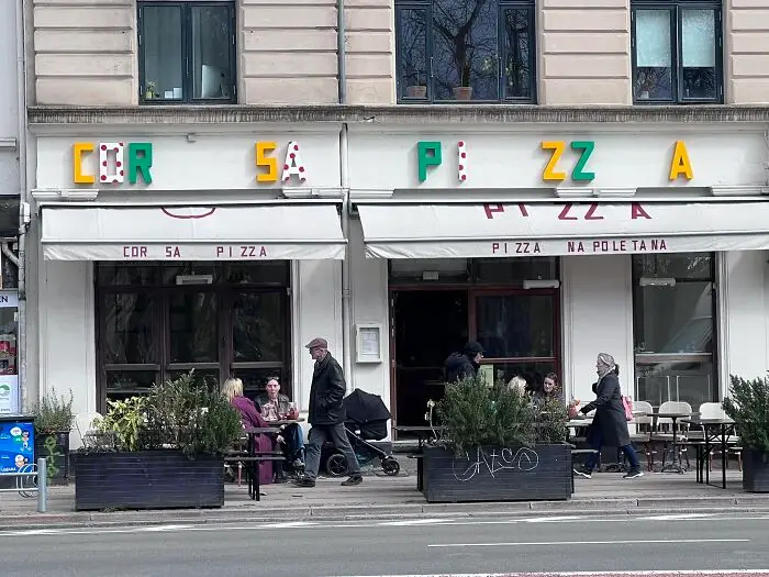
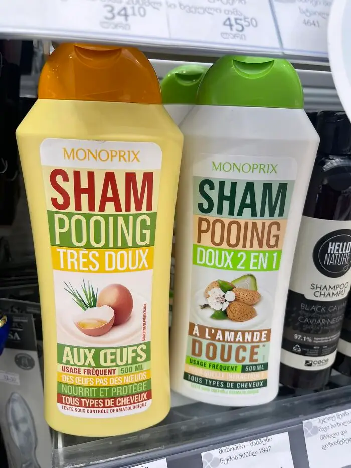
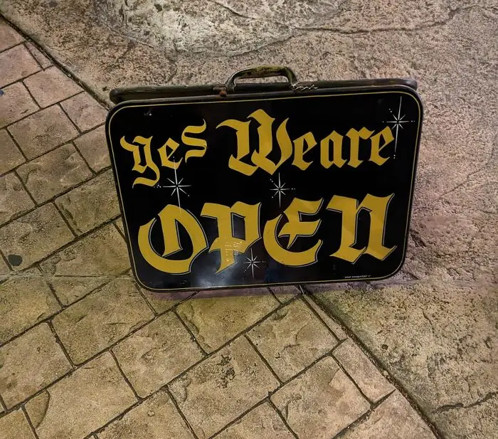
#29 I Just Saw This In A Market In Georgia Today And Could Not Stop Laughing. You’re Welcome
Report
45points

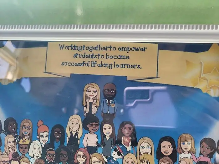
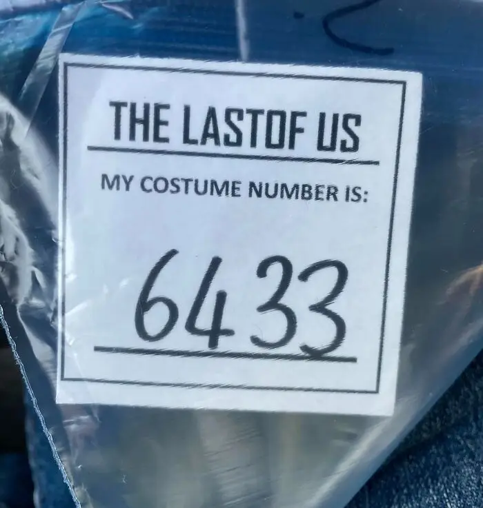
#33 A While Ago I Was An Extra On The Last Of Us, And I Had To Wait To Share This
Report
35points
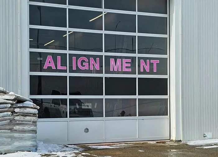
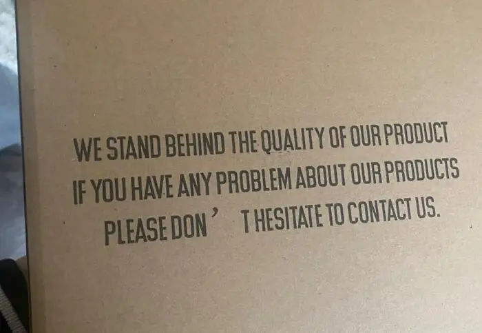
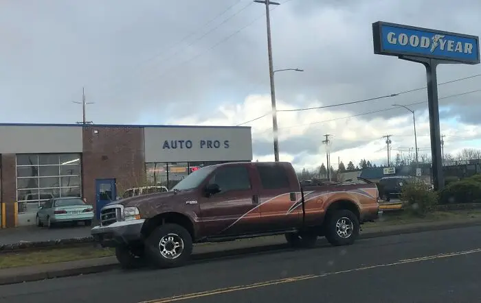
#35 Today I Learned That Automotive Professionals Are Not Typesetting Professionals
Report
33points