

We've all heard about crappy design, something that turns a blind eye to user-friendliness, logic and common sense, aesthetics, and people in general. We’re talking billboards, TV ads, product packaging and product design, websites and apps, you name it.
The phenomenon of crappy design is that no matter how much our marketing strategies and advertising techniques have evolved in the past decades, it still finds its place in our daily lives. Check out some examples of crappy design in Bored Panda’s previous features here, here and here.
This time, we are taking a step further. Sometimes the design is so annoying, senseless and defunct that it seems like the brands are doing this deliberately or at least without shame. There’s even a whole corner of reddit dedicated to cases “when a*** design things.”
With a whopping 2.9 million members, the community pokes fun at the mentality that “nothing comes before profit, especially not the consumer.” Below, we wrapped up some of the evilest designs, so let us know what you think of them in the comments!
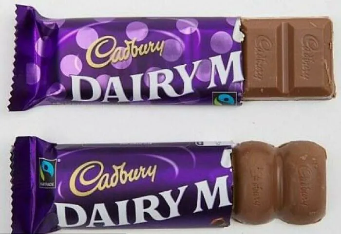
#41 Shrinkflation Used By Cadbury To Literally Cut Corners. The Bottom Chocolate Bar Is More Than 8 Percent Smaller
Report
408points
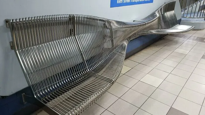
#43 Designed For Dissuading The Homeless. Literally Just Uncomfortable For Everyone Else
Report
401points
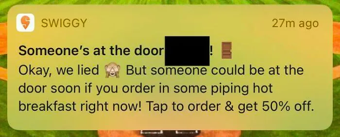
#45 Food Delivery Service That Tells You “Someone Is At The Door! Okay We Lied”
Report
389points
#47 Press Dismiss To Update This Printer
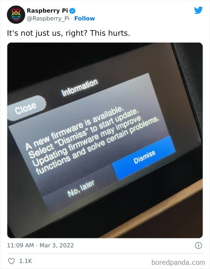
disintegore, https://twitter.com/Raspberry_Pi/status/1499341152985788417?s=20&t=xtClMxLBY0KuOytRZL2xJw
Report361points
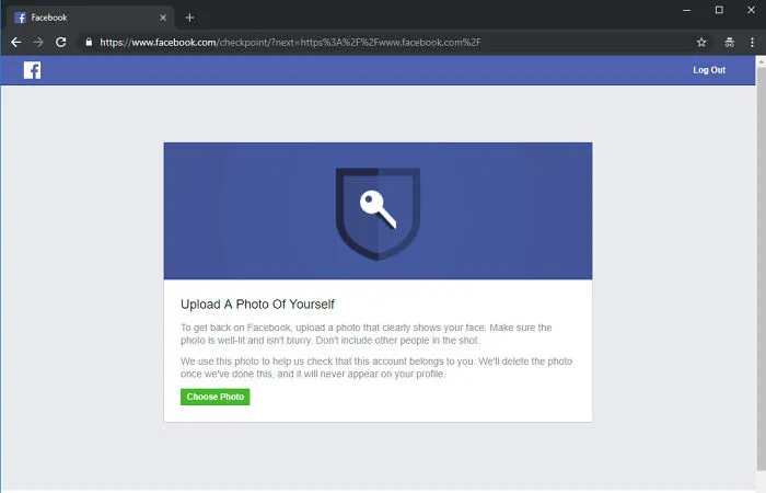
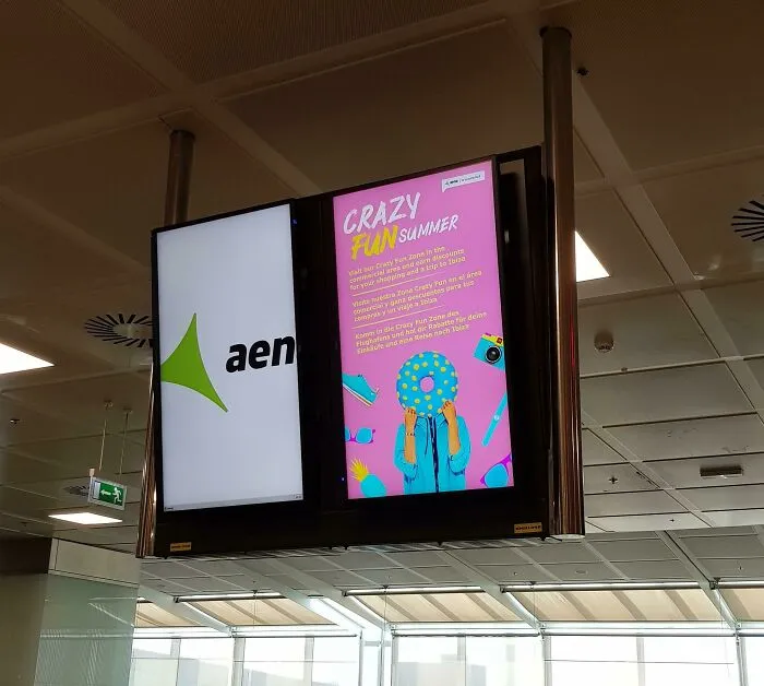
#49 Tenerife Airport Shows Ads On The Flight Information Screens Every Few Minutes (For At Least A Minute), So If You're Unlucky You Have To Wait Before Knowing Which Gate To Go To
Report
347points