







Visualization can be applied to pretty much any field; it helps to tell stories by curating data into a form that's easier to understand, highlighting any trends and outliers. And there's no place on the internet that is as obsessed with it as r/DataIsBeautiful.
The subreddit runs on a simple mission: to collect visualizations that effectively convey information. But the way its 16 million members go about it is anything but. There are no fake numbers, goofball statistics, and trivial analysis—just legitimate facts, portrayed in aesthetically pleasing ways. Such a delicate balance.
We at Bored Panda have already covered it once but when a community is that big, you know it's gonna keep delivering quality content so we just had to make an update. Enjoy!
#21 Knight Moves - A Simple Table I Made Showing The Importance Of Keeping Your Knights Near The Middle Of The Chessboard

Report
78points
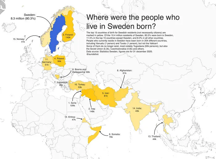
#22 The Top 15 Countries (Apart From Sweden) In Which The People Who Currently Live In Sweden Were Born
Report
74points
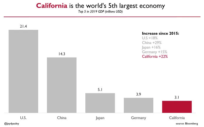
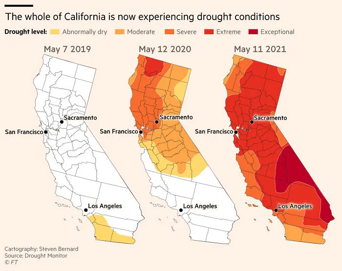
#24 Maps Showing Water Shortages During May Have Become Increasingly Extreme In California
Report
67points
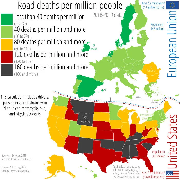
#25 Yearly Road Deaths Per Million People Across The US And The EU. This Calculation Includes Drivers, Passengers, And Pedestrians Who Died In Car, Motorcycle, Bus, And Bicycle Accidents. 2018-2019 Data
Report
66points
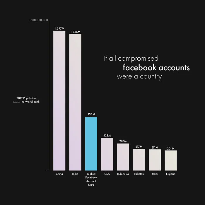
#28 If All 533 Million Compromised Facebook Accounts Were A Country
Report
59points
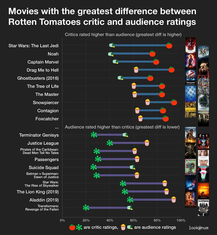
#30 Movies With The Greatest Difference Between Rotten Tomatoes Critic And Audience Ratings
Report
53points


