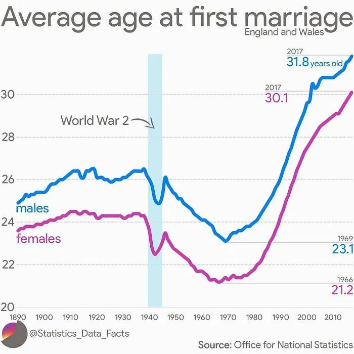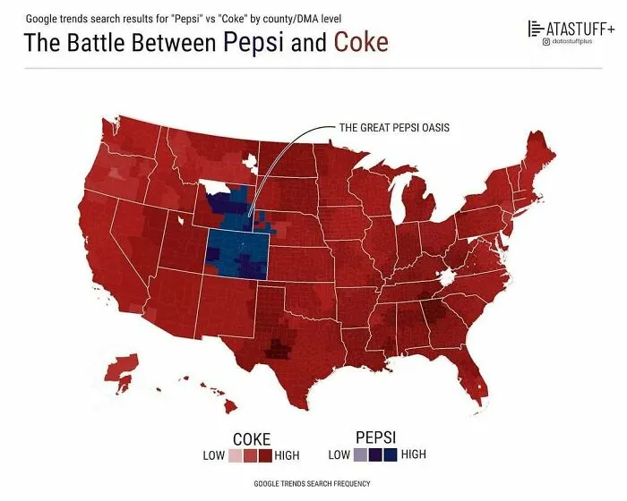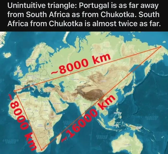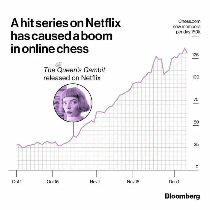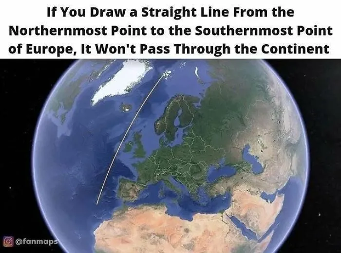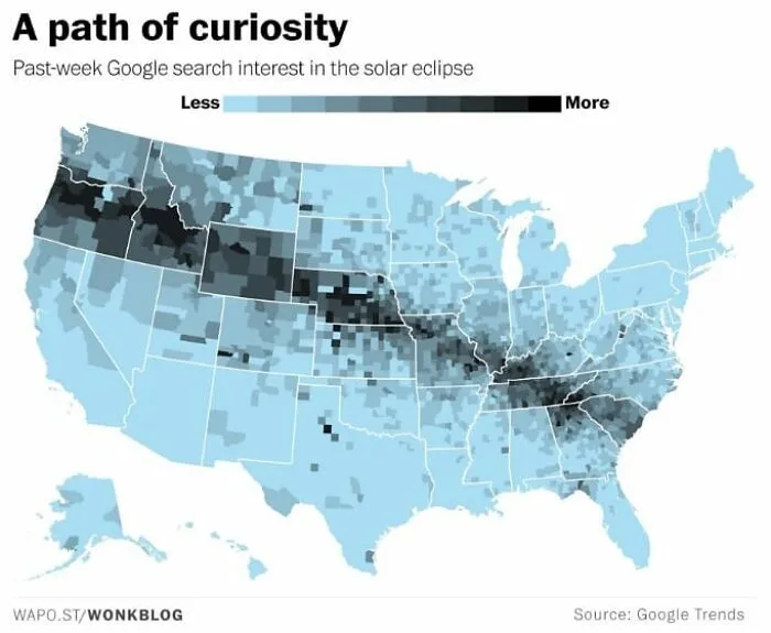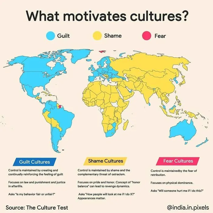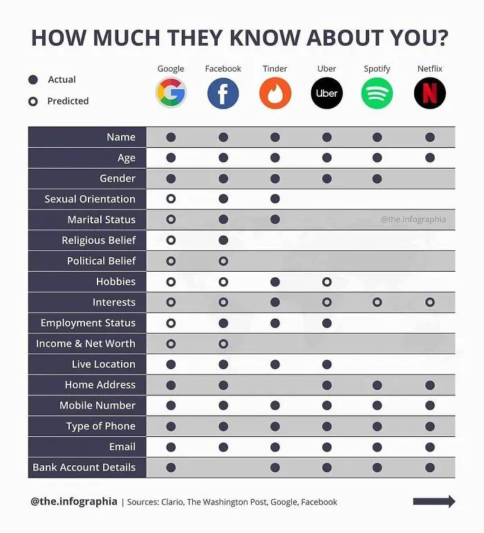



It’s also important to think about the correct way to visualize your data. Some methods aren’t as helpful as others to allow your audience to see the results. If your chart looks visually messy, then the odds are that your audience will feel lost. On the flip side, the clearer you are in your presentation, the ‘friendlier’ you are toward your audience, and the easier your findings will connect with them. You could, for instance, use empty space strategically, for the sake of better clarity.
A good rule of thumb is to redesign charts that are simply too difficult to read. Less is often more. Maybe you’re referring to too many data points in the chart and there’s an over-abundance of information. You want to make it easy for your audience to follow along. If they feel like they have to do all the thinking for you, why bother making a chart in the first place instead of sharing the raw numbers?
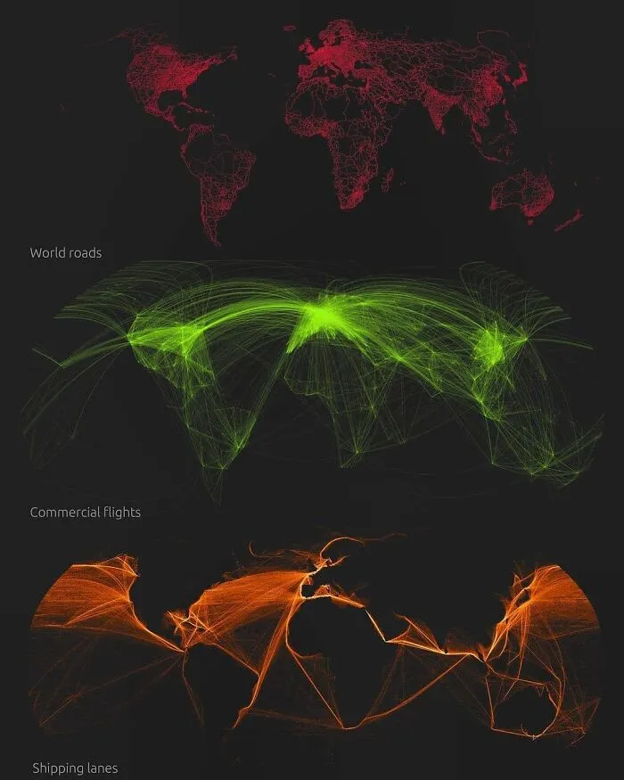
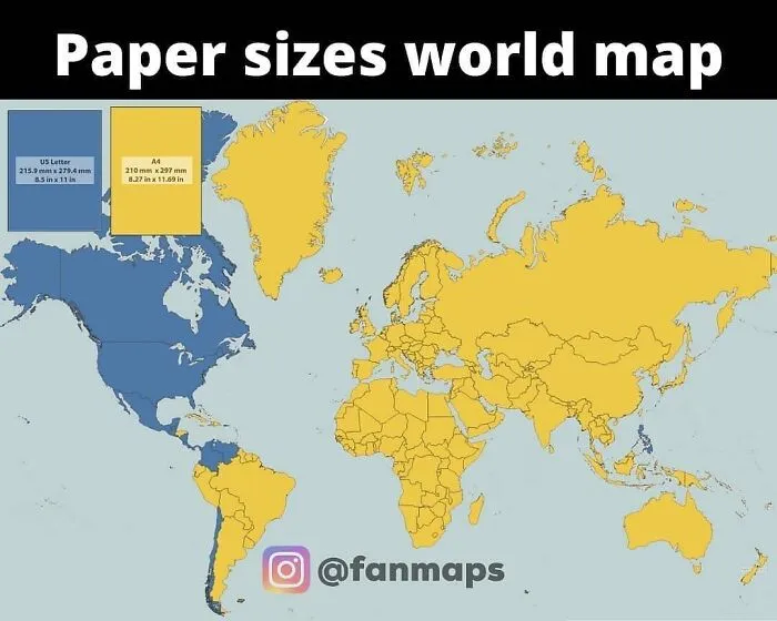
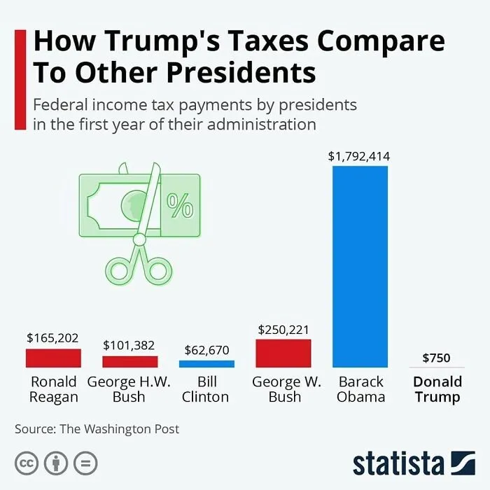
Charts shouldn’t conceal their point. “Charts like these are not misleading, nor are they very confusing. They merely fail to justify their existence — often because they have been visualized incorrectly or because we tried to cram too much in too little space.”
It’s also a bad idea to use too many colors. A change in color can often signify a change in category, according to The Economist. So, if this doesn’t happen, you shouldn’t be adding too many hues to your chart.
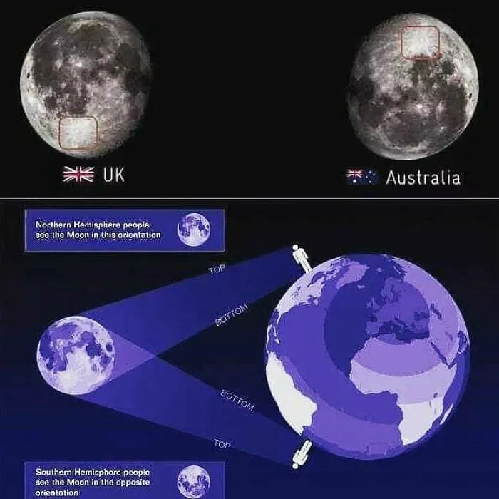
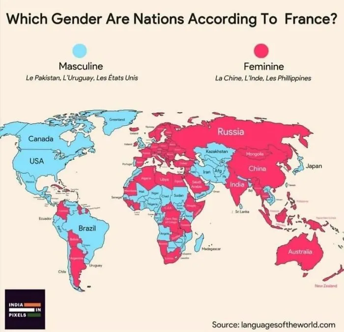
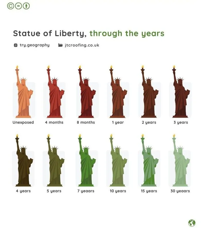
The Canada-based ‘Data Stuff Plus’ account is practically ancient. It was initially created in the autumn of 2017 (which now feels like almost a few decades ago). Over the years, the account has drawn in over 66k followers. According to the curator of the account, Pastor, he focuses on sharing interesting data and sometimes he finds the time to make his own charts as well.
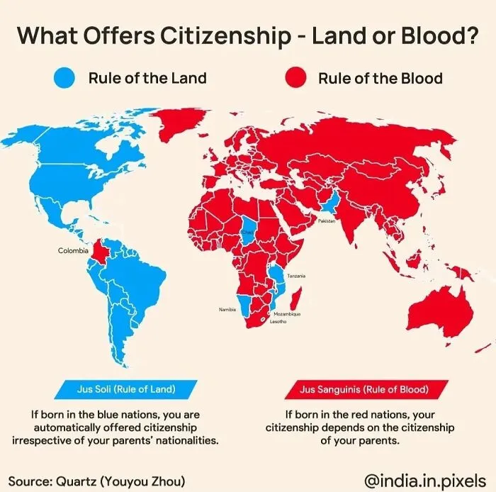
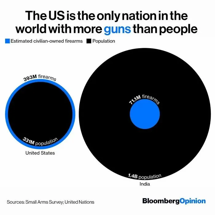
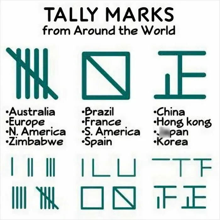
What do you think about all of these maps and charts, dear Pandas? Which ones did you personally find to be the most educational? Which ones do you feel presented the data in the clearest and also most aesthetic way possible? Were there any charts that made you want to dig deeper into the topic?
What's the best map you've ever seen? You can share your thoughts in the comments section at the very bottom of this list.