



How many times, looking, for example, at the logos of Nike, Adidas or Apple, have we asked ourselves just one question: “Well, couldn’t we have drawn such a simple logo ourselves?” If yes, then let's move on reading. If not, we still move on. How many times have we read the news that some famous design studio redesigned the next big corporate logo for a check with an obscene number of zeros, and in the end just made the font thinner or simply reduced the distance between some details?
And so, every time we read such news, we come across dozens, if not hundreds of comments that the designers simply scammed their clients for money, but actually nothing in the logo has changed. In fact, as is often the case, things are not so clear cut.
Firstly, the famous swoosh was most likely a manifestation of spontaneous genius insight (for which, however, they paid only 35 bucks), and the original version of the Apple logo was complex, artsy and as old-school as possible. Secondly, any change in the logo in a large company is preceded by a long and thorough marketing analysis. Yes, sometimes it turns out a complete fail, as was the case with the 2012 Summer Olympics logo, but more often than not, the idea of saving on logo design doesn't justify itself at all.
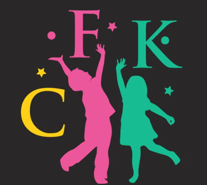
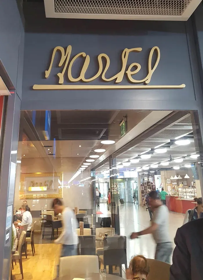
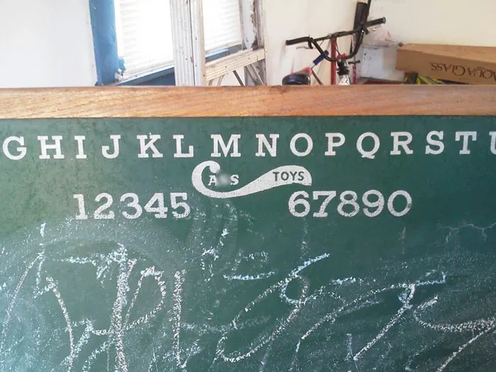
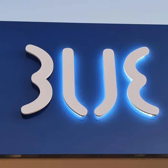
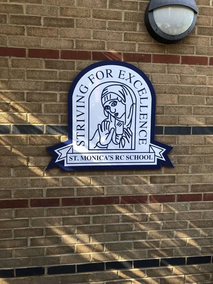
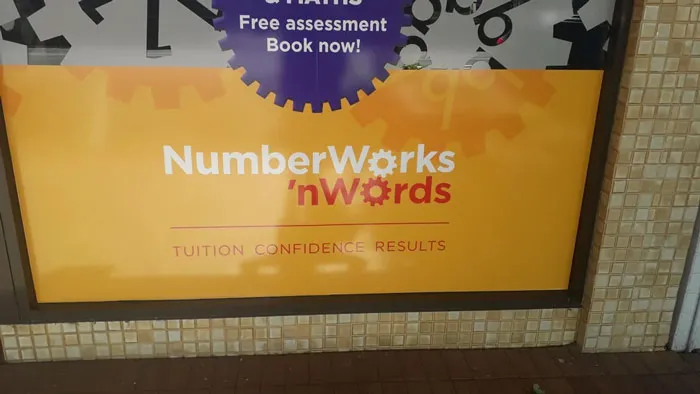
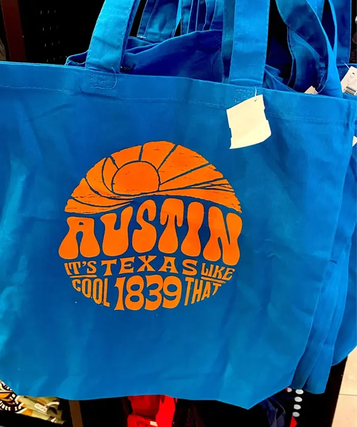
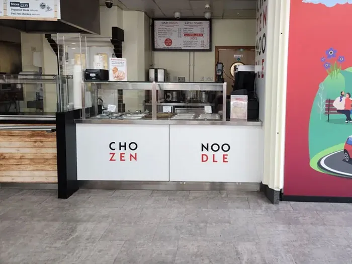
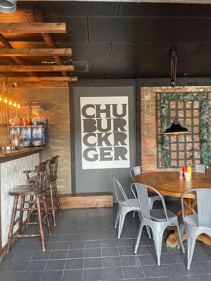
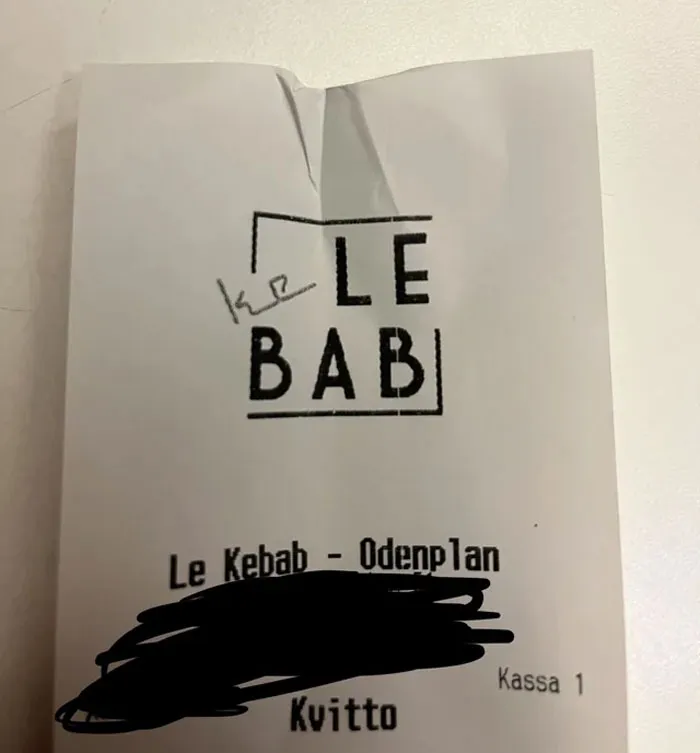
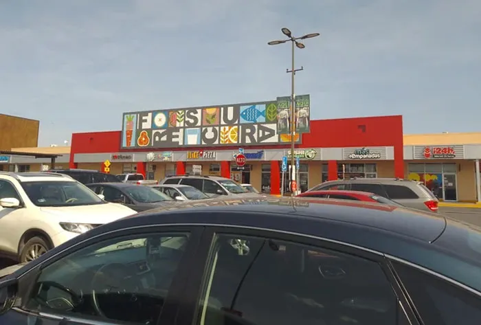
Do you want proof? Voila! As many as 47 examples collected by Bored Panda, when the designer just drew something, the marketing manager was either absent or did not think at all, and the boss approved the logo without looking. And the result is what we have - this incredible selection of logos from around the world, on the one hand, beautiful and stylish - but completely inappropriate, you just have to look at it from a different angle. So please feel free to think different, as Steve Jobs once urged us, scroll this selection to the very end, and just enjoy these absolute masterpieces of human short-sightedness.
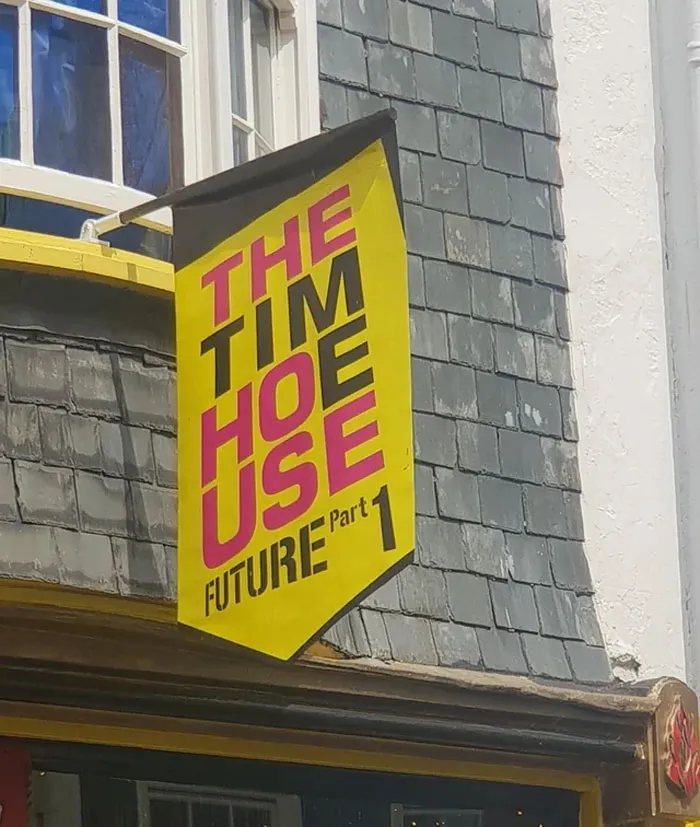
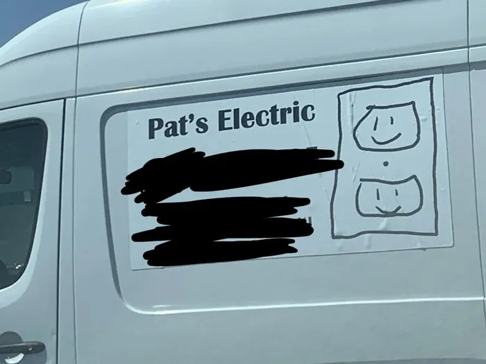
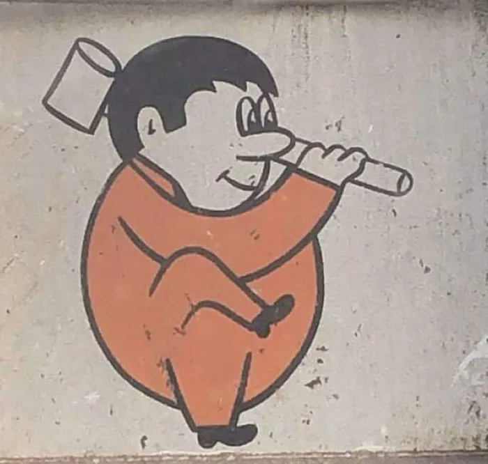
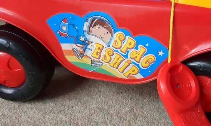
#25 This Sign In The Office Building Where I'm Attending Training
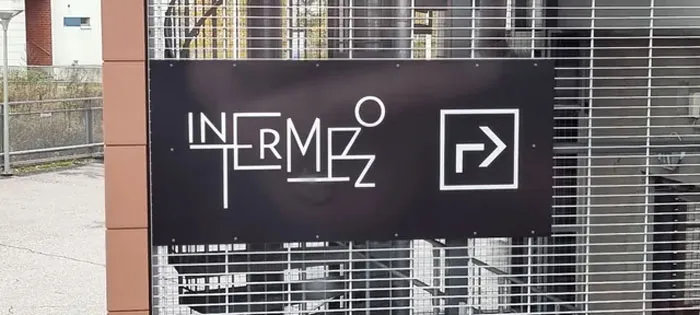
Report
249points
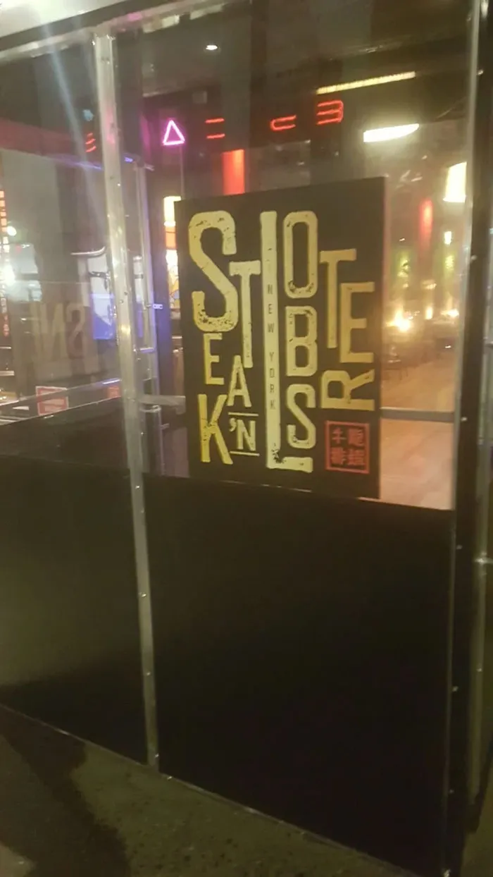
#26 Just Another Restaraunt Logo That Was Edgy And Cool In Someone's Head. Spotted Near My Gym, Midtown Manhattan
Report
238points
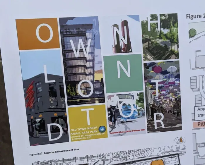
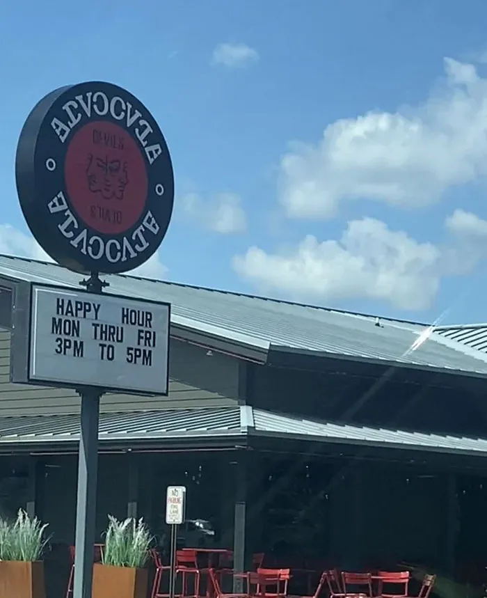
#28 Welcome To Devil’s… Alvoole? Elvccle? (Advocate). I Like The Idea, But The Execution Is Not The Best
Report
232points
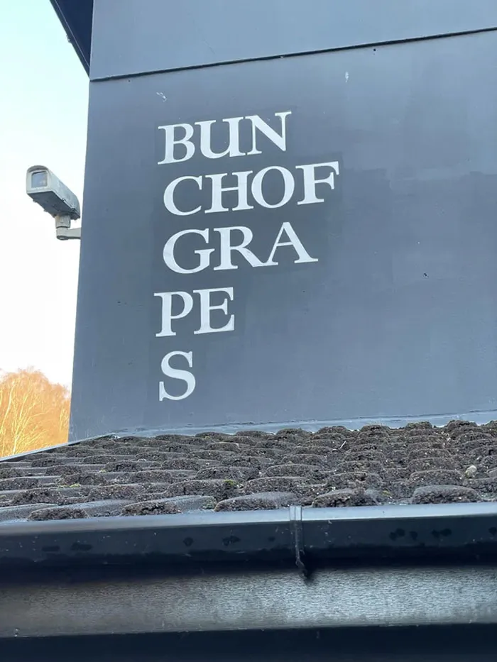
#29 This Pub Is Supposed To Be Called “Bunch Of Grapes” And I Saw This Unreadable Logo And Asked My Mate “How Far Is The Pub Then?”
Report
226points