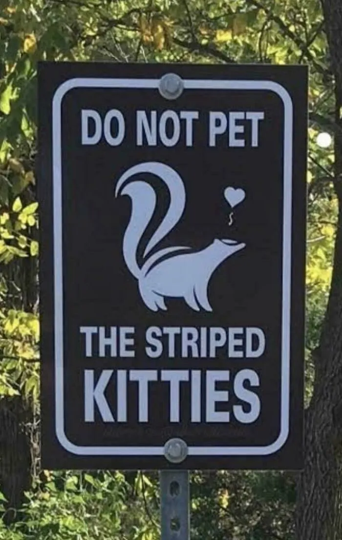



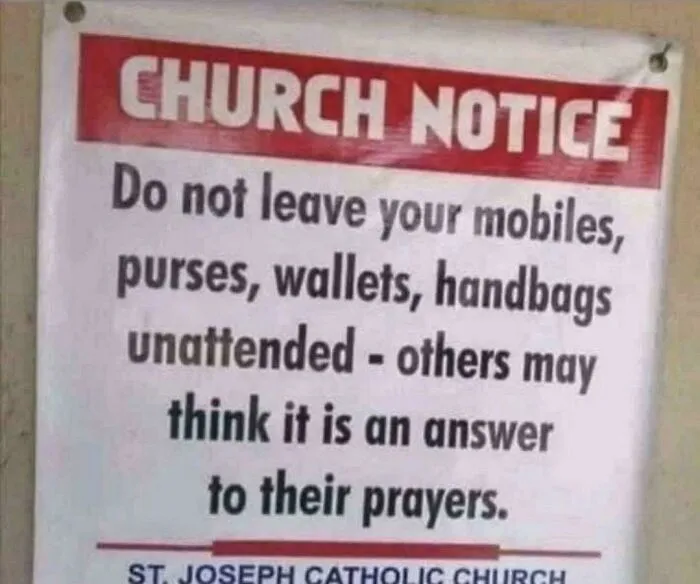
Setting your particular aesthetic tastes aside for a moment, whatever art direction route you choose to go down, you should absolutely ensure that you stay consistent.
Keep the signage visuals consistent with the identity of your brand. Think about whether the style, colors, and font match the effect and atmosphere that you’re going for.
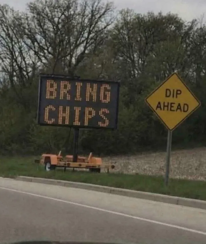
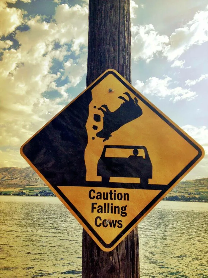
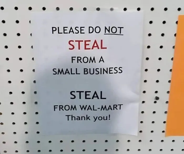
Meanwhile, you should also think about the environmental context of your sign. Your designs don’t exist in isolation!
What do the surroundings actually look like?
Where should you place your sign so that it gets seen by your target audience?
What do your competitors’ signs look like, and how do you make sure that yours doesn’t get lost among them?

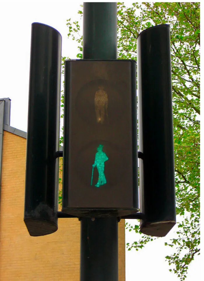

“Whether indoors or outdoors, your signs should be in locations where they naturally attract attention. Consider the viewing angle, lighting conditions, and potential obstructions to maximize visibility,” ‘Twilight Signs’ emphasizes.
In the meantime, ‘Surrey Signs’ also stresses the fact that if your sign is not visible, “it is not worth it.”
Lighting is also important to consider. Can your customers or target audience actually see your signage when it gets dark outside or someone changes the indoor lighting?
“You can use LED lights to illuminate the information during the daytime and special night lights help highlight the information during the night.”
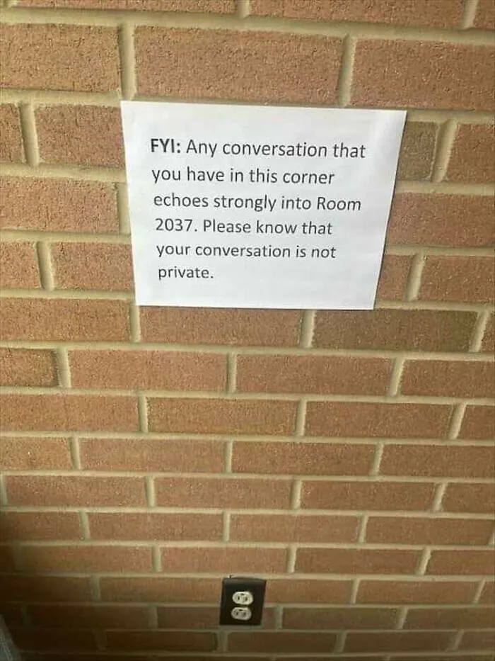
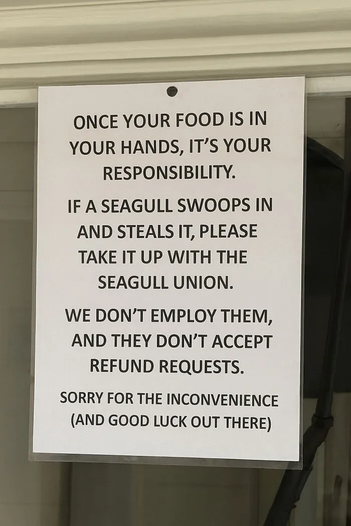
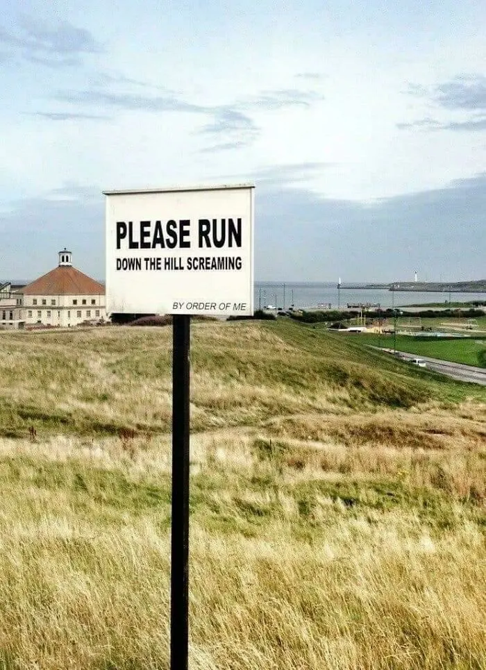
We want to hear your perspectives, Pandas—preferably in a witty format if you’re feeling particularly creative.
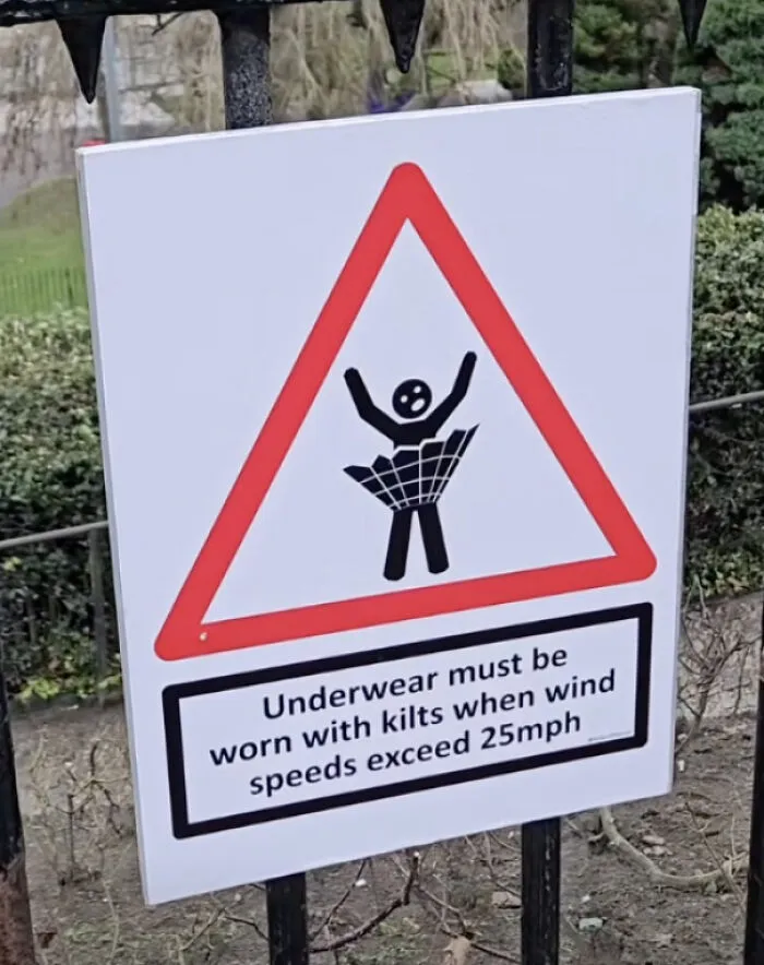
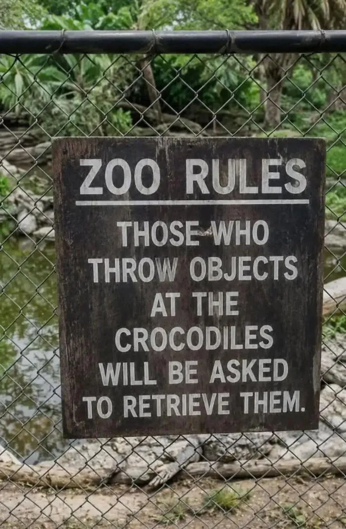
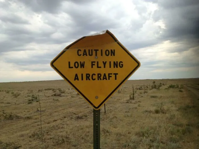
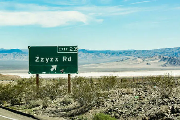
Which of these signs impressed you the most? Which ones did you think were the funniest?
Meanwhile, let’s switch back to your daily life. What’s the most hilarious or impressive signage you pass by every day on your commute? What’s the worst one you’ve recently seen?
Let us know in the comments!