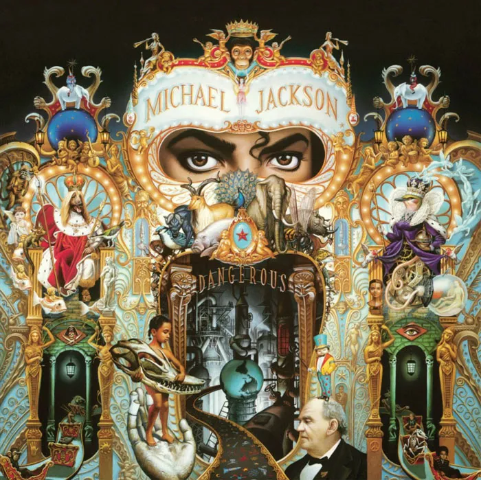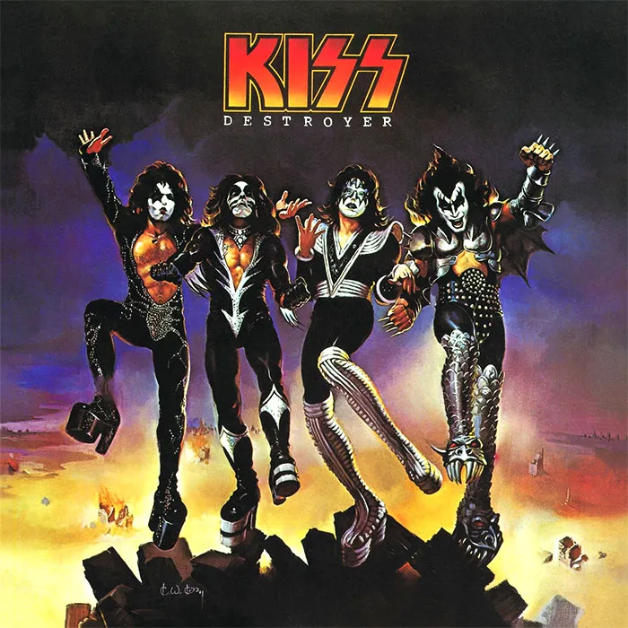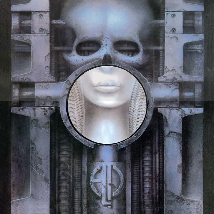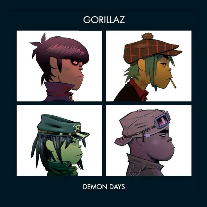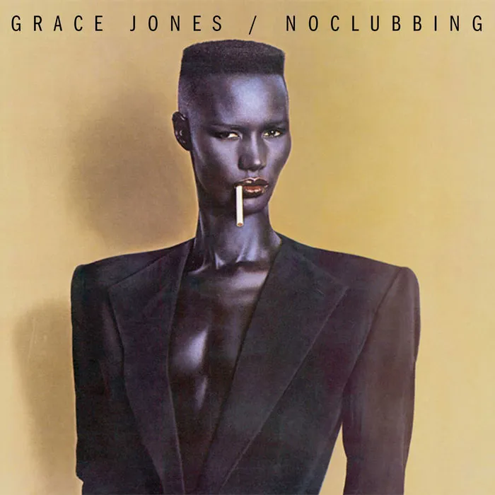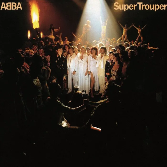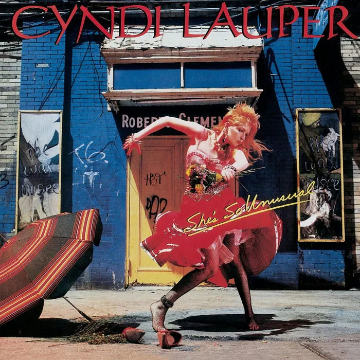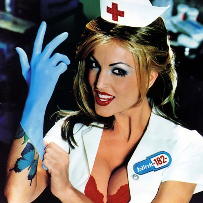


Besides being bona fide artwork, an album cover also has several important missions to achieve. First, it has to capture the audience's attention and stick out of the crowd. For that, the illustration or the photo has to be either thoroughly original or a cleverly regurgitated familiar image; it also doesn't hurt if it's on the controversial side of things. Another 'must' for an album cover design is representing the essence of the music and the soul of the band itself. A pretty big ask for such a small, single image! Aching to see which of the album artworks succeeded in these tasks and took the title of being the greatest ever? We do too! And for that, we've compiled a thorough list of the greatest album covers ever!
Of course, we do not doubt that you've already seen at least the top 30 of them, but did you know the stories of these artworks' conceptions? Neither did we, so we took the time to dig a bit and wrote the stories under the top 30 submissions for your consideration and amusement. Some of the album covers were, in fact, happy accidents, while others caused serious accidents being made (we're talking about you, Pink Floyd). So all you have to do now is scroll down below, check out the greatest album covers of all time, and vote for the ones you fancied the most. Just play fair and don't base your votes on your music preference this time, but rather the artwork! Also, don't forget to share this list of iconic album covers with your friends, as they too might like to learn the stories behind them.
This post may include affiliate links.
#21 Eagles - Hotel California (1976)
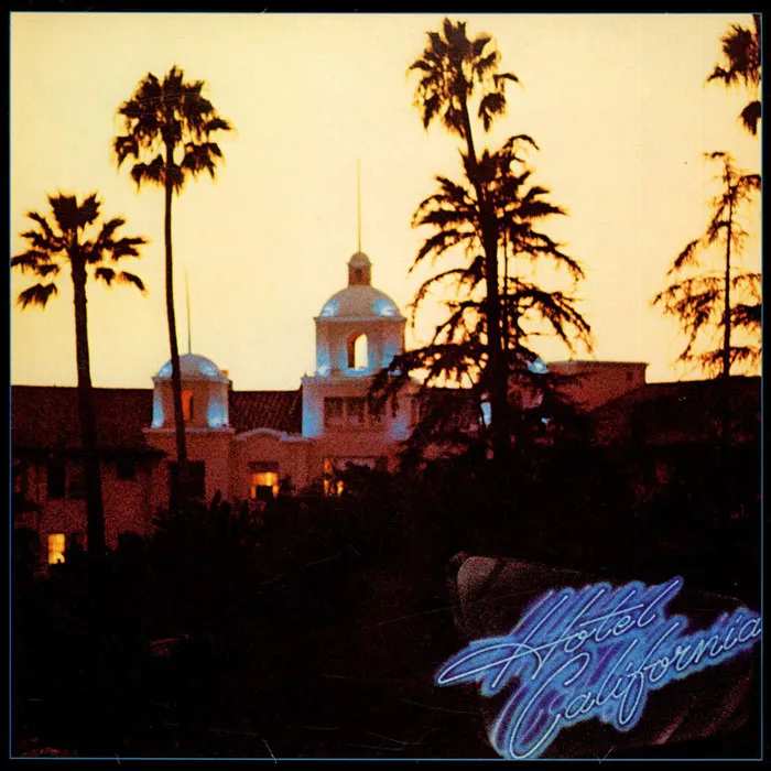
Hotel California is the fifth album by American rock band Eagles, released in 1976. The building you see in the photo is the legendary Beverly Hills Hotel, shot just before sunset by David Alexander. The later cover design was provided by John Kosh (or simply Kosh) - a legendary English graphic designer and album cover creator. The band wanted to depict the titular Hotel California with a slightly sinister edge, and this photo worked like a charm. Since the vantage point seen in the image wasn’t a usual one, it took some time for people to discover that it was The Beverly Hills Hotel, but once they figured it out, the hotel threatened legal action over the use of the image.
Report
35points
#22 Rolling Stones - Let It Bleed (1969)
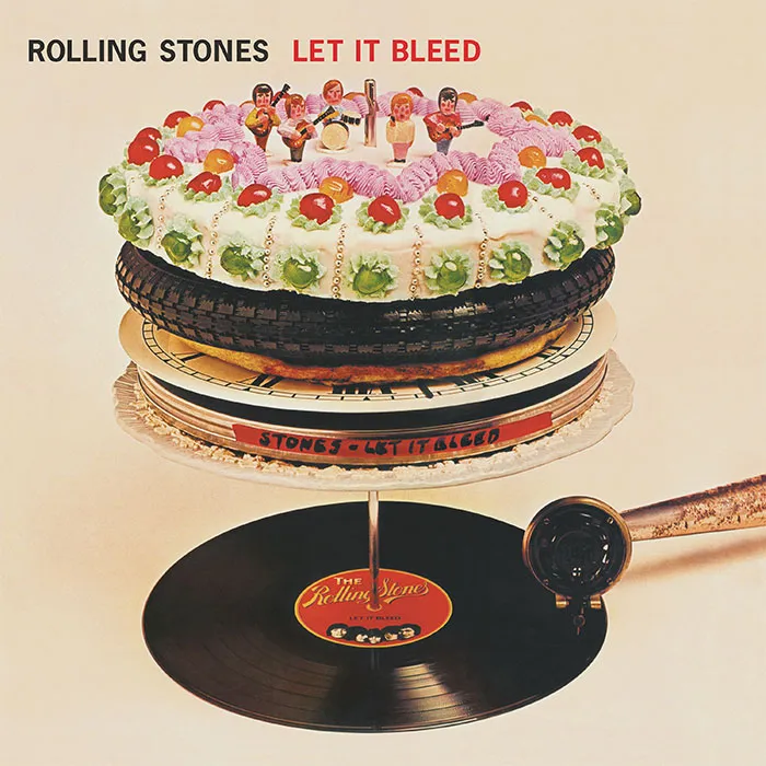
Let It Bleed is the eighth British and the tenth American studio album by the Rolling Stones, released in 1969. The picture that you see on the cover isn’t a collage or a superimposed image, but rather a surreal sculpture designed by Robert Brownjohn. Although Mick Jagger initially asked M. C. Escher to design the cover (who politely declined), it was this version that was among the ten chosen by the Royal Mail for a set of ‘Classic Album Cover’ postage stamps released in 2010.
Report
34points
#23 Supertramp - Breakfast In America (1979)

Breakfast In America is the sixth album by the English band called Supertramp, released in 1979. The album’s cover resembled the view of Manhattan from an airplane window and was designed by Mike Doud and Mick Haggerty. The center figure in the image is Kate Murtagh, an American actress and singer-comedian, dressed as a waitress mimicking the pose of Lady Liberty. The Lower Manhattan skyline seen in the photo is created by using cornflake boxes, syrup jugs, and all sorts of stuff typical to a diner’s environment sprayed white. Breakfast In America won the 1980 Grammy award for the best album packaging, beating albums by Talking Heads and Led Zeppelin.
Report
32points
#24 Alice Cooper - School's Out (1972)
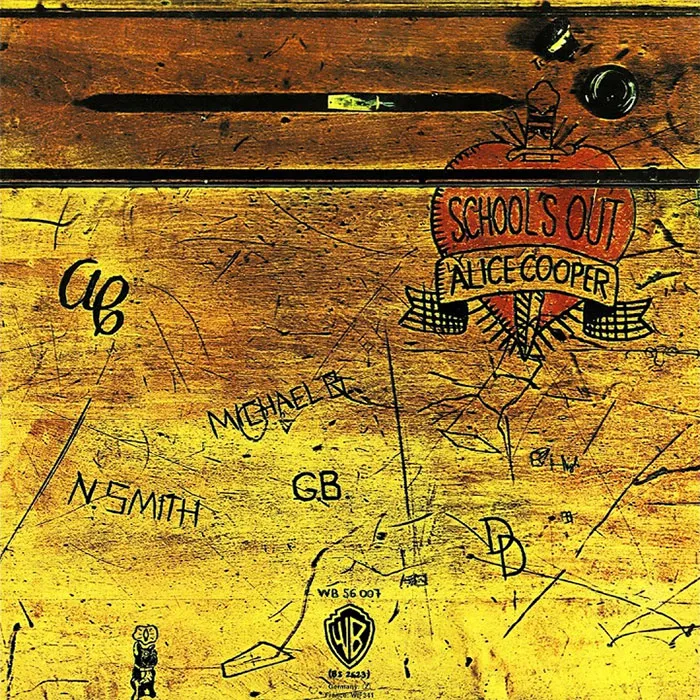
School’s Out is the fifth album by the American band Alice Cooper, which was released in 1972. The original album cover was designed by Craig Braun and had the sleeve opening in the manner of a real school desk. The vinyl inside was wrapped in a pair of panties, though it was later discontinued upon discovering that the paper garment was highly flammable. You can still see the original desk of which the photo is taken displayed in The Hard Rock Cafe in Las Vegas.
Report
31points
#25 The Clash - London Calling (1979)
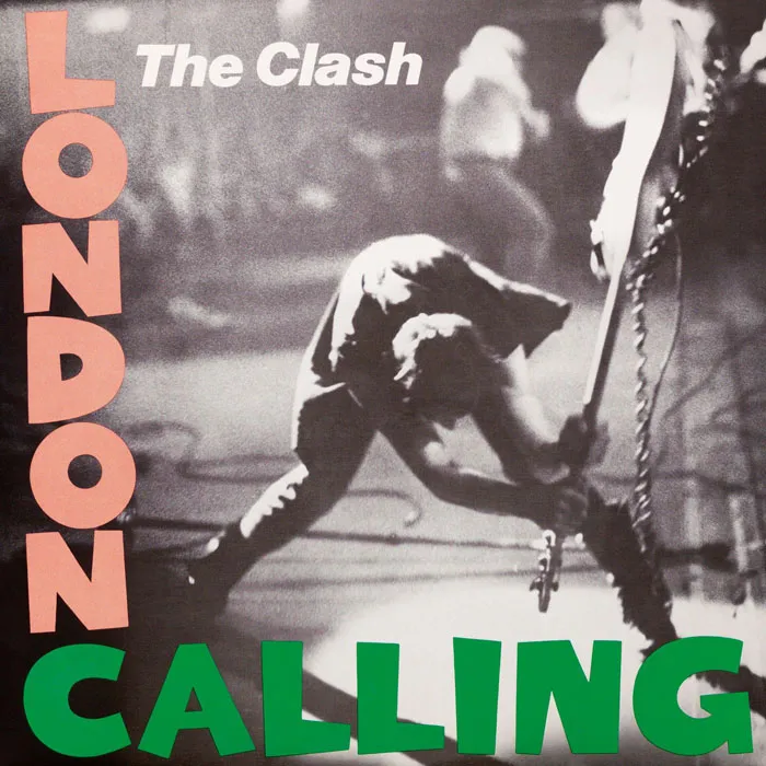
London Calling is the third album by English rock band The Clash, released in 1979. In the cover photograph, you can see the band’s bassist, Paul Simonon, smashing his Fender Precision Bass, whose remnants are now displayed in the Museum Of London. The rest of the cover was designed by Ray Lowry, who made it look like a homage to Elvis Presley’s self-titled album (which you also saw on this list). The Royal Mail also chose this album cover for their set of ‘Classic Album Cover’ postage stamps issued in 2010.
Report
31points
#26 Metallica - Master Of Puppets (1986)
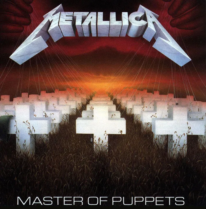
Master Of Puppets is the third album by Metallica, released in 1986. The artwork for this album was designed by the band themselves and their manager Peter Mensch. The illustration, depicting white cemetery crosses tethered by strings and manipulated by hands emerging from the blood-red sky, was painted by Don Brautigam (you can see his initials on the lower right corner of the painting). The cover depicts an overall theme of the album of people being subconsciously manipulated and easily disposed of.
Report
29points
#27 Prince - Purple Rain (1984)
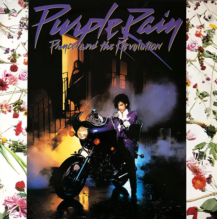
Purple Rain is the sixth studio album by Prince, released in 1984. On the cover, you can see Prince sitting on his customized 1981 Hondamatic Honda CM400A motorcycle (a purple one, of course). There’s also his movie co-star and love interest of the hour Apollonia in the background standing in a doorway of a back alley. The alley is actually in the Warner Bros Studio Backlot in California, and the location was designed to look like a New York tenement area. And as for the flower arrangements behind the photo - who knows, those were probably Prince’s idea also, knowing how much he cared about the stuff considering his one true love - music.
Report
27points
#28 Dio - Holy Diver (1983)
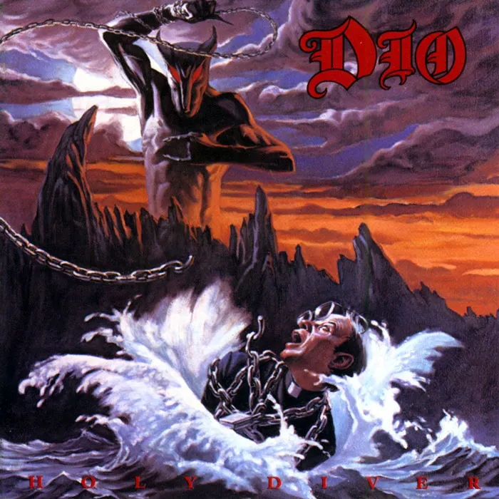
Holy Diver is the debut album by the heavy metal band Dio, released in 1983. The cover artwork was painted by Randy Berrett and featured the band’s mascot, Murray, spinning heavy chains above waves where a priest or a minister is chained and floating. You can see Murray on several of Dio’s albums, always as sinister as he can be. And although the band stated that it is a pure coincidence, if you flip the logo upside down, you can interpret it as saying ‘DIE’ or ‘Devil.’
Report
27points
#29 Elvis Presley - Elvis Presley (1956)
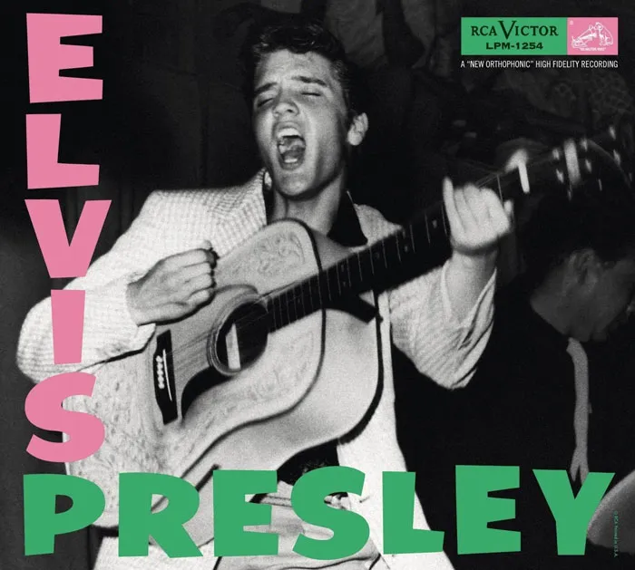
Elvis Presley (known in the UK as Elvis Presley Rock ‘n’ Roll) was the debut album by the singer, released in 1956. Initially, it was thought that the cover photo was taken by Popsie Randolph (since he was the only credited photographer on the album), although it was later discovered that the actual photographer was William V. ‘Red’ Robertson. This iconic design was echoed on the albums by The Clash, F-Punk, and Chumbawamba, just to name a few.
Report
25points
#30 Bob Dylan - The Freewheelin' Bob Dylan (1963)
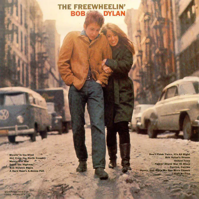
The Freewheelin’ Bob Dylan is the second album by singer-songwriter Bob Dylan, released in 1963. The photo used as this album’s cover depicts Dylan and his girlfriend at the time, Suze Rotolo, strolling in the middle of Jones Street in the West Village, New York City. As Suze remembers, Dylan was wearing a thin jacket for ‘the look,’ and she was terribly cold dressed in an oversized sweater and a bulky coat, making her feel like an ‘Italian sausage.’ The cover, being unscripted and down-to-earth simple, was a revolutionary one, compared to the stiff and polished covers of pop and folk albums at the time.
Report
22points