



This post may include affiliate links.
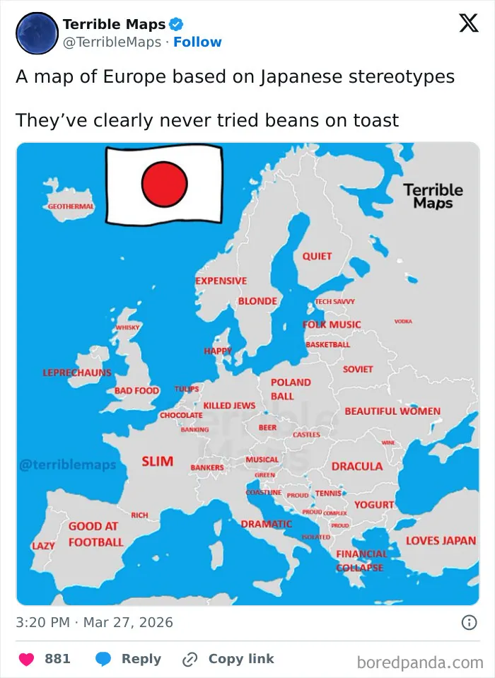
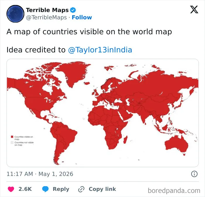
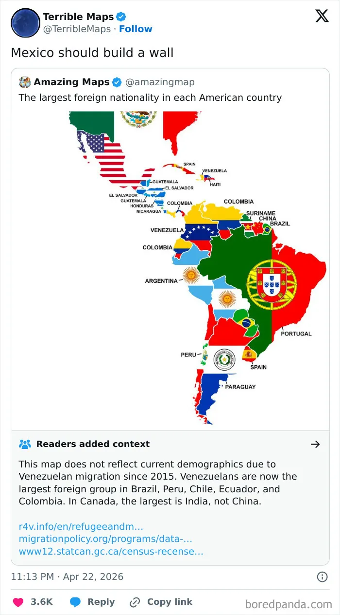
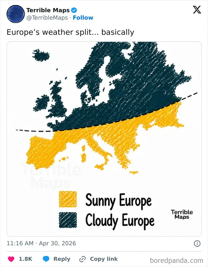
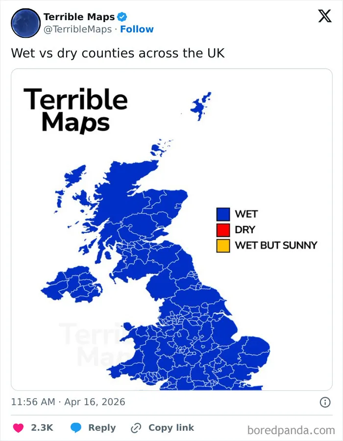
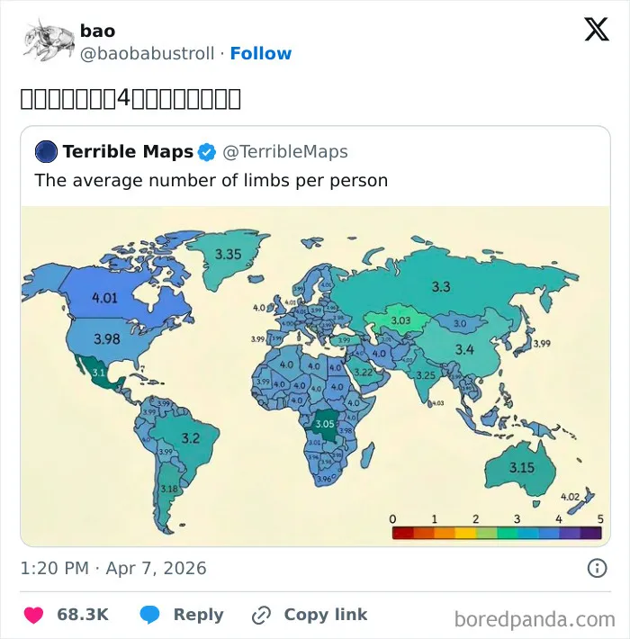
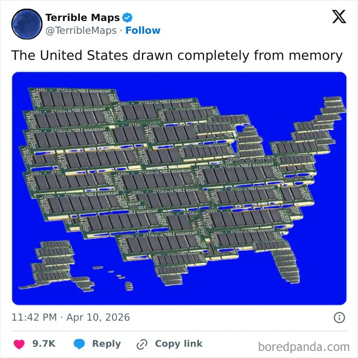
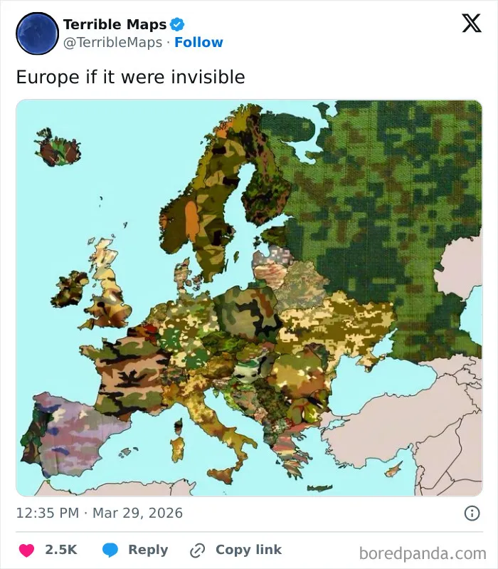
Because these maps mimic the official look of real cartography, they double as the ultimate internet bait. They regularly trigger massive, yet hilarious, controversies for one simple reason: a lot of people completely miss the satire.
Because our brains are conditioned to trust anything printed on a colorful grid, internet users constantly mistake pure nonsense for real data. When outraged users flood the page to complain or correct, the moderator’s response is usually a simple, brilliant “thank you.”
By baiting people, Terrible Maps accomplishes exactly what it sets out to do — it exposes how blindly we trust the illusion of authority on the internet.
The outraged commenters end up completely missing the joke, and in doing so, they become the joke themselves.

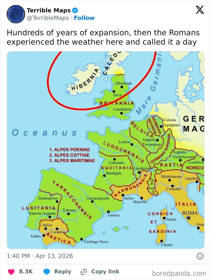
Geography can often feel dividing, focusing on borders, politics, and disputes. Funny maps do the exact opposite by turning it into a universal inside joke.
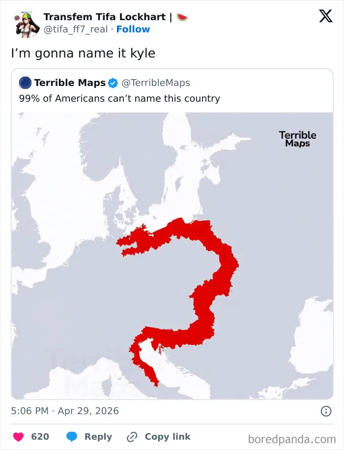
Whether a map is making fun of British food or American geography skills, it highlights shared human quirks. It reminds us that no matter where we live, we all share the same capacity for absurd and lighthearted humor.