






"Don’t carve an error in stone. It’s embarrassing and expensive to fix. Proofreading before you produce, whether it’s stone or not, is absolutely necessary," the professor said that proofreading is cheaper than having to fix the mistake later. However, that works mainly for physical signs (the embarrassment part still applies, though). In the digital sphere, it’s far easier to edit and adjust on the fly… though ideally, you won’t have to!



"Choose your font with readability in mind. It should be clear and readable at a distance; you don’t want to make people puzzle through a swirly script," the professor noted that the font that you use is very important for readability.
And readability is actually incredibly important. Matt Johnson, from Hult International Business School and Harvard University, previously told Bored Panda about the fluency effect, “the relatively robust behavioral science phenomenon that the more fluent a font is written in, the more likable and trustworthy the message.”



It’s in part due to the fluency effect that more and more brands are opting for similar-looking logos, especially in the online space. Readability means getting the message across, meaning the (potential) customer is left satisfied… or at least far more satisfied than they’d be if they were left to puzzle out what was going on.



#31 Fighting Through The Tears. Remember To Like And Subscribe, Guys. This Is So Hard. Merch 20% Off

#32 Her Posture Was So Bad It Made Her Arms Bigger And Bent The Door Behind Her
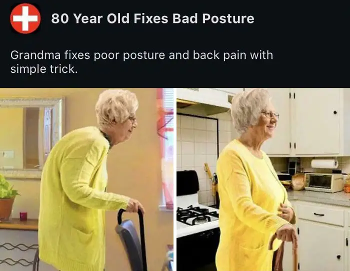


#35 Third Most Subscribed Youtube Channel Uses The Most Questionable Thumbnails I've Ever Seen. Some Of Them Encouraging The Use Of Hot Glue In Extremely Dangerous Ways