


Bored Panda
66 Poorly Designed Signs That Resulted In Hilarious Messages (New Pics)
Funny,FailsJUN 19, 2026

66 Poorly Designed Signs That Resulted In Hilarious Messages (New Pics)

36
2
If someone is tasked with creating a sign, the most important thing to keep in mind is ensuring that their message is clear. Whether they’re advertising for a company, fundraising for a charity, or trying to find their lost cat, if people can’t read their sign, it’s pointless. 
But sometimes, even if viewers can read it, they still take it to mean something completely different than what the author intended. We took a trip to a subreddit that’s dedicated to sharing comically bad signs. All of these photos feature signs that make absolutely no sense when read from left to right, so their messages were completely lost. Enjoy scrolling through these hilarious pics, and be sure to upvote the designs that you can’t believe people thought would be a good idea!

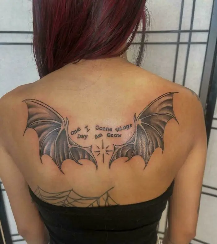
#1 One I Gonna Wings Day Am Grow

A woman's back with a tattoo of bat wings and a confusing message that says ONE I GONNA WINGS DAY AM GROW, showing poor sign design.
20points

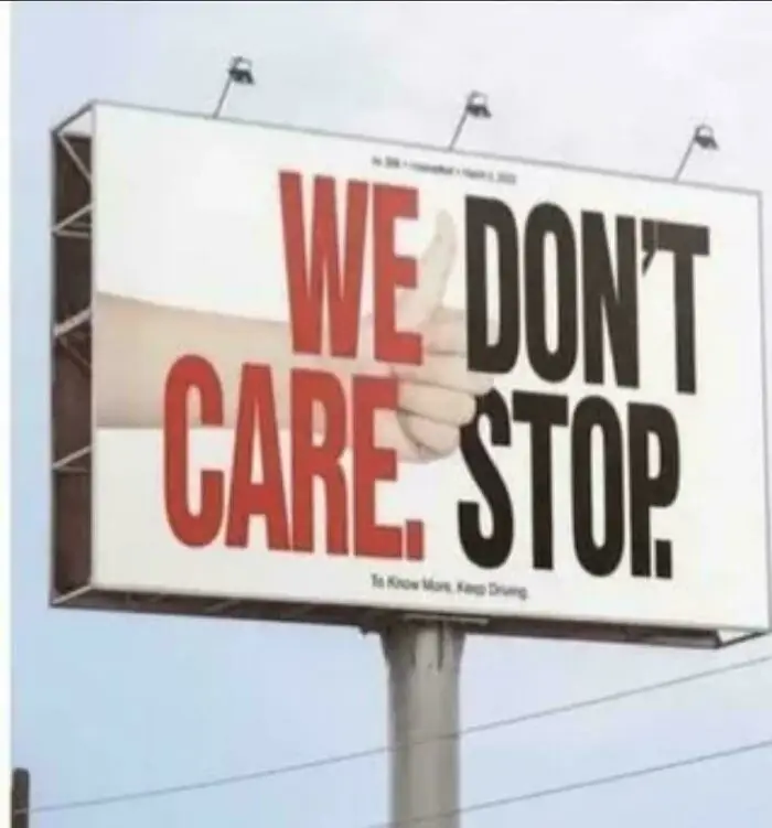
#2 We Don't Care. Stop

Hilariously confusing message from poor sign design: a billboard with WE DON'T CARE. STOP.
20points

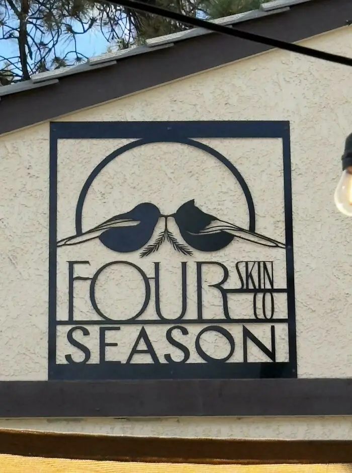
#3 Fourskin Co. Season

A hilariously confusing poor sign design, showing a metal cutout sign on a building that reads FOURSKIN CO SEASON.
18points

You might assume that you’re an expert on signage based purely on the fact that you’ve seen thousands of them. Nowadays, it’s kind of impossible to avoid them. We’re bombarded with signs when driving on the highway, walking down the street, passing any business, and even when we open up any webpage. In fact, the average person consciously sees about 100 ads per day, many of which come in the form of signs.

But just because we’re all used to seeing signs doesn’t mean that we have the skills to create them. As we can clearly see from this list, it’s harder than it looks! Apparently, it’s extremely important to get a second, third, or perhaps even a tenth opinion before sending a sign to print. Or you might get roasted online for creating a ridiculous message like “We Don’t Care, Give Up.”      
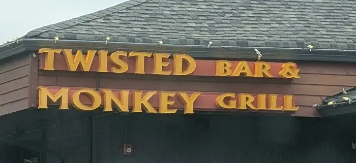
#4 Twisted Bar And Monkey Grill

A bar and grill sign with poor design reads 'Twisted Bar & Monkey Grill', creating a hilariously confusing message.
Report
13points

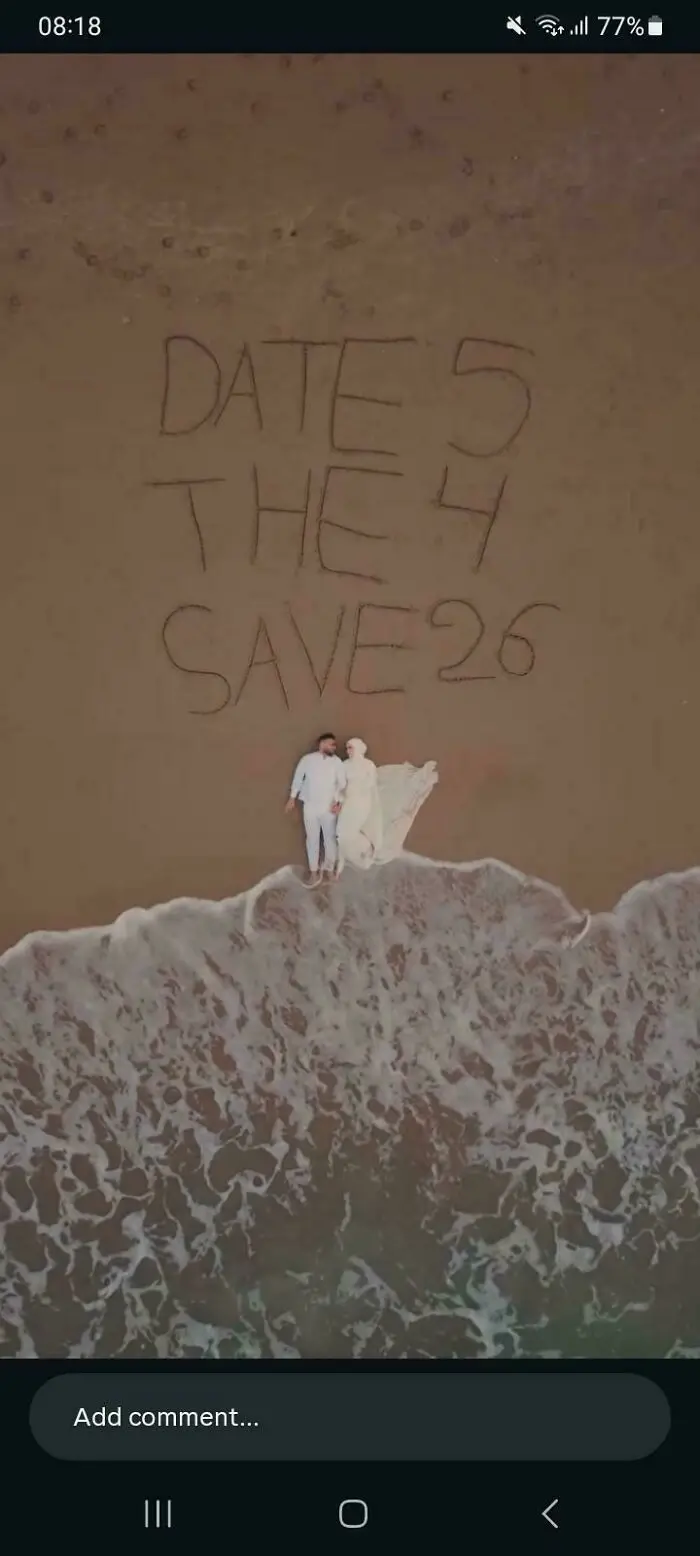
#5 Date 5 The 4 Save 26 (Supposed To Say Save The Date 5/4/26)

A hilariously confusing message on a beach, 'DATE 5 THE 4 SAVE 26', written in sand next to a couple.
12points

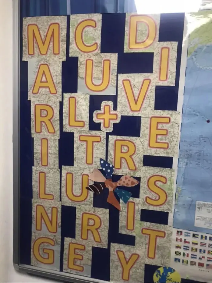
#6 Mc D A U I Rl+vi Tr E Lu S N R It Ge Y

A hilariously confusing message from poor sign design with letters that read 'MC DI AU VE RL +E RI TR IL UY S N IT R GEY.'
11points

If you want to avoid the mistakes that have been made on this list, Vistaprint published “The Ultimate Guide To Signage Design,” so we’ll share some of their wisdom with you, pandas. First, they note that there are different types of signs that serve various purposes, so it’s important to understand the specific niche you want to fit into first.

Designing a billboard is different from designing a banner, and A-frames, digital screens, shop fronts, and flags all have their unique requirements as well. So step one requires doing lots of research. Peruse loads of inspiration first, and understand exactly what you want (and don’t want) before committing to anything concrete. 
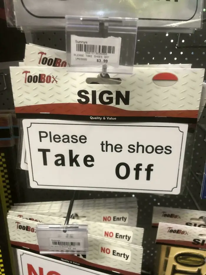
#7 Please The Shoes Take Off

A hilariously confusing sign design that reads Please Take The Shoes Off, an example of poor sign design.
10points

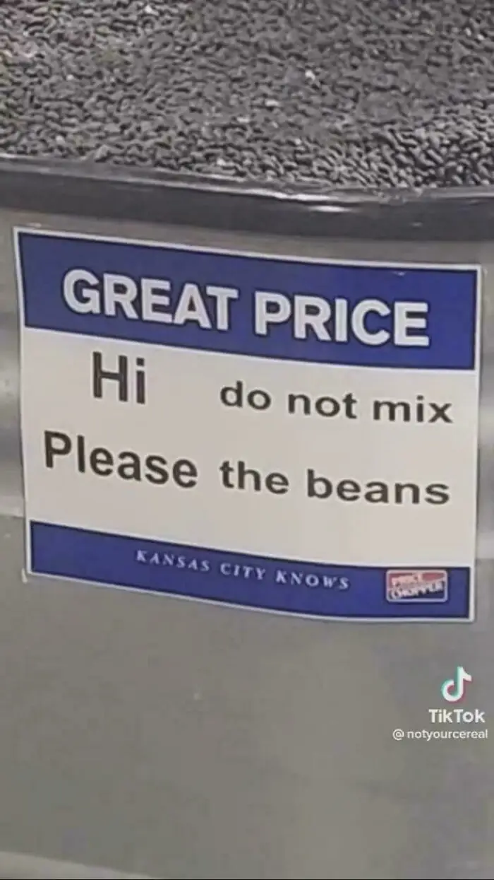
#8 Hi Do Not Mix Please The Beans

A hilariously confusing sign design for beans reads: Great Price. Hi Do Not Mix. Please The Beans.
9points

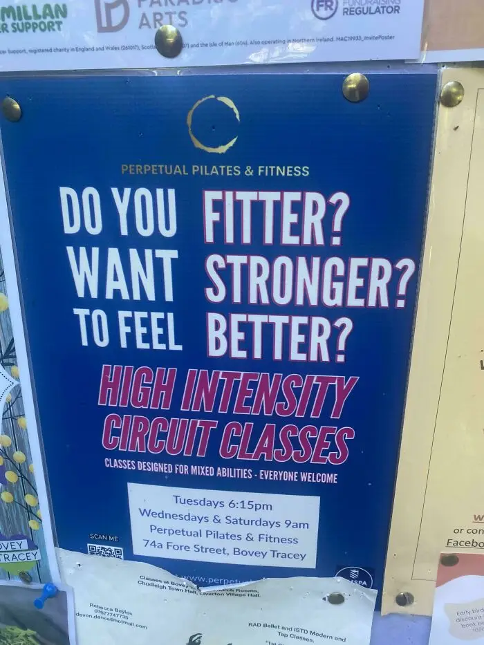
#9 Do You Fitter? Want Stronger?

A hilariously confusing message from poor sign design with a sign reading 'Do you fitter? Want stronger? To feel better?'
8points

Once you’ve made it to the drafting stage of designing a sign, it’s important not to get too attached to any one idea. Feel free to play around and experiment to ensure you find the best possible design. And once you do believe that you’re making progress, you’ll have to get reviews and feedback from people whose opinions you trust. It’s not always easy to hear critiques, but it’s much better to hear them in the drafting stage than after you’ve printed 300 signs.   
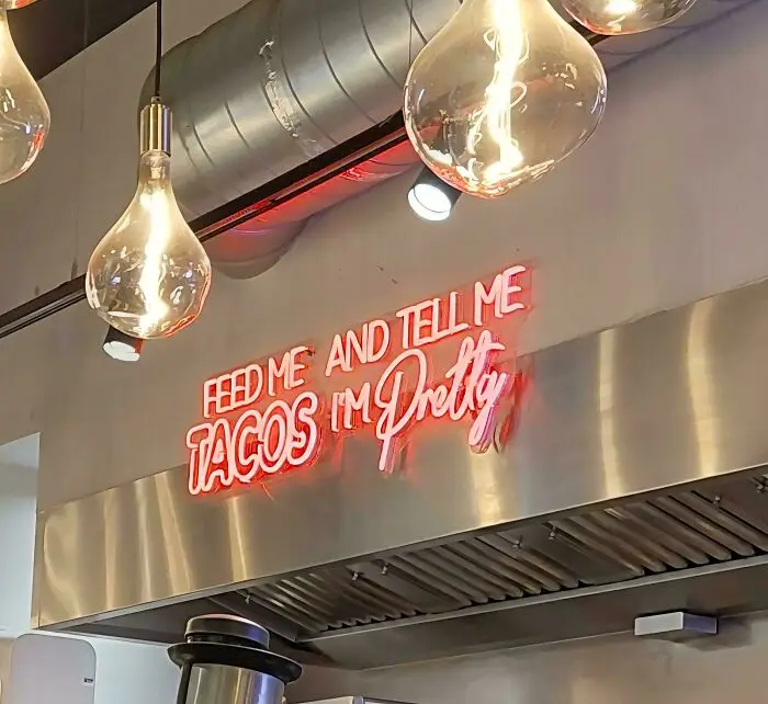
#10 Feed Me And Tell Me Tacos I'm Pretty

A neon sign with poor sign design that reads Feed Me Tacos and Tell Me Im Pretty, leading to a confusing message.
Report
8points

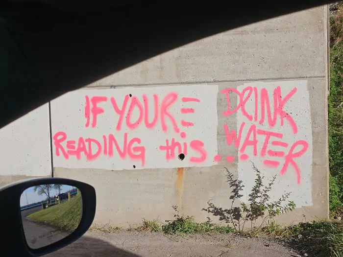
#11 If Your Drink Reading This Water

Graffiti with poor sign design on a concrete wall reads 'If You're Reading This... Drink Water', a confusing message.
7points

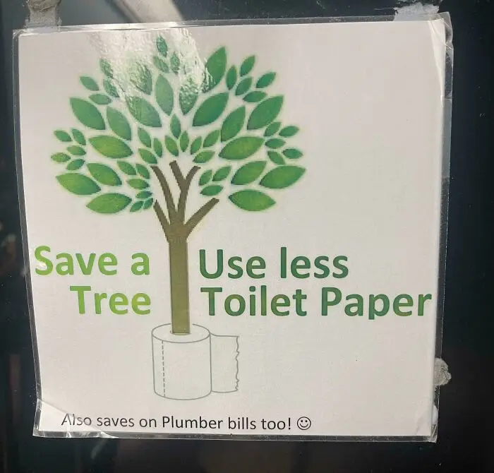
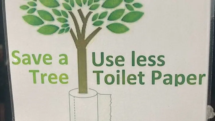
#12 Save A Useless Tree Toilet Paper

A sign with poor design humorously encourages using less toilet paper to save trees.
Report
7points

When it comes to the most important elements of sign design, Vistaprint says color, typography, graphics and images, material, texture, and size and scale are crucial to consider. You want the sign to stand out, but in a good way. You need the font to be legible and appropriate for the message, but the correct size as well. The text should be concise, perfectly visible, and engaging. Ideally, the message will be one that people remember and something that’s consistent with the rest of the brand.
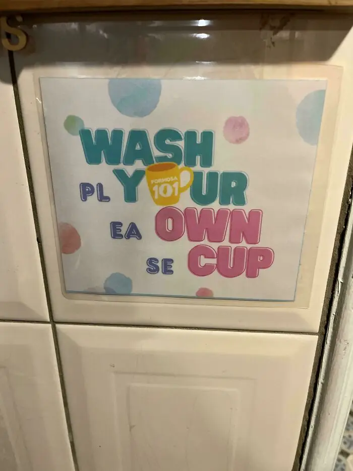
#13 Wash Plyur Eaown Secup

A sign with poor design reads Wash Ply Your Ea Own Se Cup, demonstrating a hilariously confusing message.
7points

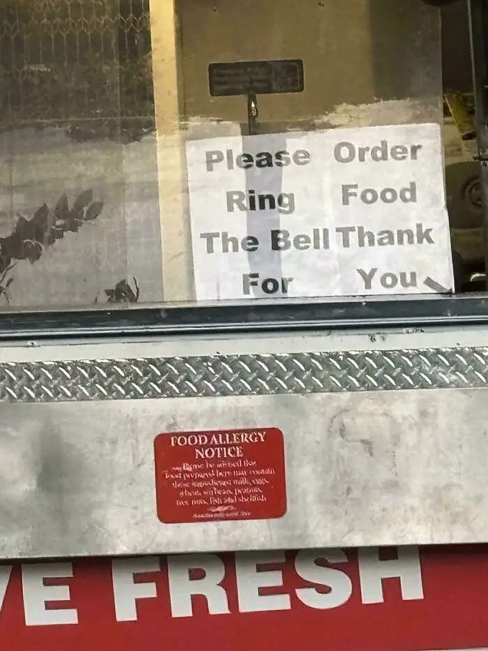
#14 Please Order Ring Food The Bell Thank For You

A hilariously confusing message on a sign reads 'Please Order Ring Food The Bell Thank For You'.
6points

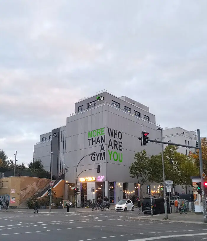
#15 (Berlin) More Who Than Are A You Gym

An external view of a gym building with a poor sign design that reads MORE WHO THAN ARE A GYM YOU, creating a confusing message.
5points

As for some of the most common mistakes sign designers tend to make, Forbes warns that a lack of contrast can ruin any great message. If the text doesn’t stand out from the background, nobody will be able to read it. But that doesn’t mean the colors should clash. There’s a fine line between having a bold contrast and hurting people’s eyes when they look at the sign.
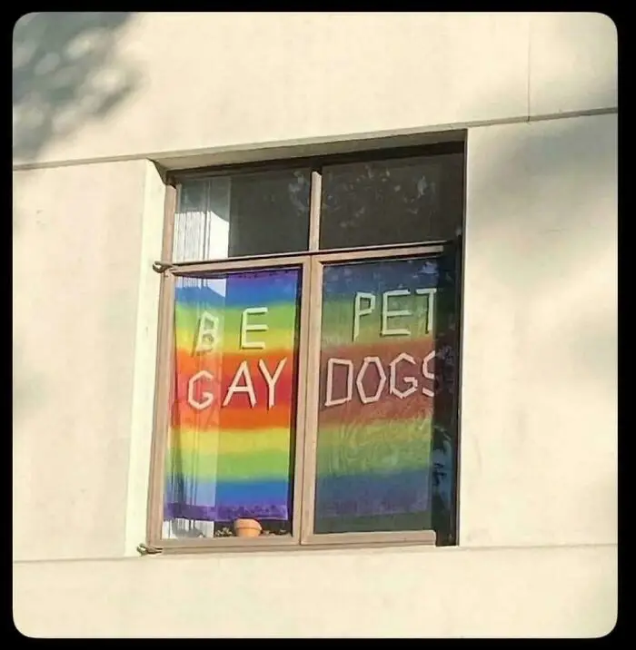
#16 Be Pet Gay Dogs

A hilariously confusing message on a window with rainbow flags reading Be Gay Pet Dogs, an example of poor sign design.
5points

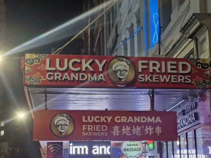
#17 Lucky Fried Geandma Skewers

A hilariously confusing message on a restaurant sign: Lucky Fried Grandma Skewers.
Report
5points

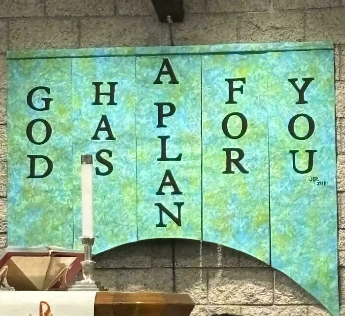
#18 Ghafy Oapoo Dslru A N

A sign design creating a confusing message: God Has A Plan For You.
5points

Something else to consider is the artwork featured on a sign. The words might be the most important part, but the images featured play a huge role too. It’s extremely important to put artwork in front of many eyes to ensure that it won’t be misconstrued. This means having viewers look at it from various distances to see if it translates from close up and far away. And if your company has a logo, it’s wise to include that in any and all signage too. 
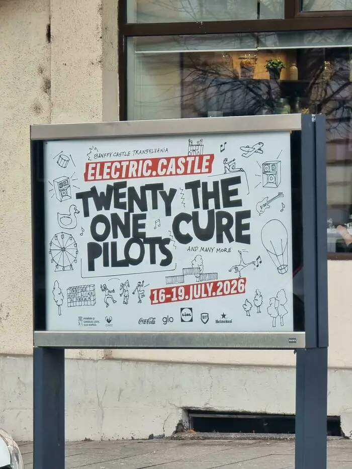
#19 Twenty The One Cure Pilots And Many More

A concert poster with poor sign design, hilariously confusing the band names Twenty One Pilots and The Cure.
Report
5points

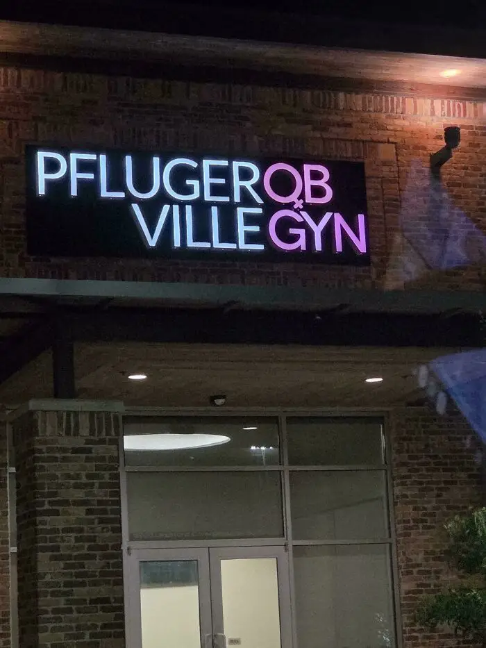
#20 Pflugerqb Villegyn

A building at night with a confusing sign design that reads Pfluger OB Ville Gyn in neon pink and white letters.
5points
36
2