


In a previous interview with Bored Panda, Portugal-based graphic designer Laura Vanagaite, who specializes in branding and illustration design, explained that the most important aspect of advertising is clarity to the potential client. "It needs to be catchy, which means the brand needs to introduce their product and actually make the person get interested in it. So normally designers can play with font sizes, but still keep it simple and readable."
The graphic designer pointed out that color also plays a crucial part. "Red, as we know, catches our attention immediately but yellow, green, or black and white combinations are equally eye-catching." Whatever the design, it’s important "to keep it simple but sophisticated since balance is the key."




Laura explained that when it comes to readability, you need to make sure your work represents the intended message before handing the sign to the production team. "The designer is the one that handles the project but if there is a chance, always represents the rest of the team. It can be tricky when different opinions come, but try to ask if it is easy to understand. Teamwork is a very important thing," she concluded.
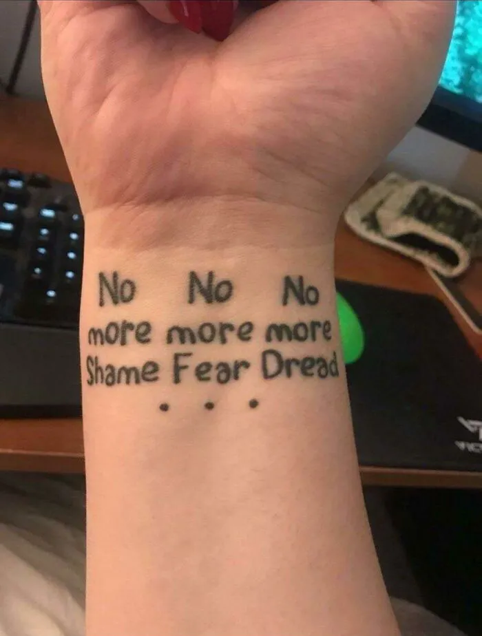
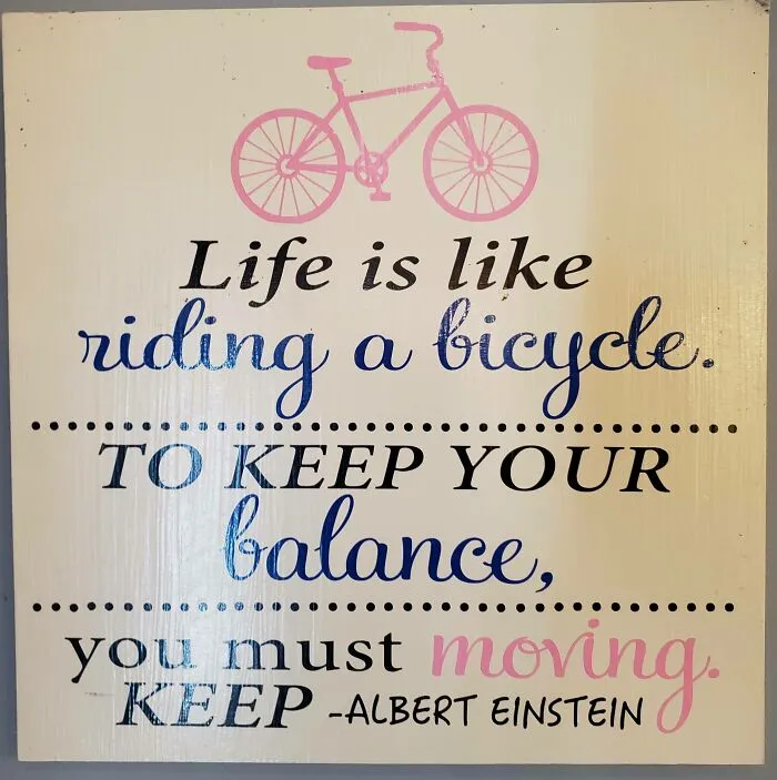


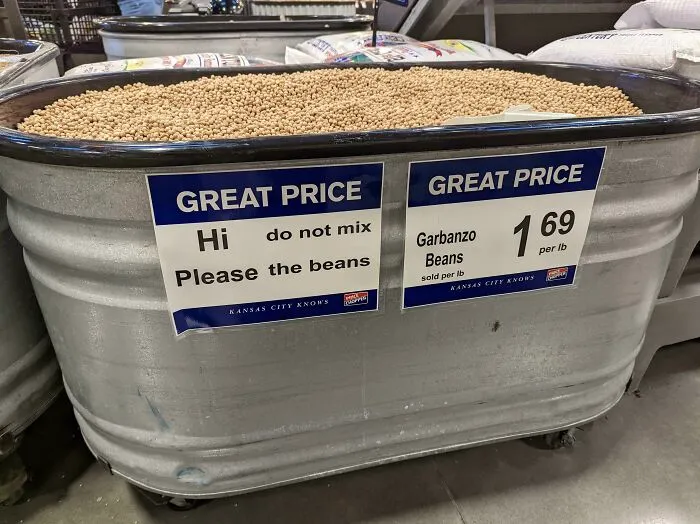
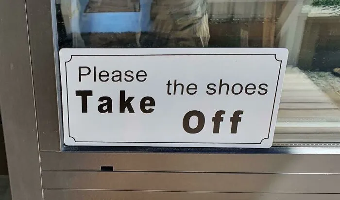



#37 Ddoi: This Guy Is On This Corner Every Day & Has A Bunch Of Similar Signs