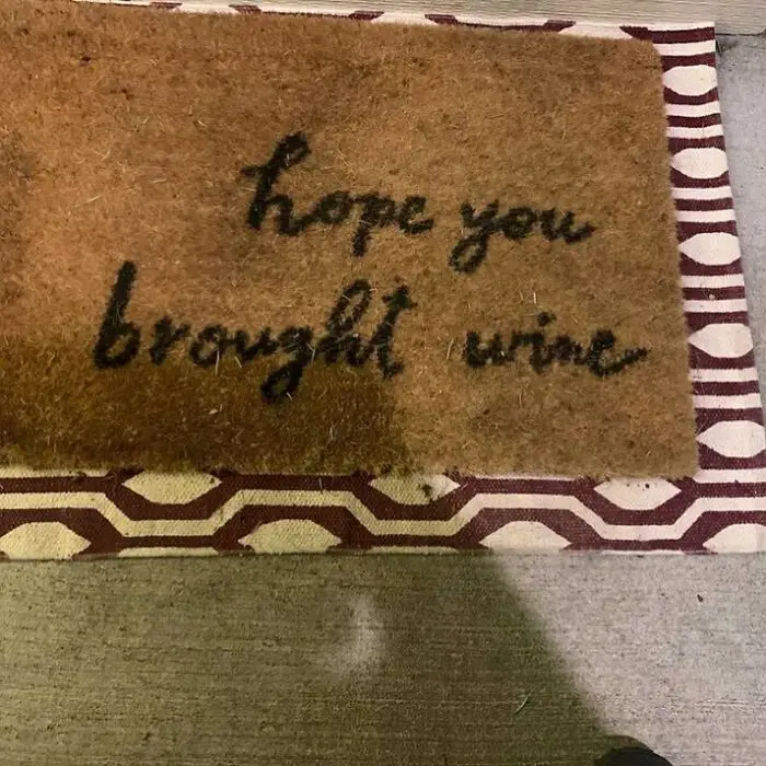





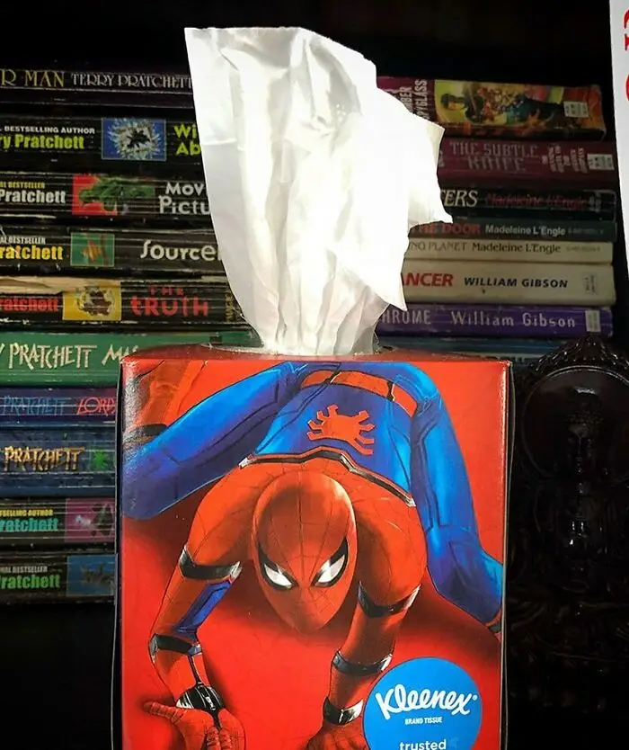
Test out a few designs with a focus group or two. Or, if you don’t have anything as fancy as that, run your visuals or sketches by your family and friends. Ask for some honest feedback and promise that you won’t get upset. Then, when you’ve got a bunch of feedback, sit down and evaluate what’s genuinely useful and what’s not.
Not every critic will be able to articulate why they (don’t) like your design (they might have a gut, instinctive reaction), but when someone offers semi-constructive feedback, it’s usually best to at least think about it.
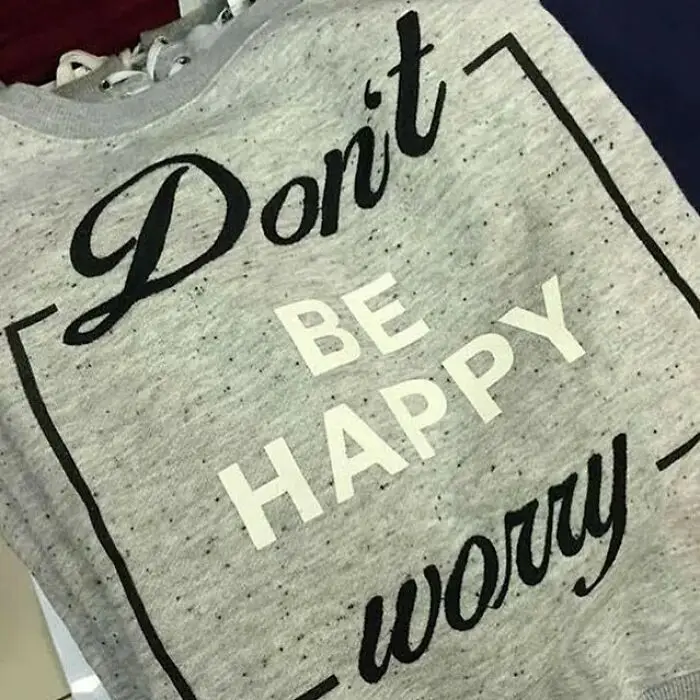

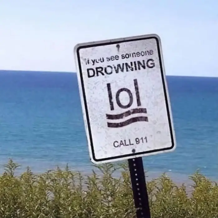
Whether or not you end up implementing those changes will depend on your goals, timelines, and design philosophy as a whole.
Meanwhile, some comments are going to be negative no matter what. It’s impossible for everyone to love your designs. When you get hate for what you do, it’s healthiest to ignore it when there’s no genuine criticism there to help you improve.
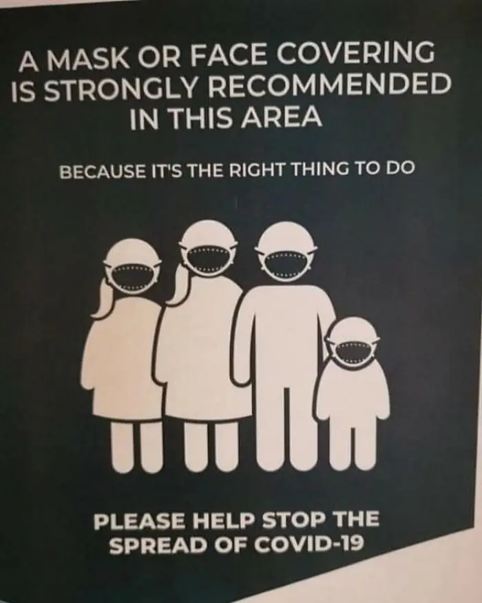
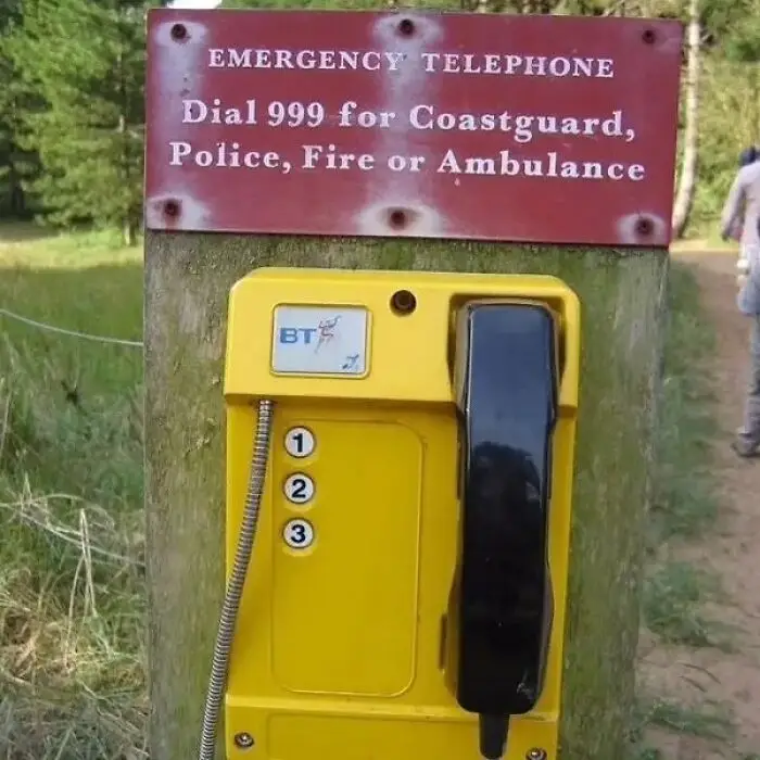

Which of these design fails did you love to hate the most, dear Pandas? On the flip side, were there any designs in this list that you genuinely liked?
What is the very worst logo or product design that you’ve seen recently with your own eyes? We’d love to hear from you! If you’d like to share your thoughts, you can do so in the comments below.