



Bored Panda
40 Designs That Are So Bad, They Deserve To Be Shamed On The Internet

40 Designs That Are So Bad, They Deserve To Be Shamed On The Internet

317
14
Being ‘born’ with bad taste, growing up aesthetically challenged creates a lot of problems: you think you’re doing fine, but you’re actually creating super crappy designs that end up scaring half the internet. Grab the holy water and repeat Dieter Rams’ 10 Principles for Good Design, Pandas, because we’re about to cross the Rubicon into the Wastelands of Crappy Design.
We’re featuring the most awful posts from these three design-oriented subreddits over here, here, and here, to prove to you that just because you can make something doesn’t necessarily mean that you should. Creativity, editing, feedback, having an understanding of how function vs. form works—these are all needed to satisfy your customer. And it’s exactly what you won’t find in this list.
From horrible signs and furniture to funky yet confusing products, we’ve got a bit of everything for everyone. This is the perfect chance to prove that you’ve got great taste, so remember to upvote the pics you hate the most. And tell us in the comments which of these horrendous designs you wouldn’t come near even with a ten-foot pole.

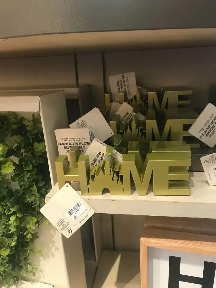
#21 Oh Shoot!

Oh Shoot!
241points

"The gray area comes in when people start to talk about taste and about degrees of aesthetic. I may love the design of Bauhaus furniture, for example, while somebody may feel that it is too cold and void of personality,” he said.

“Not unlike great art, I believe that much of what came from this era is ‘great design,’ in part because it represents an era and a philosophy. When we start to mix in discussions of taste and preference, that is where the gray areas of good and bad design get blurred,” Antoniuk noted why there’s some confusion as to whether or not some design decisions are good or bad.
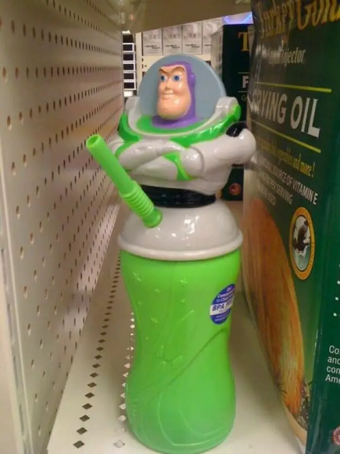

#22 Buzz Is Very Happy To See You

Buzz Is Very Happy To See You
235points

#23 Perfect Smile

Perfect Smile
Report
235points

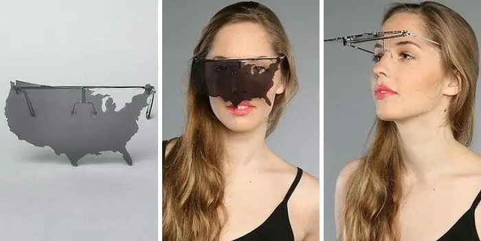
#24 Happy Independence Day America!

Happy Independence Day America!
216points

The expert told Bored Panda that people can “feel” and sense good design, intuitively. "Quite often, this relates to ergonomics and the usability or functionality of the products and services and systems. Having said that, I think far too many people expect poor design that doesn’t really work well," he said.

"For me, great design is what Dieter [Rams] talks about—it is also intuitive, it is deeply sympathetic and empathetic to the user at all levels, and at some level, it is emotional. It is a catalyst for giving us feelings."
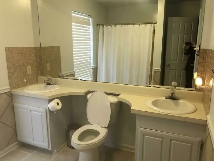
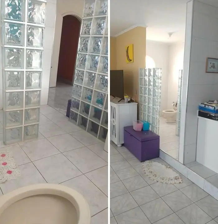
#25 Two Sinks, One Throne

Two Sinks, One Throne
215points

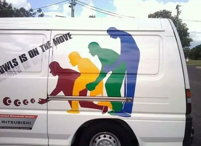
#26 This Van From Facebook

This Van From Facebook
212points

#27 Literally The First Thing You See When You Enter The House

Literally The First Thing You See When You Enter The House
Report
209points

So, Pandas, which of these designs did you think were the worst of the bunch? Were there any that you actually liked and would be happy to have at home? Why do you personally think it's so hard for designers to notice their mistakes? Share your thoughts in the comments!
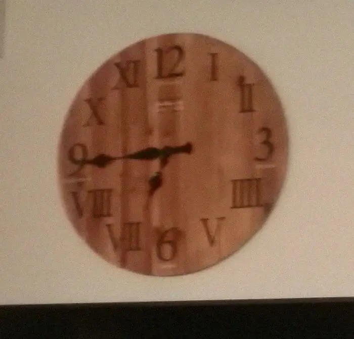
#28 The Clock At My Work. Not How Roman Numerals Work

The Clock At My Work. Not How Roman Numerals Work
201points

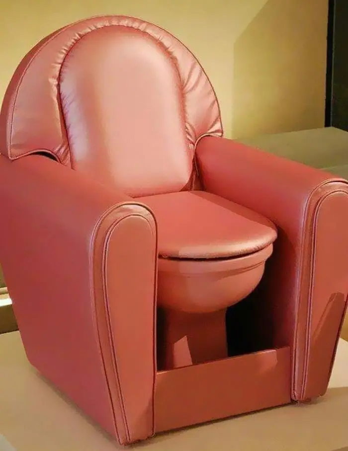
#29 Cr**per Sofa

Cr**per Sofa
194points

#30 Oh No

Oh No
Report
192points

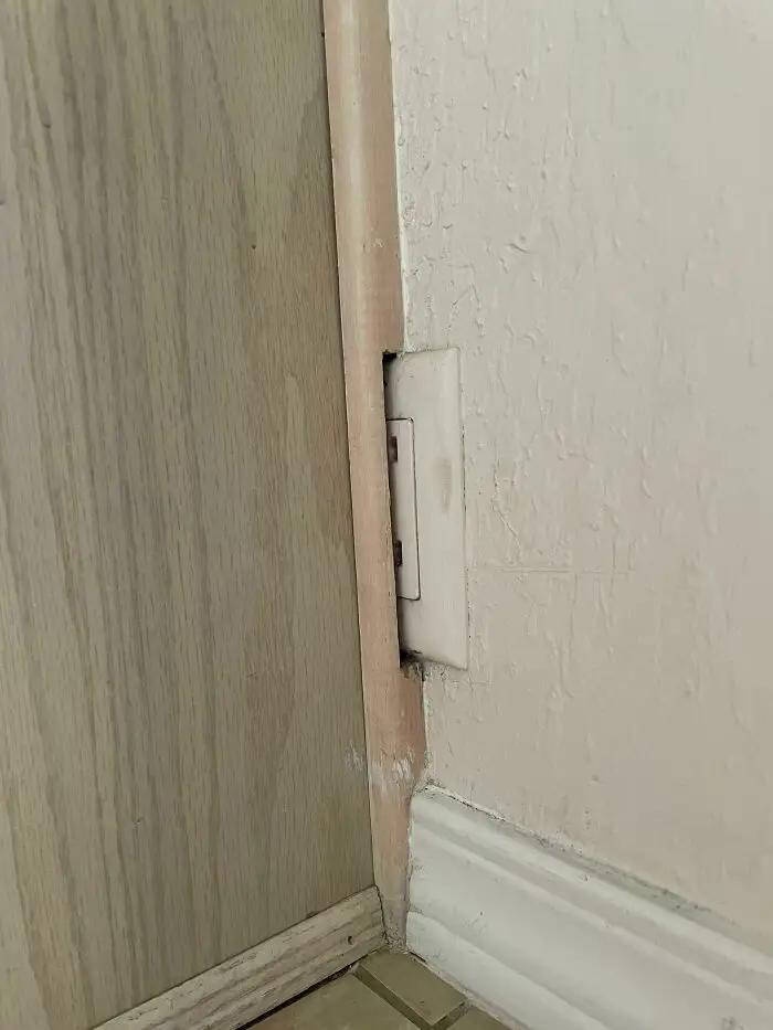
#31 I Present My Apartments 1/3 Outlet

I Present My Apartments 1/3 Outlet
191points

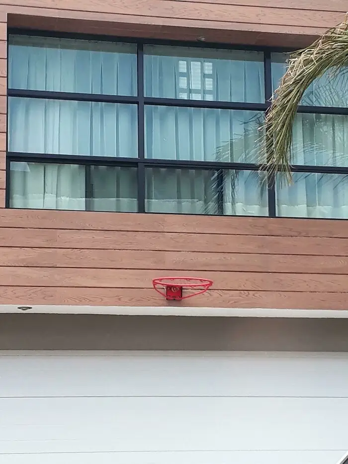
#32 I Don't Think This Is The Best Place For A Basket

I Don't Think This Is The Best Place For A Basket
184points

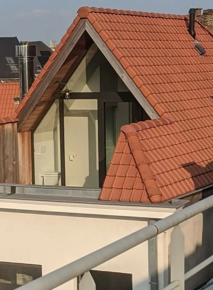
#33 Rooftop Toilets

Rooftop Toilets
181points

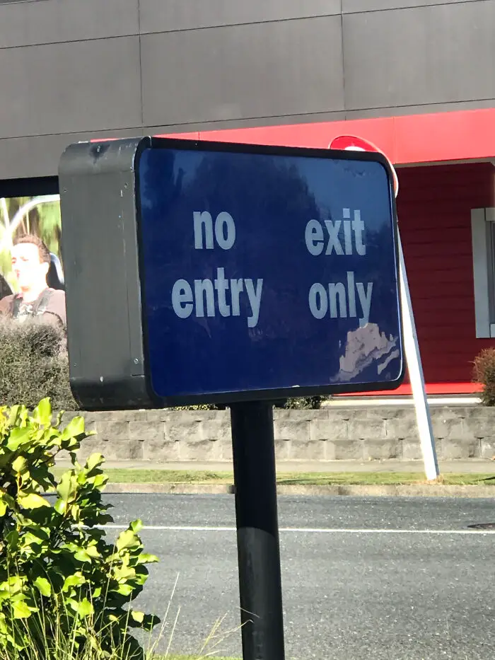
#34 Burger King's Drive Thru Sign

Burger King's Drive Thru Sign
180points

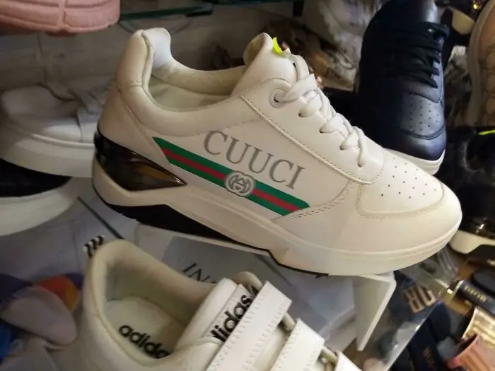
#35 Found This At My Local Store

Found This At My Local Store
Report
171points

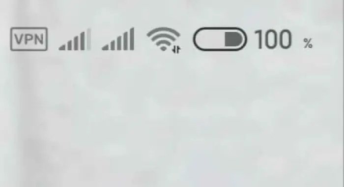
#36 Absolutly 100%

Absolutly 100%
160points

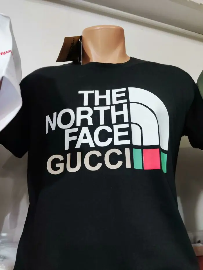
#37 Getting Two For The Price Of One

Getting Two For The Price Of One
Report
159points

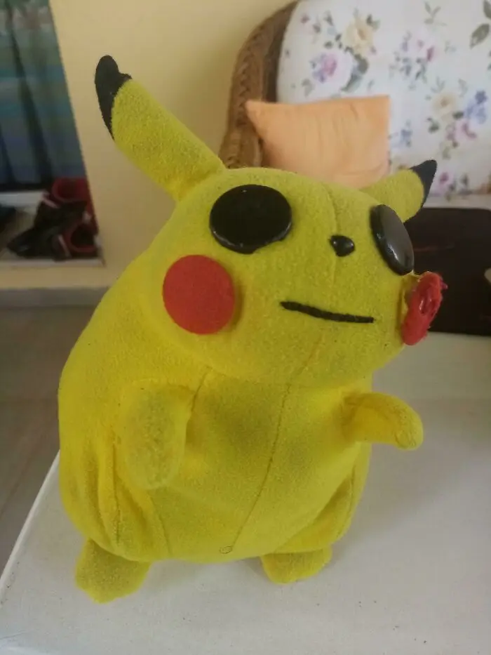
#38 My Cursed Pikachu Doll

My Cursed Pikachu Doll
Report
147points

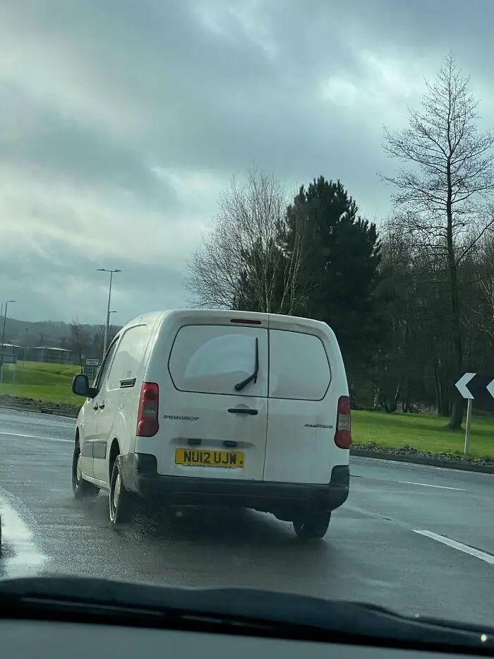
#39 Someone Please Explain The Purpose Of The Wiper?

Someone Please Explain The Purpose Of The Wiper?
146points

#40 Welcome Hnme

Welcome Hnme
138points

The concept of bad design resonates strongly across both of these pieces. As we explore a plethora of design mishaps, it becomes evident that many products suffer due to poorly thought-out creation processes.

If you're keen on further dissecting what exactly makes some designs so ineffective, consider looking into the discourse surrounding design mistakes that seem disconnected from the user's needs.

317
14