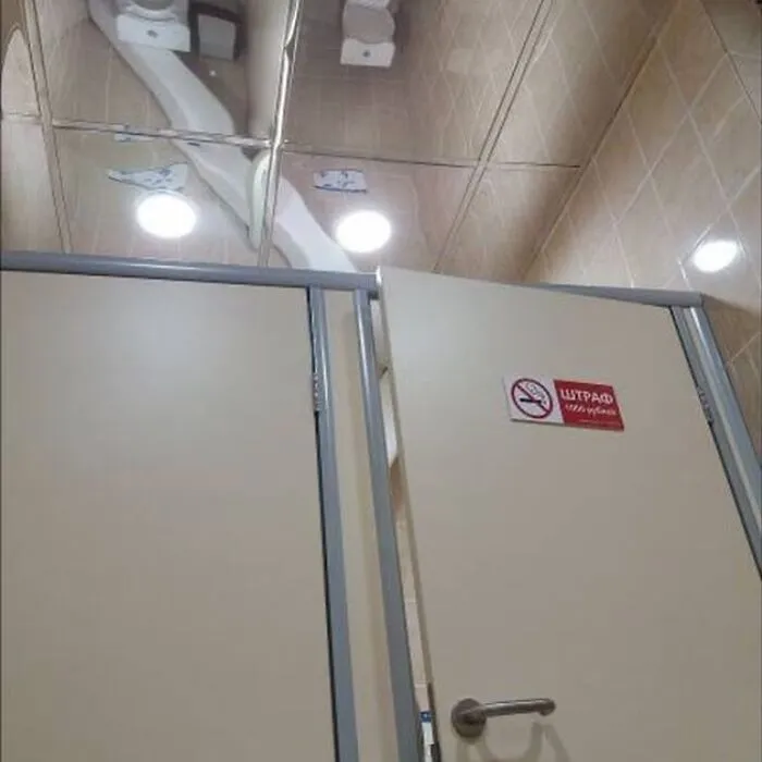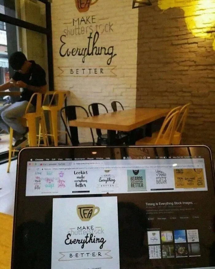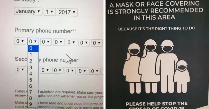



This trend becomes particularly clear when applied to older technology that could possibly “benefit” from modern innovations, for example, not only is the modern TV remote pretty heavy with buttons, but now come with hundreds of options, menus, and “features” to dig through, which is all well and good, however, the actual user interface of these things is seldom well designed.
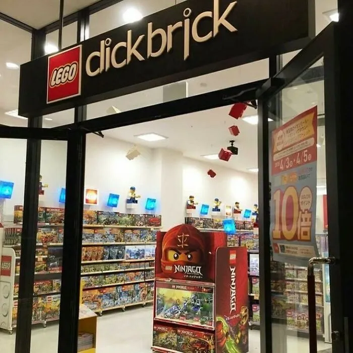


As good as it is to have cool features, something as simple as a pot of coffee shouldn’t take more time than it did two decades ago just because you have to fight your way through multiple menus. It’s even more distressing when the complicated, annoying device is “replacing” a bit of hardware that used to be incredibly simple, for example, a kettle one puts on the stove, versus a button-laden machine with a two-hundred-word instruction manual.



This is also why, in ideal circumstances, there is some degree of prototyping and testing before release. However, there is a stage in development where it’s no longer possible to really change fundamentals, in which case the people in charge prefer to close their eyes and just hope for the best.
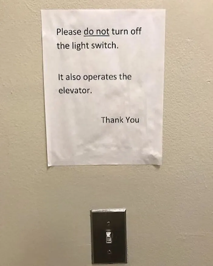


However, one fringe benefit is that every bad design can reveal an idea that doesn't work or highlight a concept that other designers would be wise to not ignore. Plus, like the fresh air after the rain, suffering through a bad coffee maker, for example, makes one really appreciate replacing it with something better. So if you want to see more examples of terrible design, don’t fear, Bored Panda has got you covered, you can find our other articles here and here.