




Graphic symbols and elements we see in famous logos today are a result of numerous techniques studied in the last couple of centuries. Considering the evolution of our society and its demands the old Instagram logo, introduced in 2010, might just not cut it today. The original Apple logo with its realistic style drawing looks way too complicated and forgettable for us, while the old Starbucks logo shows some indecency in it. We, as a society, are more used to simplistic style these days. Also, since we've gotten better at understanding symbols, famous logos changed taking in mind our demands.
Take a look at this list compiled by Bored Panda for example. In it, you'll find some of the world's most famous logos, both how they look now and how they looked in the beginning. While you probably recognize all of the contemporary ones, many of their original counterparts aren't so easy to identify.
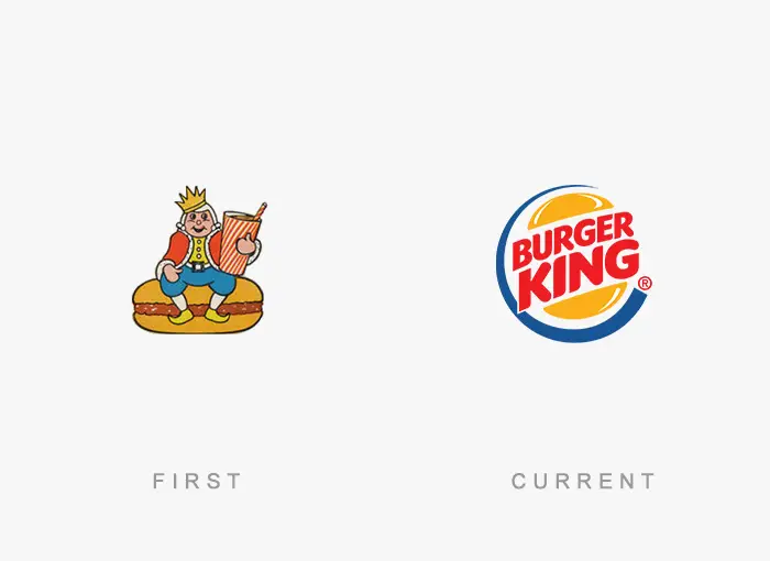
#21 Burger King
unknown
Report60points
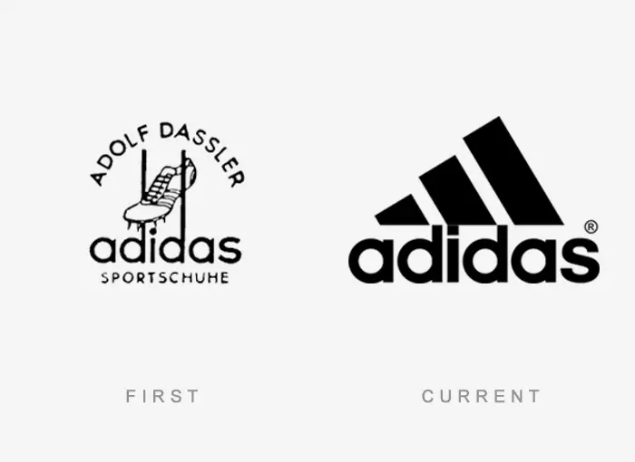
#22 Adidas
unknown
Report56points
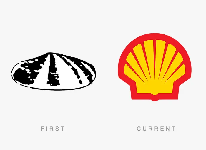
#23 Shell
Unknown
Report50points
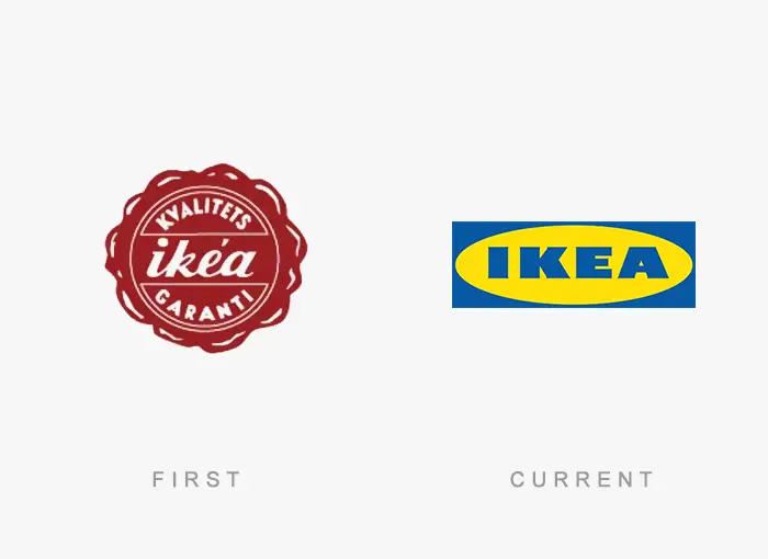
#24 Ikea
Unknown
Report47points
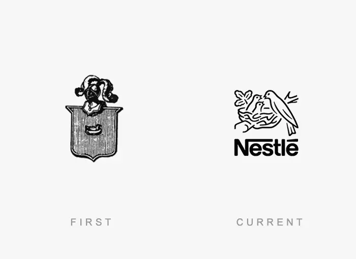
#25 Nestle
Unknown
Report45points
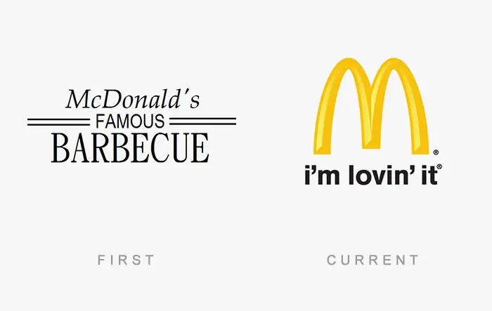
#26 Mcdonald's
Unknown
Report44points
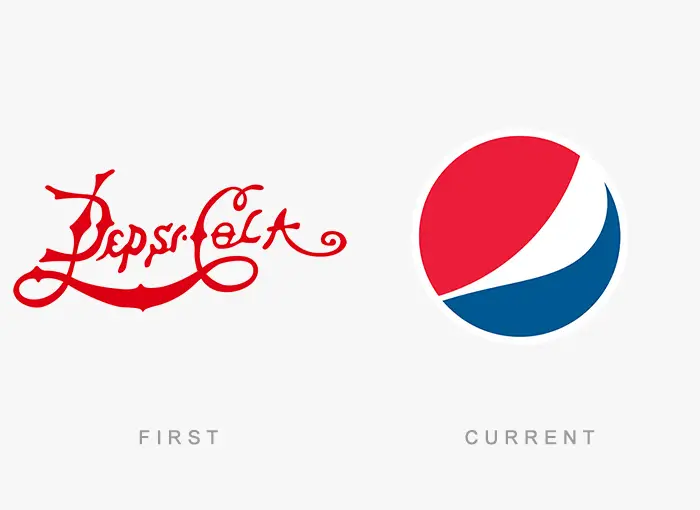
#27 Pepsi
Unknown
Report41points
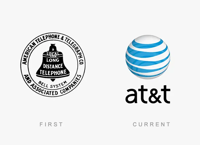
#28 At&t
Unknown
Report40points
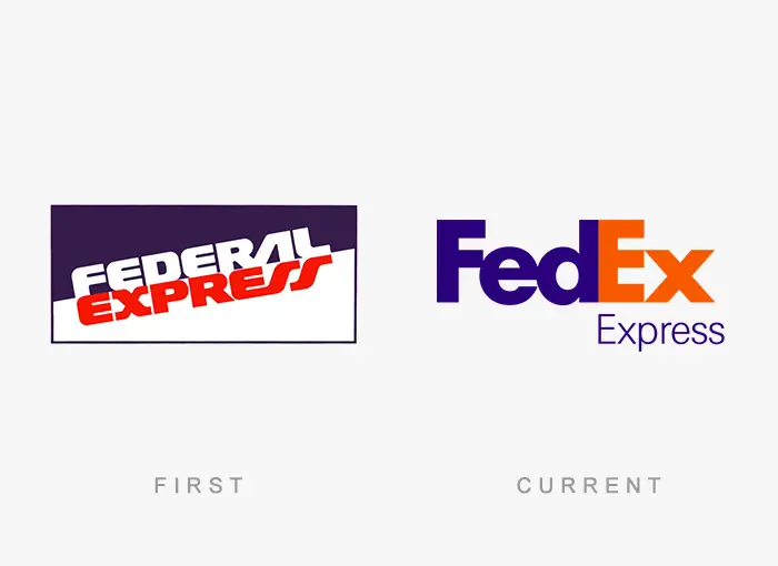
#29 Fedex
Unknown
Report39points
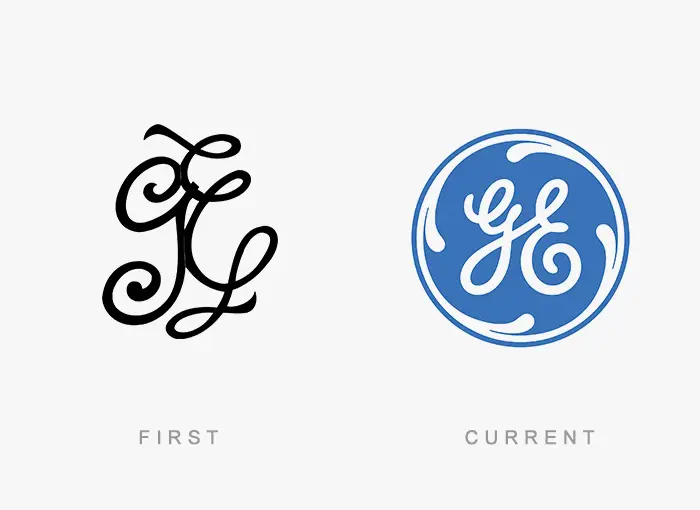
#30 Ge Healthcare
Unknown
Report38points
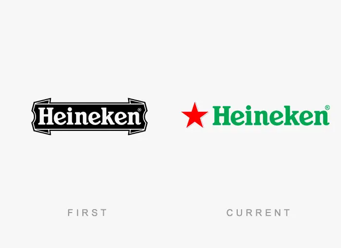
#31 Heineken
unknown
Report38points
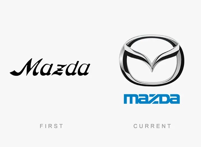
#32 Mazda
Unknown
Report33points
#33 Visa
Unknown
Report33points
#34 Adobe Systems
Unknown
Report32points
#35 Pampers

Unknown
Report32points
#36 Nissan
Unknown
Report30points
#37 Lay's
Unknown
Report29points
#38 Microsoft

Unknown
Report28points
#39 Eskimo
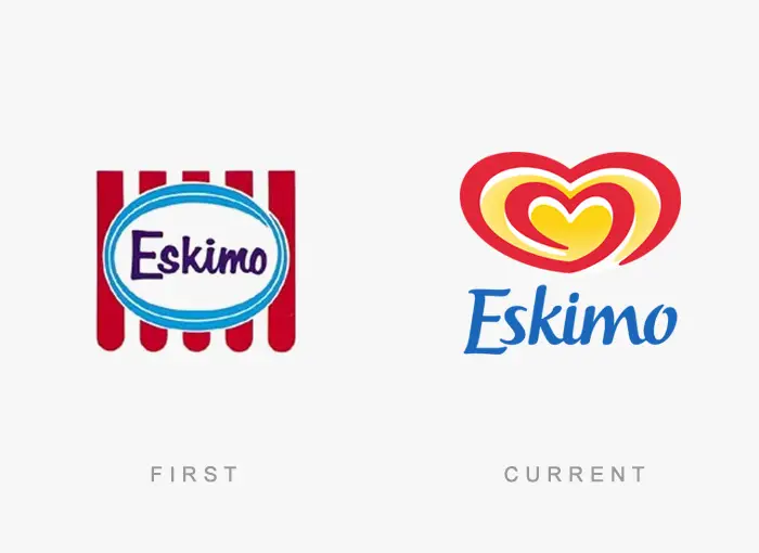
Unknown
Report28points
#40 Kodak

Unknown
Report27points