





The humor in bad design boils down to something surprisingly deep. Psychologists (or at least Germans) call it schadenfreude, that little spark of pleasure we get from watching someone else’s misfortune, the often referenced schadenfreude, it often shows up strongest when the mistake feels like it was avoidable or self-inflicted.
A door handle installed upside down or a crosswalk sign pointing directly into a wall doesn’t just make us laugh, it makes us feel a tiny bit smug, like surely we would have caught that. Of course most of us wouldn’t have, but that’s beside the point. The appeal isn’t cruelty so much as recognition. We’ve all stared blankly at a shower handle wondering which direction means hot, and seeing that confusion turned into a viral photo makes the whole shared human experience of being baffled by objects feel a little less lonely.


There’s also a satisfying sense of justice tucked into these posts. Somewhere out there, a person got paid to design a parking sign, a menu, or a building entrance, and somehow ended up creating something that actively works against the people using it. When that gets exposed and mocked online, it scratches an itch related to fairness and accountability, the same itch that makes us enjoy watching overconfident people get humbled.



Nobody actually gets hurt by a poorly placed light switch, which keeps the whole thing squarely in the realm of harmless fun rather than mean spirited ridicule. So what actually makes design bad in the first place? Cognitive scientist Don Norman spent decades studying exactly this, and his book on the subject basically argues that good design should be invisible.


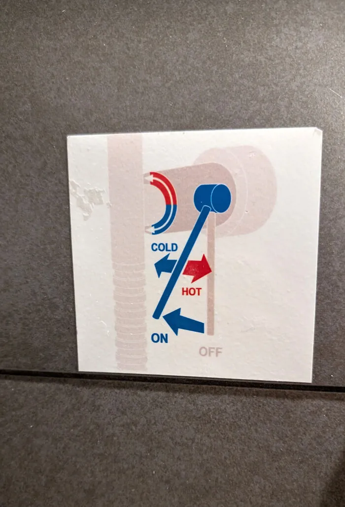
When something works the way your brain expects it to, you don’t even notice the design at all, you just glide through the task. Norman argued that when people struggle to use an everyday object, it is almost never their fault. It’s the object’s fault for failing to communicate clearly how it’s supposed to work. His most famous example is the humble door that gets pushed when it should be pulled, now nicknamed a Norman door in his honor, and once you learn the term you will never stop noticing them.



Bad design tends to share a few consistent traits. It ignores how people actually behave in favor of how a designer imagines they should behave. It buries obvious functions under decorative nonsense. It gives no feedback, so users have no idea whether their click, tap, or push actually did anything.

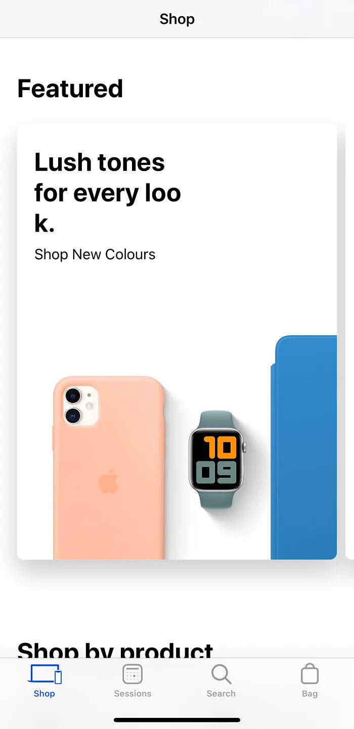

Usability researchers at the Nielsen Norman Group have spent years cataloging these patterns into a widely used set of principles, and as outlined on their site, things like visibility, consistency, and error prevention show up again and again as the difference between something that feels effortless and something that makes you want to throw your phone across the room. When a form asks you to enter a date in three different formats depending on which screen you're on, that's not a small inconvenience, it's a full heuristic violation dressed up as a minor annoyance.