
Most of us, if not all, are aware of what a typical map looks like. It usually represents a part of the Earth, showing the locations of countries, cities, and natural landmarks like rivers and mountains, as well as man-made features like roads and buildings.
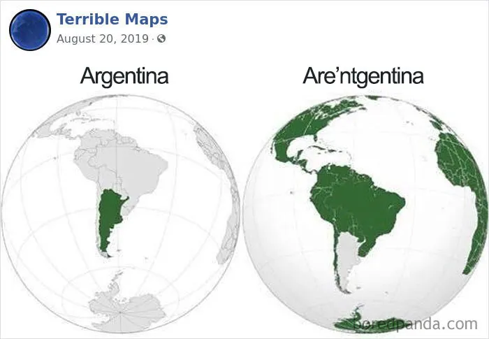
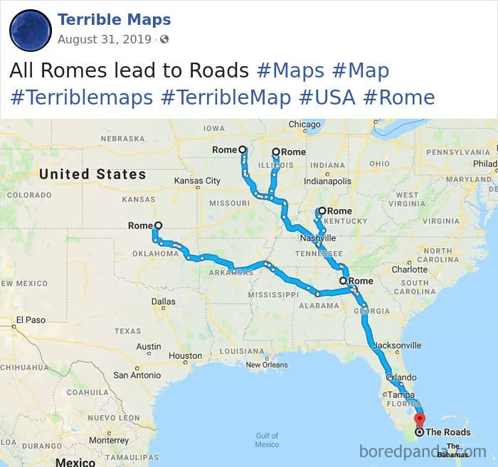
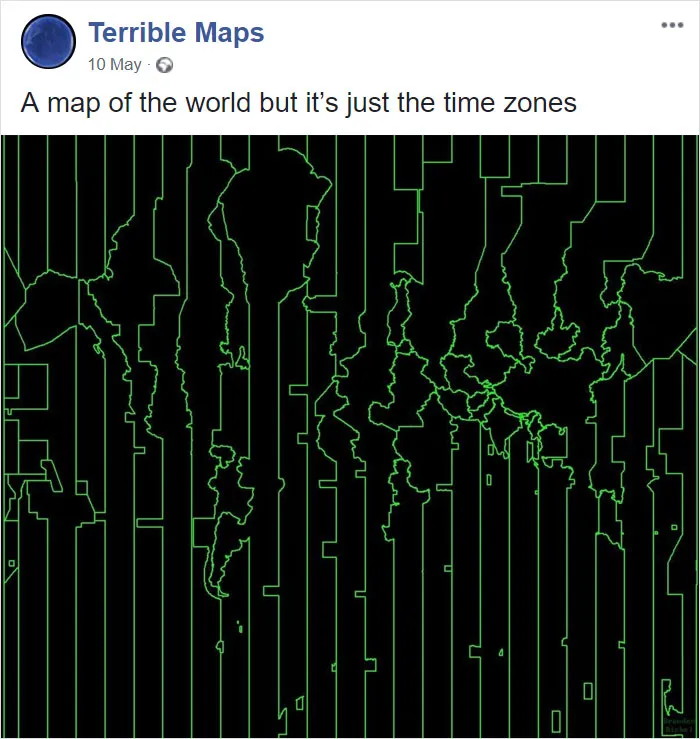
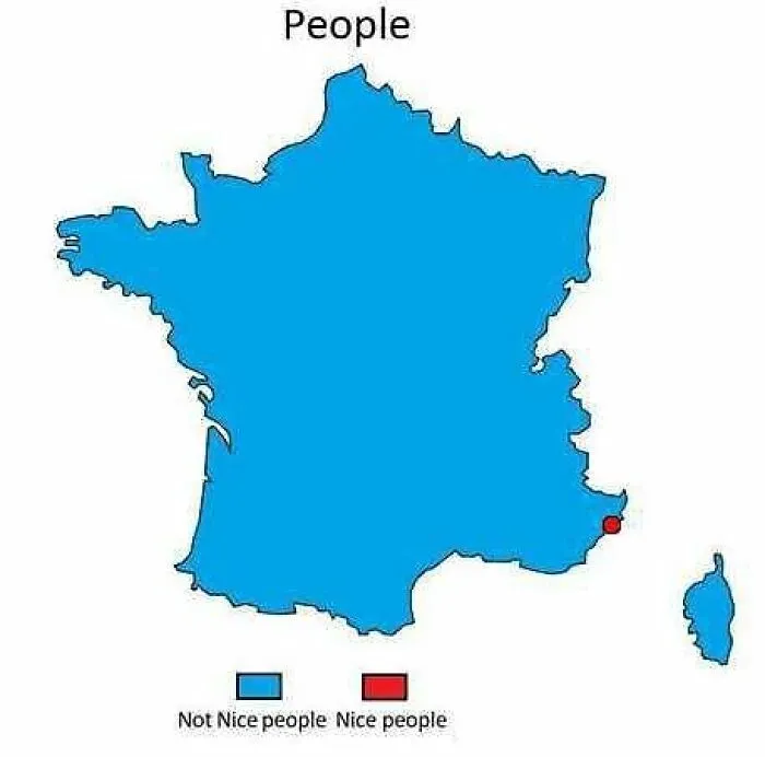
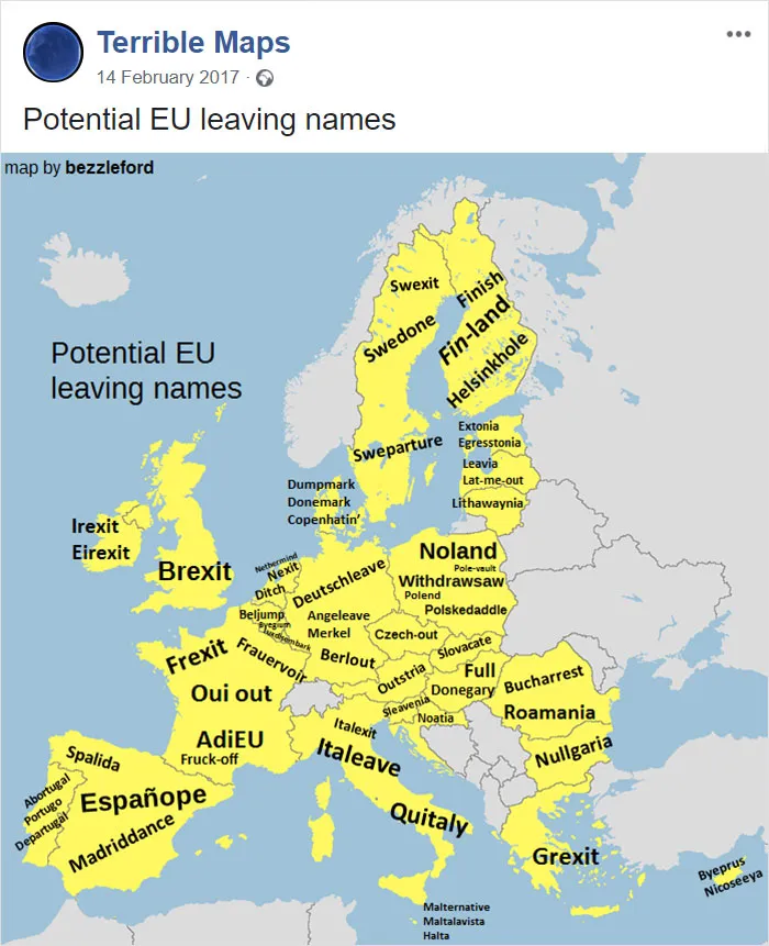
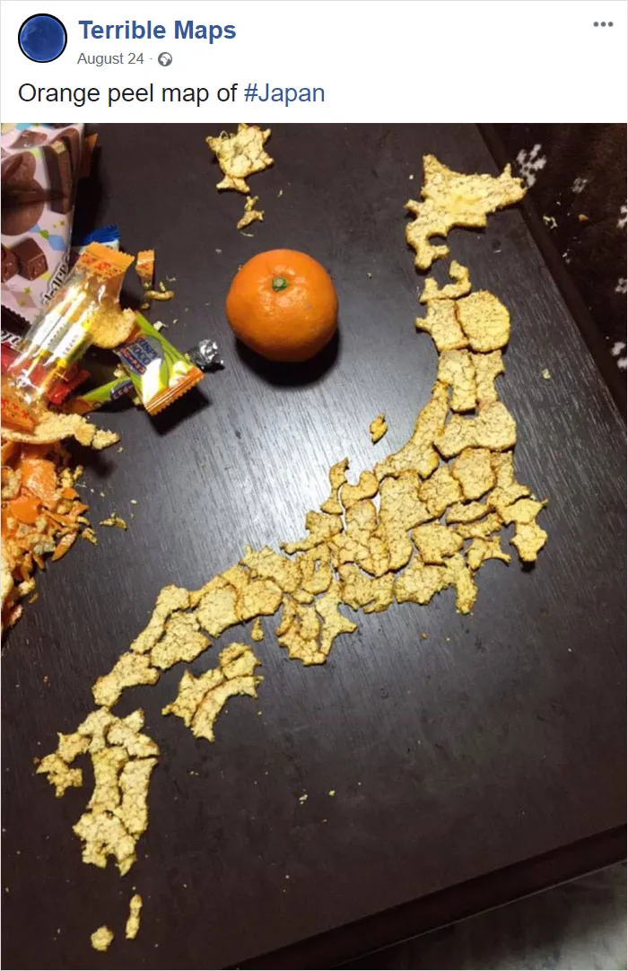
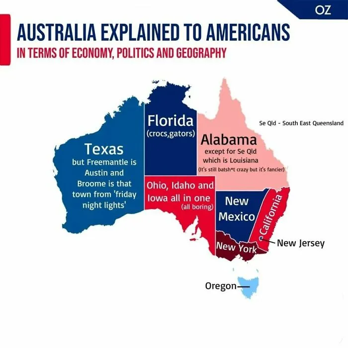
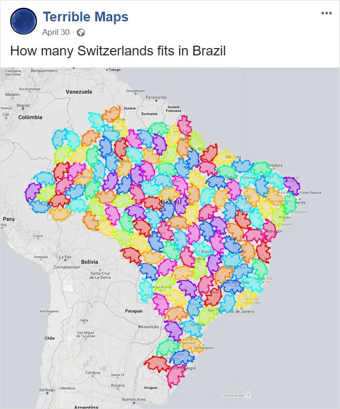
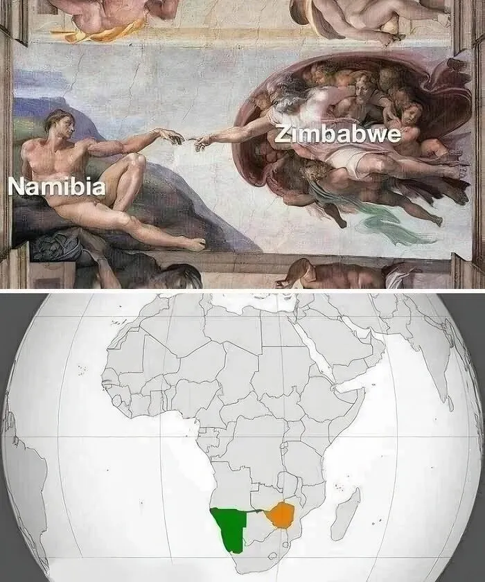
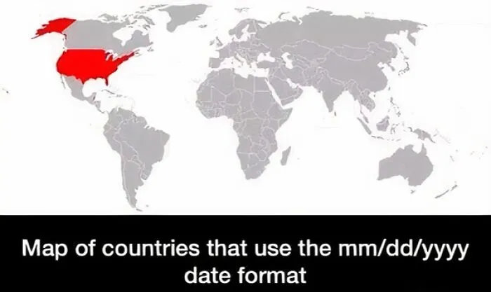
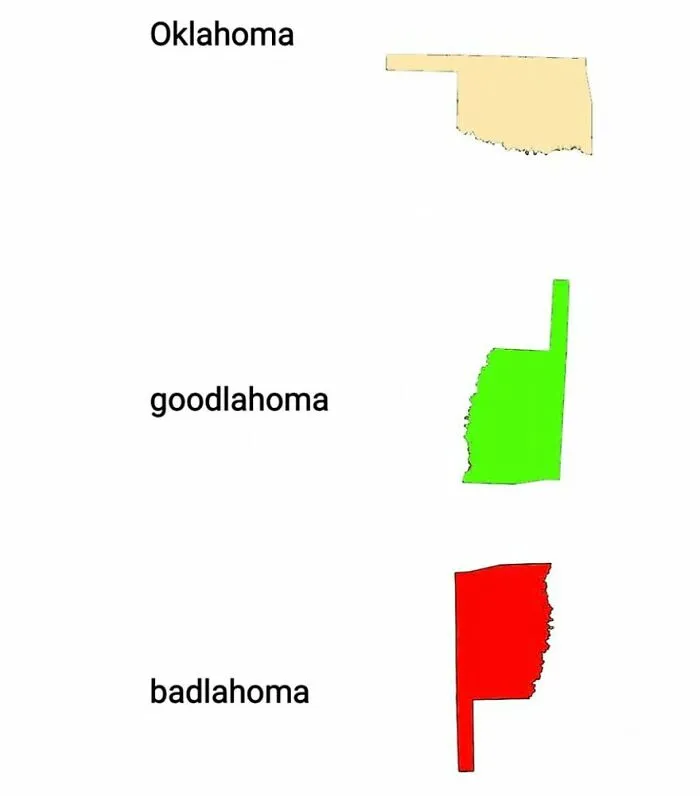
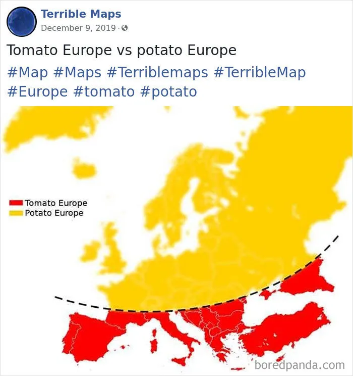
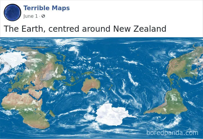
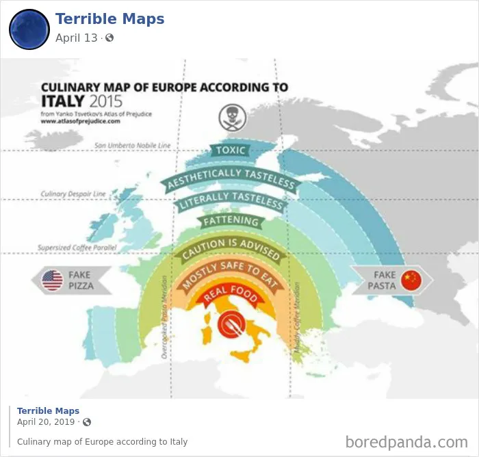
However, some cartographers try to mix it up and stray from the norm, creating not-so-conventional maps that, at first glance, have no usefulness at all. How many Switzerlands fit in Brazil and tomato Europe vs. potato Europe are just a few examples awaiting you on the best-of-all-time list of Terrible Maps. Scroll down to find them, and don’t forget to upvote the ones you think failed at geography the most!
Bored Panda also reached out to cartographer and designer Liz Cox, who kindly agreed to answer a few questions about all things maps.
However, some cartographers try to mix it up and stray from the norm, creating not-so-conventional maps that, at first glance, have no usefulness at all. How many Switzerlands fit in Brazil and tomato Europe vs. potato Europe are just a few examples awaiting you on the best-of-all-time list of Terrible Maps. Scroll down to find them, and don’t forget to upvote the ones you think failed at geography the most!
Bored Panda also reached out to cartographer and designer Liz Cox, who kindly agreed to answer a few questions about all things maps.
This post may include affiliate links.

Liz describes these particular maps by saying, “I think a terrible map that fits into this specific realm is all about the factual display of data with the perfect twist of wit and absurdity.”
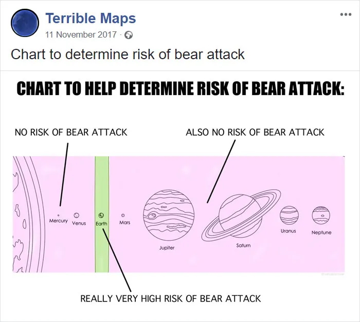
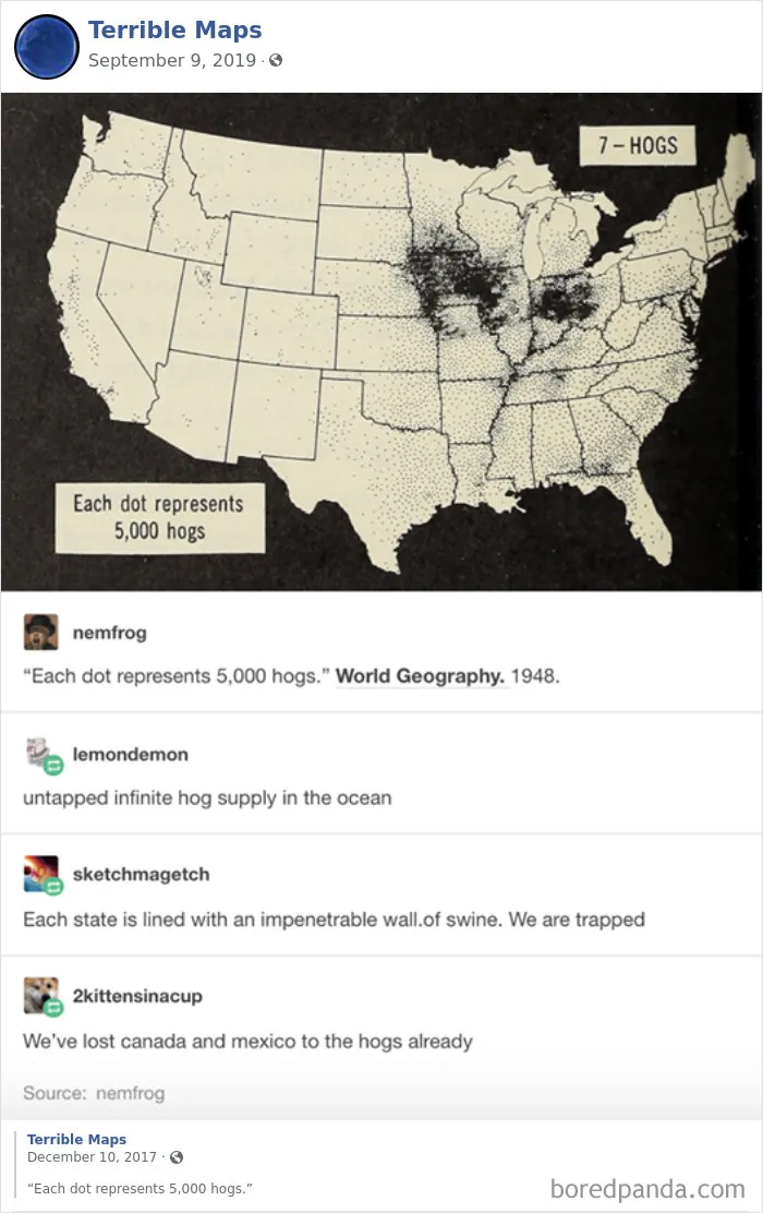
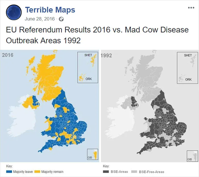
But if we’re talking about a terrible map intended for actual professional use, Liz believes that incorrect information, bad data, poor analysis, and horrid design skills can greatly contribute to a map becoming user-unfriendly and even unusable.
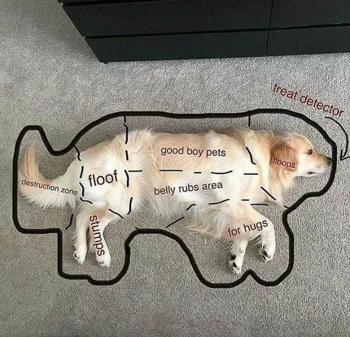
To check out how the opposite of terrible maps looks, make sure to check out our previous publications about the most informative maps that weren’t taught in schools.