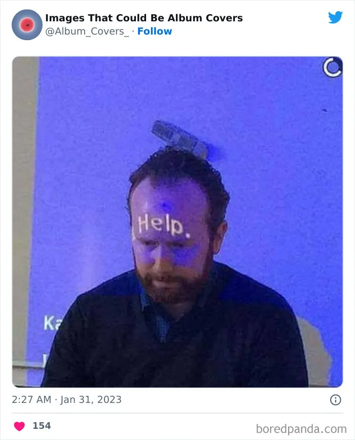


The questions that you should be asking yourself are about the type of message that your album cover is sending. Is your album title legible, clear, and brief? (Or, alternatively, if you want to be chaotic, unclear, and long-winded, are you creating exactly the atmosphere you want to?) In essence, you want to get your message across to your audience.
Opt for a font that’s instantly readable, otherwise, you’re leaving people confused and they’ll move on to the next album at the music store. That swirly script you love might look fancy, but can anyone actually read the name of your band?
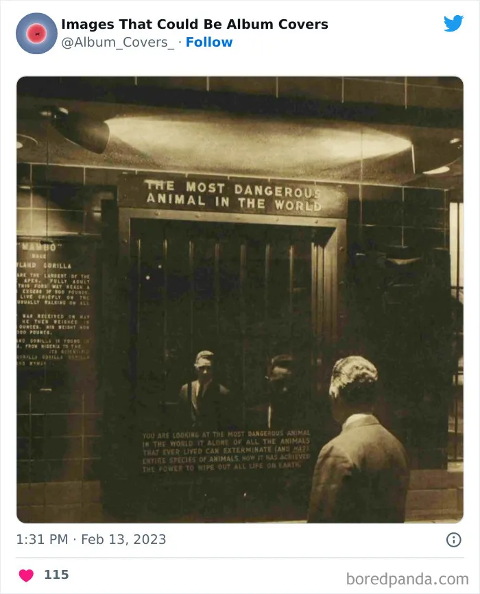
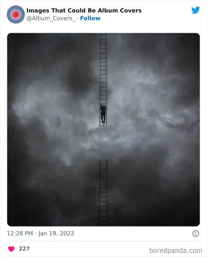

Something else that you should really keep in mind is reaching out for help. You might have designed the most perfect album cover in the history of commercial music. Or… at least that’s what you tell yourself. However, everyone needs an editor, no matter what industry they work in.
Show your album cover to a few friends whom you can trust to be open and honest with their opinions. Get in touch with some industry professionals to see what they think. Heck, ask someone to proofread what you’ve written! It’s better than realizing that you’ve made a silly grammar mistake once you’ve printed a thousand covers.
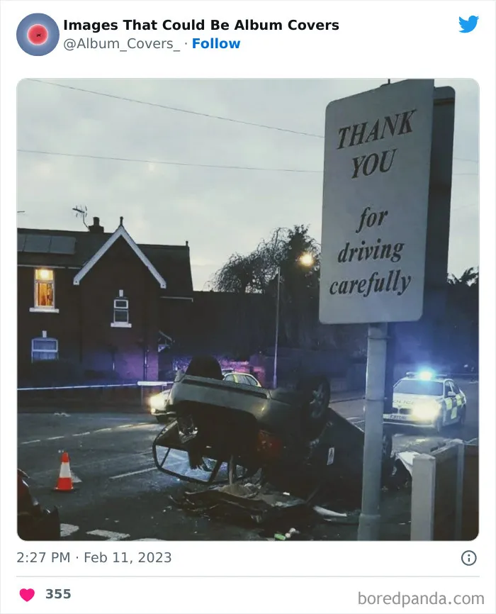
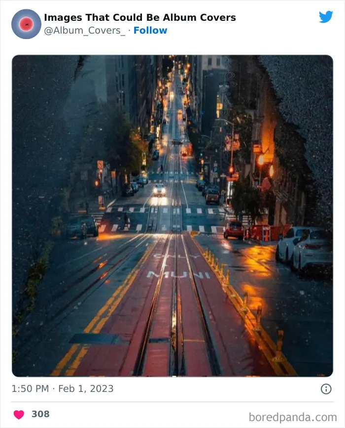
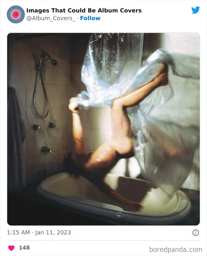
After asking for other people’s input, you might find that some things that look incredibly cool to you simply confuse others. You might not be getting the message that you want across to others. This means it’s time to get back to the drawing board and refine some of the visuals and the font. Now, that’s not to say that you should completely scrap your ideas.


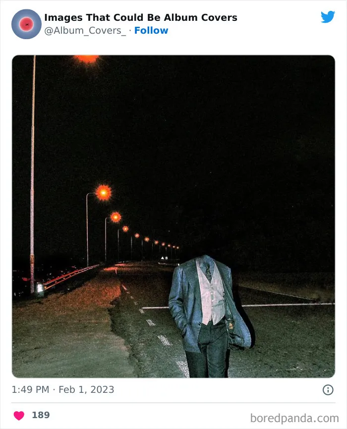
People have different opinions on art, and you shouldn’t silence your voice. However, the sign of any good artist is that they’re open-minded when it comes to criticism: they take the advice that’s useful and ignore everything else. It’s scary to put your work out there! But it can help you edit your work into something that’s elevated—on a whole other level.