

School. It's somewhere we all have to go, whether we like it or not. They could at least make it a pleasant place to be, couldn't they? Well not really, no. Most public schools are formulaic, functional places that hardly make students want to be involved in the learning process, let alone inspire creativity, and the joy of knowledge.
With budgets being further slashed under conservative governments in the U.S. and UK, the situation in these countries at least isn't looking up. Not only are students and teachers dealing with boring architecture design, dilapidated school buildings and classrooms, but many also have to live with shortages of basic materials too, prompting teachers to leave the profession en masse. So much for caring about the next generation!
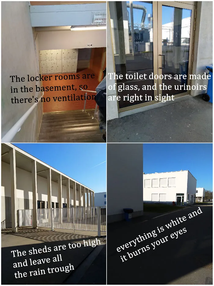
Bored Panda has collected a list of examples of school designers either taking shortcuts, not caring, or needing to go back to school themselves. From thoughtless toilet placements to hilariously offensive murals, these students can at least have a wry chuckle at the ridiculousness of crappy design.
Scroll down below to check these design fails out for yourself, and let us know what you think in the comments!
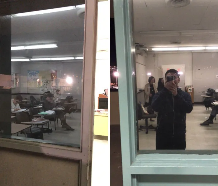
#22 One-Way Window Tint At School, So We Can't See Shooters, But They Can See Us
Report
189points
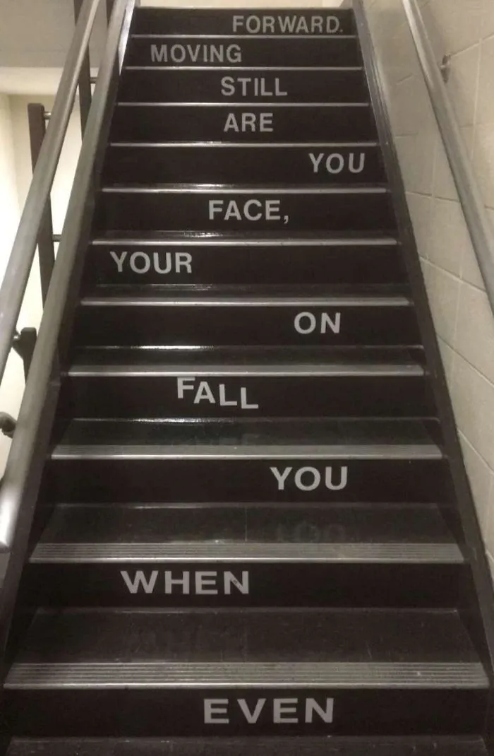
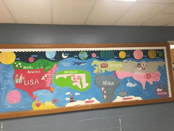
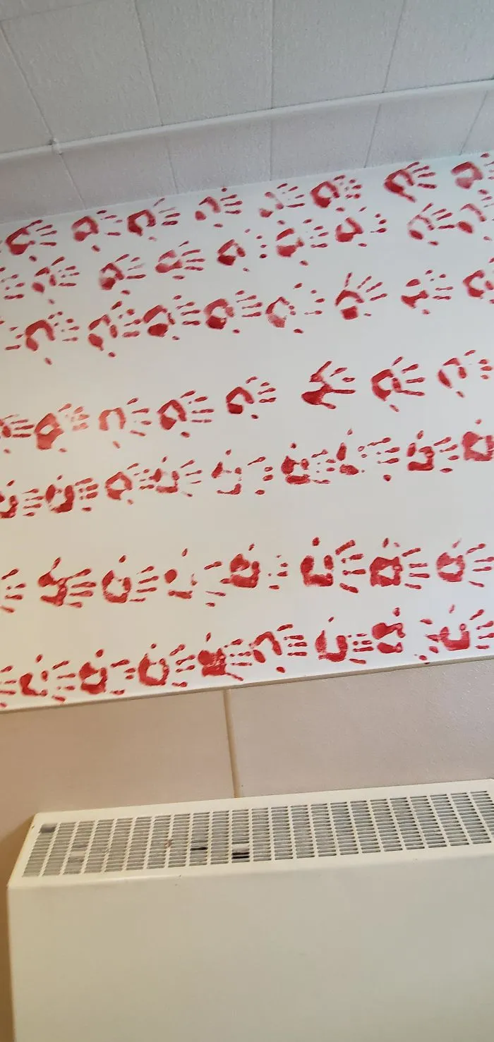
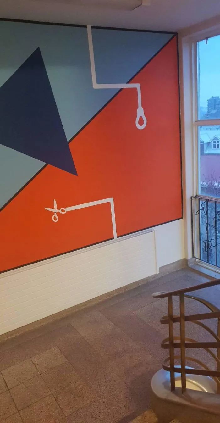
#26 The Wall Decoration At My High School, Red Is Supposed To Represent The Freshmen
Report
174points
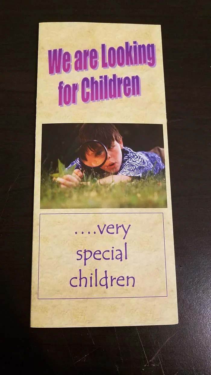
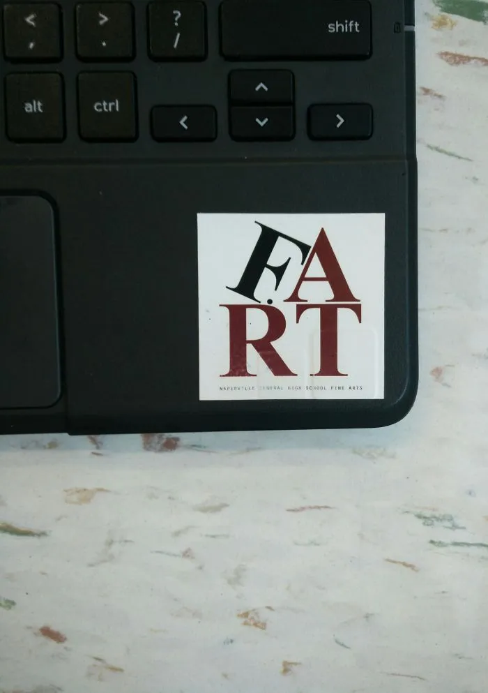


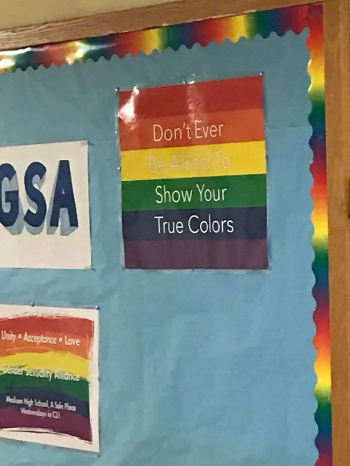
#32 At First Glance, The White Lettering On This Pride Poster At My High School Blends In With The Yellow Background. Changes The Meaning Drastically
Report
151points

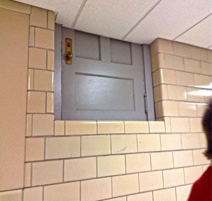
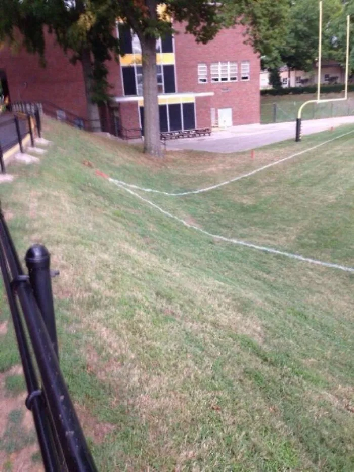

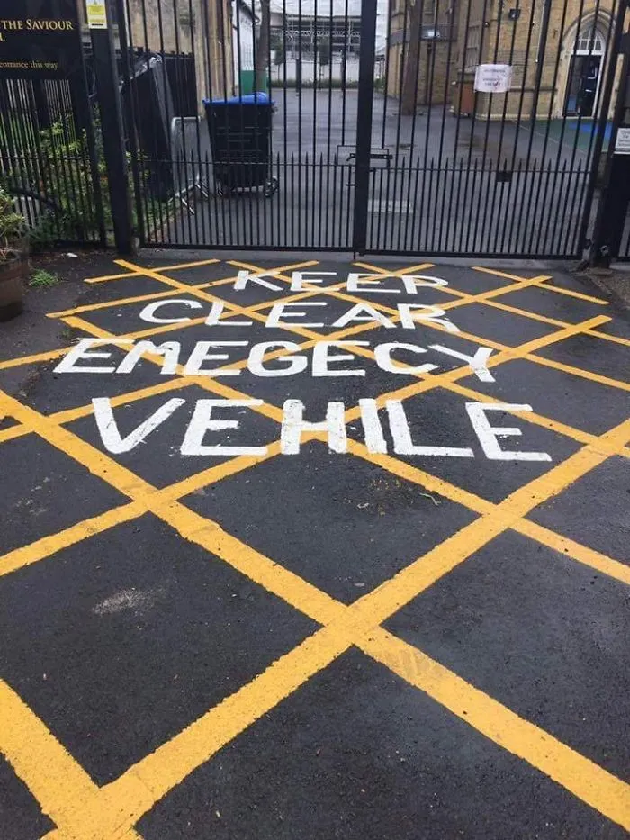
#37 Off Centre, Misspelled, Hard To See Road Markings At A Local School
Report
138points