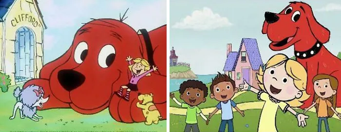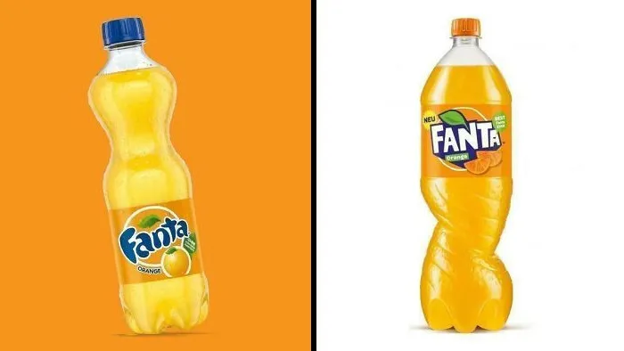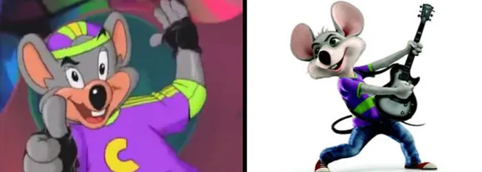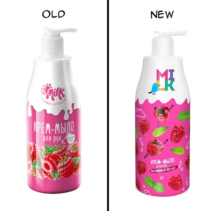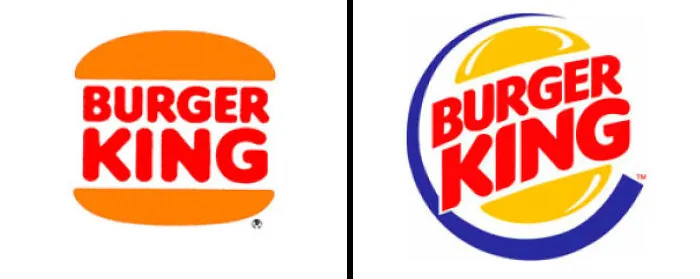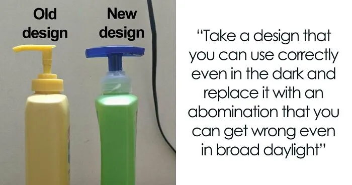


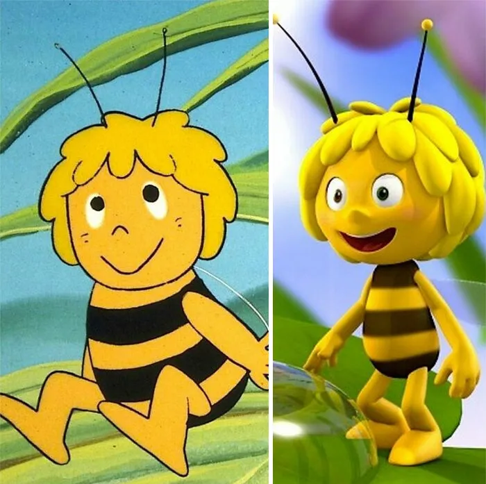
Brands that got a positive first reception to a redesign "capitalize on something we know in psychology as the familiarity heuristic — a well-documented shortcut our brains take that makes us feel calm with the familiar, and apprehensive about novel experiences — regardless of their advantages," Shah said, explaining that brands who opt to visually disrupt usually receive all the outrage.
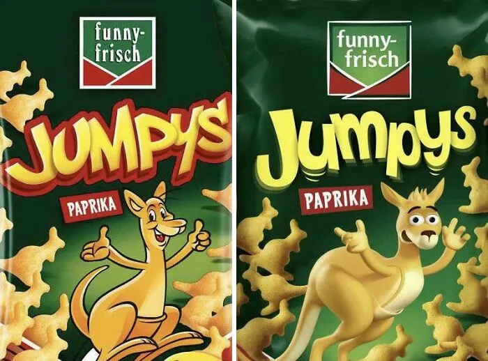
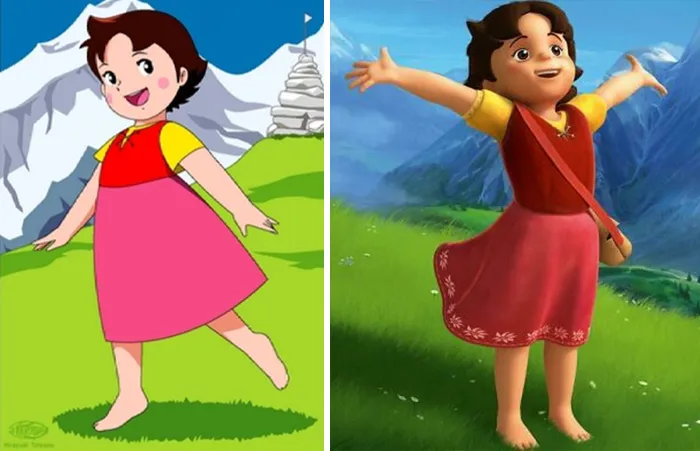
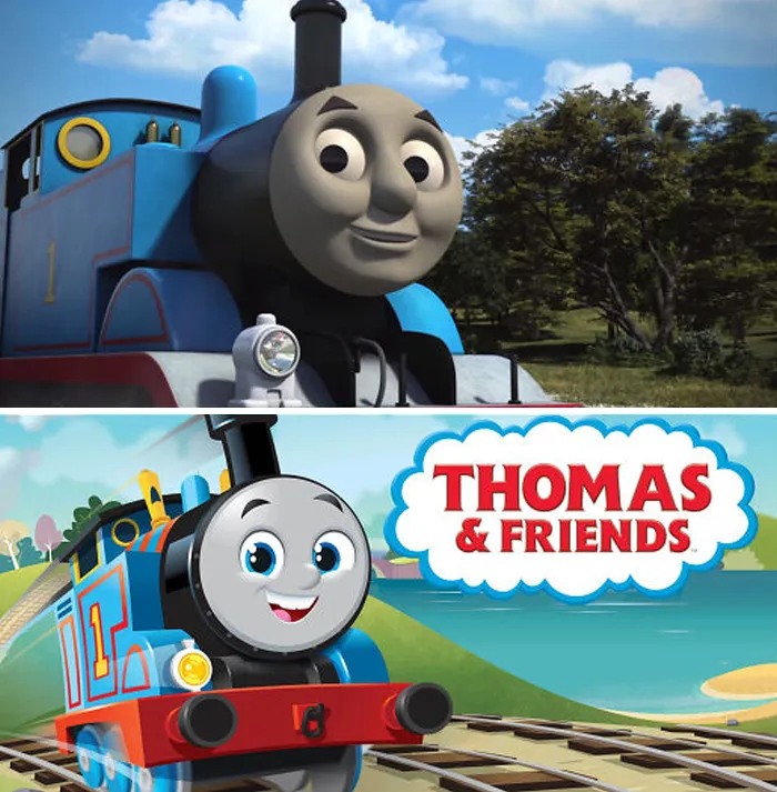
When it comes to identity integration, Shah mentioned a study conducted by Pennsylvania State University called "The Starbucks effect". After surveying 632 college students and asking them to respond to various redesigns, it was found that consumers who are strongly committed to a brand tend to react more negatively toward new logos, while more casual customers typically view the redesigns as a positive development. "When we see a brand that we’ve built an emotional relationship with modify its logo or design," Shah added, "we panic."
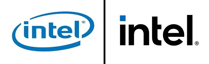
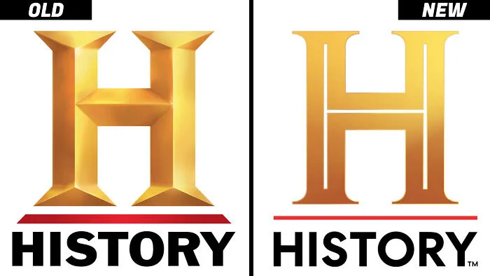
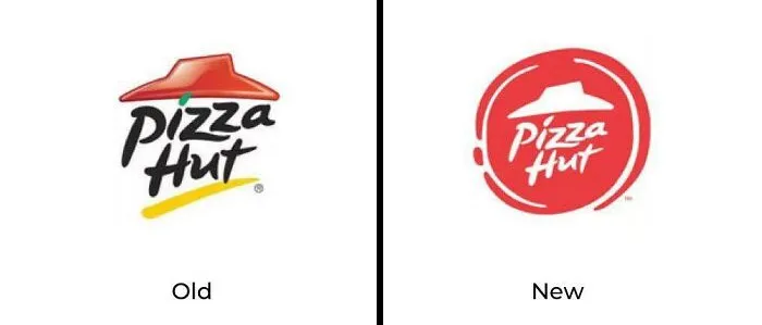
"Redesigns take time, effort, and an investment into an identity and visual cue that will stay with the company for the foreseeable future. They’re rarely done on a whim and rarely done without a conversation that spans many layers of a company."
"What we’ve learned above is that there is at least one easy way to avoid backlash altogether and thrive: Make your logo changes simple. Focus on colors and symbols that your customers recognize. Remove ambiguity," Shah suggested.
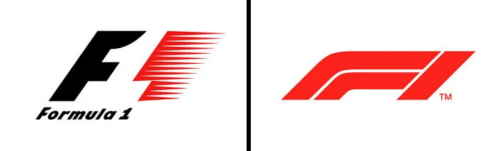
#29 Formula 1. I Understand Why They Changed It, But Dammit, The Old Logo Was Iconic!
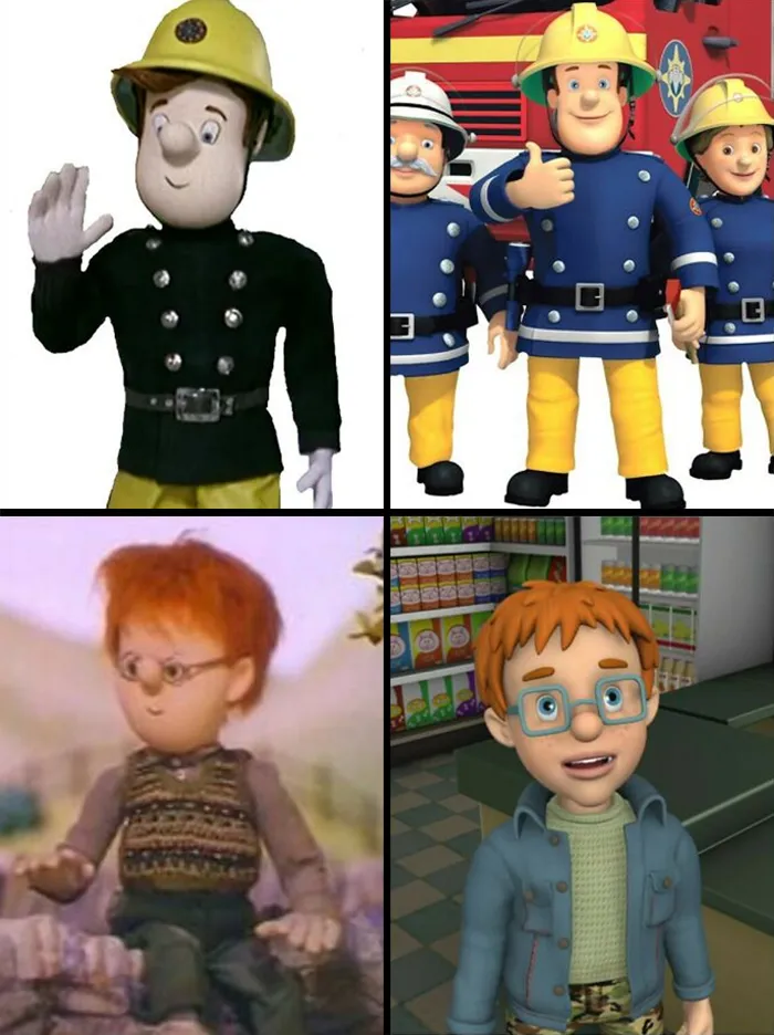
#32 Fireman Sam. Norman Price Looks Like He Works For A Lipstick Company