



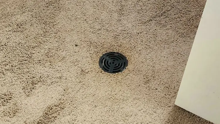


We all deserve quality. Well-designed products, environments, and advertisements should be the baseline for everyone. But that’s naive. The upside of less-than-perfect design decisions—as frustrating and icky as they are—is that they create a lot of room for unintentional comedy. And they help you see what your sense of taste is like, too!
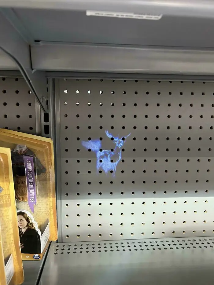
#41 This Harry Potter Projector Wand Literally Just Looks Like A Deer Farting
Report
23points
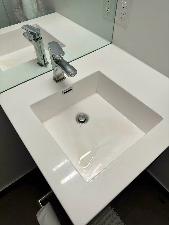
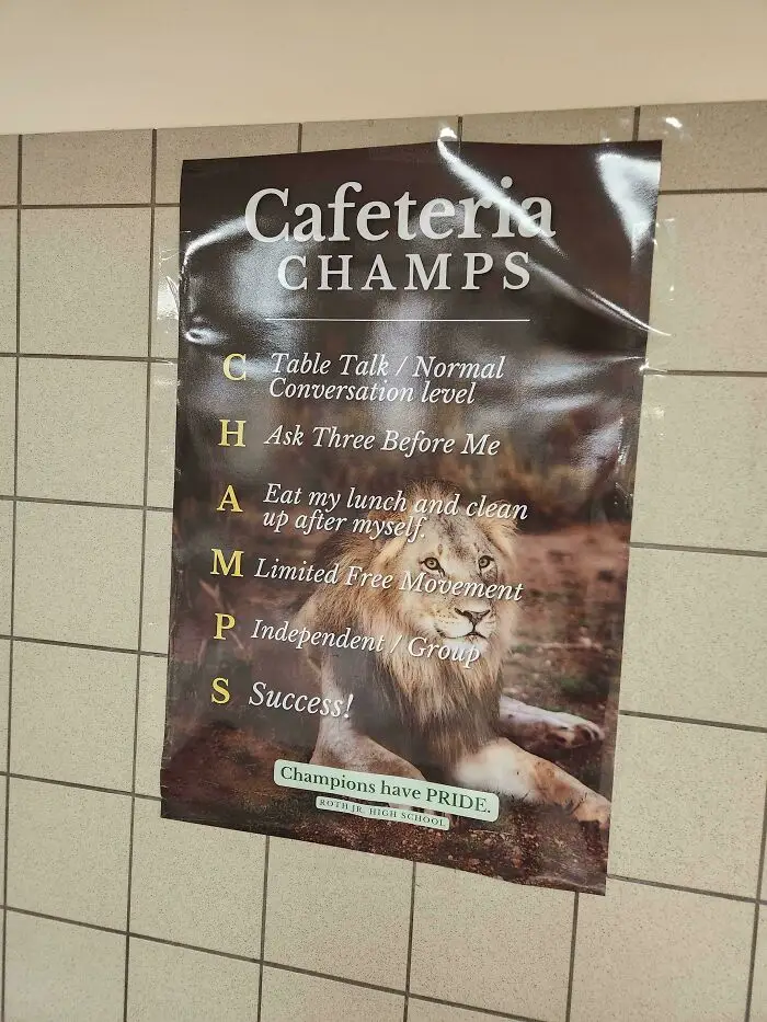
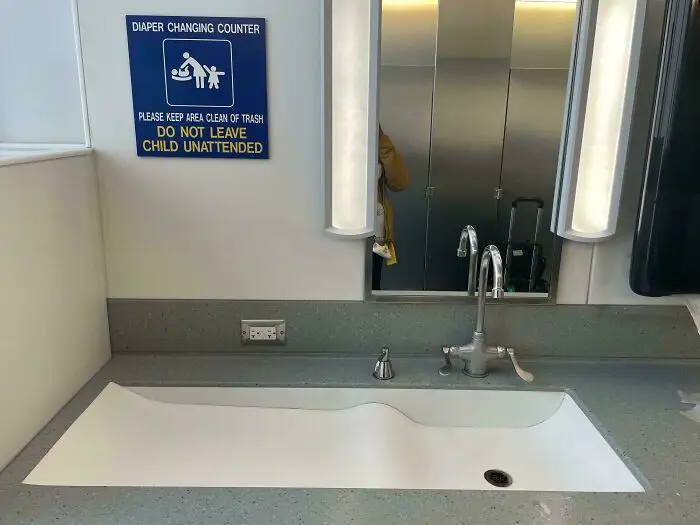
#45 The Baby Changing Area In The O’hare Bathrooms - The Whole Area Was Soaked And My 16-Month-Old’s Feet Were In The Sink 😑
Report
22points
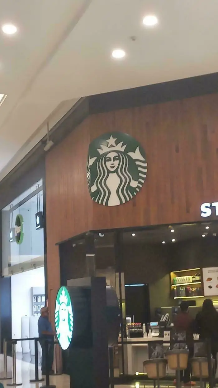
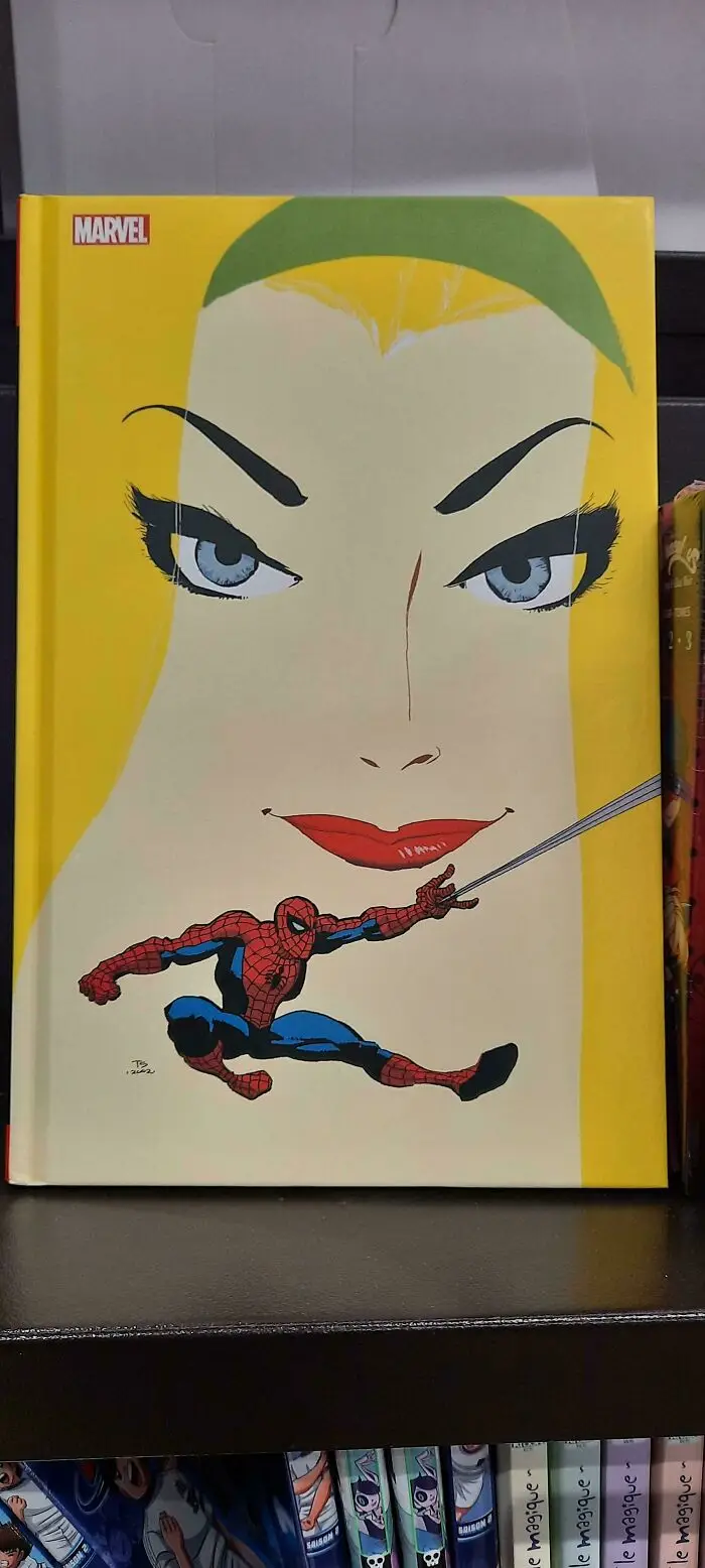
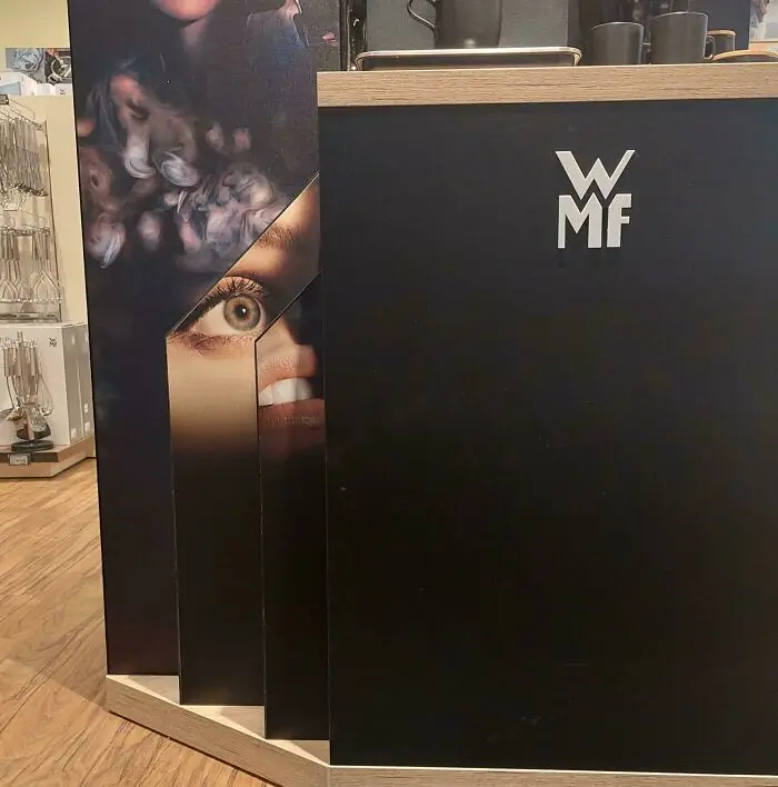
#46 Honestly I Can't Find Any Good Reason To Put 10% Of A Logo On A Corner, Its Just Weird As Hell
Report
22points
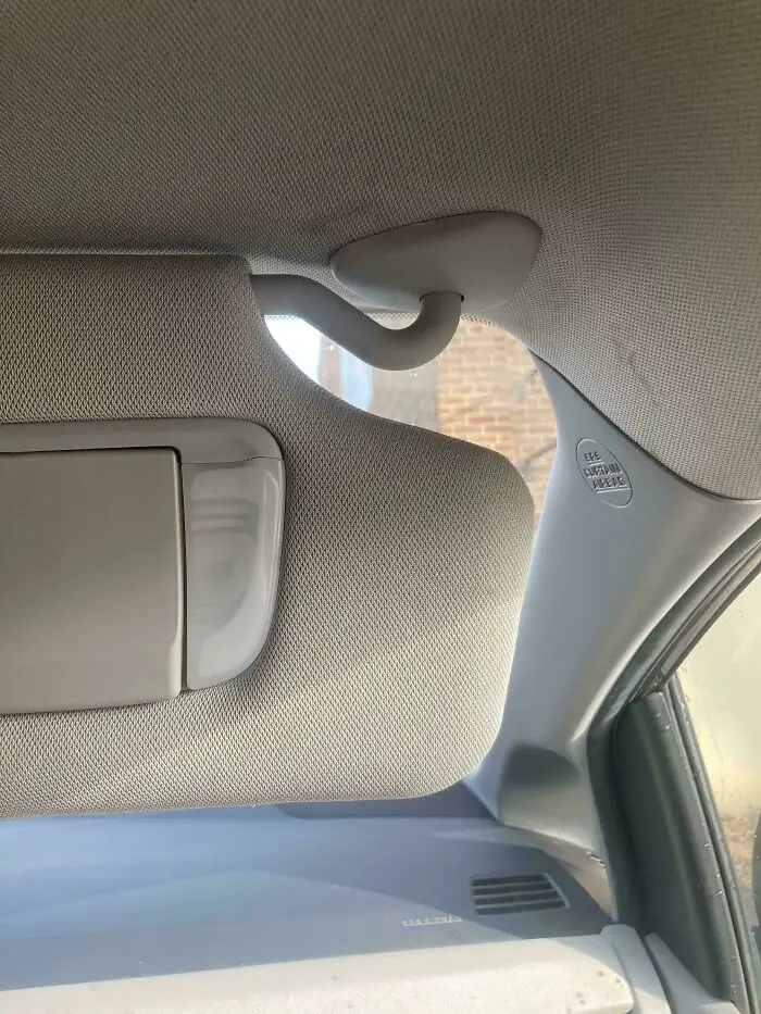
#49 This Colossal Gap In My Car’s Visor. So Much Sun Gets Through It, And There’s Absolutely No Way To Fix It
Report
21points
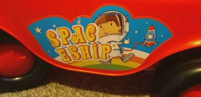
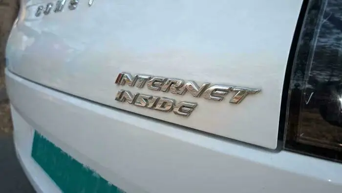
#51 That's A Feature That Could've Been Left In The Brochure Instead Of Permanently Attached To The Back Of Every Model In Production
Report
21points
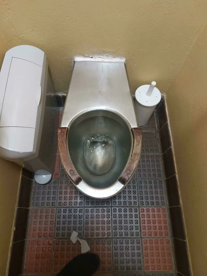
#52 In The Public Ladies Restroom In My Local High Street. Probably The Most Uncomfortable Place Ever To Have An Ibs Flare Up
Report
21points
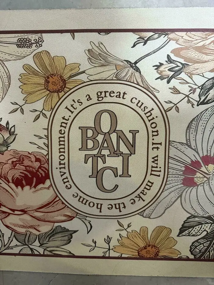
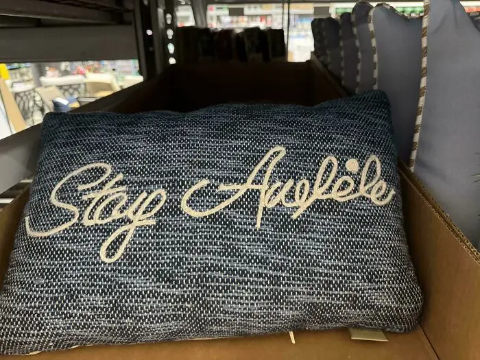
#54 “Stay Auelėle”. This Is Supposed To Say “Stay Awhile”. I Don’t See It
Report
20points
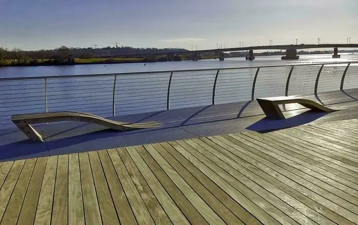
#56 Benches Designed By Someone Who Hates The Concept Of Sitting Down
Report
20points
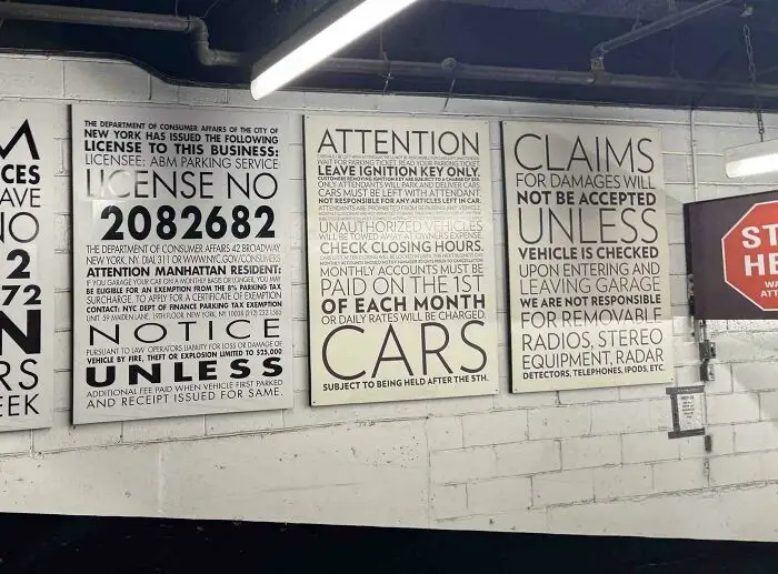
#60 The Styling Says “In This House We Believe,” The Text Says “We’ll See You In Court”
Report
19points
