

Designing a product, ad, or building is far more difficult of a challenge than you might think. Sure, you could argue that human beings are instinctively artistic and love aesthetics, but the sad truth is that there are far (far!) too many design fails out there. I’m not going to lie, sometimes they keep me awake at night. Thinking about them is both hilarious and terrifying at the same time. And the most powerful pics tend to haunt you for weeks and sometimes months at a time. Good design, why are you so rare?
One of the best places to find some outstanding examples of double-plus-ungood designs is this subreddit right here which shames and pokes fun at them for our amusement. Have a look through some of the best (worst?) design disasters that they featured recently. Remember to upvote the ones that you loved to hate the most and I’d absolutely love to hear which of these were your (least) favorite!
This post may include affiliate links.

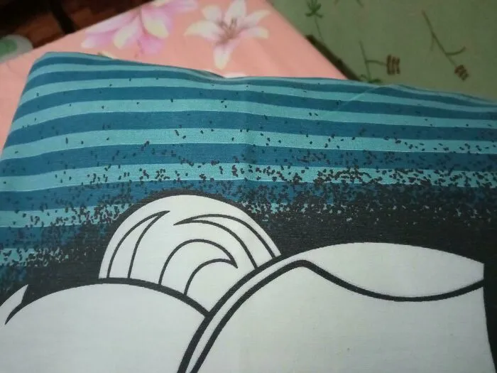
#42 The Design Of This Pillowcase Makes It Look Like There Are Bugs Crawling On It
Report
228points

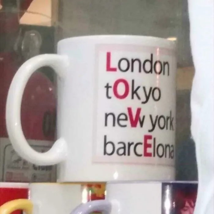
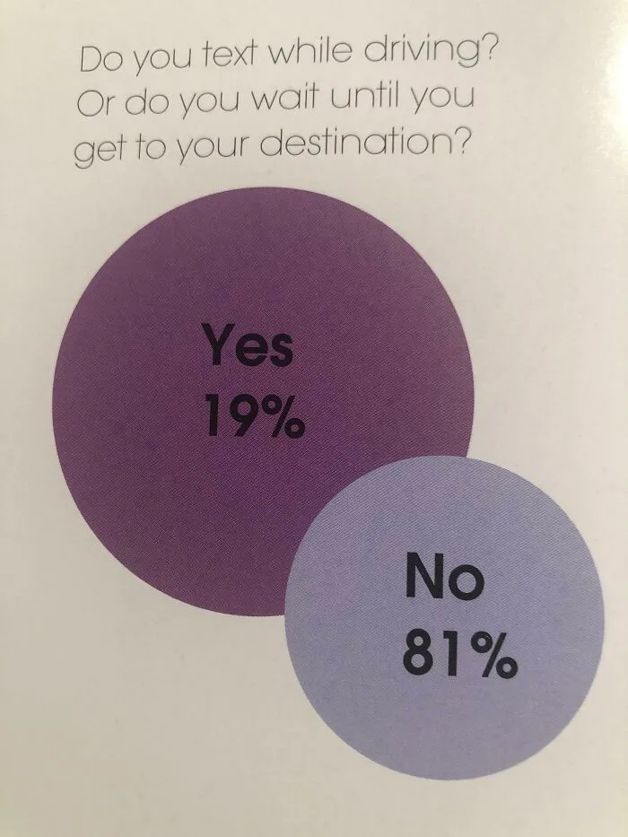
#48 A Very Easy To Read Graph About Texting While Driving? Found In My High School Yearbook
Report
195points