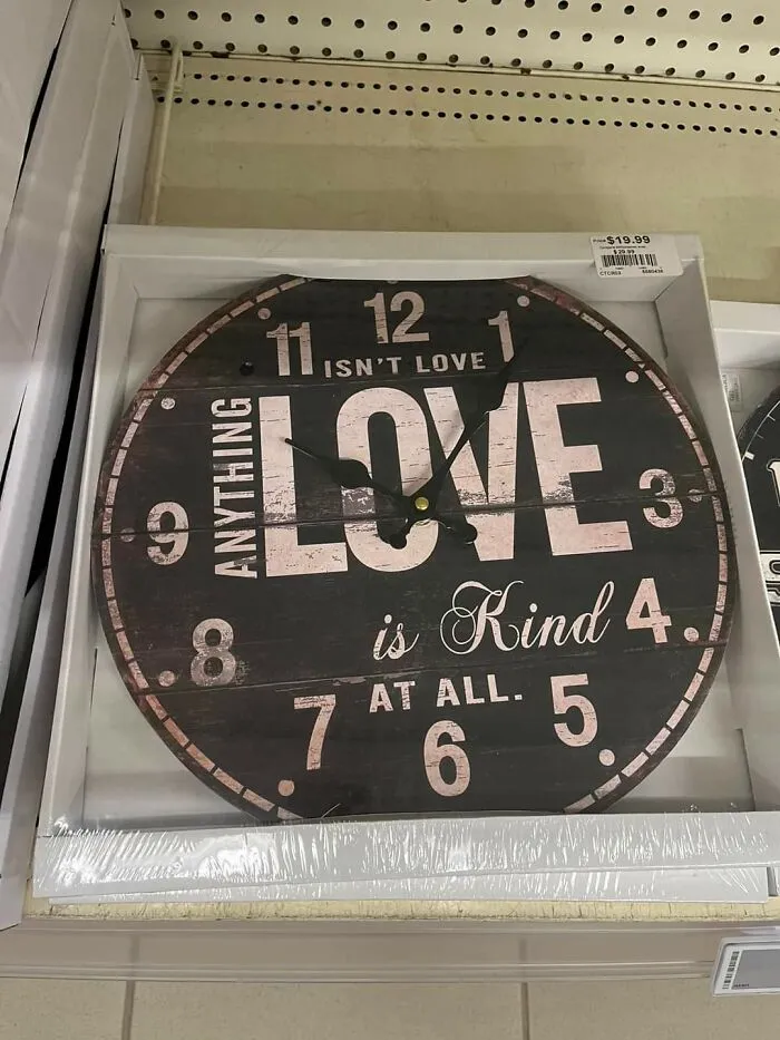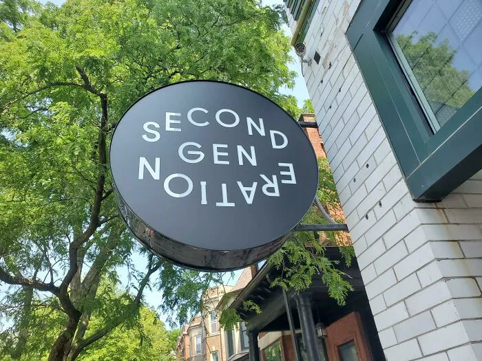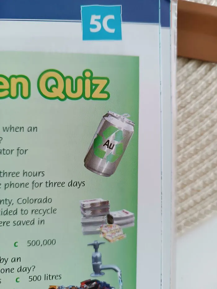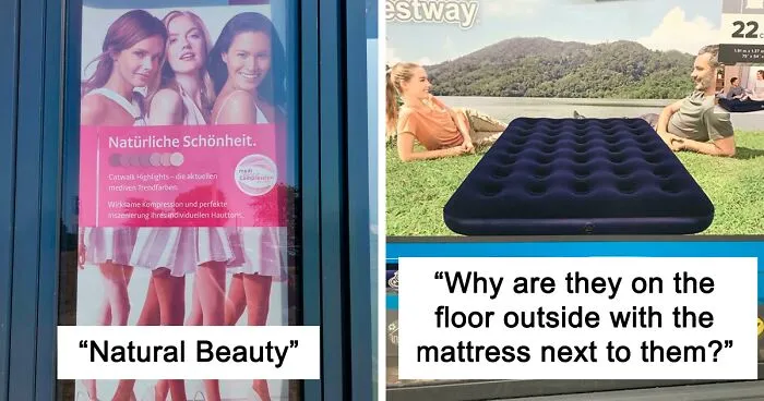



Often, people can intuitively tell whether something’s been designed well or poorly. When it comes to products, furniture, and logos, there has to be a balance between function and form. Without it, you risk alienating your customers or even worse—having your project ridiculed by millions of people online.
There’s one massively successful subreddit that does just that. Members of the online group share the most epic design fails they’ve ever stumbled across and it’s a masterclass in what to never ever do. We’ve collected some of the worst examples of design to share with you, so scroll down to check them out. Don’t forget to upvote the worst of the bunch!
Bored Panda reached out to consumer psychology specialist Matt Johnson, Ph.D., to get his thoughts on what designers can do to ensure the quality of the end product and how to pick between designs that seem equally good. You'll find our full interview with the expert as you read on. Johnson is the host of the human nature and marketing psychology blogs, as well as the author of ‘Branding that Means Business.'
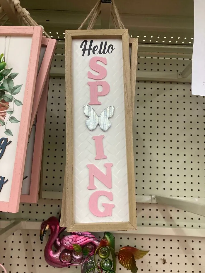
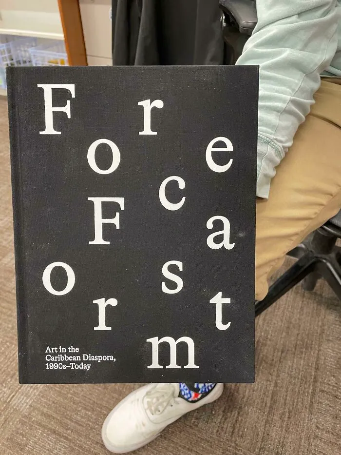

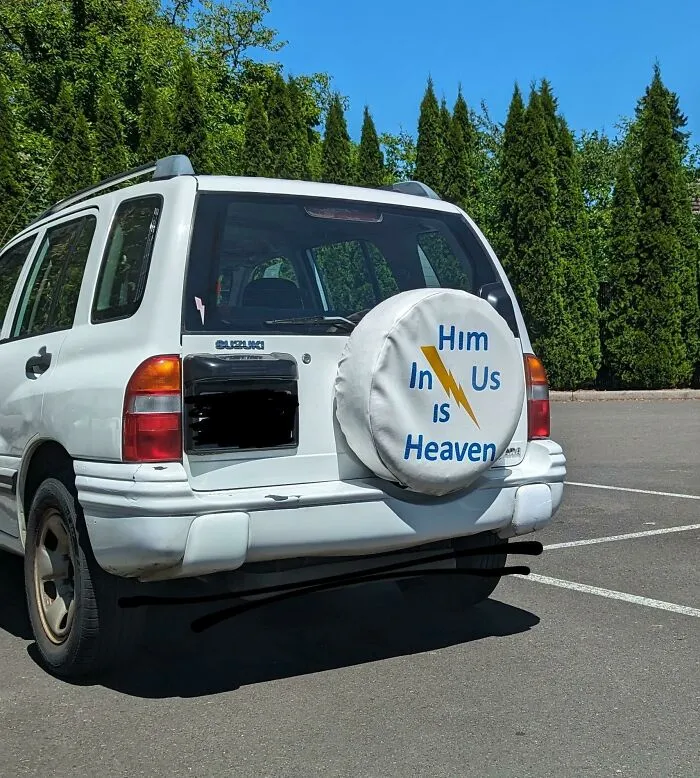
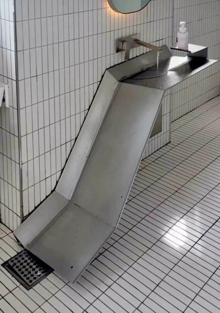
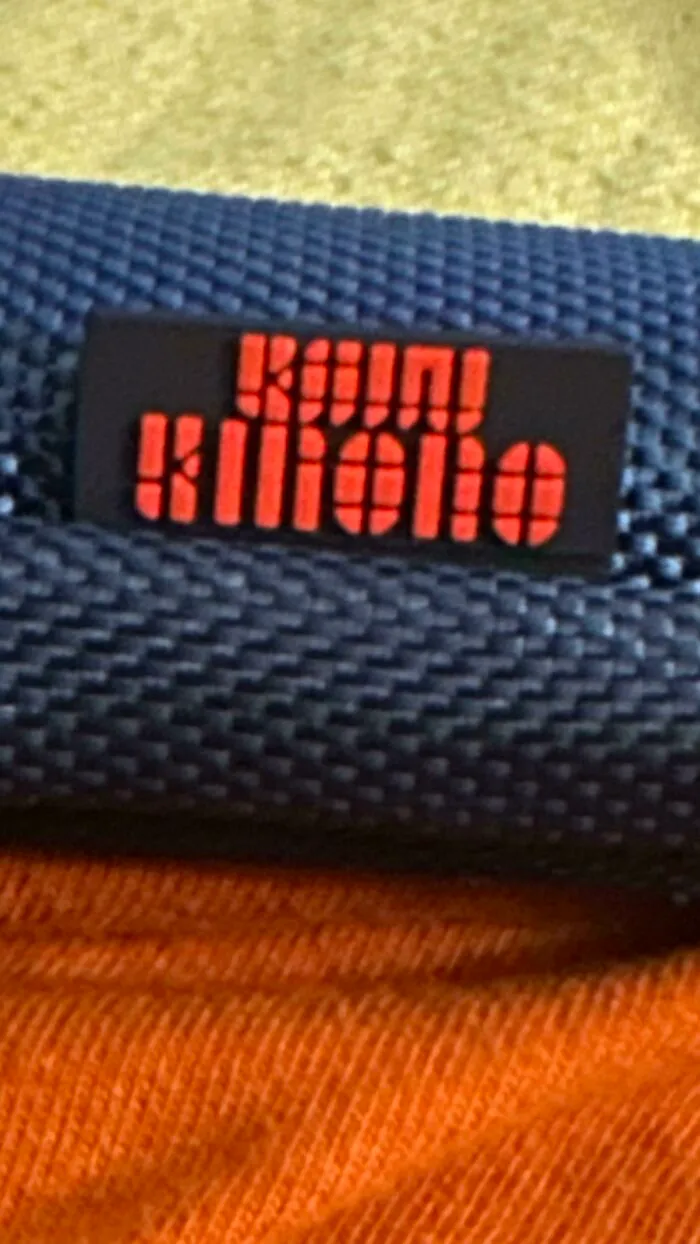
#47 My Stylus Pen And Case Have This Weird Font For The Name And I Can’t Figure Out What It Says Anymore
Report
78points