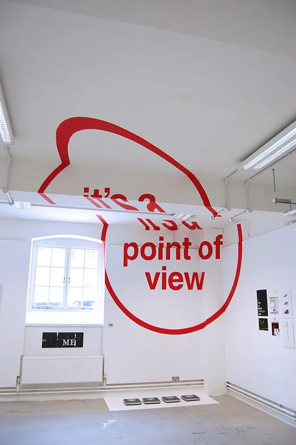
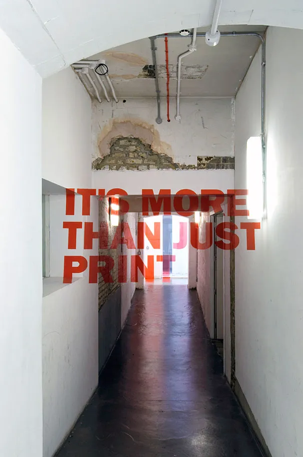
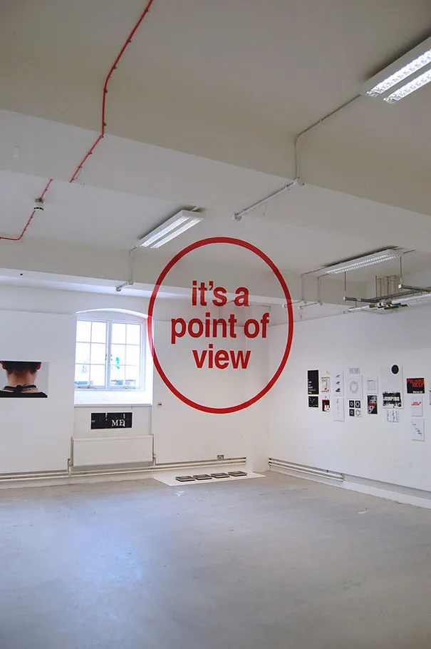
London-based graphic designer Joseph Egan together with his colleagues from Chelsea College of Art & Design created this eye-deceiving anamorphic typography installation as part of the assessment for his Foundation Degree course. I have to admit, at first I thought there was some kind of glass wall with a text sticker!
"We initially chose the phrase "It's more than just print" to challenge the conventional idea that graphic design can only be realised in 2 dimensions (a poster, business card or magazine etc). The phrase is also a comment on the technique as when viewed from the right viewpoint, the design looks as though it is flat on a 2D plain.
For our second installation we chose the phrase “it’s a point of view” as a comment on the process of anamorphosis where the design only becomes fully legible when viewed from a specific point of view. This piece was also a comment on the the subjective nature of good design, given it’s placement in our end of year exhibition featuring works by all of our peers."
Website: behance.net/josephegan/frame
Front View
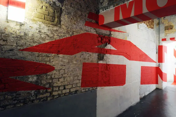
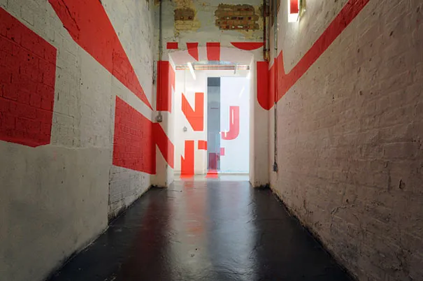
Side View

Front View
Side View